1. Font Research
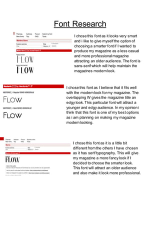
I chose this font as it looks very smart
and i like to give myself the option of
choosing a smarter font if I wanted to
produce my magazine as a less casual
and more professionalmagazine
attracting an older audience. The font is
sans-serif which will help maintain the
magazines modernlook.
I chose this font as I believe that it fits well
with the modernlook formy magazine. The
overlapping W gives the magazine title an
edgy look. This particular font will attract a
younger and edgy audience. In my opinion i
think that this font is one of my best options
as i am planning on making my magazine
modern looking.
I chose this font as it is a little bit
differentfrom the others I have chosen
as it has serif typography. This will give
my magazine a more fancy look if I
decided to choose the smarter look.
This font will attract an older audience
and also make it look more professional.
2. This font was chosen as it mixes the
modern look with the edgyas the W
again is slightly differentfrom the rest
of the letters. Again this font does not
have serif typography to keep up with
the modern and casual look. This font
will work for any age audience.