
Recommended
More Related Content
What's hot
What's hot (18)
Similar to Task 3 - Contents Page
Similar to Task 3 - Contents Page (20)
More from chloegray
More from chloegray (20)
Recently uploaded
Recently uploaded (20)
Task 3 - Contents Page
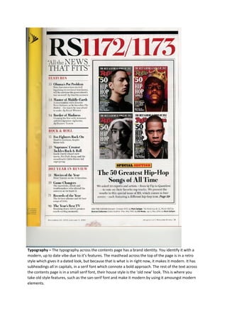
- 1. Typography – The typography across the contents page has a brand identity. You identify it with a modern, up to date vibe due to it’s features. The masthead across the top of the page is in a retro style which gives it a dated look, but because that is what is in right now, it makes it modern. It has subheadings all in capitals, in a serif font which connote a bold approach. The rest of the text across the contents page is in a small serif font, their house style is the ‘old new’ look. This is where you take old style features, such as the san-serif font and make it modern by using it amoungst modern elements.
- 2. Layout – The layout of the contents magazine creates an organised brand identity. It uses columns to break up the text within it, this shows that they are trying to make the audience believe they have that sleek look because it is not messy. Also they use boxes to separate their text from pictures, using these styles shows that they are modern as they are looking for new ways to look organised. Rather than having all of the text just on the page, they are separating it up to be different. Colour – The colours on the contents page create a welcoming but mysterious atmosphere. The colours used across the contents page are black and red, these colours are in good contrast with each other and work well. The red against the black makes it more welcoming than if it was just black, the red almost calms the black. There are a few extra colours used in the images on the page, they are a conglomerate of different colours, all dark shades creating a dark identity. Images – The images on the contents page give off a dark, almost evil vibe. The use of all male photos makes it intimidating for the audience. Also to add to these feelings are the way the photos are took, all of the photos are close ups of the male artists so their facial expressions are shown. Their facial expressions are all disheartening, they are frowning, this makes it quite harsh to look at, especially the fact that they are looking right into your eyes. Language - The language across the contents page creates a mixed brand identity. ‘Obamas pot problem’ is one of the subheadings, this shows that is it a daring magazine, isn't afraid to push the boundaries. Going into such a genre, using content such as drugs makes the magazine seem unusual as most magazine wouldn’t use content like this incase it offended the audience.