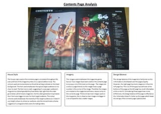
1. House Style
The house style usedonthe contents page is consistent throughout the
everyeditionof the magazine unless it is a special editionissue. The
colours used are monochrome as the white writing contrasts on the black
background. The font used emphasises the typical target audience as it is
clear to read. The font size is small, suggestingit’s a younger audience’s
magazine as stereotypicallytheyhave better eye sight thanthe older
generation, whichmeans magazine s for the older generationmayhave to
their font sizes bigger to cater for their target audience. The colour
scheme used emphasises the maturityof the target audience as it doesn’t
use bright colours to attract an audience, alsothe monochrome scheme
suggests it’s a magazine that caters for bothgenders.
Imagery
The imagesused emphasises the magazines genre.
Dance. Four images have beenusedon the contents page
to occupya lot of the room onthe page.. The images are
usedas a page director as the images have a page
number inthe corner of the image. Therefore the images
are related to the magazine andhave a reason to be on
the contents page. There are twomain images used on
the magazine, this is shownas two images are bigger in
size comparedto two smaller images.
DesignBalance
The design balance of the magazine is fairlyevenas the
informationis distributed over the pagesequally.
However, the right page hasmore imageson it thanthe
left page has. This is to fill the gapit wouldhave at the
bottom of the page as the left page has small information
at the endof it. Considering these pageshave minor
differences, the designbalance ofthe page is effective as
the informationdoesn’t clutter up the pages which leaves
the design ofthe contents page sophisticated.
Contents Page Analysis