The magazine front cover uses bright pinks and purples to attract girls. The main image is of the popular girl band Little Mix looking at the camera to seem personal. Short, snappy language like "Lesson in love" catches readers' attention. While the varied fonts may confuse readers, the images and text are well-placed. The publisher is D.C Thomson & Co. Ltd and the magazine suits its target audience overall.
The document analyzes the design elements of a magazine cover and contents page aimed at teenage girls. It discusses the use of pink and blue colors that create a wintery feel, images of popular artists to indicate the genre and appeal to readers, and informal language in headlines and articles about topics like dating that would interest the target audience. Bold formatting, large images, and a clear layout help guide readers through the contents. The overall design is brightly colored and uses familiar artists, celebrities, and informal language to engage teenage girls.
The document describes the design elements of two magazine covers - NME magazine and Top of the Pops magazine. For NME, it discusses the color palette of red, white and black which appeals to its rock music audience. The large masthead in white stands out against the red background. The main image takes up the whole cover with a close-up shot of Florence. For Top of the Pops, the target audience is young girls aged 8-13. It uses a girly color palette of pink, white and purple. The cover features a mid-shot of Cheryl Cole and text that tells readers "you can be Cheryl." Both magazines employ consistent color palettes, prominent cover lines and images, and mast
This document summarizes and evaluates the front cover and double page spread of a student-created magazine focused on pop music. On the front cover, the student uses bright pink and blue colors in the masthead and cover lines to match the pop genre. Images of musicians and cover lines about celebrities are used to appeal to the target teenage female audience. Bold anchorage text introduces the main artists. On the double page spread, black and white images of the artists scrolling along the top provide contrast. A pink masthead and quote box in the center engage readers in the interview content. Overall, the document analyzes design choices and how they appeal to and attract the intended readership.
The document summarizes the design elements of a music magazine prototype targeted at teenage girls. It includes a front cover featuring a main image and name, a contents page listing features, and a double page celebrity interview spread. Color scheme, images, and informal language are used to represent and appeal to the target demographic. Market research informed conventions and stylistic choices to engage readers and effectively promote the magazine.
The document describes the conventions used in the student's media magazine project. It discusses using a contrasting masterhead with capital and lowercase letters. It includes a pull quote about a TV show. Images on the contents page include page numbers and the front cover. Columns are used to break up text. Double page spreads include a large poster image and columns for text. The target audience is represented as teenage girls through stereotypical images and references to social media and TV. Egmont publishing would be a good fit as they currently only have one teen music magazine. The audience is attracted through pink and purple color scheme, elegant yet readable fonts, and flattering images of girls with natural looks and outfits. The student learned new skills
The document summarizes common features found on magazine front covers, contents pages, and double page spreads from pop magazines. Some key similarities included using bright colors that represent happiness, simple white backgrounds to make images stand out, dominant main images of artists, and images and facial expressions of artists that portray fun and positive personalities. Text is often in columns and boxes to break it up. The consistent features help readers recognize the magazines as pop publications and attract their interest.
This document analyzes and summarizes the key design elements of two magazine double page spreads (DPS). The first DPS is from Q magazine and discusses the small font size, sparse use of bold text, plain layout that utilizes all available space, tight column positioning, minimal color usage, and well-planned use of space. The second DPS is from NME magazine about Nicki Minaj. It has a vibrant, exciting style created by a bold central image and bright color scheme atypical of NME. The layout separates the article into different topic sections to appeal to younger readers.
The document discusses the language, images, color, and content used on various parts of a magazine aimed at teenage girls, including the front cover, contents page, and a double page article spread. The language uses slang, abbreviations, and questions to engage younger readers. Images of popular celebrities and bands are used throughout to appeal to the target audience. Pink and purple colors conform to conventions for magazines targeting teenage girls. The content focuses on artists, music, fashion and other topics of interest to young females.
The document provides details on the design elements of a magazine cover and contents page targeted towards teenage girls. The cover uses bright pinks, yellows and blues to create a happy, girly atmosphere. It features an image of One Direction to appeal to the target audience. The contents page continues the fun, quirky style through images and captions. It addresses the reader directly to make them feel special. The overall impression of both the cover and contents page is that the magazine is designed to interest teenage girls through topics like celebrities and boy bands.
The document provides an analysis of the media conventions used, challenged, and developed in the creation of the author's music magazine. It summarizes the key influences and design choices, including taking inspiration from the layout, fonts, and cover conventions of magazines like Loud and Quiet and Q while also making adaptations suited to their intended audience of late teenagers to middle-aged adults. Examples of challenged conventions included using fewer images and a non-strict color scheme to achieve a simpler, more modern style. The author analyzes how their magazine represents young to middle-aged adults through its indie music genre focus, formal fonts and colors, and minimalistic photography and clothing styles featured.
This document analyzes the front covers and contents pages of several magazines. For a Lady Gaga magazine cover, the analysis notes the bold cover line draws attention. A contents page for a music magazine focusing on Eminem is described as plain with simple colors. Another magazine cover features Cheryl Cole in the rain with red lips matching the masthead color.
The document discusses how the magazine targeted its audience of 13-23 year olds interested in alternative music. It aimed to attract this audience through using genre conventions like dark colors, emotive language, and images of alternative musicians in the magazine's layout and design. The magazine also included common features like competitions, subscriber perks, and a free song download to engage readers. The price of ÂŁ2 was chosen to be affordable for students while still undercutting competitors. Overall, the document explains how the magazine was tailored to attract its intended target audience through visuals, content, and pricing.
Analysis of three double page spreads from music magazineszoewarwood
Â
This document analyzes three double page spreads from different magazines. The first is from TOTP magazine featuring Kristen Stewart. It uses pink and white colors with a black background. The main image is an interview with Stewart. The second is from NME magazine featuring Lily Allen. It uses red, white, and black colors matching the magazine. The main image is a powerful photo of Allen. The third is from Billboard magazine featuring Rihanna. It uses pink, white, and black colors appealing to its target audience. The main image shows Rihanna in a pink outfit. All three spreads use images, text, colors, and layouts tailored to their magazines and audiences.
The document discusses elements that should be included on the front cover of a school magazine, such as the masthead, main image, cover lines, and barcode/price to identify the publication and attract readers. It also provides audience research showing common elements readers feel should be in a school magazine, like student achievements and photos. The end includes forms for planning a school magazine cover and contents page by considering the target audience, images, colors, and technical details.
The document discusses conventions for different elements of a pop magazine, including the cover, contents page, and double page spreads. Some key conventions mentioned are:
- The cover should feature an eye-catching masthead, main image of a pop star between 17-25, and cover lines linking to the image. The color scheme should appeal to the target audience, usually pinks, purples, blues and yellows.
- The contents page typically copies the cover image and uses page numbers, subheadings, and bold text to make navigation easy. It also reflects the magazine's color scheme.
- Double page spreads usually include a large main image, are formatted as a question and answer interview, and
This document analyzes the design elements of a magazine cover targeted at parents of young children. It discusses how the predominantly pink color scheme and images used would appeal more to mothers than fathers. The varied font sizes in the masthead help emphasize the magazine title. Pugs and puffs are used to draw attention to key information like prices and article topics. The main image of a smiling schoolgirl makes the intended audience of parents and their children clear. A highlighted cover line promotes an article about tricking picky eaters into eating different foods.
1) The magazine cover features a large image of the famous artist Trey Songz, who is looking directly at the camera, in order to attract readers who are fans of the artist.
2) Bold fonts and use of the color red throughout draw attention to headlines and articles about hip hop music and culture.
3) Details like the prison-like bathroom backdrop for Trey Songz's image and hard-hitting language help position the magazine as authentic and "in the know" regarding hip hop music and lifestyle.
This magazine cover features Cheryl Cole as the main image. The large main cover line "Cheryl Cole rocks" engages readers about what may be said about her in the magazine. Additional cover lines in red and white text advertise other music artists and stories featured inside. The masthead at the top identifies this as issue of "Q" magazine.
The document summarizes the process of creating a magazine mockup for a class project. It describes the design choices made for elements like the masthead, cover image, contents page, and double-page spread. Audience feedback was gathered through surveys to evaluate how well the mockup appealed to its target demographic of 14-18 year olds interested in pop music. Overall, the feedback was positive and indicated the magazine was attractively designed and priced for its intended youth audience.
Here are some key things I learned about technologies from constructing this media product:
- Digital cameras allow precise control over elements like ISO, aperture, shutter speed to capture high quality images suited to different lighting conditions. Practice and research is needed to understand how these elements impact photos.
- Photo editing software like Photoshop gives extensive control over image enhancement. Techniques like adjusting color levels can exaggerate features to visually reinforce intended messages or aesthetics.
- Online publishing platforms like Blogger facilitate scheduling posts and organizing content in a logical flow. Rearranging uploaded posts allows for flexibility in presentation.
- Researching tutorials is important for learning how to properly utilize different technologies and get the best results. Hands-on practice with preliminary
The document analyzes conventions of pop magazine covers and contents pages. Genre conventions include bright colors, neat fonts appealing to young audiences featuring popular artists. The Billboard magazine cover uses a colorful masthead and bright image of Katy Perry surrounded by flowers. The Q Magazine cover stands out with a controversial image of Lana Del Rey with blood and an attention-grabbing pink cover line. Both magazines use circles and colors like yellow consistently across elements to tie the design together professionally. Contents pages also feature celebrity images and styles tailored to each magazine's target audience.
The document describes the design choices for the masthead, cover images, text blocks, and double page spread of a magazine cover and interior page. Key points:
- The bright pink and black masthead is meant to represent the "pop" genre and stand out on the left side of the cover.
- The main cover image shows two young males in trendy clothing shot from a high angle, positioned in the center to draw attention.
- Cover lines on the left use different fonts and colors to highlight headlines and integrate with the design.
- The double page spread continues the color scheme and includes three black and white images of the duo across the top and a large quote in the center.
NME is a UK music magazine that has been published weekly since 1949. It focuses on rock, indie, and alternative music genres. It has a weekly circulation of around 33,000 readers who tend to be young, between 23-24 years old on average. The majority of readers are men around 63%.
The document provides an analysis of existing magazine front covers and double page spreads. It notes some common features found across the researched products, such as the model/celebrity being the main focal point to attract readers. It also discusses aspects that will be included in the author's own work, like maintaining a consistent color scheme and ensuring all elements relate to each other. The document concludes with a bibliography citing sources referenced in the research analysis.
NME is a UK music magazine that has been published weekly since 1949. It focuses on rock, indie, and alternative music genres. It has a weekly circulation of around 33,000 readers who tend to be young, between 23-24 years old on average. The majority of readers are men around 63%.
This document discusses how the design and content of a teen girl magazine appeals to its target audience. It analyzes various design elements like informal language, pink colors, celebrity photos at eye level, and gossip/fashion content. These features make the magazine easily understandable, draw in young readers, and portray celebrities as friendly and relatable to create an emotional connection with the target audience. Overall, the magazine's design strategically uses visuals, words, and topics that would interest and relate to its core demographic of teenage girls.
The document provides an analysis of the design elements of a magazine cover and contents page. Key points analyzed include:
- The magazine cover uses bright colors like yellow and blue to draw attention to the main image of an artist making a comeback.
- The contents page is criticized for being too cluttered with writing and not clear or appealing for younger audiences.
- While an image on the contents spread of someone humorously dressed as Elvis appeals to younger readers, it is noted as not fitting the magazine's overall house style.
Suggestions are made to use bigger font for cover stories and improve the organization and clarity of the contents page. In summary, the document provides a critique of design and stylistic elements
The document provides an analysis of the design elements of a magazine cover and contents page aimed at teenage girls. It discusses the use of bright colours and images of boy bands on the cover to attract readers. The contents page analysis highlights the fun, informal tone created through images of the bands and captions. Overall both pages are assessed as effectively appealing to the interests of the target audience through their use of popular artists and an engaging design.
The document analyzes the contents page of a pop music magazine aimed at young girls. It discusses the layout, images, colors, and text used to attract and engage readers. Key features summarized include the use of bright colors and photos of popular artists to draw in readers, short subheadings and lists to make navigation simple, and inclusion of posters and non-music content to appeal to readers' interests in celebrities and fashion. The contents page uses a conversational tone and focuses on topics likely to appeal to its target audience of teenage girls.
The document analyzes the contents page of a magazine. It notes that the page is set out professionally with the contents list on the right side and sections divided by theme. While images are included, they do not detract from the main focus on the contents. The color scheme and layout make the page easy to read. However, there is no title indicating it is the contents page, which could cause confusion.
The document analyzes the contents pages of several music magazines. It discusses the layout, images, colors and target audiences presented on each contents page. Key details analyzed include the positioning of images and text, color schemes used, and clues about the implied target demographics based on stylistic choices. The level of professionalism of the layout and how effectively the main focus is kept on the contents listing is also considered for each magazine analyzed.
The document analyzes the contents page of a magazine. It notes that the page is set out professionally with the contents list on the right side and sections divided by theme. While images are included, they do not detract from the main focus on the contents. The color scheme and layout create an attractive yet readable page that would appeal to the magazine's target audience.
The document analyzes the contents pages of four different music magazines. It discusses the layout, colors, images and target audiences presented on each contents page. Key details analyzed include the positioning of images and text, color schemes used, and clues about the intended readership based on the stylistic choices. The level of professionalism in the layout and the clarity or busyness of the page design is also considered for each magazine contents page.
The document analyzes the layout and design elements of magazine covers and pages. It discusses various components like the masthead, main image, fonts, and color schemes. Specific examples are provided from magazines like Top of the Pops, We Heart Pop, and Billboard. Key points analyzed include how elements appeal to target audiences, draw attention, and convey implied meanings through stylistic choices.
The double page spread uses a pink and white color scheme to appeal to its target audience of young girls. A large image takes up nearly a whole page of a celebrity who is featured prominently throughout the magazine. Headlines use slang and casual language like "bae" to seem more personal and relatable to teenage readers. Smaller articles are arranged casually with highlights in bubbles to make the key points easier for young readers to understand.
This document analyzes magazine covers and contents pages for two different magazines - Top of the Pops and NME. For the Top of the Pops magazine cover and contents page, the analysis finds that they target young girls ages 8-13 through the use of bright colors like pink and purple, images of popular artists like Cher Lloyd, and fashion/celebrity focused content. The NME magazine cover and contents page are analyzed as targeting males ages 16-22 through grittier band images, content focused on concerts and music news, and a simple color scheme. Key design elements like logos, images, and sectioning of content are also examined.
The document analyzes the design elements of a magazine cover and contents page aimed at teenage girls. It discusses the use of pink and blue colors that create a wintery feel, images of popular artists to indicate the genre and appeal to readers, and informal language in headlines and articles about topics like celebrities and relationships that would interest the target audience. Overall, the cover and contents page are designed to attract teenage girls through colors, images, and content directly relevant to their interests.
The document analyzes the design elements of a rock music magazine cover and contents pages. It discusses the typography, colors, images, layout, and language used on the different pages. Serif fonts in bold are used on the cover to draw attention, with a variety of sizes. Blacks and reds set a dark, angry mood. Images feature rock artists. The formal layout guides the eye across important elements. The same design conventions carry through the contents pages to maintain a consistent brand identity that positions the magazine for its target audience of teenage rock fans.
This document analyzes the typography, layout, colors, images, language, and conventions used across the front cover, content page, and double page spread of a magazine. It finds that the magazine uses sans serif fonts, bright colors like pink and red, and images of young celebrities like Rihanna to target a young, female audience. While the layouts and some language is more casual to appeal to youth, other aspects like formal writing style and ordered page designs signal an attempt to also engage older readers. Overall the brand identity conveyed aims to be fresh, youthful and feminine through its visual design choices.
The document discusses techniques used to attract and address the intended audience of a rock music magazine, including:
1) The mode of address uses personal pronouns like "your" to create rapport and exclamatives like "FREE INSIDE!" to convey excitement and fun.
2) Images on the cover and contents page feature people with the stereotypical look of rock artists to attract readers interested in that genre.
3) The color scheme of red, black, and white with splashes of blue is used to look fun and inviting while indicating a conventional rock audience. The same font style provides consistency across pages.
The document describes the design elements of two magazine covers - NME magazine and Top of the Pops magazine. For NME, it discusses the color palette of red, white and black which appeals to its rock music audience. The large masthead in white stands out against the red background. The main image takes up the whole cover with a close-up shot of Florence. For Top of the Pops, the target audience is young girls aged 8-13. It uses a pink, white and purple color scheme with images of celebrities like Cheryl Cole to appeal to this demographic. The masthead is in pink bubbles to resemble girlish handwriting. Both magazines employ consistent color palettes and layouts across their covers and contents
The document analyzes the contents page of a pop magazine. It finds that the page uses bright colors, many images of pop artists and fashion, and an informal tone to address its young, female target audience simply and engage them. Key elements that help reach this audience include large page numbers, highlighted text, and a rule-of-thirds layout that organizes the busy page clearly.
The magazine cover is aimed at teenage girls, as indicated by the pink font and rounded font style. It features an image of Lady Gaga to appeal to the target audience. Throughout the magazine, a pink, black, and white color scheme and informal font are used to create a fun, accessible feel for teenage readers. The contents page is clearly laid out to help readers easily find articles on their favorite music artists.
This contents page follows conventions like including a title and page numbers. The title "Inside the mag..." is informal to match the target audience of young girls. Many images of pop artists and fashion are used to engage readers. Articles are divided by topics like celebrities and gossip that would interest teens. The layout uses a bright pink color and scrapbook style with images to appeal to young readers and maintain the magazine's brand identity.
This magazine targets younger children who regularly listen to pop music. The layout uses bright pink and white colors with easy to read fonts. Pictures and varied page numbers break up the text and make the articles easier to find. The informal colors, fonts, and images connote fun and appeal to the target audience. The language is informal with slang to seem relaxed. The brand identity is instantly recognizable through the consistent use of girly pink and yellow colors, informal fonts, and child-friendly language throughout the magazine.
Nunit vs XUnit vs MSTest Differences Between These Unit Testing Frameworks.pdfflufftailshop
Â
When it comes to unit testing in the .NET ecosystem, developers have a wide range of options available. Among the most popular choices are NUnit, XUnit, and MSTest. These unit testing frameworks provide essential tools and features to help ensure the quality and reliability of code. However, understanding the differences between these frameworks is crucial for selecting the most suitable one for your projects.
Dive into the realm of operating systems (OS) with Pravash Chandra Das, a seasoned Digital Forensic Analyst, as your guide. đ This comprehensive presentation illuminates the core concepts, types, and evolution of OS, essential for understanding modern computing landscapes.
Beginning with the foundational definition, Das clarifies the pivotal role of OS as system software orchestrating hardware resources, software applications, and user interactions. Through succinct descriptions, he delineates the diverse types of OS, from single-user, single-task environments like early MS-DOS iterations, to multi-user, multi-tasking systems exemplified by modern Linux distributions.
Crucial components like the kernel and shell are dissected, highlighting their indispensable functions in resource management and user interface interaction. Das elucidates how the kernel acts as the central nervous system, orchestrating process scheduling, memory allocation, and device management. Meanwhile, the shell serves as the gateway for user commands, bridging the gap between human input and machine execution. đ»
The narrative then shifts to a captivating exploration of prominent desktop OSs, Windows, macOS, and Linux. Windows, with its globally ubiquitous presence and user-friendly interface, emerges as a cornerstone in personal computing history. macOS, lauded for its sleek design and seamless integration with Apple's ecosystem, stands as a beacon of stability and creativity. Linux, an open-source marvel, offers unparalleled flexibility and security, revolutionizing the computing landscape. đ„ïž
Moving to the realm of mobile devices, Das unravels the dominance of Android and iOS. Android's open-source ethos fosters a vibrant ecosystem of customization and innovation, while iOS boasts a seamless user experience and robust security infrastructure. Meanwhile, discontinued platforms like Symbian and Palm OS evoke nostalgia for their pioneering roles in the smartphone revolution.
The journey concludes with a reflection on the ever-evolving landscape of OS, underscored by the emergence of real-time operating systems (RTOS) and the persistent quest for innovation and efficiency. As technology continues to shape our world, understanding the foundations and evolution of operating systems remains paramount. Join Pravash Chandra Das on this illuminating journey through the heart of computing. đ
Programming Foundation Models with DSPy - Meetup SlidesZilliz
Â
Prompting language models is hard, while programming language models is easy. In this talk, I will discuss the state-of-the-art framework DSPy for programming foundation models with its powerful optimizers and runtime constraint system.
Driving Business Innovation: Latest Generative AI Advancements & Success StorySafe Software
Â
Are you ready to revolutionize how you handle data? Join us for a webinar where weâll bring you up to speed with the latest advancements in Generative AI technology and discover how leveraging FME with tools from giants like Google Gemini, Amazon, and Microsoft OpenAI can supercharge your workflow efficiency.
During the hour, weâll take you through:
Guest Speaker Segment with Hannah Barrington: Dive into the world of dynamic real estate marketing with Hannah, the Marketing Manager at Workspace Group. Hear firsthand how their team generates engaging descriptions for thousands of office units by integrating diverse data sourcesâfrom PDF floorplans to web pagesâusing FME transformers, like OpenAIVisionConnector and AnthropicVisionConnector. This use case will show you how GenAI can streamline content creation for marketing across the board.
Ollama Use Case: Learn how Scenario Specialist Dmitri Bagh has utilized Ollama within FME to input data, create custom models, and enhance security protocols. This segment will include demos to illustrate the full capabilities of FME in AI-driven processes.
Custom AI Models: Discover how to leverage FME to build personalized AI models using your data. Whether itâs populating a model with local data for added security or integrating public AI tools, find out how FME facilitates a versatile and secure approach to AI.
Weâll wrap up with a live Q&A session where you can engage with our experts on your specific use cases, and learn more about optimizing your data workflows with AI.
This webinar is ideal for professionals seeking to harness the power of AI within their data management systems while ensuring high levels of customization and security. Whether you're a novice or an expert, gain actionable insights and strategies to elevate your data processes. Join us to see how FME and AI can revolutionize how you work with data!
Unlock the Future of Search with MongoDB Atlas_ Vector Search Unleashed.pdfMalak Abu Hammad
Â
Discover how MongoDB Atlas and vector search technology can revolutionize your application's search capabilities. This comprehensive presentation covers:
* What is Vector Search?
* Importance and benefits of vector search
* Practical use cases across various industries
* Step-by-step implementation guide
* Live demos with code snippets
* Enhancing LLM capabilities with vector search
* Best practices and optimization strategies
Perfect for developers, AI enthusiasts, and tech leaders. Learn how to leverage MongoDB Atlas to deliver highly relevant, context-aware search results, transforming your data retrieval process. Stay ahead in tech innovation and maximize the potential of your applications.
#MongoDB #VectorSearch #AI #SemanticSearch #TechInnovation #DataScience #LLM #MachineLearning #SearchTechnology
HCL Notes und Domino Lizenzkostenreduzierung in der Welt von DLAUpanagenda
Â
Webinar Recording: https://www.panagenda.com/webinars/hcl-notes-und-domino-lizenzkostenreduzierung-in-der-welt-von-dlau/
DLAU und die Lizenzen nach dem CCB- und CCX-Modell sind fĂŒr viele in der HCL-Community seit letztem Jahr ein heiĂes Thema. Als Notes- oder Domino-Kunde haben Sie vielleicht mit unerwartet hohen Benutzerzahlen und LizenzgebĂŒhren zu kĂ€mpfen. Sie fragen sich vielleicht, wie diese neue Art der Lizenzierung funktioniert und welchen Nutzen sie Ihnen bringt. Vor allem wollen Sie sicherlich Ihr Budget einhalten und Kosten sparen, wo immer möglich. Das verstehen wir und wir möchten Ihnen dabei helfen!
Wir erklĂ€ren Ihnen, wie Sie hĂ€ufige Konfigurationsprobleme lösen können, die dazu fĂŒhren können, dass mehr Benutzer gezĂ€hlt werden als nötig, und wie Sie ĂŒberflĂŒssige oder ungenutzte Konten identifizieren und entfernen können, um Geld zu sparen. Es gibt auch einige AnsĂ€tze, die zu unnötigen Ausgaben fĂŒhren können, z. B. wenn ein Personendokument anstelle eines Mail-Ins fĂŒr geteilte Mailboxen verwendet wird. Wir zeigen Ihnen solche FĂ€lle und deren Lösungen. Und natĂŒrlich erklĂ€ren wir Ihnen das neue Lizenzmodell.
Nehmen Sie an diesem Webinar teil, bei dem HCL-Ambassador Marc Thomas und Gastredner Franz Walder Ihnen diese neue Welt nĂ€herbringen. Es vermittelt Ihnen die Tools und das Know-how, um den Ăberblick zu bewahren. Sie werden in der Lage sein, Ihre Kosten durch eine optimierte Domino-Konfiguration zu reduzieren und auch in Zukunft gering zu halten.
Diese Themen werden behandelt
- Reduzierung der Lizenzkosten durch Auffinden und Beheben von Fehlkonfigurationen und ĂŒberflĂŒssigen Konten
- Wie funktionieren CCB- und CCX-Lizenzen wirklich?
- Verstehen des DLAU-Tools und wie man es am besten nutzt
- Tipps fĂŒr hĂ€ufige Problembereiche, wie z. B. Team-PostfĂ€cher, Funktions-/Testbenutzer usw.
- Praxisbeispiele und Best Practices zum sofortigen Umsetzen
Introduction of Cybersecurity with OSS at Code Europe 2024Hiroshi SHIBATA
Â
I develop the Ruby programming language, RubyGems, and Bundler, which are package managers for Ruby. Today, I will introduce how to enhance the security of your application using open-source software (OSS) examples from Ruby and RubyGems.
The first topic is CVE (Common Vulnerabilities and Exposures). I have published CVEs many times. But what exactly is a CVE? I'll provide a basic understanding of CVEs and explain how to detect and handle vulnerabilities in OSS.
Next, let's discuss package managers. Package managers play a critical role in the OSS ecosystem. I'll explain how to manage library dependencies in your application.
I'll share insights into how the Ruby and RubyGems core team works to keep our ecosystem safe. By the end of this talk, you'll have a better understanding of how to safeguard your code.
leewayhertz.com-AI in predictive maintenance Use cases technologies benefits ...alexjohnson7307
Â
Predictive maintenance is a proactive approach that anticipates equipment failures before they happen. At the forefront of this innovative strategy is Artificial Intelligence (AI), which brings unprecedented precision and efficiency. AI in predictive maintenance is transforming industries by reducing downtime, minimizing costs, and enhancing productivity.
In the rapidly evolving landscape of technologies, XML continues to play a vital role in structuring, storing, and transporting data across diverse systems. The recent advancements in artificial intelligence (AI) present new methodologies for enhancing XML development workflows, introducing efficiency, automation, and intelligent capabilities. This presentation will outline the scope and perspective of utilizing AI in XML development. The potential benefits and the possible pitfalls will be highlighted, providing a balanced view of the subject.
We will explore the capabilities of AI in understanding XML markup languages and autonomously creating structured XML content. Additionally, we will examine the capacity of AI to enrich plain text with appropriate XML markup. Practical examples and methodological guidelines will be provided to elucidate how AI can be effectively prompted to interpret and generate accurate XML markup.
Further emphasis will be placed on the role of AI in developing XSLT, or schemas such as XSD and Schematron. We will address the techniques and strategies adopted to create prompts for generating code, explaining code, or refactoring the code, and the results achieved.
The discussion will extend to how AI can be used to transform XML content. In particular, the focus will be on the use of AI XPath extension functions in XSLT, Schematron, Schematron Quick Fixes, or for XML content refactoring.
The presentation aims to deliver a comprehensive overview of AI usage in XML development, providing attendees with the necessary knowledge to make informed decisions. Whether youâre at the early stages of adopting AI or considering integrating it in advanced XML development, this presentation will cover all levels of expertise.
By highlighting the potential advantages and challenges of integrating AI with XML development tools and languages, the presentation seeks to inspire thoughtful conversation around the future of XML development. Weâll not only delve into the technical aspects of AI-powered XML development but also discuss practical implications and possible future directions.
HCL Notes and Domino License Cost Reduction in the World of DLAUpanagenda
Â
Webinar Recording: https://www.panagenda.com/webinars/hcl-notes-and-domino-license-cost-reduction-in-the-world-of-dlau/
The introduction of DLAU and the CCB & CCX licensing model caused quite a stir in the HCL community. As a Notes and Domino customer, you may have faced challenges with unexpected user counts and license costs. You probably have questions on how this new licensing approach works and how to benefit from it. Most importantly, you likely have budget constraints and want to save money where possible. Donât worry, we can help with all of this!
Weâll show you how to fix common misconfigurations that cause higher-than-expected user counts, and how to identify accounts which you can deactivate to save money. There are also frequent patterns that can cause unnecessary cost, like using a person document instead of a mail-in for shared mailboxes. Weâll provide examples and solutions for those as well. And naturally weâll explain the new licensing model.
Join HCL Ambassador Marc Thomas in this webinar with a special guest appearance from Franz Walder. It will give you the tools and know-how to stay on top of what is going on with Domino licensing. You will be able lower your cost through an optimized configuration and keep it low going forward.
These topics will be covered
- Reducing license cost by finding and fixing misconfigurations and superfluous accounts
- How do CCB and CCX licenses really work?
- Understanding the DLAU tool and how to best utilize it
- Tips for common problem areas, like team mailboxes, functional/test users, etc
- Practical examples and best practices to implement right away
Building Production Ready Search Pipelines with Spark and MilvusZilliz
Â
Spark is the widely used ETL tool for processing, indexing and ingesting data to serving stack for search. Milvus is the production-ready open-source vector database. In this talk we will show how to use Spark to process unstructured data to extract vector representations, and push the vectors to Milvus vector database for search serving.
Trusted Execution Environment for Decentralized Process MiningLucaBarbaro3
Â
Presentation of the paper "Trusted Execution Environment for Decentralized Process Mining" given during the CAiSE 2024 Conference in Cyprus on June 7, 2024.
5th LF Energy Power Grid Model Meet-up SlidesDanBrown980551
Â
5th Power Grid Model Meet-up
It is with great pleasure that we extend to you an invitation to the 5th Power Grid Model Meet-up, scheduled for 6th June 2024. This event will adopt a hybrid format, allowing participants to join us either through an online Mircosoft Teams session or in person at TU/e located at Den Dolech 2, Eindhoven, Netherlands. The meet-up will be hosted by Eindhoven University of Technology (TU/e), a research university specializing in engineering science & technology.
Power Grid Model
The global energy transition is placing new and unprecedented demands on Distribution System Operators (DSOs). Alongside upgrades to grid capacity, processes such as digitization, capacity optimization, and congestion management are becoming vital for delivering reliable services.
Power Grid Model is an open source project from Linux Foundation Energy and provides a calculation engine that is increasingly essential for DSOs. It offers a standards-based foundation enabling real-time power systems analysis, simulations of electrical power grids, and sophisticated what-if analysis. In addition, it enables in-depth studies and analysis of the electrical power gridâs behavior and performance. This comprehensive model incorporates essential factors such as power generation capacity, electrical losses, voltage levels, power flows, and system stability.
Power Grid Model is currently being applied in a wide variety of use cases, including grid planning, expansion, reliability, and congestion studies. It can also help in analyzing the impact of renewable energy integration, assessing the effects of disturbances or faults, and developing strategies for grid control and optimization.
What to expect
For the upcoming meetup we are organizing, we have an exciting lineup of activities planned:
-Insightful presentations covering two practical applications of the Power Grid Model.
-An update on the latest advancements in Power Grid -Model technology during the first and second quarters of 2024.
-An interactive brainstorming session to discuss and propose new feature requests.
-An opportunity to connect with fellow Power Grid Model enthusiasts and users.
Salesforce Integration for Bonterra Impact Management (fka Social Solutions A...Jeffrey Haguewood
Â
Sidekick Solutions uses Bonterra Impact Management (fka Social Solutions Apricot) and automation solutions to integrate data for business workflows.
We believe integration and automation are essential to user experience and the promise of efficient work through technology. Automation is the critical ingredient to realizing that full vision. We develop integration products and services for Bonterra Case Management software to support the deployment of automations for a variety of use cases.
This video focuses on integration of Salesforce with Bonterra Impact Management.
Interested in deploying an integration with Salesforce for Bonterra Impact Management? Contact us at sales@sidekicksolutionsllc.com to discuss next steps.
Salesforce Integration for Bonterra Impact Management (fka Social Solutions A...
Â
Analysis finished
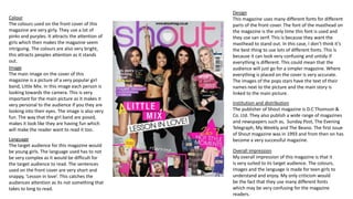
1. Colour
The colours used on the front cover of this
magazine are very girly. They use a lot of
pinks and purples. It attracts the attention of
girls which then makes the magazine seem
intriguing. The colours are also very bright,
this attracts peoples attention as it stands
out.
Image
The main image on the cover of this
magazine is a picture of a very popular girl
band, Little Mix. In this image each person is
looking towards the camera. This is very
important for the main picture as it makes it
very personal to the audience if you they are
looking into their eyes. The image is also very
fun. The way that the girl band are posed,
makes it look like they are having fun which
will make the reader want to read it too.
Language
The target audience for this magazine would
be young girls. The language used has to not
be very complex as it would be difficult for
the target audience to read. The sentences
used on the front cover are very short and
snappy, âLesson in loveâ. This catches the
audiences attention as its not something that
takes to long to read.
Design
This magazine uses many different fonts for different
parts of the front cover. The font of the masthead on
the magazine is the only time this font is used and
they use san serif. This is because they want the
masthead to stand out. In this case, I donât think itâs
the best thing to use lots of different fonts. This is
because it can look very confusing and untidy if
everything is different. This could mean that the
audience will just go for a simpler magazine. Where
everything is placed on the cover is very accurate.
The images of the pops stars have the text of their
names next to the picture and the main story is
linked to the main picture.
Institution and distribution
The publisher of Shout magazine is D.C Thomson &
Co. Ltd. They also publish a wide range of magazines
and newspapers such as, Sunday Post, The Evening
Telegraph, My Weekly and The Beano. The first issue
of Shout magazine was in 1993 and from then on has
become a very successful magazine.
Overall impression
My overall impression of this magazine is that it
is very suited to its target audience. The colours,
images and the language is made for teen girls to
understand and enjoy. My only criticism would
be the fact that they use many different fonts
which may be very confusing for the magazine
readers.
2. Colour
The colour schemes on this contents page is very similar to the front
cover. There use many pinks and girly colours just like the front cover.
The pink skirt that Jessie J is wearing matches the colour of the box in
the bottom right hand corner and the name of the magazine. They do
this because it links everything together. If they did not do this and the
colours were all varied some of the images may not look like the belong
in the magazine.
Design
The design of the contents page is very accurate for the target audience
of the magazine. It has been spread onto two pages making it a doublepage spread. By using two pages for the contents page it spreads
everything out, this means that it could be less confusing for their
audience. If it looks too over crowded, it may loose itâs appeal to teen
girls and they would no longer want to read the magazine. The images
and text are all in columns which also helps the reader to understand it
as its not too complex. They use different font for specific things. For
example they use the same fonts for the subheadings and the same
font for whatâs on the pages.
Images
The images on this page are all pictures of
women. This may be because this magazine
is targeted to teen girls. Teen girls may look
up to people in magazines so they have to
ensure that the models in the images are
dressed appropriate. They all look happy in
the images which gives off a good mood to
the reader.
Language
The language they use is similar to the
language used on the front cover. The
way they say âwhatâs insideâ catches
the readers attention. This is because
itâs a very intriguing and may make
people curious and they then will
read the magazine.
Overall impression
My overall impression of this contents page is that it fits perfectly
with not only the front cover but the target audience. The colours,
images, language and design all appeal to teen girls and match the
front cover. The design is not too complex and is easy to take in for
the reader.
3. Images
The images on this page are all related to the story. The
main story is about the world wide singing Jessie J and the
images are all of her. This is important because if there was
an image of another singer it wouldnât be relevant to the
story. Everything must link together and everything is put
there for a reason. All the images of the pop star are very
fun and she looks like sheâs having a good time. She looks
very fashionable and is the type of person teenage girls will
look up to.
Design
The design of this double-page spread is very accurate for
its target audience. The text is in columns which is
important as it is simple for people to read and understand.
The font is the same for certain things and is not too
complex. The flowers at the top of the first page in the right
hand corner are a very good design for this magazine. They
are pretty and are correct for the audience of the magazine
as they are girly.
Overall impression
My overall impression of this double-page spread is that it is
very good and is suited perfectly to its target audience. The
colours all link together and the images link to the story.
The language used is inspirational for teen girls and the
design is simple and easy to read.
Language
They use a quote from the singer as one of
the main pieces of text. âBe yourself, be
proud, be confidentâ This is important
language because it is very inspirational. It
reaches out to their target audience of teen
girls and may help them within their lives.
Colour
The colours on this double-page spread are
very similar to both the front page and
contents page. They carry on using the pink.
The text boxes and Jessie Jâs skirt are all the
same colour which then link them together
and also links them to the other pages. It
gives off a very girly feeling.
4. Colour
This magazine is aimed at young girls and this
shows with the colours that are used on the
front cover. They are many pinks but also many
blues. This could mean that even though their
target audience is teen girls, they are open to an
audience of boys too. I think they are trying not
to be sexist with the colours used.
Image
The main image on the front cover is of an
extremely popular boy band, One Direction.
This in itself attracts many young girls to buy the
magazine. All five boys are looking towards the
camera, which makes it personal for the
audience looking at it. The boys are all posed
close together which may make the audience
feel happy about the image therefore would be
more likely to buy it.
Language
The language used on the front cover of this
magazine is very easy to read. This is perfect fro
the target audience as they are teenage girls
and wouldnât be interested in a magazine is it
was complex to read. They use short snappy
sentences to attract the readers attention.
Design
The design of this magazine is very fun. There
are many colours, font and pictures to attract
the audiences attention. The main photo has
the main story text on it and all the other
images are with the appropriate text. They use
a buzz which say âwanna date us?â this is used
to attract the attention of the audience as it
invites you in the magazine.
Institution and distribution
The publisher of this magazine is Egmont UK Ltd.
Egmont UK Ltd is a leading UK childrenâs
publisher, comprising two childrenâs book
divisions and one magazine division: Egmont
Press, which publishes Fiction, and Picture
Books; Egmont Publishing, which publishes
Classic and Contemporary Characters, Learning
and Colour & Activity lists - and Egmont
Magazines, which publishes a range of top
quality market-leading childrenâs magazines.
Overall impression
My overall impression of the magazine is that it
is very suited to its niche market. The colours,
images, language and the design are all what a
teen girl is looking for in a magazine.
5. Colour
The colour used on this contents page to me does not match the colour on the front
cover of this magazine. The pinks they use on the contents page is different from the
shade they use on the front cover. They do however use the same shade of blue. It is very
important to match the colours from the front cover to the contents page because it links
everything together for the readers. People wont read a magazine if it is too complex and
has too many different colours.
Images
The images on this contents page all create a good mood for the audience. This is
because the models all look happy and as if they are enjoying themselves in the pictures.
The images also match the images on the front cover. They are all of the same people and
are linked to the stories.
Language
They used small different quotes from the main stories in the magazine. This is good for
the reader as it gives them a small incite to what the can expect to see within the
magazine. The language they use is then very important as the audience need to be
able to understand it. They use short snappy sentences.
Design
The design of this magazine is too complicated for its target audience. It is all
squeezed onto one page and can look too complex for the readers so therefore
they may not take the time to read it.
Overall impression
My overall impression of this contents page is that it is not suited to this magazine. The
design of it is too complicated for the readers as the page is too cramped. If they changed
it to be on a double-page spread I think it could be a lot better. Also the colour donât
match the colours on the front cover, this gives them a disadvantage because it is
important to link the front cover and contents page.
6. Colour
The colours used on this double-page spread do not
match fully to the front page or the contents page.
Although they use the colour blue on all three pages
its not the same shade. The other colour that we can
see on the page is very mixed as there are lots of
images. There are some bright and vibrant colours
which make certain parts of the double-page spread
stand out.
Language
The language used on this double-page spread is
simple and not hard to understand. They use short
snappy sentences and they use language
appropriate for the audience. For example, they use
the word âselfieâ in one of the captions for a picture.
This language is very appropriate for teen girls as
this is what these girls say. Older people ma not
understand the term âselfieâ and this is why it is
appropriate for teen girls.
Overall impression
My overall impression of this double-page spread
is that it is fun, jam packed with information and
images and it is very suited to its target audience.
Although the colours do not match to the previous
pages, the images, language and design are all
perfect for teen girls to read and understand.
Design
The design of this double-page spread is
very fun and there is a lot happening on the
page. It is jam packed with images and text
about the teen choice awards. The images
are all placed in the correct place and do not
overlap one another.
Images
This double-page spread has many different
images on it. They are all from the âteen choice
awardsâ which is the main story on the page. The
images are link to text and all have a caption. The
pictures are all fun and show what happened at
the award show which people are in to.
7. Colour
The colours used on this front cover are very
similar to âWe Love Popâ magazine. They use
many pinks and blues to show that this
magazine is suited for both girls and boys even
though the target audience is teen girls. The
colours are extremely bright which attracts a
lot of attention and could distinguish a reader
from buying this one or a different magazine.
Images
The main image on this magazine is a picture
of a wide world boy band, One Direction. They
are extremely popular and well known all
around the world. This image already invites
people to buy the magazine because of how
popular the band is. They are all looking
towards the camera in the image which makes
it personal for the readers. The images all look
very fun to the audience and in most of them
you see the pop starts smiling.
Language
The language used on the front cover is very
short and snappy. Nothing is at all complicated
and the language isnât very complex. This is
right for the target audience because they are
teenage girls.
Design
The design of this magazine is a very fun
design. They use bright colours, images of
popular bands and buzz and puffs. All the
images are linked to the correct texts and
they have many interesting stories that
grabs the audiences attention.
Institution and distribution
Top of the Pops magazine is a monthly
publication published by Immediate Media
Company. It features chart information, star
gossip, fashion and beauty advice, quizzes,
song lyrics and posters. It is a supplementary
magazine for the TV show Top of the Pops until
the latter was cancelled in 2006.
Overall impression
My overall impression is that this is a
fun, exciting and eye catching magazine.
It attracts the target audience perfectly
by the use of colour, the images and the
design.
8. Colour
The colour of this contents page doesnât match the front cover at all. They have
decided to use a completely different colour to the colours on the front cover. They
use green as their main colour which is not linked to the colours elsewhere. The
colours on this page seem to be very boring. No bright colours and nothing really
stands out.
Images
There are not very many images on this contents page. There is an image of the
front cover which helps you understand where the main stories on the front cover
are located in the magazine. There are a few other small images which are
connected to the stories which are in the magazine. The images do not create a
mood for the reader which then means they may not want to read it.
Language
The language used is very simple and fits well with the target audiences. There
are a few short snappy sentences which grabs the readers attention.
Design
The design of this magazine is quite cramped and the writing is very small. The way
they placed an image of the front cover on the contents page is a very good idea as it
gives the reader a chance to see where the stories on the front cover are located in
the magazine. This is important as it was these stories that attracted the audience in
the first place.
Overall impression
My overall impression of this magazine is that it does not link to the front cover at
all. The colours and the design of the contents page is completely different to the
front cover. If there was not an image of the front cover on the contents page the
some people might not even think that this is the right contents page for this
magazine.
9. Images
The images on this double-page spread are all relevant
to the stories provided. They are pictures of celebrities
that are popular to the target audience of teen girls.
They are images of certain celebrities doing everyday
thing in their lives. The readers can then relate to the
celebrities which might make them feel better about
themselves.
Design
The design of this double-page spread is very fun and
eye-catching. The text and images are in columns and is
easy for the reader to read. The page is colourful and
the images are exciting. The images all have the
appropriate texts around them and the font used is
mainly the same for specific things.
Overall impression
My overall impression of this double-page spread is
that it is a fun, eye catching and colourful page. The
colours make certain things stand out and images get
the audience involved as these celebrities are doing
things that people do in their everyday lives. The
design is good and overall it is not complicated and is
easy for the readers to understand and read.
Colour
The colours used on this double-page spread are
very similar to the front page of the magazine. They
use the pinks and blues that are also on the front
cover. The colours however do not match any of
the colours on the contents page. The colours are
bright and make the double-page spread stand out.
Language
The language used on this double-page
spread is simple and very easy for the
readers to understand. They also use short
snappy sentences such as, âThe Munch
Bunchâ. The language is not complex and is
perfect for the target audience.