
Recommended
More Related Content
What's hot
What's hot (19)
Similar to Deconstructios+
Similar to Deconstructios+ (20)
More from meganbullock16
Recently uploaded
Recently uploaded (20)
Deconstructios+
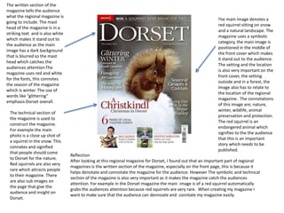
- 1. The main image denotes a red squirrel sitting on snow and a natural landscape. The magazine uses a symbolic category, the main image is positioned in the middle of the front cover which makes it stand out to the audience. The setting and the location is also very important on the front cover, the setting outside and in a forest, the image also has to relate to the location of the regional magazine. The connotations of this image are; nature, winter, wildlife, animal preservation and protection. The red squirrel is an endangered animal which signifies to the the audience that this is an important story which needs to be published. The written section of the magazine tells the audience what the regional magazine is going to include. The mast head of the magazine Is in a striking text and is also white which makes it stand out to the audience as the main image has a dark background that is blurred so the mast head which catches the audiences attention.The magazine uses red and white for the fonts, this connotes the season of the magazine which is winter. The use of words like “glittering” emphasis Dorset overall. The technical section of the magazine is used to construct the magazine. For example the main photo is a close up shot of a squirrel in the snow. This connates and signified that people should come to Dorset for the nature. Red squirrels are also very rare which attracts people to their magazine. There are also sub images on the page that give the audience and insight on Dorset. Reflection After looking at this regional magazine for Dorset, I found out that an important part of regional magazines is the written section of the magazine, especially on the front page, this is because it helps denotate and connotate the magazine for the audience. However The symbolic and technical section of the magazine is also very important as it makes the magazine catch the audiences attention. For example in the Dorset magazine the main image is of a red squirrel automatically grabs the audiences attention because red squirrels are very rare. When creating my magazine I want to make sure that the audience can dennoate and conntate my magazine easily.
- 2. The typeface throughout the front cover of the magazine is white. This catches the audiences attention because it does not blend in with the main image. The main image is of part of a harbour. The main image mainly consists of a blue background, this represents summer. It can also symbolises feeling calm. By using both the colour blue and a harbour this represents an ideal location for summer and a place for the audience to go if they want to feel calm. The language throughout the front cover also attracts the audiences attention. For example the sub heading which says “taking the plunge” represents/ symbolises a place to take risks. The colour scheme throughout the magazine is bright colours. Colours like green and yellow represent spring and summer. The lighting used on the front cover is natural, this shows the audience that it is a natural landscape. The magazine also has some common codes and conventions seen throughout a magazine, for example a puff, which normally consists of a competition and also basic things like a barcode and the issue number. The main image is a long shot, this gives the audience an insight on one specific part of the regional area. There is also a sub image on the page which is a close up shot of a poppy, this shows the audience what type of nature they could find in hat specific regional area. Reflection After looking at this regional magazine I found out that puffs and sub headlines attract the audiences attention. The colour scheme Is also very important depending on the season that the magazine is being released in. Language is also very impritant on the cover of this regional magazine. This links to Swis linguist Ferdinanad De Saussure who invented semiotics and viewed language as a figure on the page that had no physical link to the image related. For example 2taking a plunge2 ha no physical relation to the main image on the front cover.
- 3. The main image is picture of a lamb. A lamb typically represents spring, this is then backed up by one of the sub headings which says “Easter fun”. This is also supported by the colour scheme of the magazine, which features yellow, which is classed as a spring/ summer colour. The layout of this magazine features a header, which has short headlines of what is feature in the magazine. They use language like “special offer” which automatically grabs the audiences attention The written section of the magazine, is placed around the main image, to emphasis the shape of the lamb. The writing is also in a bold white font which automatically grabs the audiences eye because it sticks out from the green background and also fits in with the lamb which is a similar shade of white. The main image is placed in the middle of the page, where the lamb is centre and shows the audience that this is the main image. The picture is also taken outside and uses natural landing which helps fit in with the overall theme of the front cover which is spring and nature. There is also another image in the left hand corner which has been cut and placed over the top of the main image, this takes the attention way from the main image because it does not have anything to do with it. However it signifies that Cheshire had wonderful wildlife and nature as well as glitz and glam. The magazine also has common conventions of the magazine, for example the name of the magazine is in bold writing and the barcode is placed in the right hand corner. Reflection In this magazine the use of language and the main image is very important. They both link together for example the word “Easter” and the picture of the lamb represent the beginning of spring. The one thing that i will not use as inspiration for my magazine is the use of the picture in the left hand corner. I personally think that the picture does not fit in with the overall theme of the front cover, where as in my magazine I want to make sure that the theme is consistent throughout.