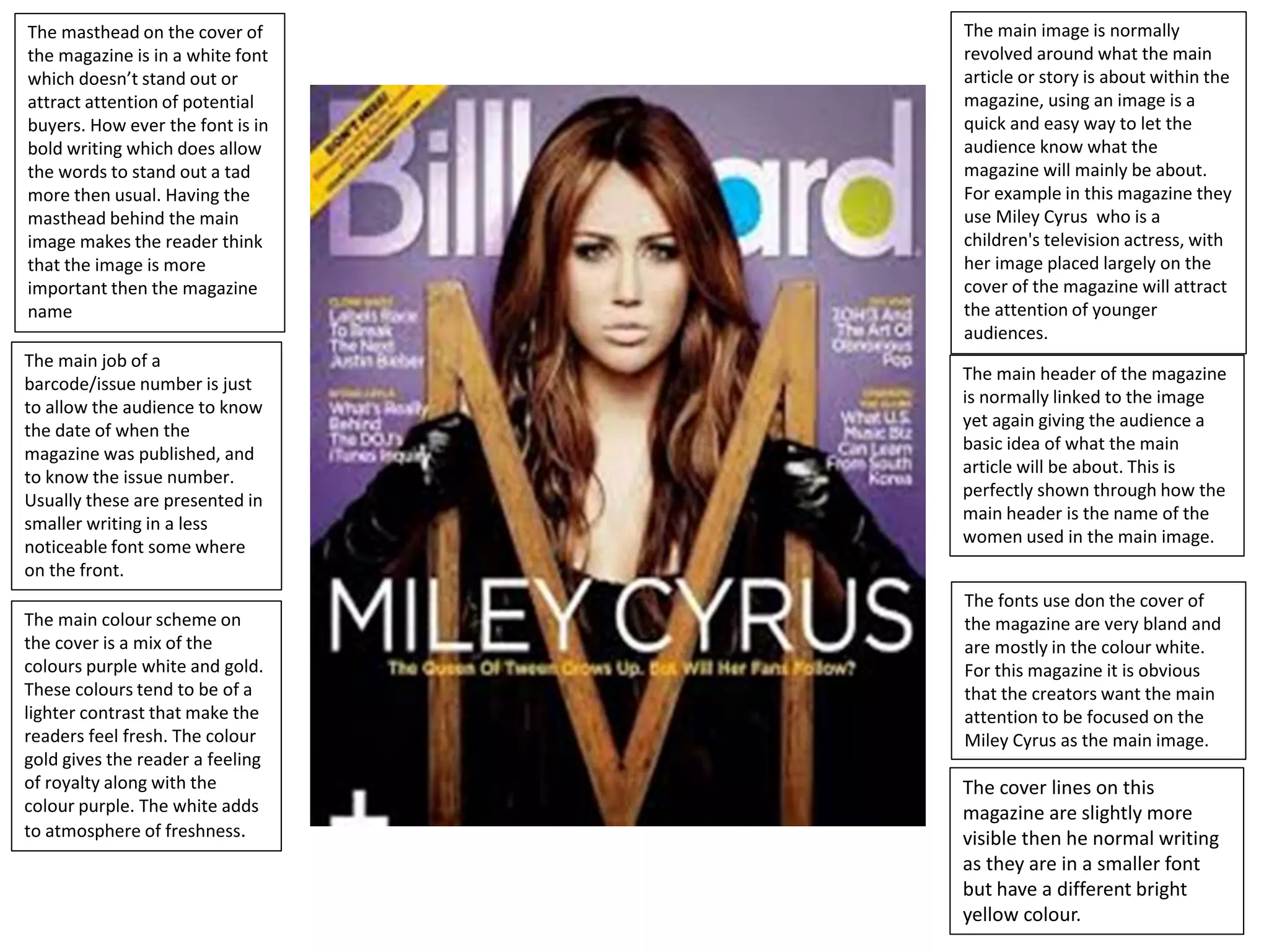
The masthead on the cover of
the magazine is in a white font
which doesn’t stand out or
attract attention of potential
buyers. How ever the font is in
bold writing which does allow
the words to stand out a tad
more then usual. Having the
masthead behind the main
image makes the reader think
that the image is more
important then the magazine
name
The cover lines on this
magazine are slightly more
visible then he normal writing
as they are in a smaller font
but have a different bright
yellow colour.
The fonts use don the cover of
the magazine are very bland and
are mostly in the colour white.
For this magazine it is obvious
that the creators want the main
attention to be focused on the
Miley Cyrus as the main image.
The main colour scheme on
the cover is a mix of the
colours purple white and gold.
These colours tend to be of a
lighter contrast that make the
readers feel fresh. The colour
gold gives the reader a feeling
of royalty along with the
colour purple. The white adds
to atmosphere of freshness.
The main header of the magazine
is normally linked to the image
yet again giving the audience a
basic idea of what the main
article will be about. This is
perfectly shown through how the
main header is the name of the
women used in the main image.
The main image is normally
revolved around what the main
article or story is about within the
magazine, using an image is a
quick and easy way to let the
audience know what the
magazine will mainly be about.
For example in this magazine they
use Miley Cyrus who is a
children's television actress, with
her image placed largely on the
cover of the magazine will attract
the attention of younger
audiences.
The main job of a
barcode/issue number is just
to allow the audience to know
the date of when the
magazine was published, and
to know the issue number.
Usually these are presented in
smaller writing in a less
noticeable font some where
on the front.
Yet again the mast head is
placed behind the main image,
how ever this time it is in a
vibrant bright blue colour
which attracts the audience
attention it also in a much
larger font and is in bold. The
masthead is also right behind
the image where the audience
interest is mostly focused on.
The cover lines on this magazine
are slightly more visible then he
normal writing as they are in a
smaller font but have a different
bright yellow colour.
All of the fonts presented on this
magazine cover are all in bold. but
also lets of a Which catches the
audience attention atmosphere
and aura of strength.
The most common colours
used in this magazine cover
are purple and blue, for
starters the purple just pops
out and attracts the audience
attention how ever he bright
blue is also used on the main
image which will greatly catch
the audience attention more
then any other colour could.
The main header of the magazine
is normally linked to the image yet
again giving the audience a basic
idea of what the main article will
be about. This is perfectly shown
through how the main header is
the name of the women used in
the main image.
The main image is normally
revolved around what the main
article or story is about within the
magazine, using an image is a
quick and easy way to let the
audience know what the
magazine will mainly be about for
example. The man on the cover is
a well known US R&B and Rap
star. The main group of people
who tend to listen this genre of
music tend to be black Americans
who are the between the ages of
16 – 30.
The main job of a
barcode/issue number is just
to allow the audience to know
the date of when the
magazine was published, and
to know the issue number.
Usually these are presented in
smaller writing in a less
noticeable font some where
on the front. In this case the
numbers are placed on the
bottom left of the magazine
cover.
Unlike the other magazines on
this one the masthead is
placed on the bottom half of
the page. Although this may
not pay attention it makes
sure that the main image
receives the attention the
creatures desire it to receive.
The font of the mast head
varies. In the first word ‘Foo’
the font is large and bold and
attracts the most attention of
every thing on the page, and
although the second word
‘fighters’ is in the same colour
font the size is slightly smaller
and this is because it is a
longer word and ‘foo’ is easier
and quicker to read.
The cover lines on this magazine
are slightly more visible then he
normal writing as they are in a
smaller font but have a different
range of different colours.
Like the other magazines the font
is all in bold and all the colours
used and used particularly used to
let of the aura of a typical rock
atmosphere or song.
The colour scheme of this
magazine is very dark and the
colour red and black is used a
lot. These colours and these
shades let off the tones and
atmospheres associated with
the stereotypical rock aura
that the magazine is trying to
portray.
The main header of the magazine
is normally linked to the image yet
again giving the audience a basic
idea of what the main article will
be about. This is perfectly shown
by the Words foo fighters
underneath the image.
The main image is normally
revolved around what the main
article or story is about within the
magazine, using an image is a
quick and easy way to let the
audience know what the
magazine will mainly be about.
For example on this cover we
have the front man of the band
the foo fighters used to obviously
show us that the main article of
this news paper is either going to
be about him or his band
The main job of a
barcode/issue number is just
to allow the audience to know
the date of when the
magazine was published, and
to know the issue number.
Usually these are presented in
smaller writing in a less
noticeable font some where
on the page.

Analysis of graphic elements

  • 1.
    The masthead onthe cover of the magazine is in a white font which doesn’t stand out or attract attention of potential buyers. How ever the font is in bold writing which does allow the words to stand out a tad more then usual. Having the masthead behind the main image makes the reader think that the image is more important then the magazine name The cover lines on this magazine are slightly more visible then he normal writing as they are in a smaller font but have a different bright yellow colour. The fonts use don the cover of the magazine are very bland and are mostly in the colour white. For this magazine it is obvious that the creators want the main attention to be focused on the Miley Cyrus as the main image. The main colour scheme on the cover is a mix of the colours purple white and gold. These colours tend to be of a lighter contrast that make the readers feel fresh. The colour gold gives the reader a feeling of royalty along with the colour purple. The white adds to atmosphere of freshness. The main header of the magazine is normally linked to the image yet again giving the audience a basic idea of what the main article will be about. This is perfectly shown through how the main header is the name of the women used in the main image. The main image is normally revolved around what the main article or story is about within the magazine, using an image is a quick and easy way to let the audience know what the magazine will mainly be about. For example in this magazine they use Miley Cyrus who is a children's television actress, with her image placed largely on the cover of the magazine will attract the attention of younger audiences. The main job of a barcode/issue number is just to allow the audience to know the date of when the magazine was published, and to know the issue number. Usually these are presented in smaller writing in a less noticeable font some where on the front.
  • 2.
    Yet again themast head is placed behind the main image, how ever this time it is in a vibrant bright blue colour which attracts the audience attention it also in a much larger font and is in bold. The masthead is also right behind the image where the audience interest is mostly focused on. The cover lines on this magazine are slightly more visible then he normal writing as they are in a smaller font but have a different bright yellow colour. All of the fonts presented on this magazine cover are all in bold. but also lets of a Which catches the audience attention atmosphere and aura of strength. The most common colours used in this magazine cover are purple and blue, for starters the purple just pops out and attracts the audience attention how ever he bright blue is also used on the main image which will greatly catch the audience attention more then any other colour could. The main header of the magazine is normally linked to the image yet again giving the audience a basic idea of what the main article will be about. This is perfectly shown through how the main header is the name of the women used in the main image. The main image is normally revolved around what the main article or story is about within the magazine, using an image is a quick and easy way to let the audience know what the magazine will mainly be about for example. The man on the cover is a well known US R&B and Rap star. The main group of people who tend to listen this genre of music tend to be black Americans who are the between the ages of 16 – 30. The main job of a barcode/issue number is just to allow the audience to know the date of when the magazine was published, and to know the issue number. Usually these are presented in smaller writing in a less noticeable font some where on the front. In this case the numbers are placed on the bottom left of the magazine cover.
  • 3.
    Unlike the othermagazines on this one the masthead is placed on the bottom half of the page. Although this may not pay attention it makes sure that the main image receives the attention the creatures desire it to receive. The font of the mast head varies. In the first word ‘Foo’ the font is large and bold and attracts the most attention of every thing on the page, and although the second word ‘fighters’ is in the same colour font the size is slightly smaller and this is because it is a longer word and ‘foo’ is easier and quicker to read. The cover lines on this magazine are slightly more visible then he normal writing as they are in a smaller font but have a different range of different colours. Like the other magazines the font is all in bold and all the colours used and used particularly used to let of the aura of a typical rock atmosphere or song. The colour scheme of this magazine is very dark and the colour red and black is used a lot. These colours and these shades let off the tones and atmospheres associated with the stereotypical rock aura that the magazine is trying to portray. The main header of the magazine is normally linked to the image yet again giving the audience a basic idea of what the main article will be about. This is perfectly shown by the Words foo fighters underneath the image. The main image is normally revolved around what the main article or story is about within the magazine, using an image is a quick and easy way to let the audience know what the magazine will mainly be about. For example on this cover we have the front man of the band the foo fighters used to obviously show us that the main article of this news paper is either going to be about him or his band The main job of a barcode/issue number is just to allow the audience to know the date of when the magazine was published, and to know the issue number. Usually these are presented in smaller writing in a less noticeable font some where on the page.