Organic Name Reactions for the students and aspirants of Chemistry12th.pptx
Task2
1. ANALYSIS
LEAH ALLIE
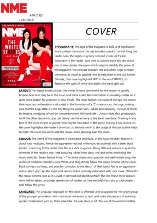
COVER
TYPOGRAPHY: The logo of the magazine is bold and significantly
more so than the rest of the text to make sure it’s the first thing the
reader sees, the tagline is greatly reduced in size as it’s less
important to the reader. Sans serif is used to make the text stand
out, it masculinizes the cover which helps to identify the genre of
the magazine, the contrast between red and white helps to make
the words as visual as possible and to help them stand out further.
Cleverly, they have highlighted ‘RIP’ in the word STRIPES, to
illustrate the topic of the article inside (the band split up).
LAYOUT: The layout avoids clutter, this makes it more convenient for the reader to quickly
browse over what may be in the issue, and there is also less information in avoiding clutter so it
gives more reason for a person to look inside. The cover follows the route of the eye this means
that important information is allocated in the formation of a ‘Z’ shape across the page, making
sure that the Logo (NME) is the first thing the reader sees , whilst also following the rule of thirds
by keeping a majority of text on the predominant left hand side . Using a wide shot photograph,
to fill the other two thirds, you can clearly see the entirety of the band members; Drawing in any
fans of the white stripes or people who may be interested in the genre. Placing a box outline on
the cover highlights the reader’s attention, to the text within it, the usage of the box outline helps
to order the cover too which aids the reader when glancing over the cover.
COLOUR: The Genre of the magazine is Alternative and Rock, in this issue the main feature is
about rock musicians, hence the aggressive red and white contrast outlined with a sleek black
border, screaming to the reader that this is a rock magazine. Using different colours to grab the
attention of the reader’s eye , text colouring varies from black, red and white; mimicking the
music video to ‘ Seven Nation Army ‘– The white stripes most popular and well known song ,the
outfits of the band members (Jack White and Meg White) follow the colour scheme of the cover .
Black conveys darkness, and possibly connotes to the ‘death’ of their band; Red is an aggressive
colour which portrays the angst and venom that is normally associated with rock music. White fits
the colour scheme well as it is used to contrast and stand out from the red. These three colours
work well to attract a younger generation of readers as they are bright but also attract people
who follow the genre
LANGUAGE: The language displayed on the cover is informal, and so appeals to the target group
of the younger generation, short sentences are easier to read and make the process of scanning
quicker. Statements such as ‘Their incredible 14-year story in full ‘the use of the word incredible
2. ANALYSIS
LEAH ALLIE
entices the reader , words such as ‘special ‘ and ‘finally’ make the reader think it is limited to only
them , as if the cover only wants them to know. Referring back to the use of RIP in the STRIPES,
this also connotes to the end of the band, highlighting it and making the word almost
scandalous.
CONVENTIONS: Typically of the rock genre, angst is illustrated in the cover by its colour scheme
and the very forward, to-the-point, or matter-of-fact styling in the covers language, there is a
great deal of attitude in the language used as there is no explanation and this appeals to the
youth who associate themselves with the genre. Death is also commonly associated with the rock
genre, or at least a fascination of it, this can be alluded to by the black border, the colouring of
the text and of the clothes the subjects wear. Fortunately for the cover designers, The White
stripes have a consistent colour scheme of black, white and red; which is already very
stereotypical for the rock and alternative genre.
3. ANALYSIS
LEAH ALLIE
CONTENTS PAGE.
TYPOGRPHY: The text of the contents page is written in serif, this is to
suit the genre of the magazine, the masculine features help to display
the personality of the magazine. Bold lettering (Sans serif) is used to
highlight main areas of the page such as the main article and other
subtitles, font sizes differ depending on their importance and similarity
to the cover or the image on the page. The main article contains a
small amount of detail, compared to the other titles, the font is much
larger as this is the story they are trying to sell to the reader. The page
number is placed next to the title of the article rather than at the
bottom of the text like the other stories on the contents page.
COLOURS: Colours such as white black, red, and yellow match the
genre of the Rock magazine. Red is aggressive and yellow can connote
to danger , this attracts readers who like the genre , the white background aids to contrast
between the darker more recessive colours and the brighter more eye catching ones. The aim of
the colour scheme is to present the text in a highly visual manner , an almost colour coded layout
which expresses a varying importance or dominance of articles, the colour scheme plays on an
angst-fuelled stereotype related to the target group of adolescents.
IMAGE: Again using a wide shot, it gives the reader a full view of who they are reading about, the
image absorbs a large amount of space, so that readers can almost instantly tell who they are
reading about. Especially if they are a fan. The image itself is dark and poorly lighted, the artist
pictured almost blends into the black background; it displays the artist singing and playing the
guitar and as the stereotype of the genre demands, his hair is unkempt and partially covering his
face. The image of Alex Turner (of the Arctic Monkeys) is informal which would appeal to the age
group the magazine is intended
LAYOUT: Keeping with a consistency, the NME logo remains in the top left corner of the page
just before the masthead, as a reminder of who is presenting you with the latest news in the
genre. Despite the aggressive nature of the magazine, the contents page is neat and tidy, this is
so the reader can easily access areas of the page without much thought ; maintaining a mostly
uncluttered contents page helps the reader to find what they are looking for with ease. The
contents column keeps all of their important information about what to expect from the issue.
LANGUAGE: The language in informal, however there is no usage of slang, meaning the
magazine is trying to reach an older group of teenagers, short sentences and phrases keep the
page neat and tidy .
4. ANALYSIS
LEAH ALLIE
DOUBLE SPEAD
TYPOGRAPHY: The combination of sans and sans
script helps keep the genre of the magazine
consistent whilst giving insight on the type of
person the article is about. By enlarging certain
words of the title it makes it easier for the reader
to know that the page they are o is the double
spread as it takes up a considerable amount of
space. The use of a drop cap gives a formal
appearance to the article, and boasts its relevancy
in the magazine. To make the quote stand out,
sans has been used, as the quote itself is
aggressive and full of attitude. The By-line is highlighted by a small column which also sections
the page from the title and the text.
COLOURS: The theme of the artist has quite dark but neutral colours such as grey and ever-
green which contrast with the artists pale completion. Relating to the origins of the artist (Clifton,
Nottingham) they have generalised its dreary colours and have tied them into the colour scheme
to suit the artist. Using darker colours such as grey and black help to connote the general mood
of the artist’s genre which is English Indie Folk / Folk Rock.
IMAGE : The close up of the 22 year old artist , Jake Bugg (Jake Edwin Charles Kennedy
Bugg)clearly shows his facial expression and the emotion his face is portraying . This also ties in
well with the general aesthetic of the article, as he seems focused and stern; the second image
used in the double spread is a wide shot which manifests him performing with an acoustic guitar,
this helps display to the reader what genre of music he creates. Fans of the artist will be drawn in
by the close up and people who are new to the artist’s work will study the page over as the close
up clearly shows that this is a feature article.
LAYOUT: Consisting of two sections, the layout of this double spread doesn’t stick to
conventional layouts. The reason being is that there is plenty of writing, so to make it interesting
for the reader visually, they have sectioned it by using a box outline to show a timeline of the
artist life leading up to his stardom. Sectioning the double spread in this way keeps order of the
article and is visually pleasing to the reader. By using the rule of thirds the article maintains a neat
presentation, whilst focusing the attention of the reader to three main parts; the close up image,
the text, and the wide shot image with text. This makes processing the double spread easier for
the reader and prevents confusion.
5. ANALYSIS
LEAH ALLIE
LANGUAGE: Language used is mostly informal, as the interview is with a youth (or a more
developed adolescent). This makes the article relatable to the target population as they are
teenagers and adolescents, the language used makes Jake Bugg seem like the authorities figure
for these adolescents, like a spokesperson whilst also telling his own story.