The document discusses rationales for design choices in a rock music magazine, including:
- Choosing a color scheme of black, white, and red to fit the rock genre and models' outfits.
- Selecting fonts like "El tercer hombre" and "Hollywood hill" in dark red for artist names to stand out against images.
- Using the font "dark Monday" in black for the magazine name "Uncut" because it stands out and connects letters.
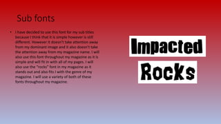
- Incorporating simple fonts throughout for subtitles and variety, including "rocks" to fit the rock genre.
- Relying mainly on natural outdoor lighting but also controlling indoor lighting for photoshoots