
Recommended
More Related Content
What's hot
What's hot (20)
Viewers also liked
Similar to Market research
Similar to Market research (20)
More from Em Leeman
Recently uploaded
Recently uploaded (20)
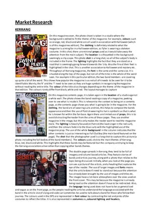
Market research
- 1. MarketResearch KERRANG On this magazinecover, the photo shoot is taken in a studio where the background is edited to fitthe theme of the magazine. For example, colours such as orange, red, black and white are all used in association with Halloween (which is of this magazines edition). The clothing is definitely related to what the magazine is aimingfor in a Halloween edition, as Tyler is wearinga skeleton costume. In this shot, there areminimal props used as itwould take away the attention from the main subject. The location is silhouetted in the background- seemingly a city scape. This photo shot is a longshot, so all of the subject’s body is included in the frame. The lighting highlights the factthat they arestood on a road that is seemingly going forward towards the ‘city. Also the fireat their feet is highlighted in the shot. This is another association to Halloween and mystery etc. Throughout all Kerrangmagazines,the font is the same and the samesize. It is situated alongthe top of the page, but not all of the time is the whole of the word seen. For example in this particular edition,the two band members are covering up quite a bitof the word. This shows how popular the magazine is as notall of itneeds to be seen for it to be identifiable.Mainly,the‘K’ and the ‘!’ need to be seen as they are huge symbols in recognisingthemagazine without readingthe entire title. The colour of the title also changes dependingon the theme of the magazine in that edition. The colours rarely differ fromblack,white and red. The layoutmanages to capture On this magazinecontents page, it is taken again in the location of a studio against a white wall.The photo shows the band readinga copy of a magazine, peeking over to see what is insideit.This is relevantto the context to being on a contents page, as the contents page shows you what is goingto be in the magazine. For the clothing, the band are all wearingsuits and ties,this helps to compose the bands appearanceand then the use of Patrick wearinghis hatis symbolic as thatis what he is known for within the fan base. Again there arelimited use of props, this is to avoid distractingthereader from the aims of these pages. They use another magazine in the image, but this only makes the reader want to read the magazine more. The lighting is heavily focused on Patrick (the lead singer in the red suit), and then the colours fadein to the blue suits with the highlighted use of the magazine prop. The use of the white background in the column indicates thatthe other contents is justas interestingas Fall OutBoy (the main band featured on the page). The shot that the photographer used is a longshot to capture this picture(a photo includingthe full bodies of the band members). The colours used, stick to the main themes of Kerrang; blue, red, black and white. This highlights thatthese bands may be featured but the company aretrying to keep the Kerrang associationsaliverather than copyingother bands themes. The double page spreads in Kerrang,they tend to be full of imagery and column based articles.They feature stories of bands and artists journey,alongwith a photo that relates to the topic being discussed.Initially,when you look at the page you can see a pictureof the artists,and a headingthat captures the eye of the reader. The use of larger images and fonts means that the articledoesn’t need to stand out becausethe attention has already been brought by the use of images and titles etc. The images have a lotmore atmosphere over the ones used on the front cover. This may be because the magazine is already being read so the attention doesn’t have to be redirected. Also, the language being used does not have to be as generalised and vague as on the front page, as the people readingthe articles understand the languageassociated with the band in the article.Useof slangand code can sometimes be used to talk about a band for those who followtheir journey. The colours used in the DPS are represented in font colour by contrastingthe red and pinks of the costumes to reflect the titles.It is also represented in costumes as,coloured lighting and headers.
- 2. ROCKSOUND On this magazinecover, the photo shoot is taken in a studio where the background is edited to fitthe theme of the magazine. For example, colours such as YELLOW, red, black and white areall used in association with this magazines edition. The clothingis definitely related to what the magazineis aimingfor, as Fall OutBoy arewearing black.In this shot, there are minimal props used as itwould take away the attention from the main subject. The location is of a photo studio with a plain bluebackground.This photo is a mid- shot so only the chest and above of the band arevisiblein the frame. Throughout all RockSound magazines,the font is the same structure. The title is situated alongthe top of the page, but not all of the word is seen all the time. This time the band is behind the title. This may be because the band is more famous than the magazine so are easily identifiable.Mainly,the ‘R’ needs to be seen as itis a huge symbol for recognisingthe magazine without reading the entire title. The colour of the title also changes depending on the theme of the magazine in that edition. The colours rarely differ fromblack,white, red, and yellow. In this magazines contents page, there aremultipleimages used of many artists and bands in order to capturethe attention of the reader. The fact these bands etc arein the contents pages indicates thatthere will bearticles based upon them. The shots are mixes of medium closeup,medium longshots and long shots.The lightingis focused heavily on use of makeup and their faces so the reader is further intrigued to the magazineand its contents. Again the colour scheme is red, white, black and green/grey, follows the colour scheme from the front cover. The languageused is justeveryday language, itdoes not change between the articleand the formality used by the artists.Importantaspects are highlighted over less significantparts of the writing. In the top left hand corner, the RockSound logo is present in a red circle. The double page spreads in RockSound, they tend to be full of imagery and column based articles.They feature stories of bands and artists journey,alongwith a photo that relates to the topic being discussed.Initially,when you look at the page you can see a pictureof the artists,and a headingthat captures the eye of the reader. The use of larger images and fonts means that the articledoesn’t need to stand out because the attention has already been brought by the use of images and titles etc. The images have a lotmore atmosphere over the ones used on the front cover. This may be because the magazine is already being read so the attention doesn’t have to be redirected. Also, the languagebeing used does not have to be as generalised and vague as on the front page, as the people readingthe articles understand the languageassociated with the band in the article.Useof slangand code can sometimes be used to talk about a band for those who followtheir journey. The colours used in the DPS are represented in font colour, costumes, coloured lightingand headers. Again they followthe colour scheme of red, black,white and green/grey from the contents page and the front page.
- 3. CLASSIC ROCK Classic rock isa well-known music magazinethat focuses heavily on ‘classic rock artists’,hence the name of the magazine. The front covers are distinguishabledueto their logo title being easily noticeablein the magazine industry.The logo only needs to showthe ‘Classic’partas nextto both sides there are stars.Stars areassociated with things being legendary and are memorable for readers for the future. With this particularcover,the title for Guns n Roses is more noticeablethan the magazine title, symbolisingthatthe band is a lot more common and popular than the magazine itself.The picture taken for the cover is a medium long shotof Axel Rose who is an icon in the rock community. All covers are generally black and white and then stick to one other colour.There are no props used asidefromthe sunglasses and bandana for the costume which is highly associated with Guns n Roses. The other smaller headings areof related artists which aresimilar to Guns n Roses. The contents pages are very basic,again followingthecolour scheme of black and white alongwith one or two other colours.The photo featured follows both the theme of the magazine and then of the artist/band featured. The fonts used in the headings and paragraphs areconsistent.There is useof 5-7 images on Classic Rock magazinecontents pages. The use of certain bands and artists in the contents is used as a mark to indicatethatthey will befeatured in the edition of the magazine. These magazines areaimed to people who listened to Rock music before the 1990s as the featured artists arewhat people would say arethe ‘classics’hencethe name of the magazine. This is what makes this magazineso different compared to recent magazines such as Kerrang or RockSound. The reader profiles differ for the older generati on in the Classic Rock magazine. In this double page spread, the pictureis the most noticeable thing you see. This contradicts thetext which is usually there to directthe reader. The headingfor the band “Led Zeppelin” is faint,this could be because people don’t need to know who the band is as they areso famous.The amount of writingfor the band shows that they are well known and people want to know about them.