Organic Name Reactions for the students and aspirants of Chemistry12th.pptx
Brand Identity
1. Brand Identity and Mode of address
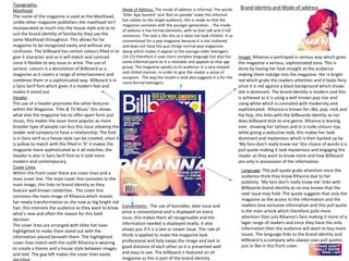
Image: Rihanna is portrayed in serious way which gives
the magazine a serious, sophisticated tone. This is
done by having her look straight at the audience
making them indulge into the magazine. Her is bright
red which grabs the readers attention and it looks fiery
since it is red against a black background which shows
she is dominant. The brand identity is modern and this
is achieved as it is using a well known pop star and
using white which is connoted with modernity and
sophisticated. Rihanna is known for r&b, pop, rock and
hip hop, this links with the billboards identity as nor
does billboard stick to one genre. Rihanna is leaning
over, showing her tattoos and in a nude colours top,
while giving a seductive look, this makes her look
dominant and mysterious which is then backed up by
‘My fans don’t really know me’ this choice of words is a
pull quote making it look mysterious and engaging the
reader as they want to know more and how Billboard
are only in possession of the information.
Language: The pull quote grabs attention since the
audience think they know Rihanna due to her
publicity. ‘My fans don’t really know me’ links with
Billboards brand identity as no one knows that the
next issue may hold. The quote suggests that only the
magazine as the access to the information and the
readers love exclusive information and this pull quote
is the main article which therefore pulls more
attention then juts Rihanna's fans making it more of a
lager range of readers and since they have the only
information then the audience will want to buy more
issues. The language links to the brand identity and
billboard is a company who always uses pull quotes
just in like in this front cover.
Typography:
Masthead
The name of the magazine is used as the Masthead,
unlike other magazine publishers the masthead isn’t
incorporated as much into the house style and so to
suit the brand identity of familiarity they use the
same Masthead throughout. This allows for he
magazine to be recognised easily and without any
confusion. The billboard has certain colours filled in to
give it character and so it will match and contrast
since it flexible to any issue or artist. The use of
various colours is a denotation of Billboard as a
magazine as it covers a range of entertainment and
combines them in a sophisticated way. Billboard is in
a Sans Serif font which gives it a modern feel and
makes it stand out.
Header
The use of a header promotes the other features
within the Magazine. ‘Film & TV Music’ this shows
what else the magazine has to offer apart form just
music, this makes the issue more popular as more
broader type of people can buy this issue allowing the
reader and company to have a relationship. The font
is in Sans serif so a house style can be created, since it
is yellow to match with the filled in ‘D’ it makes the
magazine more sophisticated as it all matches, the
Header is also in Sans Serif font so it look more
modern and contemporary.
Cover Lines
Within this front cover there are cover lines and a
main cover line. The main cover line connotes to the
main image, this links to brand identity as they
feature well known celebrities. The cover line
connotes the main image of Rihanna which reveals
her newly transformation as she now as big bright red
hair, this interests the audience as they want to know
what's new and often the reason for this bold
decision.
The cover lines are arranged with titles hat have
highlighted to make them stand out with the
information placed beneath them. The highlighted
cover lines match with the outfit Rihanna is wearing
to create a theme and a house style between images
and text. The gap left makes the cover lines easily
Conventions : The use of barcodes, date issue and
price is conventional and is displayed on every
issue, this makes them all recognisable and the
information needed is displayed neatly. It also
shows you if it is a late or newer issue. The rule of
thirds is applied to make the magazine look
professional and help keeps the image and text in
good distance of each other so it is presented well
and easy to see. The billboard is featured on all
magazine as this is part of the brand identity.
Mode of Address: The mode of address is informal. The words
‘Killer App Summit’ and ‘Bull on parade’ make this informal
but relates to the target audience, this is made so that the
magazine connotes with the younger generation. . The mode
of address is has formal elements, with no text talk and is full
sentences. The text is like this so it does not look childish. It us
conventional for a pop magazine because it is not cluttered
and does not have the quiz things normal pop magazines
doing which makes it appeal to the average older teenagers
(16-21) therefore it uses more complex language but also has
some informal parts so it is relatable and appeals to that age
group. The magazine speaks to its audience in a very relaxed
and chilled manner, in order to give the reader a sense of
escapism. The way the model is look also suggests it is for the
more formal teenagers.
2. Content page
Colours: The colours used on the content page are mainly
simple, natural colours, this does not link on form the front
cover, the content page is the same within every issue. Black,
grey, blue and white are the colours used to make a house
style. They are simple basic tones- connoted with simplicity,
grey and blue compliments the black and white well since
they are calm shades and connoted with sophistication.
There is a constant house style throughout, the blue, black
and white are in the ‘Billboard’ logo. The colour do not
associate with just one gender making a larger range of
audiences.
Layout: The Rule of Thirds is implied, it stated that the audience
eye will go directly to the elements positioned on the lines when
a canvas is divided by equally spaced vertical and horizontal
lines. Billboards album and singles chart is positioned on the
vertical left thirds of the page, the contents of the actual
magazine are listen in the middle third and the image of the
singer female, is in the right vertical third of the page. The three
images are sitting on the top horizontal line- with small number
placed next to them showing what page to turn to. This layout
makes it easy for the reader to see and navigate themselves
around easily.
Image: The images used means that the target audience will be aimed towards 14-25 year olds. The images do connote towards one specific gender. The artist
in the main image and the montage are contemporary, the Billboard music chart on the left of the page is up to date making it more appealing for the target
audience. The shot used for the main image is a long shot this is so you can see her fully and her body language. Although she is kneeling down you can still see
her at eye level, from kneeling down this connotes with her having a humble and relaxed attitude. The camera angle is kept low to connote with her being
comfortable and content, the higher angle will make her seem intimating and too low makes her look dominating and not friendly. The background is simple so
the main image can stand out and grab your attention, She has no props and so you focus on just her. The model is propped on one leg and is not look directly
at the camera, this connotes with shyness and humbleness, she is smiling and appears comfortable to connote with calmness and contentment. Her clothes are
fashionable to appeal to the teenagers with her hair slightly blowing making her look free and careless. She look happy and relaxed which connoted again with
content with life and her poise connoted with a levelling attitude. In the first image on the content page he is leaning back with his hands in his pockets both
these thing connoted with confidence and relaxation, to back up the idea of confidence he is looking directly into the camera. In the second photo, the high
camera angle, and the main facial expressions connote with him being intimidated and his unshaven face shows his lack of motivation and he may not be too
wealthy. In the third insert, the model looks well presented and radiant, her expression is easy to see due to the close-up, her expression is surprised with a
combined look of radiance while look neat and tidy to perfection, this could connote as her being innocently shocked.
Conventions: There is a page number for each feature
and cover line, on the other hand the list of the features
is in the middle of the page which is unconventional due
its normally on the left side but the chart is in the way.
Typography: ‘Contents’ is in a Sans Serif font, it is black and bold
making it clear, this attains the attention from the audience straight
away. The fonts used for the headings of the features are black and
bold too, creating a house style. Some sub-headings have been put
in blue to grab your attention as this part is important making it
easy for the reader to navigate there way through, the light blue appeals to wither Gender so it is available to a larger target
audience range, the blue is stereotypically a male colour but it In a gently and subtle on the page which are seen stereotypically female colours. There are many different type of fonts
used but they are used on every page to keep the house style the same. The main fonts used are Sans Serif but there is also a mixture with Sans-serif. ‘Contents, No.1’ and ‘Home Front’ this
makes the main headings and subheadings stand out as they are also in capitals and a different font, this ,makes the magazine seem serious by using black but also exciting to the reader. This
dictates where the audience should read first. One convention with the Typography is the billboard being in the left corner as this is where you look first. The other part of writing are in serif
which makes it appealing to look at and also makes the headings stand out more. The typography is important as it helps to navigate the reader around the page and shows them where to go. It
also it one of the first thing the reader sees so the contents needs to stand out and also the number one part stands out so they can see what is in the charts which is conventional as the charts
are for pop music and this is a pop music magazine cover. The magazine cover typography follows the same in very magazine making it memorable and the reader knows where’s were. The
‘Contents’ bit has a stencil feel to it which gets your attention and is a fairly modern look which appeals to the reader since they are teenagers to young adults with the psychographics of being
youthful and modern alongside being internet uses and into music.
The font size is small since there is a lot of information to be placed on the magazine contents page. The main important parts are in blue, this is done so that instead of just making them bigger
and bolder and in the same colour as the rest of the writing, like other important parts are like ‘Contents’ is it gives the page more colour and excitement while dragging in and engaging the
audience. The use of sans serif fonts help signify the magazine to be young, fun and modern which helps appeal to tis target audience. The logo and masthead are the same thing which is
conventional and also brings character.
3. Double page spread
Typography: The masthead ‘Amy's Ink House’ is linked in with her
clearly visible tattoos, this makes the article seem personal due to
tattoos being something she is passionate about, this link in with the
brand identity as Amy is a world well known artist just like Billboard
feature. The use of the tattoos make it seem personal and exclusive
information, making the audience want to buy the magazine. The
headline also gives an insight into what the article is to be about. The
play on words, Since she is Amy Winehouse they have changed it to Ink
house, this relates to the phrase further used in the extract ‘** is my
middle name’ reiterating Amy’s passion for tattoos.
The font used is Serif to give it a casual appeal and make it appealing,
the use of a heart makes it informal mode of address. The font used
also makes the article look dramatic and since it is thick it looks
masculine. The actual article is Sans Serif so it has a contrast is easy to
read making it more enjoyable for the reader. The Masthead also
seems as if it written in ink to link with the article and the theme of
tattoos, this is reinforced by the text, it tells how Amy is now a
tattooist.
Image: The image is conventional as it is placed on the
right hand side with the text on the left, this links with
Billboards brand identity. Within all the double page
spread I have analysed they have all featured
sexualised women. The main image in comparison
with the text is significantly large, this suggests that
the main image is important and could double-up to
become a poster making the audience want to buy the
magazine. The image and text is in black and white to
keep a house style, it also links with her public image.
She is seen as natural looking, and the image looks as
if Amy was not aware the photo was being taken due
to her lack of eye contact. This image is aimed more
for men as she is lying on the bed with little clothing
on and her hand down her shorts, making the image
sexualised.
Language/Mode of Address: The article is not about Amy’s music although that us what
she is actually famous for, it is her passion that the article is focuses on. This inks in with
the theme of Billboard magazine, this is because the article is just about music but the
musician herself. The magazine says how she worked hard and how she becomes a
tattooist which people aren’t familiar with making it seem exclusive. The language is
mainly informal with ‘Go away’ and ‘whips’ which makes it more interesting for the
reader as they are easy to relate to the text which fits billboards target audience brand
identity. The mode of address is relaxed as not a lot is going on and is following a simple
colour scheme, the image is informal and explicit due to its provocativeness. It has a
relaxed, clam feel since its simple with not a lot of information or images going on. Amy
is known for pop which is Billboards brand identity . The mode of address can be
inspirational since she is known for drugs and alcohol and getting life back on track.
Colour: The colour scheme is very simple, it consists of
one colour which has come out of the black and white
effect. This links to her tattoos as the conventional colour
of tattoos is typically black, linking back to ‘Amy Ink
House’ as the article is about her passion and love for the
tattoos. The black and white colour connoted that it is a
documentary footage which is also shown by her on the
bed in her home.
Layout: The layout is very
conventional as the image is on
the right and the text to the left, it
also follows the route of the eye
as you see the Masthead, then
Amy herself, then the text and
then lastly the e-mail and
company details that are not as
important. The rule of thirds is
also applied her due to the name
of the article is within the top left
third and the text is within the
middle two boxes, this makes it
clearer to see and read and gives it
an organised look. The image is
significantly larger than the