SlideShare a Scribd company logo
1 of 3
Masthead: The masthead is typically placed right at the top in the centre and
is the biggest text on the page, along with being in bold, which draws your eyes
to it instantly. In addition to this the text of the masthead ties in with the rest
of the colour scheme which is green, orange and white, this allows the magazine
to have a professional outcome and also means that the front cover flowers
well.
Main Image: The main image of the model has a strong effect, as the model is
looking straight down the camera creating a direct mode of address engaging
the reader. The main image is also used as the background which is in black and
white allowing other text on the page to stand out. In addition to this the facial
expression of the singer creates attitude, so by putting the image in black and
white exaggerates the mood. Her hand is on her face, with her head tilted down
but her eyes looking up, all contributing towards the mood and atmosphere.
Cover line: The magazine also includes some other cover lines which relate to
other main stores like ‘Q&A Sevendust Two decades of forging metal gems’.
This allows the reader to connect with what is inside the magazine without
even reading inside. It draws in the target audience and makes the magazine
specific and suited to them.
Audience: The audience of this magazine is anyone interested in R&B music, the
front cover has been specifically designed to suit this group of audience and is
something exclusive to them. If you were someone interested in rock this is
something you wouldn’t even look at as it alienates any other groups.
Font/text: There is a balance of font on the page which has a constant colour
of orange, white and green. The size of the font also changes depending on the
importance of the story, like ‘CIARA’, this is purposely done because it makes
the main stories stand out. The content of the text varies but all relates back
to R&B music for example at the bottom it says ‘new releases reviewed’
Main cover line: The main cover line is the second biggest text on the page
which is ‘Ciara: Sultry singer breathers new life into R&B’ which is in block
capitals drawing attention to it.. This headline relates to the picture as it is the
same artist so you instantly know what you are going to find inside. The fact
that it is placed in the centre highlights how it is one of the main pieces of
text, this is also shown because the orange cover line is placed on the models
black top creating a stronger contrast.
Header and footer: There is a header and a footer
on this magazine which adds sophistication to the
front cover and results in it being so professional.
The header has names of artists on and the foot has
newly released singles, engaging the reader to want
to read on. Both of these aspects are something that
makes a magazine stand out and it introduces the
reader to the context of the magazine.
I think this magazine is really effective and thoroughly thought through as it
suits the target audience. It has been specifically designed for the audience
and all the attributes of this front cover contribute towards this.
Genre: R&B music
Genre: Rock music
Masthead: The masthead is placed in the top of the page, in the centre and is
the first thing you see when you look at the page. The block capitals are in white
and creates a contrast to the background which is a mix of red and black. The
font is original and this is the same font they use on each issue of their
magazine.
Main Image: The main image is of the artist ‘Andy Six’ who is looking straight at
the camera. This creates a direct mode of address which engages the reader and
draws all attention to the picture, it also creates a connection between the
reader and the front cover. The genre of this magazine is rock and this is
immediately illustrated from the main image as Andy Six looks like a typical
rocker.
Flasher: The magazine also includes a flasher which is a big bubble of writing
that stands out on the page, in this case the magazine have done it to advertise
there magazine and appeal to the audience. The flasher says ‘the UK’s biggest gig
guide!’ which grasps the attention and reveals what is also inside of the magazine.
Audience: The audience of this front cover is obviously people who love Rock
music, this is clear when you take a glance at the cover; the red, white, black and
yellow colour scheme reinforces this. If you were not interested in this genre
then you are excluded instantly because you wouldn’t walk past it in a shop and
stop. This is because the font cover has specifically designed for the audience.
Font/text: One thing that is unusual about this front cover is that all the text
is in block capitals, this may be due to the genre of music because rock is known
for being loud and edgy, just like the layout and text on the front cover. The
main text is in white with the rest in orange, which gives the magazine a constant
house style.
Main cover line: The main cover line is the second biggest text on the page and
says ‘Black veil brides…’ relating to the picture of Andy Six. They have used the
picture and the main cover line together to create a connection, this is one of the
norms of a music magazine.
Header and footer: The magazine has both, this
the header includes one of the story lines, and the
footer has names of bands/artists featuring in the
magazine. This is something that a lot of their
issues has and it not only gives the front cover
structure but it gives the front cover more
content resulting in the page being pleasing to the
eye.
I personally think that this magazine is well suited to the target audience and
the design is specifically made to shape that audience. The colour scheme is
effective as there is a house style, but it also relates to the bold genre of rock
music. It is clear that this magazine is well thought out and each individual part
of the page contributes to the success.
Masthead: The masthead of this magazine is bold but elegant. The fact
that the Nicola Benedetti’s face is covering the masthead suggests how the
audience know the magazine therefore do not need to see the full
masthead. In addition to this the masthead covers the top of the page and
ties in with the rest of the magazine making it professional and laid back.
Main Image: The main image is of Nicola Benedetti who is a young musician,
it is a picture of her smiling looking at the camera which has direct mode of
address. The fact she is just smiling adds to the laid back approach of the
magazine, unlike the other magazines I have analysed the models have been
posing purposely to suit the genre, however this musician is simply sitting
there to reflect the type of calm music.
Audience: The audience for the magazine is particular due to the genre of
music. Because this magazine is based around classical music, it will only
interest a certain group of people. This means the magazine front cover is
specified to attract this particular group and aim to make them stop. They
do this through the elegant design of the front cover.
Font: The font on the page is elegant and stylish which is pleasing to the
eye, this goes with the calm genre of music, the font is mostly in white
allowing the font cover to flow. The size of the text varies depending on the
importance of the text. I think by keeping the colour of the text constant
allows the front cover to maintain the elegant outcome.
Genre: Classical music
Main cover line: The main cover line is the text relating to the background
photograph which says ‘Nicola Benedetti….’ this is one of the largest text on
the page drawing attention to it. The fact that the main cover line relates
to the image makes that connection and allows the magazine to make you
want to read on.
Header and footer: The magazine has a header but
not a footer, this could be to avoid making the page
over-crowded. The header reveals how it is the best
selling classical music magazine, this engages the
reader and advertises it to the audience.
The front cover also has ‘also in this issue’ to advertise the magazine
further and attract the audience to buy the magazine. This also adds
sophistication to the front cover as it is something else that is appealing to
the reader.
I personally think that this magazine has the most effect out of all three of
the ones I have analysed because every part of the page goes together and
allows the front cover to flow. The font choice has been clearly thought out
and chosen to suit the genre and the layout adds elegance to the classical
music.

More Related Content

What's hot

Research on existing music magazines
Research on existing music magazinesResearch on existing music magazines
Research on existing music magazinesGiran11
 
Magazine Analysis - Kerrang
Magazine Analysis - KerrangMagazine Analysis - Kerrang
Magazine Analysis - Kerrangguestb26673
 
NME analysis
NME analysisNME analysis
NME analysisbeckyt95
 
Contents page deconstructions
Contents page deconstructionsContents page deconstructions
Contents page deconstructionsLawrenceNorman
 
Mojo magazine analysis
Mojo magazine analysisMojo magazine analysis
Mojo magazine analysisLittlePainter
 
Front cover analysis.
Front cover analysis.Front cover analysis.
Front cover analysis.AmyShields00
 
Textual Analysis
Textual AnalysisTextual Analysis
Textual Analysispinogo
 
Front covers, contents pages, double page spreads #5
Front covers, contents pages, double page spreads #5Front covers, contents pages, double page spreads #5
Front covers, contents pages, double page spreads #5QureshiSohail
 
Media front cover analysis
Media front cover analysisMedia front cover analysis
Media front cover analysisurvisha38
 
Contents analysis
Contents analysisContents analysis
Contents analysiskimb0ot
 
Contents analysis
Contents analysisContents analysis
Contents analysiskimb0ot
 
Music Magazine Analysis
Music Magazine AnalysisMusic Magazine Analysis
Music Magazine AnalysisDarciBoamah
 
AS Media: NME Music Magazine Analysis
AS Media: NME Music Magazine AnalysisAS Media: NME Music Magazine Analysis
AS Media: NME Music Magazine Analysismegancampbellmedia
 
Front covers, contents pages, double page spreads #5
Front covers, contents pages, double page spreads #5Front covers, contents pages, double page spreads #5
Front covers, contents pages, double page spreads #5QureshiSohail
 
Kerrang analysis
Kerrang analysisKerrang analysis
Kerrang analysisShelby
 
Q Contents Page Analysis
Q Contents Page AnalysisQ Contents Page Analysis
Q Contents Page Analysisannabellehussey
 
Dizzee rascal front cover etc
Dizzee rascal front cover etcDizzee rascal front cover etc
Dizzee rascal front cover etcasmediac15
 
Analysing music magazines
Analysing music magazinesAnalysing music magazines
Analysing music magazinesasmediag13
 

What's hot (20)

Research on existing music magazines
Research on existing music magazinesResearch on existing music magazines
Research on existing music magazines
 
Magazine Analysis - Kerrang
Magazine Analysis - KerrangMagazine Analysis - Kerrang
Magazine Analysis - Kerrang
 
NME analysis
NME analysisNME analysis
NME analysis
 
Contents page deconstructions
Contents page deconstructionsContents page deconstructions
Contents page deconstructions
 
Mojo magazine analysis
Mojo magazine analysisMojo magazine analysis
Mojo magazine analysis
 
Task 3
Task 3 Task 3
Task 3
 
Front cover analysis.
Front cover analysis.Front cover analysis.
Front cover analysis.
 
Textual Analysis
Textual AnalysisTextual Analysis
Textual Analysis
 
Front covers, contents pages, double page spreads #5
Front covers, contents pages, double page spreads #5Front covers, contents pages, double page spreads #5
Front covers, contents pages, double page spreads #5
 
Media front cover analysis
Media front cover analysisMedia front cover analysis
Media front cover analysis
 
Contents analysis
Contents analysisContents analysis
Contents analysis
 
Contents analysis
Contents analysisContents analysis
Contents analysis
 
Music Magazine Analysis
Music Magazine AnalysisMusic Magazine Analysis
Music Magazine Analysis
 
AS Media: NME Music Magazine Analysis
AS Media: NME Music Magazine AnalysisAS Media: NME Music Magazine Analysis
AS Media: NME Music Magazine Analysis
 
Front covers, contents pages, double page spreads #5
Front covers, contents pages, double page spreads #5Front covers, contents pages, double page spreads #5
Front covers, contents pages, double page spreads #5
 
Front Cover Analysis
Front Cover Analysis Front Cover Analysis
Front Cover Analysis
 
Kerrang analysis
Kerrang analysisKerrang analysis
Kerrang analysis
 
Q Contents Page Analysis
Q Contents Page AnalysisQ Contents Page Analysis
Q Contents Page Analysis
 
Dizzee rascal front cover etc
Dizzee rascal front cover etcDizzee rascal front cover etc
Dizzee rascal front cover etc
 
Analysing music magazines
Analysing music magazinesAnalysing music magazines
Analysing music magazines
 

Viewers also liked

Genre research a2
Genre research a2Genre research a2
Genre research a2akeay1
 
Audience theories a2
Audience theories a2Audience theories a2
Audience theories a2akeay1
 
Narrative theories a2
Narrative theories a2Narrative theories a2
Narrative theories a2akeay1
 
Institutional regulations and institutions profile
Institutional regulations and institutions profileInstitutional regulations and institutions profile
Institutional regulations and institutions profilejoshmacqueen2
 
Textual analysis short film
Textual analysis short filmTextual analysis short film
Textual analysis short filmjoshmacqueen2
 
Pilot qustionnaire a22222
Pilot qustionnaire a22222Pilot qustionnaire a22222
Pilot qustionnaire a22222akeay1
 
Final questionnaire a2
Final questionnaire a2Final questionnaire a2
Final questionnaire a2akeay1
 
Musical research main prodcution
Musical research main prodcutionMusical research main prodcution
Musical research main prodcutionjoshmacqueen2
 
Final pitch a2
Final pitch a2Final pitch a2
Final pitch a2akeay1
 
Conventions of genre
Conventions of genreConventions of genre
Conventions of genrejoshmacqueen2
 
Movie trailer presentation
Movie trailer presentationMovie trailer presentation
Movie trailer presentationSashawallen
 
Genre theory a2
Genre theory a2Genre theory a2
Genre theory a2akeay1
 

Viewers also liked (13)

Genre research a2
Genre research a2Genre research a2
Genre research a2
 
Audience theories a2
Audience theories a2Audience theories a2
Audience theories a2
 
Narrative theories a2
Narrative theories a2Narrative theories a2
Narrative theories a2
 
Institutional regulations and institutions profile
Institutional regulations and institutions profileInstitutional regulations and institutions profile
Institutional regulations and institutions profile
 
Audience theories
Audience theoriesAudience theories
Audience theories
 
Textual analysis short film
Textual analysis short filmTextual analysis short film
Textual analysis short film
 
Pilot qustionnaire a22222
Pilot qustionnaire a22222Pilot qustionnaire a22222
Pilot qustionnaire a22222
 
Final questionnaire a2
Final questionnaire a2Final questionnaire a2
Final questionnaire a2
 
Musical research main prodcution
Musical research main prodcutionMusical research main prodcution
Musical research main prodcution
 
Final pitch a2
Final pitch a2Final pitch a2
Final pitch a2
 
Conventions of genre
Conventions of genreConventions of genre
Conventions of genre
 
Movie trailer presentation
Movie trailer presentationMovie trailer presentation
Movie trailer presentation
 
Genre theory a2
Genre theory a2Genre theory a2
Genre theory a2
 

Similar to Music magazine analysis

Analyising music magazines
Analyising music magazinesAnalyising music magazines
Analyising music magazinesJess Stafford
 
music magazine analysis 2
music magazine analysis 2 music magazine analysis 2
music magazine analysis 2 media355
 
Music Magazine Analysis
Music Magazine AnalysisMusic Magazine Analysis
Music Magazine AnalysisEmilyJayne
 
Front Covers - Research Task
Front Covers - Research TaskFront Covers - Research Task
Front Covers - Research Taskbeckyjay26
 
Front cover analysis essay and labelled analysis
Front cover analysis essay and labelled analysisFront cover analysis essay and labelled analysis
Front cover analysis essay and labelled analysisLizRose2012
 
Contents analysis
Contents analysis Contents analysis
Contents analysis tafigaza
 
Front covers, contents pages, double page spreads #5
Front covers, contents pages, double page spreads #5Front covers, contents pages, double page spreads #5
Front covers, contents pages, double page spreads #5QureshiSohail
 
Kerrang analysis
Kerrang analysisKerrang analysis
Kerrang analysisscoley
 
Textual Analysis - Media Studies
Textual Analysis - Media StudiesTextual Analysis - Media Studies
Textual Analysis - Media StudiesNorah Fields
 
Magazine anaylisis
Magazine anaylisisMagazine anaylisis
Magazine anaylisissineadjen
 
Magazine anaylisis
Magazine anaylisisMagazine anaylisis
Magazine anaylisissineadjen
 
Research
ResearchResearch
Researchjoshfoo
 
Research
ResearchResearch
Researchjoshfoo
 
Research
ResearchResearch
Researchjoshfoo
 
Music Magazine Analysis
Music Magazine AnalysisMusic Magazine Analysis
Music Magazine AnalysisGemma
 
Format research of music magazines
Format research of music magazinesFormat research of music magazines
Format research of music magazinesellisputnam
 

Similar to Music magazine analysis (20)

Analyising music magazines
Analyising music magazinesAnalyising music magazines
Analyising music magazines
 
music magazine analysis 2
music magazine analysis 2 music magazine analysis 2
music magazine analysis 2
 
Music Magazine Analysis
Music Magazine AnalysisMusic Magazine Analysis
Music Magazine Analysis
 
Front Covers - Research Task
Front Covers - Research TaskFront Covers - Research Task
Front Covers - Research Task
 
Front cover analysis essay and labelled analysis
Front cover analysis essay and labelled analysisFront cover analysis essay and labelled analysis
Front cover analysis essay and labelled analysis
 
Contents analysis
Contents analysis Contents analysis
Contents analysis
 
Front covers, contents pages, double page spreads #5
Front covers, contents pages, double page spreads #5Front covers, contents pages, double page spreads #5
Front covers, contents pages, double page spreads #5
 
Dizze rascal
Dizze rascalDizze rascal
Dizze rascal
 
Kerrang analysis
Kerrang analysisKerrang analysis
Kerrang analysis
 
Textual Analysis - Media Studies
Textual Analysis - Media StudiesTextual Analysis - Media Studies
Textual Analysis - Media Studies
 
Dizze rascal
Dizze rascalDizze rascal
Dizze rascal
 
Dizze rascal
Dizze rascalDizze rascal
Dizze rascal
 
Magazine anaylisis
Magazine anaylisisMagazine anaylisis
Magazine anaylisis
 
Magazine anaylisis
Magazine anaylisisMagazine anaylisis
Magazine anaylisis
 
Med
MedMed
Med
 
Research
ResearchResearch
Research
 
Research
ResearchResearch
Research
 
Research
ResearchResearch
Research
 
Music Magazine Analysis
Music Magazine AnalysisMusic Magazine Analysis
Music Magazine Analysis
 
Format research of music magazines
Format research of music magazinesFormat research of music magazines
Format research of music magazines
 

More from Sashawallen

Ancillary text research
Ancillary text researchAncillary text research
Ancillary text researchSashawallen
 
Movie trailer bridesmaids
Movie trailer bridesmaidsMovie trailer bridesmaids
Movie trailer bridesmaidsSashawallen
 
Movie trailer paranormal acitivyt
Movie trailer paranormal acitivytMovie trailer paranormal acitivyt
Movie trailer paranormal acitivytSashawallen
 
Saw movie trailer analysis
Saw movie trailer analysisSaw movie trailer analysis
Saw movie trailer analysisSashawallen
 
Movie trailer presentation finished
Movie trailer presentation finishedMovie trailer presentation finished
Movie trailer presentation finishedSashawallen
 
Movie trailer analysis
Movie trailer analysisMovie trailer analysis
Movie trailer analysisSashawallen
 
Music magazine double page spread
Music magazine double page spreadMusic magazine double page spread
Music magazine double page spreadSashawallen
 
Music magazine double page spread
Music magazine double page spreadMusic magazine double page spread
Music magazine double page spreadSashawallen
 
Final misbourne magazine
Final misbourne magazineFinal misbourne magazine
Final misbourne magazineSashawallen
 
Magazine design template
Magazine design templateMagazine design template
Magazine design templateSashawallen
 
Magazine design template
Magazine design templateMagazine design template
Magazine design templateSashawallen
 
Layout design template
Layout design templateLayout design template
Layout design templateSashawallen
 
School magazine analysis 3
School magazine analysis 3School magazine analysis 3
School magazine analysis 3Sashawallen
 
School magazine analysis
School magazine analysisSchool magazine analysis
School magazine analysisSashawallen
 

More from Sashawallen (17)

Ancillary text research
Ancillary text researchAncillary text research
Ancillary text research
 
Movie trailer bridesmaids
Movie trailer bridesmaidsMovie trailer bridesmaids
Movie trailer bridesmaids
 
Movie trailer paranormal acitivyt
Movie trailer paranormal acitivytMovie trailer paranormal acitivyt
Movie trailer paranormal acitivyt
 
Saw movie trailer analysis
Saw movie trailer analysisSaw movie trailer analysis
Saw movie trailer analysis
 
Movie trailer presentation finished
Movie trailer presentation finishedMovie trailer presentation finished
Movie trailer presentation finished
 
Movie trailer analysis
Movie trailer analysisMovie trailer analysis
Movie trailer analysis
 
Music magazine double page spread
Music magazine double page spreadMusic magazine double page spread
Music magazine double page spread
 
Music magazine double page spread
Music magazine double page spreadMusic magazine double page spread
Music magazine double page spread
 
Final misbourne magazine
Final misbourne magazineFinal misbourne magazine
Final misbourne magazine
 
Magazine design template
Magazine design templateMagazine design template
Magazine design template
 
Magazine design template
Magazine design templateMagazine design template
Magazine design template
 
Layout design template
Layout design templateLayout design template
Layout design template
 
School magazine analysis 3
School magazine analysis 3School magazine analysis 3
School magazine analysis 3
 
School magazine analysis
School magazine analysisSchool magazine analysis
School magazine analysis
 
Magazine 2
Magazine 2Magazine 2
Magazine 2
 
Magazine 3
Magazine 3Magazine 3
Magazine 3
 
Magazine 1
Magazine 1Magazine 1
Magazine 1
 

Music magazine analysis

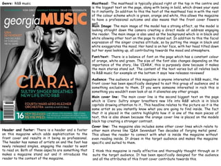
  • 1. Masthead: The masthead is typically placed right at the top in the centre and is the biggest text on the page, along with being in bold, which draws your eyes to it instantly. In addition to this the text of the masthead ties in with the rest of the colour scheme which is green, orange and white, this allows the magazine to have a professional outcome and also means that the front cover flowers well. Main Image: The main image of the model has a strong effect, as the model is looking straight down the camera creating a direct mode of address engaging the reader. The main image is also used as the background which is in black and white allowing other text on the page to stand out. In addition to this the facial expression of the singer creates attitude, so by putting the image in black and white exaggerates the mood. Her hand is on her face, with her head tilted down but her eyes looking up, all contributing towards the mood and atmosphere. Cover line: The magazine also includes some other cover lines which relate to other main stores like ‘Q&A Sevendust Two decades of forging metal gems’. This allows the reader to connect with what is inside the magazine without even reading inside. It draws in the target audience and makes the magazine specific and suited to them. Audience: The audience of this magazine is anyone interested in R&B music, the front cover has been specifically designed to suit this group of audience and is something exclusive to them. If you were someone interested in rock this is something you wouldn’t even look at as it alienates any other groups. Font/text: There is a balance of font on the page which has a constant colour of orange, white and green. The size of the font also changes depending on the importance of the story, like ‘CIARA’, this is purposely done because it makes the main stories stand out. The content of the text varies but all relates back to R&B music for example at the bottom it says ‘new releases reviewed’ Main cover line: The main cover line is the second biggest text on the page which is ‘Ciara: Sultry singer breathers new life into R&B’ which is in block capitals drawing attention to it.. This headline relates to the picture as it is the same artist so you instantly know what you are going to find inside. The fact that it is placed in the centre highlights how it is one of the main pieces of text, this is also shown because the orange cover line is placed on the models black top creating a stronger contrast. Header and footer: There is a header and a footer on this magazine which adds sophistication to the front cover and results in it being so professional. The header has names of artists on and the foot has newly released singles, engaging the reader to want to read on. Both of these aspects are something that makes a magazine stand out and it introduces the reader to the context of the magazine. I think this magazine is really effective and thoroughly thought through as it suits the target audience. It has been specifically designed for the audience and all the attributes of this front cover contribute towards this. Genre: R&B music
  • 2. Genre: Rock music Masthead: The masthead is placed in the top of the page, in the centre and is the first thing you see when you look at the page. The block capitals are in white and creates a contrast to the background which is a mix of red and black. The font is original and this is the same font they use on each issue of their magazine. Main Image: The main image is of the artist ‘Andy Six’ who is looking straight at the camera. This creates a direct mode of address which engages the reader and draws all attention to the picture, it also creates a connection between the reader and the front cover. The genre of this magazine is rock and this is immediately illustrated from the main image as Andy Six looks like a typical rocker. Flasher: The magazine also includes a flasher which is a big bubble of writing that stands out on the page, in this case the magazine have done it to advertise there magazine and appeal to the audience. The flasher says ‘the UK’s biggest gig guide!’ which grasps the attention and reveals what is also inside of the magazine. Audience: The audience of this front cover is obviously people who love Rock music, this is clear when you take a glance at the cover; the red, white, black and yellow colour scheme reinforces this. If you were not interested in this genre then you are excluded instantly because you wouldn’t walk past it in a shop and stop. This is because the font cover has specifically designed for the audience. Font/text: One thing that is unusual about this front cover is that all the text is in block capitals, this may be due to the genre of music because rock is known for being loud and edgy, just like the layout and text on the front cover. The main text is in white with the rest in orange, which gives the magazine a constant house style. Main cover line: The main cover line is the second biggest text on the page and says ‘Black veil brides…’ relating to the picture of Andy Six. They have used the picture and the main cover line together to create a connection, this is one of the norms of a music magazine. Header and footer: The magazine has both, this the header includes one of the story lines, and the footer has names of bands/artists featuring in the magazine. This is something that a lot of their issues has and it not only gives the front cover structure but it gives the front cover more content resulting in the page being pleasing to the eye. I personally think that this magazine is well suited to the target audience and the design is specifically made to shape that audience. The colour scheme is effective as there is a house style, but it also relates to the bold genre of rock music. It is clear that this magazine is well thought out and each individual part of the page contributes to the success.
  • 3. Masthead: The masthead of this magazine is bold but elegant. The fact that the Nicola Benedetti’s face is covering the masthead suggests how the audience know the magazine therefore do not need to see the full masthead. In addition to this the masthead covers the top of the page and ties in with the rest of the magazine making it professional and laid back. Main Image: The main image is of Nicola Benedetti who is a young musician, it is a picture of her smiling looking at the camera which has direct mode of address. The fact she is just smiling adds to the laid back approach of the magazine, unlike the other magazines I have analysed the models have been posing purposely to suit the genre, however this musician is simply sitting there to reflect the type of calm music. Audience: The audience for the magazine is particular due to the genre of music. Because this magazine is based around classical music, it will only interest a certain group of people. This means the magazine front cover is specified to attract this particular group and aim to make them stop. They do this through the elegant design of the front cover. Font: The font on the page is elegant and stylish which is pleasing to the eye, this goes with the calm genre of music, the font is mostly in white allowing the font cover to flow. The size of the text varies depending on the importance of the text. I think by keeping the colour of the text constant allows the front cover to maintain the elegant outcome. Genre: Classical music Main cover line: The main cover line is the text relating to the background photograph which says ‘Nicola Benedetti….’ this is one of the largest text on the page drawing attention to it. The fact that the main cover line relates to the image makes that connection and allows the magazine to make you want to read on. Header and footer: The magazine has a header but not a footer, this could be to avoid making the page over-crowded. The header reveals how it is the best selling classical music magazine, this engages the reader and advertises it to the audience. The front cover also has ‘also in this issue’ to advertise the magazine further and attract the audience to buy the magazine. This also adds sophistication to the front cover as it is something else that is appealing to the reader. I personally think that this magazine has the most effect out of all three of the ones I have analysed because every part of the page goes together and allows the front cover to flow. The font choice has been clearly thought out and chosen to suit the genre and the layout adds elegance to the classical music.