1. Task 3
Cover page
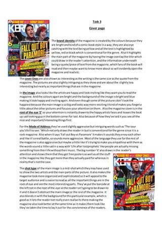
The brand identityof the magazine iscreatedby the coloursbecause they
are brightand kindof a comic bookstyle ina way,theyare alsoeye
catchingwiththe textbeingyellow andall the textishighlightedby
yellow,redorblackwhichisconventional forthe genre. Alsoithighlights
the mainpart of the magazine byhavingthe image overlapthe title which
coulddraw inthe reader’sattention,andthe informationunderneath
beinga quote/piece of textfromthe magazine,whichfansof the bookwill
readand thenmaybe wantto know more about so will evidentlyopenthe
magazine andreadetc.
The cover linesare alsoshownas interestingasthe writingisthe same size asthe quote fromthe
magazine.The picturesare alsoslightlyintriguingastheyshow andare aboutthe slightlyless
interestingbutnearlyasimportantthingsthatare inthe magazine.
In the image alsolookslike the artistsare happyand lookinvitinglike theywantyoutoreadthe
magazine.Andthe coloursagainare brightand the backgroundof the image isbrightand blue
makingitlookhappyand invitingagain. Andeventhoughsome of the picturesdon’tlookthe
happiestbecause the mainimage issobigandlookswaymore excitingitkindof makesyou forgeta
little aboutthe otherpicturesandfocusesyourattentiononthem. Alsothe magazine coverisinthe
root of the eye ‘Z’ so yourattentionisinstantlydrawntothe happyartistsfacesand leavesthe beat
up sad lookingguyinthe bottomcornerfor last.Alsobecause of how they’ve laidityou see all the
nice and important/interestingthingsfirst.
For the Mode of Address they’ve usedslightlyaggressive butintriguingwordssuchas‘The tour
you’dkill tosee.’Whichnotonlydrawsthe readerin butis conventionalforthe genre since itis a
rock magazine.Alsowhenitsays‘Fall outBoyvs Paramore’itmakesitsoundstheyenvyeachother
and like it’sareal battle,sosoundsmore aggressive. Mostof the language theyuse forthe rest of
the magazine isalsoaggressive butmaybe alittle like it’stryingtomake youempathise withthemas
the wordssounda little sadina waywith‘Life afterlostprophets’likepeople are actuallymissing
somethingfromtheirlifewithouttheirmusic. The bignumber‘6’alsodrawsinthe reader’s
attentionandshowsthemthattheyget free postersaswell asall the stuff
inthe magazine like theygetmore thantheyactuallypaidforwhereasin
realitythat’snotthe case.
The shot type of the mainimage isa mid-shotwhichtheymayhave used
to showthe two artistsand the mainparts of the picture.Italsomakesthe
magazine lookmore organizedandsophisticatedsoitwill appealtothe
target audience andis easiertoreadas all the important thingsare in the
root of eye and are the mostinterestingparts. They’ve putthe barcode at
the leftnotin the root of the eye sothe readerisn’tgoingto be drawnto
it andit doesn’tobstructthe mainimage or the restof the magazine. It
alsoblendsinwiththe backgroundforthisparticularexample,whichis
goodas it letsthe readernot reallyevenrealiseitsthere makingthe
magazine alsolookbetteratthe same time as it makesthemlooklike
they’ve takenthe time tolayitout for the convienence of the readers.
2. Contents page
The brand identity createdhere isfor 15-34 year olds,sothe target audience.
You can see thisby the girl smilingandthe backgroundbeingbrightbutthe
writingstill beinggothicandblackisconventional forthe magazine still and
wouldappeal tothe target audience. Alsothe use quite eye-catchingtextsuch
as highlightingthe ‘KERRANG!CONTENTS’withlightblue whichmakesit
standout and draw inthe readersattention. Alsoall the writingforthe other
storysare yellowtexthighlightedbyblackwhichare prettymuchopposite
coloursmakingthe texxtstandoutagain drawinginthe readersattention.
The main picture iseye-catchingagainbecausethe womnissmilingandlooks
happywhichcouldcreate the feelingof the readerbeingwelcomedtoread.
Andmost of the picturesunderneathare brightandlooknice andgo withthe
restof the magazine asthe backgoundbehindthe girl isbrightwhichmay
appeal tothe targetaudience andbe conventional tothe magazine,because
eventhoughthe magazine isusuallydarkthe brightcoloursdocontradictirt
slightlybutif youwere afrequentreaderitcouldmake youlike itevenmore because itstill hasall
the contentthe readerlikesbutwitha slightlymore welocmingstyle.
The Images alsoall have numbersabove themwhichshowsthattheyare
the most importantpartsof the magazine andisalsoconvenientforthe
readeras theycan easilyfindthe pagee theywanttogo to.
The Layout is alsointhe Root of the Eye ‘Z’ soyou are drawnto the title
thenthe womanand some of the storysthenthe otherpicturesandfinally
the little piece atthe bottomaboutthe writerwhowrote and decided
whatthe contentof the magazine shouldbe. Alsobecauseitislaidoutlike
thisit leavesthe littleaddatthe bottomright lastso you don’tsee the least
importantthingfirst. Italsois inthe Naughts and Crosses gridwhichshows
that the mainpart of thispage and the rest of the magazine isthe girl and
highlightsall the otherstorysinthe magazine.
The Shot type of the girl isa mid-shot.Thisisusedtoshow the womanand
herpose withherhands uptowardsthe camera,
alsoto showall the main partsof the image,below
the torso forthe picture isprettymuchirrelevantsothere wasnopoint
themputtingitin.
The Mode of Addressfor the restof the contentspage of the magazine is
organisedwhichisappealingtothe targetaudience asit islaidout neatly
so iseasyto read soyou can read all the parts youwant to andeasilyfind
the part of the magazine you wantto got to. The fontthey’ve usedissans
serif alsowhichfollowsthe House Style of the rest of the magazine and
suitsthe conventionsof the magazine. The exclamationmarkonthe endof
KERRANGalsocan be consideredslightlyaggressive whichsuits the genre,
so the target audience will approve of it.Some of the otherwordsinthe
magazine contentspage are slightlyaggressivewhichagainfollowsthe
house style.
3. Double Page Spread
The Image in this double page spreadisof TaylerJardine,the main
memberof the bandwhichshowsshe isthe mostimportant,andher
picturesfillsupthe whole rightside page,whichisalsoaconvention
for all magazinesbecause itshowsthe mostimportantthingpretty
much firstas that isone of the mainthingsyouare drawnto. All the
coloursare quite brightandfeminine andbecause there isawoman
fillingthe rightpage thiscanbe seenas unconventional because
womenaren’tusuallythatfamousina wayinthe rock musicindustry
so thiscould be seenas unconventional.
The image is alsointhe Root of the Eye and the Noughts and
Crossesgrid.The root of the eye isconventional andalsocovers
mostof the importantthingssuchas the statementat the top
whichcan be consideredone of the mostimportantthingsonthe
page thenthe girl again,thenthe picture of the whole bandthe
add at the bottom,but the add thistime ismore important,but
still one of the lastthingsthat people wouldfindinteresting.And
the noughtsand crossesisconventional andcoversmore of the
importantthings,suchas the textandthe bigstatement,andthe
quote fromthe mainsingerat the right slightly.
The Colours for the whole
double pagesare all brightand none of themare reallydark,
onlyreallythe outline of ‘POP-PUNK’,andthiswouldbe
because thatis the mostimportantpart and makesitstand
out.The coloursof the fontandthe twobigeyesare pink
and big,andthe coloursforthe statementare brightand
girlycolourswhichisquite unconventionalasforthisgenre
theyusuallyuse darkandgothic colours,butforthis they
haven’t.Buteven thoughthisisn’tconventional itmakesit
standout. The onlydark piece of textisthe quote nextto
her,whichmakesitstand outagainstthe background.
The Font is alsosans serif whichfollowsthe house style,sodothe colours(forthisparticular
magazine anyway).The italicforthe word‘NEW’inthe statementat the top makesitstandout
more and emphasisesthe wordsoitwill standoutandreaderswouldbe drawnto it.
The Shot type of the girl isa mid-shot.Thisisusedtoshow the womanand herpose withherhands
up towardsthe camera,also to showall the mainparts of the image,below the torsoforthe picture
isprettymuch irrelevantsothere wasnopointthemputtingitin.Alsothe shottype of the picture in
the bottomleftisa close-upshottoshow all the bandbut ina small area,andshowsthemsmiling
and beinghappysoactuallyenjoyingeachotherscompany.
The Mode of Addressfor the double page spreadisfriendly,asyoucan see thrughthe bottomleft
photoand the girl smiligonthe rightpage. Alsobothpagesare laidout andorganisedneatly,except
the fontat the top whichcouldbe because the ywantedthat part to stand out and catch the
readerseyes.None of the wordsonthe page are reallyagrressive butthe waythey’ve laiditoutand
highlighted‘POP-PUNK’cancome across as thoughit isand follow the house-style.