FULL ENJOY - 9953040155 Call Girls in New Ashok Nagar | Delhi
Regional magazine
1. Regional Magazines codes and conventions
I will be looking at a range of different regional magazines, looking
at their codes and conventions of the:
• Content
• Layout
• Language and register
• Images
• Colour scheme
• Fonts and style.
I will be analysing 6 front covers, content pages and double page
spreads of current regionals magazine. I will try to vary the magazine
in which I use to get a range of different techniques and overall
results.
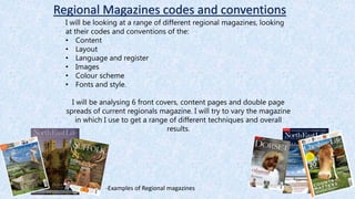
-Examples of Regional magazines
2. All regional magazines follow the majority of the same codes and conventions as this
technique works effectively to produce a professional and successful magazine front cover
look. Therefore they wouldn’t want to differ from this because it works well fro each
stablished and independent regional magazine company. For example:
• All masthead are positioned across the top third of the front cover as it is a high focal
point and significant to every magazine company that their readers see the masthead on
every issue. So that it becomes more memorable and well known.
• They all have a main image followed by sub images to back up/support sub headings and
content that will be featured in the magazine.
• All magazines follow an professional colour scheme using no more than 4/5 colours
otherwise it looks messy and too busy.
3. Dorset regional magazine
Masthead: The white coloured masthead against
the dark background creates a contrast. Symbolising
the weathers in which this regional experience in
this particular winter season. For example white to
symbolise the snow and black to symbolise the cold
and dark days. This makes it stand out and will
attract the readers attention. The bold and large
writing also follows the codes and conventions of
what mastheads usually look like, again with it also
being at the top in the centre of the page it is
professionally placed to caught the audiences
attention.
Text: A lot of describing words are used to
interest and appeal to the readers, as they add
more feelings and emotions to the Christmas
theme. All words used are relevant to one
another suggesting there will be continuity
throughout the magazine. Words such as
“Glittering” and “Magic” etc.
Colour Scheme: The colour scheme of this magazine is mainly
white and red. This fits well with the theme of the magazine whilst
enforcing a powerful contrast. The white colours are used to
represent the snow, icy and cold weather of winter. Where as the
red colours are used to represent the emotions of the season such
as love, happiness and warmth of one another.
Sub Images: The images following the codes and convention of framing the main
focus by only being portioned in the bottom banner, so that no attention is taking
away from the main image and information. Followed by text along side it
describing the images, throughout providing the reader with essential
information on the subject to make them want to read on. The banner enforces
classy and professional to the magazine as it acts as a guide to keep all content
neat and tidy.
Essential Information: The barcode is
provided small located in the bottom right
corner, following the codes and conventions
of a typical magazine. The reader is also
supplied with the web address proving links
to e-media and alternative ways to view the
magazine Also the price of the magazine
which an important detail to note so that the
reader is aware of the price.
Image: The image is typically unusual as the majority of
regional magazine cover images usually include a
landscape of the area or a person. However having the
main image as an animal enforces the nature and
outdoors environment to the magazine, suggesting the
magazine company is exploring the area in which it is
focusing on. Also the main image gets the readers
attention as it is big and in the centre of the page. Also
the editors have burred out the background to make the
snow and squirrel stand out more. Suggesting them
features are Signiant in attracting the audience.
4. Suffolk regional magazine
Image: The main image used contains many different
warm toned and nature colours, implying the focus of
this regional magazine will be on the season of Autumn.
The colours have been used to refer and link to the
overall meaning of the magazine, which suggests
continuity will be throughout the issue. The main image
of an animal represents the nature and purity of the
magazine, symbolising life and creations.
Masthead: The white text against deep and dark
coloured background creates a strong contrast
enforcing classy, professionalism purity and
innocence to the magazine. These colours help to
make the masthead stand out against other features
and bring importance to the feature. This follows the
typical codes and conventions by being presented as
big, bold and easy to read. Also by it being situated in
the top centre third added more significance to the
masthead.
Text: A lot of describing words are used to interest and
appeal to the readers, as they add more feelings and
emotions to the autumn theme. All words used are
relevant to one another suggesting there will be
continuity throughout the magazine. Words such as
“spooky” etc. are used to relate back to the season as the
word spooky is commonly know to be used to describe
ghosts and mysterious events. Around the time of
Halloween which is an event that occurs every autumn,
bring attention to the focal point of the magazine.
Colour Scheme: The colour scheme of this magazine is mainly focused around
warm, natural colours . Such as orange, red, brown and green tones. This
implies to be that this issue of the magazine was published during the season
of Autumn as the colours used clearly relate and present the colours used and
most commonly seen associated with this season. The warm brown colours
used represent the falling leaves and the sunny bright weather of summer
slowly being mixed with the cold colours of winter. Therefore creating an
transition warm tone shades for example brown and red. Where as the green
colours are used to represent the natural and pure process of the changing in
seasons.
Essential Information: The barcode is provided small located in
the bottom right corner, following the codes and conventions of a
typical magazine. The reader is also supplied with the web address
proving links to e-media and alternative ways to view the
magazine. This is position in a smaller and thin font above the
masthead in the top right third, as the reader will always be drawn
to rad the masthead therefore they will mostly commonly read
what is presented above it. Also the price of the magazine which
an important detail to note so that the reader is aware of how
much they will be paying.
Sub Images: The images following the codes and convention of framing the
main focus by only being portioned in the bottom banner, so that no attention is
taking away from the main image and information. Followed by text along side it
describing the images, throughout providing the reader with essential
information on the subject to make them want to read on. The banner enforces
classy and professional to the magazine as it acts as a guide to keep all content
neat and tidy. The sub images are all relevant to the content that the mazagine
will hold. For example the image of pumpkin again linking to the event taking
place in autumn which is Halloween.
5. Cumbria Life regional magazine
Masthead: The black and red text against the soft and light
white coloured background creates a strong contrast
enforcing classy, professionalism purity and innocence to
the magazine. These colours help to make the masthead
stand out against other features and bring importance to
the feature. This follows the typical codes and conventions
by being presented as big, bold and easy to read. Also by it
being situated in the top centre third added more
significance to the masthead. The two different bold colours
used in the masthead create a solid divide between the two
words used implying they are different with different
meanings etc. However they are used together in this issue
trying to break down the divide between the words.
Image: The main image used contains many different
earth toned and nature colours, implying the focus of
this regional magazine will be on a specific area used in
the image, which is this case is a picture of a Cumbria.
As it is a regional magazine. The colours have been used
to refer and link to the overall meaning of the magazine,
which suggests continuity will be throughout the issue.
The main image of an outsides represents the nature
and purity of the magazine, symbolising life, creations
and the environment.
Colour Scheme: The colour scheme of this magazine is mainly
focused around natural and emotional colours. Such as green, blue
and brown tones. The green colours used represent the nature of the
countryside, symbolizing the green glass and hills in Cumbria which
they are commonly known for, their land and outsides. Therefore the
blue tones have been used to present the cool environmental factors
of blue bright sky, suggesting the colours used are displaying the
natural and pure process of the changing in seasons.
Text: A lot of describing words are used to interest and appeal to the
readers, as they add more feelings and emotions to the outsiders
theme. All words used are relevant to one another suggesting there will
be continuity throughout the magazine. Words associated with a guide
to how to life when in Cumbria, for example ”your essential guide to
life’ etc. This adds a friendly factor to the magazine as the company give
advice to their readers.
Essential Information: The barcode is provided small located in
the bottom right corner, following the codes and conventions of a
typical magazine. The reader is also supplied with the web
address proving links to e-media and alternative ways to view the
magazine. This is position in a smaller and thin font beside the
barcode therefore they will mostly commonly read as it is
presented in a key place. Also the price of the magazine which an
important detail to note so that the reader is aware of how much
they will be paying.
Sub Images: The images following
the codes and convention of
framing the main focus by only
being portioned in the bottom
banner, so that no attention is
taking away from the main image
and information. Followed by text
along side it describing the images,
throughout providing the reader
with essential information on the
subject to make them want to read
on.
Sub Images: The banner enforces classy and professional to
the magazine as it acts as a guide to keep all content neat
and tidy. The sub images are all relevant to the content that
the mazagine will hold. For example the image food links to
the advice giving in the sense of a guide to life in this region.
6. North East Life regional magazine
Masthead: The soft and light white coloured masthead
creates a strong contrast against the dark cool blue
enforcing classy, professionalism purity and innocence to
the magazine. These colours help to make the masthead
stand out against other features and bring importance to
the feature. This follows the typical codes and conventions
by being presented as big, bold and easy to read. Also by it
being situated in the top centre third added more
significance to the masthead. The white of the masthead
symbolises the sharpness of the cool clouds in the sky,
whilst the blue enforces the bright and clear crisp sky.
Image: The main image used stinks to the environmental
and nature colours of the bright sky. Implying the focus of
this regional magazine will be on the season of summer as
the clear blue sky and beach used in the image with the
prop of a kite is a typical active to do on a summers day.
The colours have been used to refer and link to the overall
meaning of the magazine, which suggests continuity will
be throughout the issue. The main image of an outsides
represents the nature and purity of the magazine,
symbolising life, creations and the environment.
Colour Scheme: The colour scheme of this magazine is mainly
focused around soft white innocent colours and deep blue
colours. The blue colours used represent the nature of the
environment, symbolizing the clear summers sky and deep sea.
which are significant features desired to see during the summer.
Therefore the blue tones have been used to present the cool
environmental factors of blue bright sky, suggesting the colours
used are displaying the natural and pure process of the changing
in seasons.
Text: The majority of text used on the front are names of
places in the north east with a caption of what is happening in
the area or what people think of the area. Text colour is till
within the colour scheme suggesting continuity and relevance
throughout the magazine.