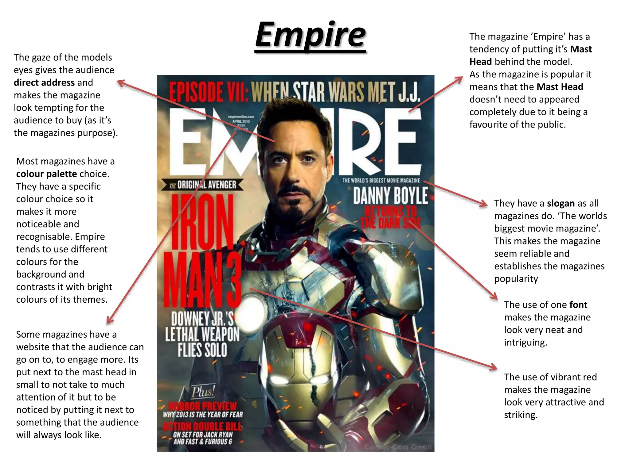
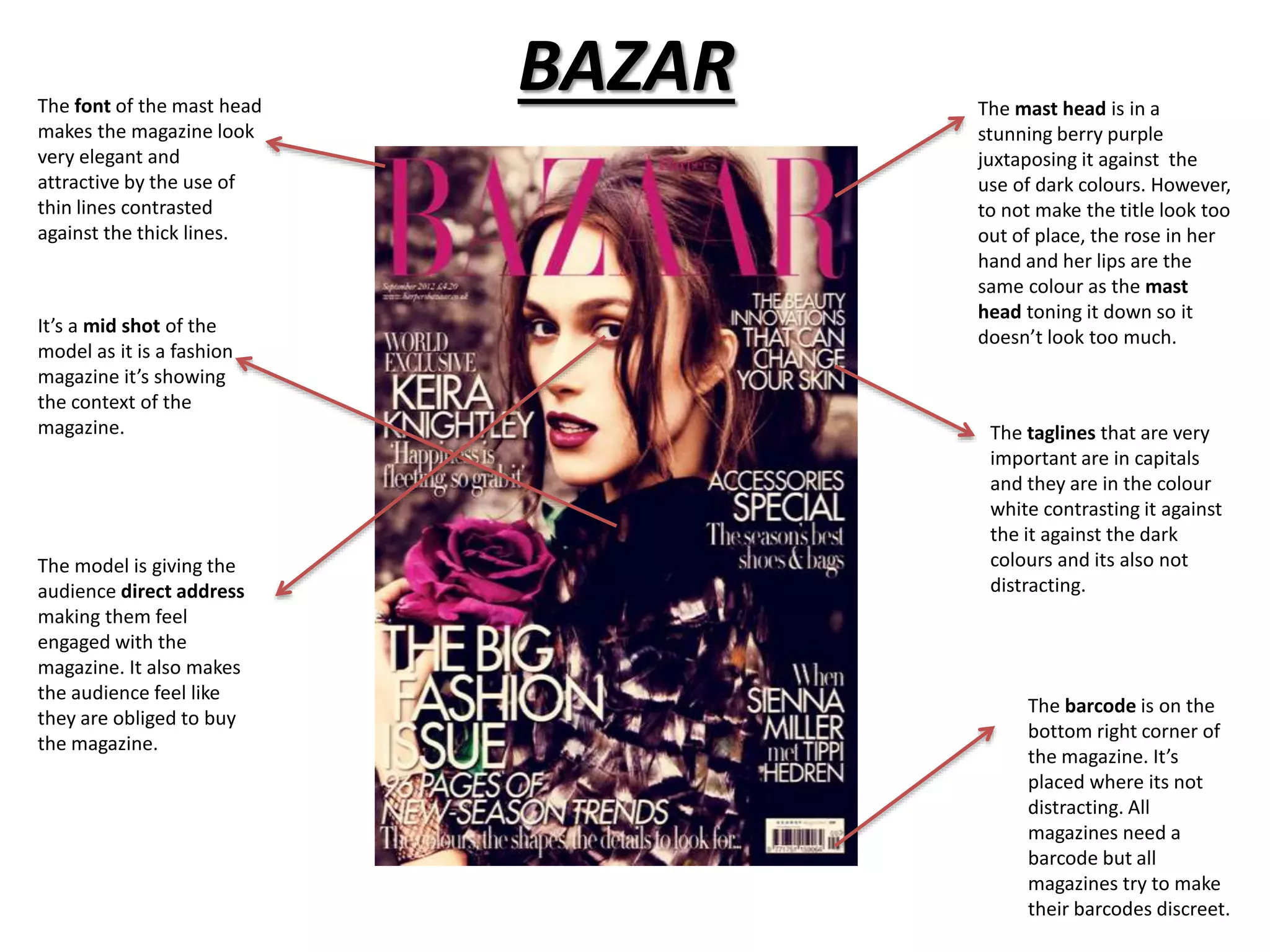
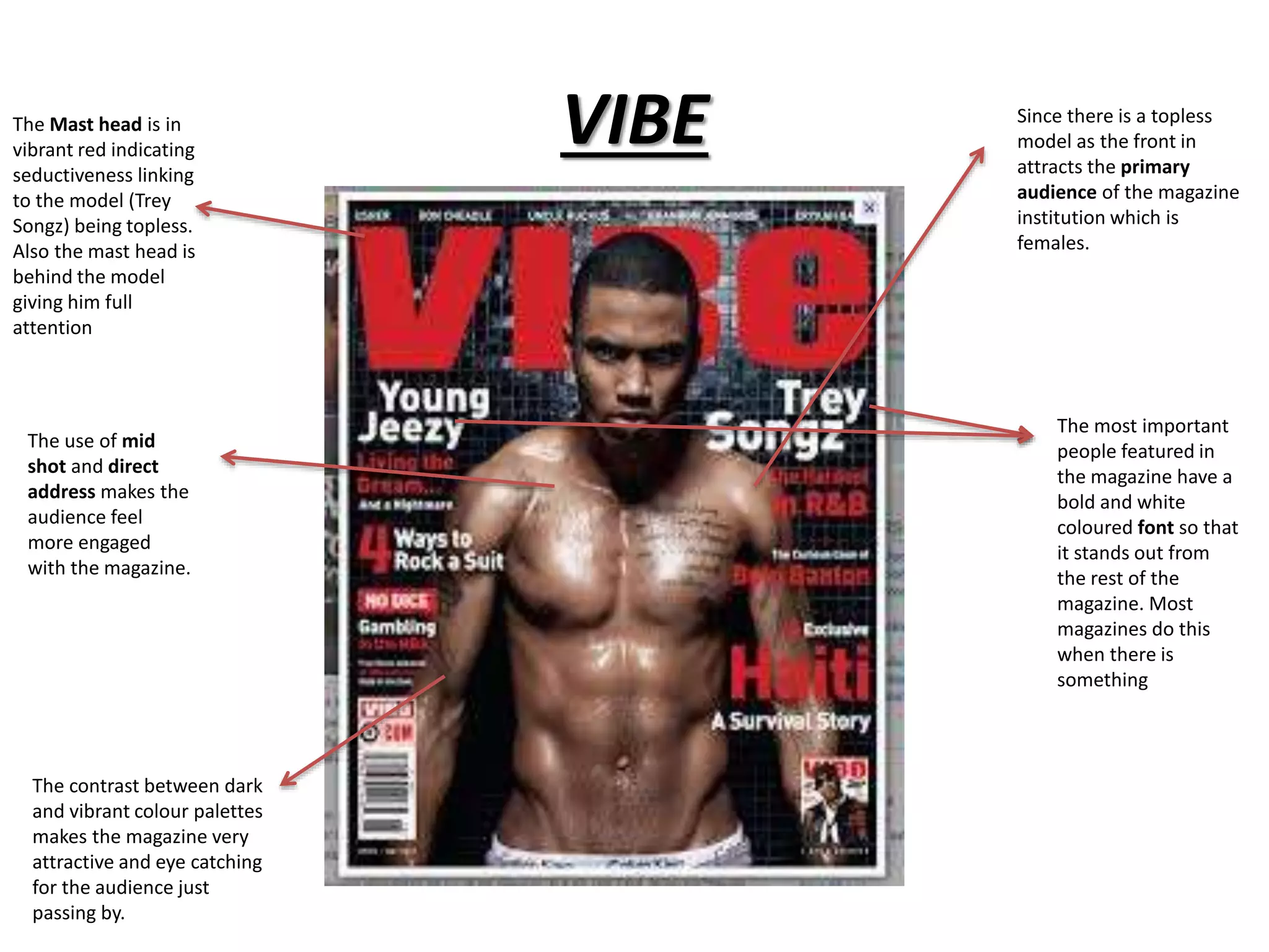
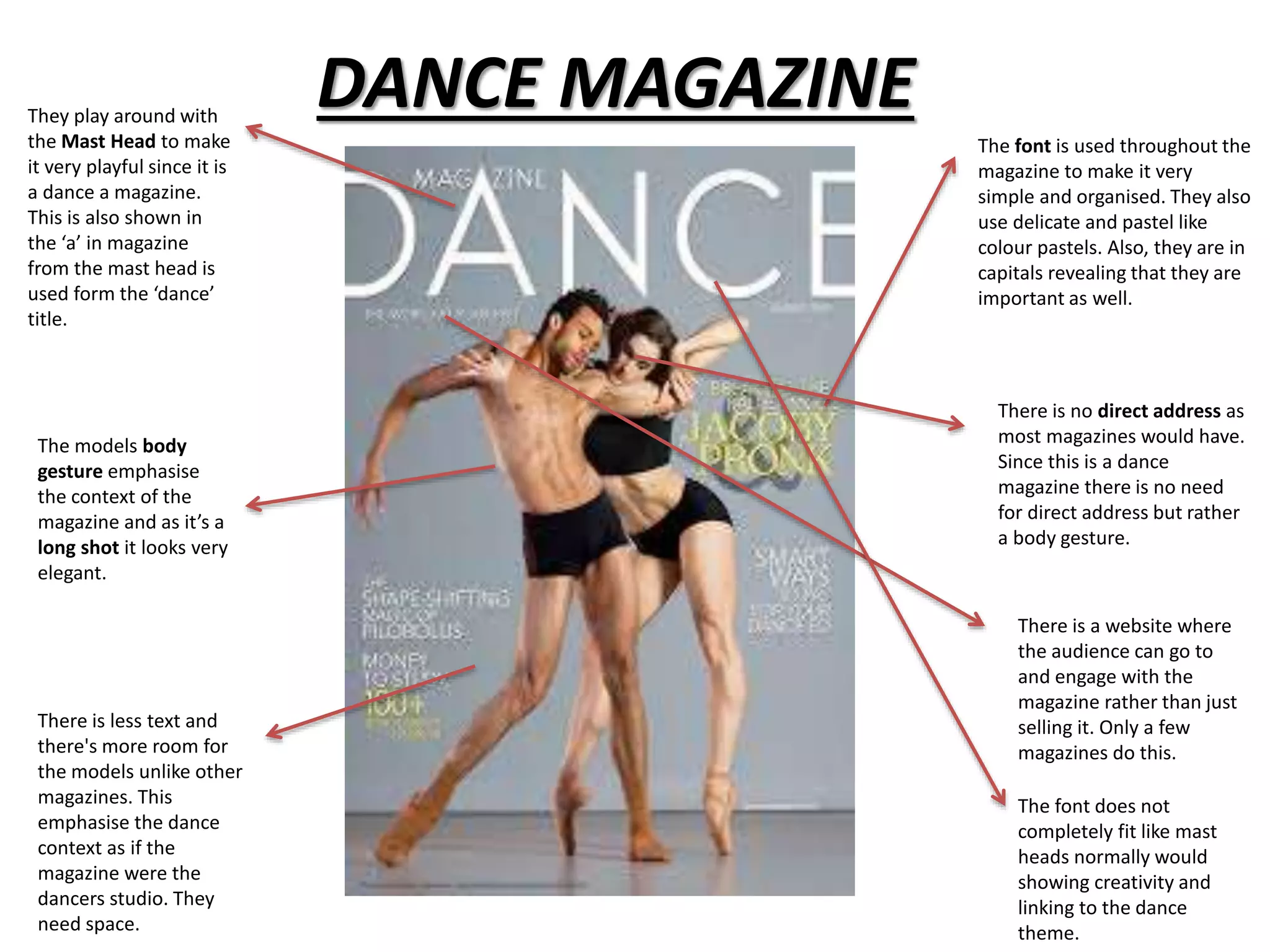
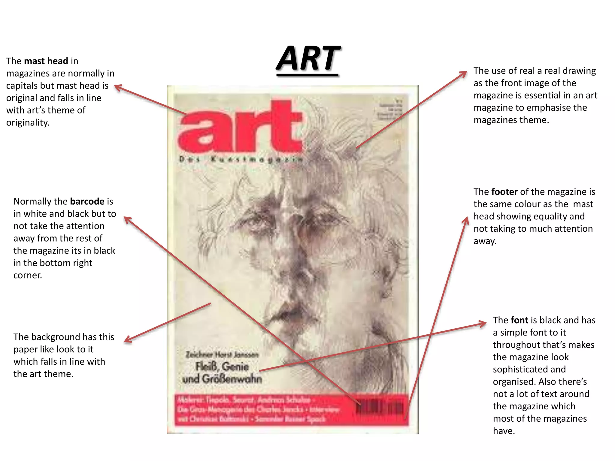
2. Empire The magazine ‘Empire’ has a
tendency of putting it’s Mast
Head behind the model.
As the magazine is popular it
means that the Mast Head
doesn’t need to appeared
completely due to it being a
favourite of the public.
They have a slogan as all
magazines do. ‘The worlds
biggest movie magazine’.
This makes the magazine
seem reliable and
establishes the magazines
popularity
The gaze of the models
eyes gives the audience
direct address and
makes the magazine
look tempting for the
audience to buy (as it’s
the magazines purpose).
Most magazines have a
colour palette choice.
They have a specific
colour choice so it
makes it more
noticeable and
recognisable. Empire
tends to use different
colours for the
background and
contrasts it with bright
colours of its themes.
Some magazines have a
website that the audience can
go on to, to engage more. Its
put next to the mast head in
small to not take to much
attention of it but to be
noticed by putting it next to
something that the audience
will always look like.
The use of one font
makes the magazine
look very neat and
intriguing.
The use of vibrant red
makes the magazine
look very attractive and
striking.
3. BAZAR
The mast head is in a
stunning berry purple
juxtaposing it against the
use of dark colours. However,
to not make the title look too
out of place, the rose in her
hand and her lips are the
same colour as the mast
head toning it down so it
doesn’t look too much.
The font of the mast head
makes the magazine look
very elegant and
attractive by the use of
thin lines contrasted
against the thick lines.
The taglines that are very
important are in capitals
and they are in the colour
white contrasting it against
the it against the dark
colours and its also not
distracting.
It’s a mid shot of the
model as it is a fashion
magazine it’s showing
the context of the
magazine.
The barcode is on the
bottom right corner of
the magazine. It’s
placed where its not
distracting. All
magazines need a
barcode but all
magazines try to make
their barcodes discreet.
The model is giving the
audience direct address
making them feel
engaged with the
magazine. It also makes
the audience feel like
they are obliged to buy
the magazine.
4. VIBE Since there is a topless
model as the front in
attracts the primary
audience of the magazine
institution which is
females.
The Mast head is in
vibrant red indicating
seductiveness linking
to the model (Trey
Songz) being topless.
Also the mast head is
behind the model
giving him full
attention
The most important
people featured in
the magazine have a
bold and white
coloured font so that
it stands out from
the rest of the
magazine. Most
magazines do this
when there is
something
The use of mid
shot and direct
address makes the
audience feel
more engaged
with the magazine.
The contrast between dark
and vibrant colour palettes
makes the magazine very
attractive and eye catching
for the audience just
passing by.
5. DANCE MAGAZINE They play around with
the Mast Head to make
it very playful since it is
a dance a magazine.
This is also shown in
the ‘a’ in magazine
from the mast head is
used form the ‘dance’
title.
The font is used throughout the
magazine to make it very
simple and organised. They also
use delicate and pastel like
colour pastels. Also, they are in
capitals revealing that they are
important as well.
The models body
gesture emphasise
the context of the
magazine and as it’s a
long shot it looks very
elegant.
There is no direct address as
most magazines would have.
Since this is a dance
magazine there is no need
for direct address but rather
a body gesture.
There is less text and
there's more room for
the models unlike other
magazines. This
emphasise the dance
context as if the
magazine were the
dancers studio. They
need space.
There is a website where
the audience can go to
and engage with the
magazine rather than just
selling it. Only a few
magazines do this.
The font does not
completely fit like mast
heads normally would
showing creativity and
linking to the dance
theme.
6. ART The use of real a real drawing
as the front image of the
magazine is essential in an art
magazine to emphasise the
magazines theme.
The mast head in
magazines are normally in
capitals but mast head is
original and falls in line
with art’s theme of
originality.
The footer of the magazine is
the same colour as the mast
head showing equality and
not taking to much attention
away.
Normally the barcode is
in white and black but to
not take the attention
away from the rest of
the magazine its in black
in the bottom right
corner.
The background has this
paper like look to it
which falls in line with
the art theme.
The font is black and has
a simple font to it
throughout that’s makes
the magazine look
sophisticated and
organised. Also there’s
not a lot of text around
the magazine which
most of the magazines
have.