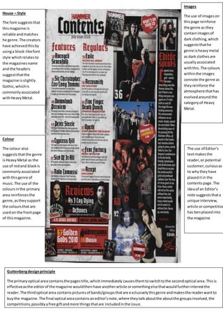
1. House – Style
The font suggeststhat
thismagazine is
reliable andmatches
he genre.The creators
have achievedthisby
usinga block-likefont
style whichrelatesto
the magazines name
and the headers
suggestthatthe
magazine isslightly
Gothic, whichis
commonlyassociated
withHeavyMetal.
Colour
The colour also
suggeststhatthe genre
isHeavyMetal as the
use of redand blackis
commonlyassociated
withthisgenre of
music.The use of the
coloursinthe primary
area reinforcesthe
genre,astheysupport
the coloursthat are
usedon the frontpage
of thismagazine.
Guttenbergdesignprinciple
The primaryoptical area containsthe pagestitle,whichimmediately causesthemtoswitchtothe secondoptical area.Thisis
effectiveasthe editorof the magazine wouldthenhave anotherarticle orsomethingelsethatwouldfurtherinterestthe
reader.The thirdoptical area containspicturesof bands/groupsthatare exclusivelythisgenre andmakesthe readerwantto
buythe magazine.The final optical areacontainsaneditor’snote,where theytalkaboutthe aboutthe groupsinvolved,the
competitions,possiblyafree giftandmore thingsthatare includedinthe issue.
Images
The use of imageson
thispage reinforce
the genre as they
containimagesof
dark clothing,which
suggeststhathe
genre isheavymetal
as dark clothesare
usuallyassociated
withthis. The colours
withinthe images
connote the genre as
theyreinforce the
atmosphere thathas
evolvedaround the
categoryof Heavy
Metal.
The use of Editor’s
textmakesthe
reader,or potential
customer,curiousas
to whytheyhave
placeditin the
contents page.The
ideaof an Editor’s
note suggeststhata
unique interview,
article or competition
has benplacedinto
the magazine
2. House-Style
The use of block-
like writing
suggeststhatthe
magazine isstrong
and that the
informationwithin
itspagesis reliable.
The coloursof the
textare effective as
the Headline
standsout against
the background.
The contrast
againstthe dark
backgroundof this
editionscontents
page is effective as
it thensupportshe
colourof the text
whichisdeveloping
furtheronthe
pointgivenbythe
Headline.The use
of italicsandbold
inthe subtextis
effectiveasit
highlightswhothe
articlesare talking
aboutor whohave
beenincludedin
that week’sedition.
Colour
The colour also
suggeststhe genre as
beingindie music,as
the use of red,white
and yellowis
commonlyassociated
withthisgenre of
musicdue t it being
brighterandmore
variedthanother
colours.The use of the
coloursinthe primary
area reinforcesthe
genre,astheysupport
the coloursthat are
usedon the frontpage
of thismagazine.
The use of sub-text
underneaththe Head
titlesmakesthe reader,
or potential customer,
curiousas to whothe
articlesare about and
the topicof
conversationbetween
the artist and
interviewer.Thisis
effectiveasthe reader
may use these sub-
textsto judge whether
the editionisworth
buying,yettheyare
subtlypersuadedby
the act of placing
informationaboutthe
editionIthe contents
page.Anexample of
thiswouldbe the
questionof whether
Eminemthinks‘Sober
successtastesjustas
sweet.’Thispiquesthe
potential customer’s
curiosityastheythen
wantto knowwhat the
artistthinks.
Guttenbergdesignprinciple
The primaryoptical area containsthe pagestitle,showingthe websiteof the magazine soitcan be
visitedonline,while immediatelycausesthemtoswitchtothe secondoptical area.Thisiseffective as
the editorof the magazine hasplacedan enlargedimage of the artistEminem, whichcausesfurther
interestinthe readerastheywonderwhy the image hasbeenplacedthere.The thirdoptical area
containspicturesof bands/groupsthatare exclusivelythisgenre andmakesthe readerwanttobuy
the magazine.The final optical areacontainsaneditor’snote,where theytalkaboutthe aboutthe
groupsinvolved,the competitions,possiblyafree giftandmore thingsthatare includedinthe issue.