Python Notes for mca i year students osmania university.docx
Music magazine analysis
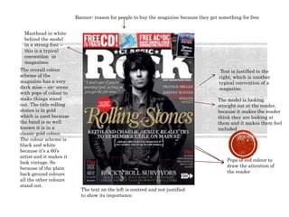
1. Masthead in white
behind the model
in a strong font –
this is a typical
convention in
magazines.
The model is looking
straight out at the reader,
because it makes the reader
think they are looking at
them and it makes them feel
included
Banner- reason for people to buy the magazine because they get something for free
Text is justified to the
right, which is another
typical convention of a
magazine.
The overall colour
scheme of the
magazine has a very
dark mise – en- scene
with pops of colour to
make things stand
out. The title rolling
stones is in gold
which is used because
the band is so well
known it is in a
classic gold colour.
The colour scheme is
black and white
because it’s a 60’s
artist and it makes it
look vintage. So
because of the plain
back ground colours
all the other colours
stand out.
The text on the left is centred and not justified
to show its importance.
Pops of red colour to
draw the attention of
the reader
2. The fact that this magazine has two different covers is quite common in the music
magazine industry. This is done to get more money for the magazine. This is also
used for major fans and collectors . Everything inside is the same the only
difference is the photo on the front.
The masthead
is bold and one
of the main
focus on the
magazine. The
title ‘q’
actually
stands for ‘que
the music’.
This puff is on
both
magazines but
they have
changed the
number. This
is for the
collectors.
The sub headings
around the
outside are
justified on both
sides.
The overall colour scheme of these issues is very monochrome, apart from the
main titles of each headline. Red is a very common colour to use in magazines
because it stands out against the monochrome background.
Barcode- typical convention of magazines, just used for
people buying them
Both the models
photos are in black
and white, which adds
some elegance. But the
stance of the models is
very intimidating,
which for anyone who
is a fan of the band
knows what the two
brothers personalities
are, so this pose fits in
with that.
3. Strong distinct
masthead-
In a bright red font to
attract the readers
attention. It is set
behind the photo which
is a common thing to do
in magazines because it
helps everything to
look blended together
even though it is still
noticeable
The colour scheme of
this magazine is very
monochrome with red as
the focus colour, this is
something I have found
is very common in rock
magazines.
This band is from the
90’s so the black and
white photo makes it
look vintage.
The title is very
bold even though its
in white, because of
the font size and the
font
There’s a total of 3
fonts in this cover,
which is a typical
convention in
magazines to keep it
very classic and
doesn’t overpower
the reader. To also go
with the minimal
fonts there are only 3
main colours-
Black, white and red,
which is again to
keep the cover as
classy and
minimalistic as
possible
Bar code, date, issue
number and price are all
very common things in a
magazine
All text is justified to the
right down the sides of the
cover which is a very
common convention in a
magazine because it keeps
the cover looking clean and
neat
The names across the top and the names of some people who
are going to be mentioned in the magazine
All the models are
looking out towards the
reader, this is something
that is done regularly to
entice the reader
Also in this photo all of
the model have messy
hair, which is done to fit
in with the ‘stereotypical
rock star’ image