The two magazine contents pages are similar because they target the same genre of alternative/rock music. Both magazines use red, black, and white colors associated with this genre. They also lay out text and images similarly. However, the Q magazine contents page has a more informal design balance with wild photos of artists. It also does not follow the Gutenberg design principle of placing important information in specific areas as strictly as the other magazine. Overall, the summaries show the magazines aim to attract similar audiences through house style and content while one displays a less formal layout.
Diseño de Mesa-Comedor para 8 personas. Mesa Alta tipo bar para hombre soltero que vive en un loft y le gusta reunirse en su apartamento para trabajo y con amigos.
Eixo hipotálamo hipofisário a “glândula mestra” desde criança infantil juven...Van Der Häägen Brazil
A principal função do hipotálamo está homeostase, ou manter o “status quo” do corpo. Fatores como pressão arterial, temperatura corporal, o equilíbrio de fluidos e eletrólitos, e peso corporal são realizados com um valor preciso chamado de set-point. Embora este set-point pode migrar ao longo do tempo, no dia a dia é notavelmente fixo. Para realizar esta tarefa, o hipotálamo deve receber inputs sobre o estado do corpo, e deve ser capaz de iniciar mudanças compensatórias.
Instructions for Submissions thorugh G- Classroom.pptxJheel Barad
This presentation provides a briefing on how to upload submissions and documents in Google Classroom. It was prepared as part of an orientation for new Sainik School in-service teacher trainees. As a training officer, my goal is to ensure that you are comfortable and proficient with this essential tool for managing assignments and fostering student engagement.
Macroeconomics- Movie Location
This will be used as part of your Personal Professional Portfolio once graded.
Objective:
Prepare a presentation or a paper using research, basic comparative analysis, data organization and application of economic information. You will make an informed assessment of an economic climate outside of the United States to accomplish an entertainment industry objective.
Read| The latest issue of The Challenger is here! We are thrilled to announce that our school paper has qualified for the NATIONAL SCHOOLS PRESS CONFERENCE (NSPC) 2024. Thank you for your unwavering support and trust. Dive into the stories that made us stand out!
Acetabularia Information For Class 9 .docxvaibhavrinwa19
Acetabularia acetabulum is a single-celled green alga that in its vegetative state is morphologically differentiated into a basal rhizoid and an axially elongated stalk, which bears whorls of branching hairs. The single diploid nucleus resides in the rhizoid.
The Roman Empire A Historical Colossus.pdfkaushalkr1407
The Roman Empire, a vast and enduring power, stands as one of history's most remarkable civilizations, leaving an indelible imprint on the world. It emerged from the Roman Republic, transitioning into an imperial powerhouse under the leadership of Augustus Caesar in 27 BCE. This transformation marked the beginning of an era defined by unprecedented territorial expansion, architectural marvels, and profound cultural influence.
The empire's roots lie in the city of Rome, founded, according to legend, by Romulus in 753 BCE. Over centuries, Rome evolved from a small settlement to a formidable republic, characterized by a complex political system with elected officials and checks on power. However, internal strife, class conflicts, and military ambitions paved the way for the end of the Republic. Julius Caesar’s dictatorship and subsequent assassination in 44 BCE created a power vacuum, leading to a civil war. Octavian, later Augustus, emerged victorious, heralding the Roman Empire’s birth.
Under Augustus, the empire experienced the Pax Romana, a 200-year period of relative peace and stability. Augustus reformed the military, established efficient administrative systems, and initiated grand construction projects. The empire's borders expanded, encompassing territories from Britain to Egypt and from Spain to the Euphrates. Roman legions, renowned for their discipline and engineering prowess, secured and maintained these vast territories, building roads, fortifications, and cities that facilitated control and integration.
The Roman Empire’s society was hierarchical, with a rigid class system. At the top were the patricians, wealthy elites who held significant political power. Below them were the plebeians, free citizens with limited political influence, and the vast numbers of slaves who formed the backbone of the economy. The family unit was central, governed by the paterfamilias, the male head who held absolute authority.
Culturally, the Romans were eclectic, absorbing and adapting elements from the civilizations they encountered, particularly the Greeks. Roman art, literature, and philosophy reflected this synthesis, creating a rich cultural tapestry. Latin, the Roman language, became the lingua franca of the Western world, influencing numerous modern languages.
Roman architecture and engineering achievements were monumental. They perfected the arch, vault, and dome, constructing enduring structures like the Colosseum, Pantheon, and aqueducts. These engineering marvels not only showcased Roman ingenuity but also served practical purposes, from public entertainment to water supply.
Operation “Blue Star” is the only event in the history of Independent India where the state went into war with its own people. Even after about 40 years it is not clear if it was culmination of states anger over people of the region, a political game of power or start of dictatorial chapter in the democratic setup.
The people of Punjab felt alienated from main stream due to denial of their just demands during a long democratic struggle since independence. As it happen all over the word, it led to militant struggle with great loss of lives of military, police and civilian personnel. Killing of Indira Gandhi and massacre of innocent Sikhs in Delhi and other India cities was also associated with this movement.
June 3, 2024 Anti-Semitism Letter Sent to MIT President Kornbluth and MIT Cor...Levi Shapiro
Letter from the Congress of the United States regarding Anti-Semitism sent June 3rd to MIT President Sally Kornbluth, MIT Corp Chair, Mark Gorenberg
Dear Dr. Kornbluth and Mr. Gorenberg,
The US House of Representatives is deeply concerned by ongoing and pervasive acts of antisemitic
harassment and intimidation at the Massachusetts Institute of Technology (MIT). Failing to act decisively to ensure a safe learning environment for all students would be a grave dereliction of your responsibilities as President of MIT and Chair of the MIT Corporation.
This Congress will not stand idly by and allow an environment hostile to Jewish students to persist. The House believes that your institution is in violation of Title VI of the Civil Rights Act, and the inability or
unwillingness to rectify this violation through action requires accountability.
Postsecondary education is a unique opportunity for students to learn and have their ideas and beliefs challenged. However, universities receiving hundreds of millions of federal funds annually have denied
students that opportunity and have been hijacked to become venues for the promotion of terrorism, antisemitic harassment and intimidation, unlawful encampments, and in some cases, assaults and riots.
The House of Representatives will not countenance the use of federal funds to indoctrinate students into hateful, antisemitic, anti-American supporters of terrorism. Investigations into campus antisemitism by the Committee on Education and the Workforce and the Committee on Ways and Means have been expanded into a Congress-wide probe across all relevant jurisdictions to address this national crisis. The undersigned Committees will conduct oversight into the use of federal funds at MIT and its learning environment under authorities granted to each Committee.
• The Committee on Education and the Workforce has been investigating your institution since December 7, 2023. The Committee has broad jurisdiction over postsecondary education, including its compliance with Title VI of the Civil Rights Act, campus safety concerns over disruptions to the learning environment, and the awarding of federal student aid under the Higher Education Act.
• The Committee on Oversight and Accountability is investigating the sources of funding and other support flowing to groups espousing pro-Hamas propaganda and engaged in antisemitic harassment and intimidation of students. The Committee on Oversight and Accountability is the principal oversight committee of the US House of Representatives and has broad authority to investigate “any matter” at “any time” under House Rule X.
• The Committee on Ways and Means has been investigating several universities since November 15, 2023, when the Committee held a hearing entitled From Ivory Towers to Dark Corners: Investigating the Nexus Between Antisemitism, Tax-Exempt Universities, and Terror Financing. The Committee followed the hearing with letters to those institutions on January 10, 202
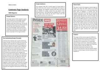
1. Abbie Corbett
Contents Page Analysis
NME Magazine
Design Balance:
The design balance of this magazine is quite
formal I would say, as the images used for
example are quite formal and the whole
magazine style looks well set out. The text all
matches perfectly and it has all been placed in
a certain way and it looks like it contains
more text than images, which means more
reading has to be done. Therefore,this gives
me the impression that the contents page is
formal, especially for this target audience.
House Style:
The colours used on the magazine contents page are
mainly red, black and white which are all quite
typical colours when put in a rock/indie/alternative
genre type of magazine. It connotes that the
magazine will feature this rock style and therefore
includes rock/indie music. The colours make the
magazine look edgy and have a sense of danger and
again will make audiences link this to a rock type of
genre.All of the NME magazines use the same house
style, so they keep to the same colours and also have
all the contents pages set put in the exact same way.
They do this so that audiences are familiar with the
magazine and they know that these are the NME
magazines. The fonts used are also quite bold and
they stand out, but they tend to use similar fonts
throughout to again reinforce this certain house
style.
Imagery:
The images on this contents page are of different
artists and bands that are famous mostly in the UK
and they all seem to be artists that are of indie /
rock genres.For example,there is a quite large
picture of Oasis on the cover, which many peoples
attention will be drawn to straight away. This band
is majorly famous in the UK as they are a
Manchester based band and they are a Brit
pop/rock band and this is what the contents page is
all about, so these images represent what genre the
magazine is.
Target Audience:
This magazine looks like it would appeal to young adults or
older teens due to the amount of information that is given in
the magazine. The magazine contents itself looks very formal
and readable for people around the age groups I have
mentioned above. I also think that this magazine tries to target
more males than females by the type of music used and
through the pictures and colours etc.
The Guttenberg Design Principle:
I thinkthat this magazine does use the Guttenberg
Design Principle, as in all of the different areas of the
magazine match well with the design principle. For
example,the top left hand corner of the magazine is
the primary optical area, which is where audiences
are supposedly drawn to immediately and on this
contents page,this area shows the name of the
magazine, which is obviously important to audiences.
The terminal area mentions prices and gives the
option to subscribe to the magazine. This would least
interest audiences,as this wouldn’t be as important,
therefore it seems to be in the right area. The weak
fallow area is at the bottom left and this is where
many people loose interest, they don’t seem to look
very much at this part of the magazine and in this
magazine, is where articles on contributors are which
wouldn’t interest people. Lastly, in the strong fallow
area, shows interesting articles that are going to be
featured in the magazine and therefore is in the right
place.
2. Abbie Corbett
Q Magazine
Target Audience:
Once again like the magazine above, I would think that
the target audience would be young adults/teens
because of the sort of articles that it includes. Again, I
would imagine this magazine is mostly aimed at males
based on the bands and artists that are present and the
colours used all give me this impression.
House Style:
The colours used on this magazine are mainly red,
black, white and a little amount of blue.Like the
magazine above,this magazine tries to keep to the
same house style throughout and this is clearly seen
through the contents page and the colour scheme
used.The typography is less bold, but is still bold
enough where needs be for audiences to see clearly.
All of these colours really represent the rock /
alternative genre that the magazine is trying to
portray. Due to the house style being kept the same,
audiences are able to properly identify with the
magazine as they will be familiar with it, as over a
long period of time the house style has stayed the
same.
Imagery:
The images used on the magazine contents page are
very rock and alternative. They really support this
idea of the magazine genre of rock etc. The photos
are basically of the artists and different bands and in
each photo, the artist looks really rock and they
show how this magazine portrays this idea. All of
the photos seem quite serious and just by looking at
these images alone; you can clearly see what the
magazine is all about.In the photos there is use of
iconography and these artists are posed in certain
ways to once again portray this certain genre. The
images are pretty typically for this sort of magazine
genre.
Design Balance:
The design balance of this magazine contents
page is a little more informal than the above
magazine. For example,the photos used on
this contents page are informal, such as the
two top photos, the artists in these images are
shown to be quite wild and they look really
rock, especially with their tops off or ripped
open. These images just give of the
impression of the magazine as a whole being
informal.
The Guttenberg Design Principle:
This magazine contents doesn’t realty seem to
follow the Guttenberg Design Principle, as the
magazine is quite widely and equally spread out. For
example,in the primary optical area, it does show
the name of the magazine, however in places such as
the weak terminal area shows the main cover story,
which to many people would be very important and
interesting. Also, in the strong fallow area it doesn’t
really show much, as it says ‘the birth of British pop’
but this is repeated elsewhere,so it isn’t really
shown as a strong fallow area. As well as this, in the
weak fallow area, it shows other story lines that
could be quite important for audiences, as this story
lines are what the magazine will be all about.
3. Abbie Corbett
Summary of both magazines
To summarize both magazine contents pages,there are quite a fewsimilaritiesand theyalso have theirdifferences.The reasonthese magazine contents
pages are very similaris because theyare both magazinesfor very indie / rock / alternative genres,therefore theyare bound to have many similarities.
This is because theytend to have the same target audiencesand so to get these certainaudiencesto read or buythe magazine,they tendto copy the
same house style.Many music magazinesthat are based on rock/alternative use the same house style with the same colour schemes,theytend to use
the redand black and white colours,which many people associate with this particular music genre.Both of the contentspages have beenset out in
quite a similarway withthe way the text and imagesare placed,however,the do differ.The Q magazine seemsto have more of an informal design
balance and it looks a lot differentfromthe other incertain ways, such as how theyhave usedthe imagesand the way they have placedthe text etc.
However,both magazine contentpages give off the impressionthat they are trying to target the same type ofaudiencesand they are both trying to do
this through what they put on the contentspage as well as the cover page, as this carries the informationthat people will read and want to buy the
magazine.