The document discusses how the media product uses, develops, and challenges conventions of real magazines. It follows many conventions: the masthead stretches the page width like real magazines; images are edited to fit the genre and mise-en-scene; cover lines are positioned in the left and right thirds with the main line over the main image. The color scheme uses a typical three color palette to fit the rock genre. The strapline is positioned at the top to grab attention and uses colors from the palette. The only challenge is the double page text, which alternates image and text positioning and uses a question and answer format.
Macroeconomics- Movie Location
This will be used as part of your Personal Professional Portfolio once graded.
Objective:
Prepare a presentation or a paper using research, basic comparative analysis, data organization and application of economic information. You will make an informed assessment of an economic climate outside of the United States to accomplish an entertainment industry objective.
Unit 8 - Information and Communication Technology (Paper I).pdfThiyagu K
This slides describes the basic concepts of ICT, basics of Email, Emerging Technology and Digital Initiatives in Education. This presentations aligns with the UGC Paper I syllabus.
2024.06.01 Introducing a competency framework for languag learning materials ...Sandy Millin
http://sandymillin.wordpress.com/iateflwebinar2024
Published classroom materials form the basis of syllabuses, drive teacher professional development, and have a potentially huge influence on learners, teachers and education systems. All teachers also create their own materials, whether a few sentences on a blackboard, a highly-structured fully-realised online course, or anything in between. Despite this, the knowledge and skills needed to create effective language learning materials are rarely part of teacher training, and are mostly learnt by trial and error.
Knowledge and skills frameworks, generally called competency frameworks, for ELT teachers, trainers and managers have existed for a few years now. However, until I created one for my MA dissertation, there wasn’t one drawing together what we need to know and do to be able to effectively produce language learning materials.
This webinar will introduce you to my framework, highlighting the key competencies I identified from my research. It will also show how anybody involved in language teaching (any language, not just English!), teacher training, managing schools or developing language learning materials can benefit from using the framework.
Model Attribute Check Company Auto PropertyCeline George
In Odoo, the multi-company feature allows you to manage multiple companies within a single Odoo database instance. Each company can have its own configurations while still sharing common resources such as products, customers, and suppliers.
Operation “Blue Star” is the only event in the history of Independent India where the state went into war with its own people. Even after about 40 years it is not clear if it was culmination of states anger over people of the region, a political game of power or start of dictatorial chapter in the democratic setup.
The people of Punjab felt alienated from main stream due to denial of their just demands during a long democratic struggle since independence. As it happen all over the word, it led to militant struggle with great loss of lives of military, police and civilian personnel. Killing of Indira Gandhi and massacre of innocent Sikhs in Delhi and other India cities was also associated with this movement.
Thesis Statement for students diagnonsed withADHD.ppt
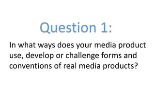
Question 1 conventions
1. Question 1:
In what ways does your media product
use, develop or challenge forms and
conventions of real media products?
2. Masthead
My masthead follows the typical conventions of real magazines well and doesn’t challenge or break them. It stretches the
entire width of the page which is a very typical feature of real products. I used the masthead from the ‘Kerrang’ magazine (a
very popular rock magazine) for inspiration, and tried to imitate the distorted and eroded nature in my own. I therefore
made the font large and bold to illustrate the power and dominance that is usually associated with rock music, and chose a
yellow pigmentation to portray danger. I also added the eroded effect to portray the metal image of the rock genre.
3. Main images
My main images again use the typical conventions well as I have a few
different shot distances, and they also fit within the mise en scene of the
magazine. I also edited the images to allow this, for example, I edited my
main image on the cover to greyscale to show the dark nature of rock, and
also to allow the colour of my cover lines and other conventions to stand
out considerably. Overall, my images tie In nicely with the genre the
magazine is related to.
4. Cover lines
My cover lines again use the typical conventions of media products
through the fact that they are positioned in the left third and right
third, with the main cover line being positioned over my main
image in larger text, which draws attention to it and shows clearly
that it links to the main article in the issue. They also fit in with the
colour scheme of my magazine which helps my product use the
three colour palette rule well. Furthermore, the cover lines are
short sentences, which allow them to get to the point and draw the
readers attention, persuading them to buy the issue.
5. Text on double page spread
The text on my double page spread challenges the
conventions of existing media products and is in the
form of a question and answer interview. The reason
it challenges is due to the fact that I have alternated
the position of the image and text, with the image
usually being in the left third. I have however used
features that do tie in with typical features of a
magazine, for example the addition of a drop cap
and also a pull quote. This is used to attract the
readers attention and entice them to read the article
to found out why the quote is used. Furthermore,
the colours of the text again follow my colour
palette.
6. Colour scheme
The typical colour conventions of a magazine are to have a three colour
palette, which my product uses very well. The colours I have used are
red, black and yellow, with white text also being used on my double
page spread. The colours I have used also fit in with the genre of rock
music and also help produce my mise en scene. The yellow colour
portrays danger which clearly ties in with the stereotypical view of rock,
red portrays violence which again fits in with the genre, and black
portrays power and dominance which is commonly associated with the
genre of music and people involved in it.
7. Strapline/slogan
My strapline follows the conventions of typical media products as it is positioned
at the top of the page and is aimed to grab attention and help sell the magazine.
The colours used also fit my colour palette again which ties in with the three
colour rule. It is also memorable due to the repetition of ‘music’ and hyberbole
is also used with ‘live the music’ to attract the reader further as it exaggerates
the pint and portrays the idea that they can live it.