
Recommended
More Related Content
What's hot
What's hot (20)
Viewers also liked
Similar to Evaluation task 1
Similar to Evaluation task 1 (20)
Recently uploaded
Recently uploaded (20)
Evaluation task 1
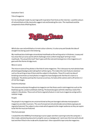
- 1. EvaluationTask1 Title of magazine For my mastheadi made my ownlogowithinspirationfromfontsonthe internet, i usedthe colours of redand black as th3y classically suggestrock andbreakingthe rules. The mastheadcouldbe comparedto that of RollingStone. Whichalso usesredand blackas itsmaincolour scheme,itisalsocurvyand breaksthe ideaof straightlinesbeingusedinthe lettering. My mastheadalsochallenges conventional mastheadsasthe writingvariesinthickness,iswavyand has areasthat jut outas pointswhichchallengesmore uniformshapingof writinginmost mastheads. The actual title itself ‘Harm’goeswiththe rockandmetal genresinthe magazine as it goeswiththe theme of edgymusic. Mise en scene The mise enscene of my photos islike thatof some magazines. Thisisbecause my mainphotoshave photoshoppedbackgrounds makingthemwhite orgrey.Thismakesthe mainfeaturesstandout such as the writingontop of themand the subjectinthe photos. These fitinwith myideaof breakingconventionsas mostphotosinmagazineshave backgrounds likethatof a room or a landscape.The photosportraythe musicianas serious,he looksatthe camera and is off centre in 2 of 3 of the images. Costume andprops The costume and propsthroughoutmymagazine are like those usedinrockmagazinessuchas the blackbass guitar, aviatorsandblack clothing.The beardalsogoeswiththe rebellious lookof the subjectinthe photos. These sortsof itemsregularlyfeature in real musicmagazines andgowitha rockstar image. People The people inmymagazine are unconventional astheyare teenagerswhereasmostpeoplein magazinesare oldermusicians. The use of one persononlyalsobreaksconventions asgroupsare regularlyfeatured.The subjectisalsoamale whichappealstothe target audience as theycan aspire to be like the musicianfeatured. Title fontandstyle I createdthe title HARMby firstdrawingit outon paper and thenscanningitonto the computer.I thenmade a photoshopdocumentusingthe scanas a background.I wentoverthe lineswithabrush tool and thenfilledinthe inside witha buckettool.Ithencopiedthislayerontothe magazines
- 2. pages. The textisntstraightwhich challengesmostconv3ntionsastextiscommonlystraightand uniformonmastheads. The textwill appealtoteensastheycommonlylike thingsthatgoagainst the rulesandconventionsof more grownupmagazines.Itgoeswithconventionsasitisthe largestand boldestwritingonthe page andstandsout fromeverythingelseonthe cover. Writtencontent The contentwritteninthe magazine goeswithconventionsof musicmagazinesasthe mainarticle is a Q&A withthe musicianinthe photos.The contentspage goeswithconventionsasithasheadings, subheadingsanddescriptionsof whatisonthe pages.The use of an editorsnote isconventional and bringsa friendlytone tothe magazine.Conventionsare followedbythe use of an introductory paragraph onthe double page spreadwhichtellsthe readerwhoisbeinginterviewedinthe article. Music genre andhow the magazine suggestsit My magazine showsitsgenre throughitsuse of mise enscene,contentandbandsfeaturedonthe contents/frontpage.These bandsare rock and metal bandsthat fitwiththe genre of the magazine and will hopefullyappealtothe audience.The use of black,white andredthroughoutgoesalong withthe theme of rock due to theirconnotationswiththe genre.The propuse goe withthe genre of rock and metal as the guitarand aviatorsare classicallyusedbybandsandrockstars. Layout My magazine layoutismainlyconventional due toitsuse of three columnsinthe double page spread,the double page spreadalsohasa starting paragraph, a large title atthe topof the page and the picture of the subjecthavingthe textwraparoundit.The contentspage hasthree areasof writingthatinclude article descriptions,alarge areaof thispage istakenup by three photosone of whichpertainstothe mainarticle,thisone islargerthan the otherpicturesso itstandsout and showsitis the mostimportantpart of the magazine.The frontpage goesalongwithconventionsas it hasa headeranda footerthat include bandnamesfeatured inthe magazine,ithasa bold mastheadinthe top leftcornerof the page andhas articlesdescribedonthe leftside of the page.It alsohas a barcode and price in the bottomrightcorner whichisnormal for magazines. Contents My contentspage follows codesandconventionsasitis gridlike anduniformlike thatof Qmagazine. It has an editorsnote whichmakesthe magazine seemmore personal andthe contentspage featuresmultiple pictureslike mostothermagazines.Thismeansthatmycontentsgoesalongwith manyconventionswhichdoesntparticularlyfitwithmyrebelliouslookof the magazine.