
Recommended
More Related Content
What's hot
What's hot (20)
Similar to Deconstruction cover page 1
Similar to Deconstruction cover page 1 (20)
Recently uploaded
Recently uploaded (20)
Deconstruction cover page 1
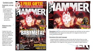
- 1. Content codes Denotation Gritty sans serif font for the masthead, sans serif fonts are also used on the whole cover of the magazine too keep with in its magazine (metal and rock music) conventional design Sex/gender and age used Young teen females Used to appeal to several audiences - Young teem males - Young teen girls who aspire to be like the celebrity's - Fans of the group/music Magazines extra content Freebies that come with the magazine, the reason this magazine does this is because its away for the consumers to believe that this is the best magazine to buy using tangible gifts to gain favouritism to the magazine as a whole Denotation font style/ language Using text written in Japanese as a way to stick with the theme they are using, having a Japanese rock/metal band on the front cover and also using the font is a good design on this magazines cover because it can appeal to larger audiences
- 2. Masthead Main cover line Rule of three Denotation- colour Technical Deconstruction This magazine metal hammer uses four colours on the cover; red, yellow, white and black this is because it’s a conventional rule for magazines to use no more than three to four colours on there covers, we can see this rule being used on this issue of metal hammer. Rule of Thirds and direct mode of address The cover image of the subjects uses direct mode of address, this means the subjects on the cover image looks directly at the audience to immerse the consumer into the media product in this case the magazine metal hammer. The masthead head is conventionally always at the top of the magazine. This magazine also uses super imposition with the masthead and the cover image, having some of the main cover image covering the magazines name, this is because the magazine metal hammer is strong enough to stand with out needing to see the entire name. the audience is very pacific and the audience that it targets would easily see what this magazine was just by seeing the word metal on the side, this is because the brand is so iconic and strong with its target audience. MS/ Medium shot Medium shot on the subject The main cover line is white, what this means is this magazine uses juxtaposition because of the contrast of colours, I.e. the what name and the dark blacks and reds cover image. Lighting The lighting is high key Denotation colour- white Using three words in the same way anchor text is used to draw in the reader and grip your attention Typography This magazine follows the rules that most magazines follow using no more than three to four font types and sizes Puff Used on the cover to help sell it, they’re used to grab the consumers attention. They are usually in a different colour than the cover image Barcode On the side of the magazine always at the bottom
- 3. Symbolic Deconstruction and theory's Star theory User and gratification theory Personal identification between the magazine and the audience – The audience builds a connection between them self's and the product Seeing some of them self's in the magazine and relating to it making them want to buy it. Entertainment- The audience seeks entertainment in any magazine that’s the point in buying it witch is why is present in this magazine. Escapism- The audience will go to the magazine as a way of escaping everyday life, this is why the magazine uses U&G theory to grab the attention of its target audience I.e. metal music fans to offer them an escape Needs-Once the target audience builds a personal connection with the product I.e. metal hammer they then feel they don’t just want to read it but the have too, this is why U&G is so affective for selling media because of the way it grabs its audience and creates a bond so strong it cant be easily broken, this is all present in this magazine because of the signs it connotes like the technical and symbolic codes I've already gone over. Richard Dyre’s star theory shows us how the media uses stars (celebrity's) to sell something, this can be something like a perfume bottle all the way up to a car. Star theory is less used in magazines than other media however it is still often used, for example in this magazine here the cover image is of baby metal a very parlour metal band in japan. Using them on there cover means they can appeal to a large audience with just one image. This is because although it’s a music magazine having fans of metal music reading it this particular copy of metal hammer can also appeal to fans of just baby metal. Star theory in magazines are solely used to appeal to more and larger audiences to sell more copy's of there magazine.
- 4. Compering two magazine covers from the same magazine- metal hammer Compering two different copies of metal hammer to test if they follow the same conventions of music magazines and to see if they are consistent. Both magazines use a similar sans serif font in its gritty style Both magazines also use only sans serif fonts on there covers The colour scheme that the magazine uses is consistent both magazines using white, red, yellow and black common colours used to represent the gothic look also relating to rock and metal music Both magazines have freebies of some kind that is included within the magazine Over all layout of the puffs, barcodes ect are fairly consistent on both magazines keeping with in the same design and theme of metal music magazines. Even though each magazine is different due to that issues theme they still follow the same rules ie fonts colours layout number of fonts ect keeping there design professional and consistent