This document analyzes the cover of an NME magazine featuring rapper Dizzee Rascal. It summarizes key elements of the cover design and what they convey about the magazine's target audience and goals. The masthead uses bright red text to symbolize passion for music. The main image features Dizzee Rascal in a graffiti-filled room, indicating the target audience is young males interested in youth culture. Various elements like the graffiti, bold text, and pull quotes are intended to attract this target demographic and make them want to purchase the magazine.
1. Connor Morewood Media Studies Coursework
AS Media Coursework: NME Cover Analysis.
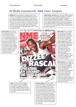
Masthead: The mastheadof this magazine coveris very
symbolic of the magazine’s passionregarding music due to
an arrayof variedways. One of which is the significance of
the bright redtypographyused;redfrequentlyconnotes to
passionwhich couldbe reflective ofDizzee Rascal’s opinion
towards hismusic and its effect. Thiscould be reinforcedby
his expressiononthe mainimage. This wouldbe incredibly
effective inattracting the target audience as theywould
notice the passionate waythat NME magazine refer to music
and respect that fact.
Main Image: The mainimage
portrays iconic rapperDizzee
Rascal squatting ina heavily
‘vandalised’ roomconsistingof
graffiti enclosed walls witha
medium shot. To begin, the
mise-en-scène ofthis image is
highlysuggestive to whothe
target audience actuallyconsists
of. Forexample, the graffiti on
the walls is highlyindicative of
youth culture andthe
stereotypicalactions that
surround the younger male
generation. This evidently
reflects the target
demographic/audience’s age
and genderand gives us a huge
insight into who NME target
their magazine towards.
Target Audience and Genre: By analysingthe NME magazine
cover provided, we candevelopandestablisha somewhat
moderatelyclear target audience andgenre including a
recognisedage andgender demographic. Judging by
numerous features andcharacteristics, we cantellthat this
music magazine targets the young, male sector ranging from
approximately15-20. We cantell this byanalysing various
inclusions onthe cover page (these willbe mentioned within
alternate analysis areas.
Main Coverline: This coverline is
anchoredto the mainimage and
an article within the magazine
via the storyregarding Dizzee
Rascal. The typographyis bold
and dominating clearly
illuminating its high priorityand
that it is the maincoverline.
Furthermore, a pull quote is
usedinorder to dragthe
audience’s attentionto the
storyand to entice the audience
into purchasingthe magazine to
discoverthe whereabouts and
meaningof this quote.
Barcode and Price: The corner ofthe
page clearlydisplays the barcode andthe
price of the magazine. I feel as ifthe
editors of the magazine have made the
executive decision to place these items
into the bottom corner inorder for it to
be hiddenuntil removed. This is done for
numerous reasons, primarilyto avoid
puttingof the audience byintroducinga
heftyfee. It mayalsohave been done to
indicate to the audience that profit is not
a huge aspect of the magazine andthat
the developers’ interest revolves around
the music that is referred to throughout
the magazine.
Colour Scheme: The cover of
this magazine seems to heavily
stick to a colour scheme
surroundingred and white.
From a connotationaspect, this
is anincrediblyabnormalmix as
red is often a symbol of passion,
danger, sex, etc while white
commonlyconnotes innocence
and almost a level of shyness.
The red maybe, again, another
symbol of the passionthat NME
has forthe subject music in the
magazine therefore enticing
audience members witha
similar characteristic.
Footer: The footer for this magazine
cover expressesallof the additional
artists that the magazine will refer to
during the magazine;thisfootertells us
that smaller articleswithinthe magazine
will revolve around Paramore, Jay-Zand
a few more.