SlideShare a Scribd company logo
1 of 7
Task 1- research into music magazines
Magazine – Kerrang“The bestsellingweeklyrockmagazine”
Genre – Alternate rock
Target audience – Aimedatteenagersandyoungeradults
Publisher– Bauermediagroup
Magazine – Fabulous
Genre – pop
Target audience – femalesof anyage
Publisher– The Sun
Magazine – Q magazines
Genre – Hip Hop,R&B
Target audience – olderpeople intheir30’s and40’s
Publisher- Bauer mediagroup
Task 2 - Detailed analysis of music magazine
The genre of musicmagazine thatI have chosentoresearchabout isrock.
Front cover
Typography
The font stylesacross the frontcoverare sans
serif.These fontshave beenusedtogive the
magazine a harderand more rockerlook. Sans-
serif isa more relaxedfontandthe musicwhichis
inKerrang magazine isnotthe relaxedtype asis
more heavyand sharp. The boldtextdrawsin
attentionthisisdone byhavinga lotof different
fontsizeslayereduponeachother. The master
headand headlinesthisisbecause thisiswhere
the audience lookfirsttodetermineif the
magazine isworthbuying,ornot.The genre being
rock needstobe dark, but alsoneedstostandout
thisiswhy contrastingfontcoloursare usedthisis
mostlywhite textonblackbackgroundsoryellow
texton blackbackgrounds.These coloursare
conventional forthe rockgenre ona front
magazine cover. The majorityof thistextis
capitalisedgivingitaloudand more energeticfeel
whichsitsthe rock genre verywell.
Colour
The main coloursusedonthisfrom coverare; black,white,yellowandred.
Black isassociatedwithpower,elegance,formality,death,evil,andmystery.Blackisamysterious
colourassociatedwithfearandthe unknown.Itusuallyhasa negative connotation(blacklist,black
humour,'blackdeath').Blackdenotesstrengthandauthority;itisconsideredtobe a veryformal,
elegant, andprestigious colour. Inheraldry,blackisthe symbol of grief.
White isassociatedwithlight,goodness,innocence,purity,andvirginity.Itisconsideredtobe the
colourof perfection.Whitemeanssafety,purity,andcleanliness.Asopposedtoblack,white usually
has a positive connotation.White canrepresentasuccessful beginning.Inheraldry,white depicts
faithand purity.HoweverIfeel itisjustusedtocontrast againstthe blackbackgroundas this
contrast worksveryeffectively.
Yellowisthe colourof sunshine.It'sassociatedwithjoy,happiness,intellect,andenergy.Yellow
producesa warmingeffect,arousescheerfulness,stimulatesmental activity,andgeneratesmuscle
energy.Yellow isoftenassociatedwithfood.Bright,pure yellow isanattentiongetter,whichisthe
reasontaxicabsare paintedthiscolour.Whenoverused,yellow mayhave adisturbingeffect;itis
knownthat babiescrymore in yellow rooms.Yellow isseenbeforeothercolourswhenplaced
againstblack;thiscombinationisoftenusedtoissue awarning.Inheraldry,yellow indicateshonour
and loyalty.Laterthe meaningof yellowwasconnectedwithcowardice.Ithinkthatthe designartist
choose yellowtogradto audience, itcouldalsobe an issue warningdue tothe explicitlanguage in
the majorityof rock songs.
Redis the colourof fire andblood,soit isassociatedwithenergy,war,danger,strength,power,
determinationaswell aspassion,desire,andlove.Redisaveryemotionallyintensecolour.It
enhances humanmetabolism, increasesrespirationrate,andraisesbloodpressure.Ithasveryhigh
visibility,whichiswhystopsigns,stoplights,andfire equipmentare usuallypaintedred.Inheraldry,
redis usedto indicate courage.Itisa colourfoundin manynational flags. Energyisthe main
connotationIget fromthe red onthe frontof thismagazine.
Image
The imagesappeal tothe audience becausetheyare imagesof celebritieswhomake musicforthat
genre.The artistsfeaturedare;
 Nirvanasfrontman Kurt Cobain
 All Time Low
 Paramore
 GuitaristSlashwithMylesKennedy
Thisis nota lotof imageshoweverthe image of KurtCobainisratherlargerand impliesthatitisthe
mainstory inthe magazine thisislikelytobe atleasta double page spread inthe magazine.
These celebritiesare all respectedinthe rockgenre.The mainshoton thismagazine isof Kurt
Cobainandis a mid-shothowevertheyare large enoughforthe audience tosee them.Thisislikely
to make people buyitbecause if theirfavouritecelebritiesare featuredtheywill wanttoreadthe
magazine tosee why.
Layout
As we can see fromthe coverthis front page has a cluttered
layout.The effectsof thismake the magazine have afunlookto it,
it alsomakesitlookas thoughthere isa large amountof content
available toreadmeaningitsmore costeffecttothe consumer.
From the image onthe rightwe can see that the coverfollowsthe
route of eye technique,thisiswhere the mainbulkof the
informationisinaZ formation. The principle of thirdsisalsoused
thisisa veryeffective techniqueforwhenthismagazine of on
storesshelfs.The isbecause whenonshelvesonlypartscan be
seeneitherthe leftthirdwherethe bigonthe name will be a
shownto showthat itsKerrangmagazine orthe topbannerwhich
showsParamore are in the magazine, thisisa technique usedby
the producerto make the magazine more popularandgain
audience coverage.
Language/Mode of address
The language usedonthe frontcoveris positive aboutthe magazinecontentanexampleof a
positive wordusedis“greatest”.The wordsalsolookgoodonthe page and scream outto the
audience thatitis an excitingmagazine,thisisdone bythe use of exclamationmarksorthe headline
and physiographicsbandnamesonthe lefthandside. The mode of addressisinformal Iknow this
because of the language usedsuchas “sickest”,thiswill appeal tothe audience because this
magazine shouldn’treadlikeatextbookor somethingalike.The tone of the magazine isveryupbeat
and lively,thisiscreatedformthe use of imagesandpatchesof brightcolours,thisisveryappealing
to the target audience andveryconventional forarock magazine,Kerrangmake all theirdesigns
similartothisone.
Conventions
Thismagazine isveryconventional formychosengenre. The colourblackisveryconventionalfora
rock magazine thisisbecause rocker are seento be people wholike dark colours,redisalsoa
conventional couldbecause itsymbolisesthe angerinthe rockmusicand oftenthe angerthe
rockersholdwithinthem.The masterheadgoingthe whole wayacrossthe widthof the magazine is
alsousedinabundance withrock magazine show thatthe noise producedislargerthanlife.The
informal textisalsopopularandconventionalinarock magazine,the story/contentswiththe
magazine are alsoconventional asitgoesoverpastevents,withthe industry.The people name
droppingisalsoconventional because if theydidn’tdothisitwouldbe as effective towardsthe
target audience.
Contents page
Typography
Typography
All of fonton the contentspage issans-
serif. Thisassuresthatthe sharp edgy
lookisconsistentacrossthe whole
magazine.There isa lotof texton this
age showingthatthe magazine is
crammedfull withexcitingmaterial. The
wayin whichthe headingsappearinthis
page makesit excitingandappealingto
the audience asit makesthe contents
seemexciting. The autographfontatthe
bottomof the page,to the leftstands
out andgivesa unique rockstar lookto
it.Similarlytothe frontpage there isuse
of an exclamationmarkwhichimplies
loudmusicand excitingcontext.
Colour
Thisis a contentspage froma differentKerrangissue howeveritstill usesthe same coloursasthe
previousone did,these are black,white,yellowandred. Blackisthe maincolourinthe image
coveringalmostthe tophalf of the page. The white isused as a good contrastingbackground
againstthe black andred textwhichisthe informationsectionof the contentspage.the yellow and
redare usedas textcoloursbecause theycontrastwell andappeal tothe rock genre,redisa very
appropriate colourforthe rock genre because of isconnotationof anger. The highlightedyellow
headingsconnote fun,thiswillattractreaderstothese pages.
Image
The numberof imagesonthe contentspage islimitedcomparedtothe amountonthe frontcover.
Thisallowsthe audience toappreciate the tidierlayoutinside, howeveritalsoshowsthe articles
that have an image withthem,andthis couldmean theyhave largerimportance withinthe
magazine. The large image at the top of the page isof rock legendSlash,thissetsthe rockgenre and
appealstothe target audience.There isalsosmallerimagesof otherkerrangmagazines,thisis an
advertisingsubscriptionforthe magazine itself. The mainimage onthe page isSlash it’sa close upof
hisface and parts of hisupperbody,thisisa dark image butshowsoff what he iswearingthiscould
appeal tothe audience if theywanttotry and lookmore like arock star. The otherimagesof male
celebritiesare alsomidshots,thisisveryconventional withthe rockgenre onthe contentspage,
and alsofrontcover,I will incorporate thisinmyfinal piece.
Layout
The layoutof the contentspage iscluttered;howeveritisslightlymore organisedthan the front
cover,a reasonfor thisisbox outsare usedthisallowsdifferentarticlestobe separated. This
magazine doesn'tuse the principleof thirds,howeveritdoesusedroute of eye, andthis wasalso
usedon the frontcover. It is likelythatthe route of eye isusedtocarry the audience intothe
magazine,thisallowsthemtosee the content, andthis alsogivesagoodflow throughoutthe
magazine.The wayinwhichthe page islaidoutis to encourage the audience toview the pages
whichtake up more space on thispage thisis done byrelatedimagesandpage numbersbythese
images. The layoutisinhalf the top half holdsthe majorityof the image,whilstthe bottomhalf
holdsthe textandinformation.
Language/Mode of address
The language usedforthe headingsisverylaidbackand approachable. Thisisdone bynot beingtoo
formal.The wordsusedare onesthatwouldbe familiartothe targetaudience meaningthatthey
are more likelytobuyitas theywill understanditanditwill be appropriatelyaimedatthem.The
wordchoice is alsoaimedtowardsthe rock audience,anexample isthe word"gig"thisisoftenused
insteadof showor performance inthe rockgenre. The majorityof the page comesacross in an
informal manor,thisallowspeople toreaditat theirfree will andalsotostopthe magazine coming
across like abroadsheetnewspaper,the informal appearanceis more funtoread and more
interestingintermsof appearance.
Conventions
Thisis a very conventional contentspage forthe rock genre. Itis alsoconventionalforKerrangto
have thislayout.Thislayoutmustbe successful otherwise theywouldn'tbe usingitas consistentlyas
theydo socurrently.The colouruse is very conventionaldue totheirrepresentations.The images
are alsoconventional tothisgenre because theyare midshotsandclose-upsthisallowsthe
audience tosee whothe photoisof, the audience are more likelytobuythe magazine if their
favourite celebritiesare include within itscontents. The amountof imagesisalsoconventionalas
theyare neededbutthere shouldbe lessthanonthe frontcover of the magazine. Thisisa very
typical contentspage forthe rock genre and alsothe for magazine Kerrangthemselves.
Double page spread
Typography
Most the fontson this
double page are sansserif,
thisgivesthe page a
masculine lookandfeel toit,
whichisappropriate because
of whatthe page isinforming
the readerabout. The part
that isn'tsans serif isthe
headline,serif isusedhereto
make the letteringeasierto
distinguishandisalsomore
visuallypleasingtothe eye.
A droppedcapital isalso
usedon thisdouble page
spread.There are several
differentfontsandfontsizes
usedon thisspread,this
givesita bold and interesting
look.The textisin bothred
and blackwhichaddscolour
to the page and contrasts
well withthe image onthe
pages.
Colour
The three colourson thisdouble page are;blackredand white.These three coloursare oftenused
for the hiphopgenre howeverinthiscase itis beingusedforrock.The redusedfor CoreyTayloris
givingconnotationthathe isan angry person,thisissuitable forthe angrylyricshe singsinthe
bandswhichhe’sin.The colourscontrast well againsteachotherandcomplementeachotherwell.
The white representpuritythiscouldbe because the page isaskingquestions,meaningthe answers
that he gives are honestandpure.
Image
There isone image withthisdouble page spread.The image onthe pagesisof CoreyTaylor,thisis
because thisparticulararticle isabouthim.The image isa mid-shotof him, fromthisimage we can
see CoreyTaylorstophalf.The image coversthe whole of the rightpage andalso comesoverthe
leftpage,itisconventional forthislayouttoappearina rock genre magazine.The leatherjacketin
the image isverystereotypical of arock star and the genre. These three colourstogethercanappear
quite aggressive,thisishowrockmusiccan come across towardsthe audience,rockersare also
consideredtobe aggressive people. The image isof CoreyTaylorwhoisleadvocalistof Slipknot,
thisappealstothe audience because Slipknotare arock brand appealingtomychosengenre.
Layout
The layoutis 60% image and the otherbeing40% text.The layoutisorganisedaseverythinghasa
designatedarea. The layoutistidiercomparedtothe contentspage andthe frontcover thisgivesa
professionalfeel tothe readerandcouldbe more appealingtothe targetaudience.Ifindthatthis
audience isexcitingandit’salsoveryconventionalforthisgenre,andmusicmagazinesingeneral.
Language/Mode of address
The mode of addressforthisdouble page spreadisformal,howeveritstill comesacrossina chatty
informal way.One wayinwhichitappearsis the use of language,awordusedon the double page
spreadis“pro” thisisshort forprofessional,if the magazine wantedtocome acrossformallythe
wordprofessional wouldbe usedinreplacementtoit.The language usedis familiartowhatthe
target audience are usedto,thismakesitmore appealing.
Conventions
Thisis a veryconventional double page spread formychosengenre.The coloursare verypopular
because of whattheyconnote can relate tothe rock genre andthe differentlyrics.The layoutwith
the image takingup a whole page isconventionalforthe rockgenre and all musicmagazinesin
general.Thisallowsthe audience tosee whothe celebrityisandcan alsoinfluencethemonthe
clothingtheywearsotheycan be more like theiricons.

More Related Content

What's hot

Unit 13 – LO1 Planning and Pitching a Print Based Media Product
Unit 13 – LO1   Planning and Pitching a Print Based Media Product Unit 13 – LO1   Planning and Pitching a Print Based Media Product
Unit 13 – LO1 Planning and Pitching a Print Based Media Product stamkostas3068
 
Planning most recent final final
Planning most recent final finalPlanning most recent final final
Planning most recent final finalEmilyPlenty
 
Planning most recent 101
Planning most recent 101Planning most recent 101
Planning most recent 101EmilyPlenty
 
Evaluation as production final version
Evaluation as production final versionEvaluation as production final version
Evaluation as production final versiontaytumc
 
Evaluation presentation
Evaluation presentationEvaluation presentation
Evaluation presentationheatheraveyard
 
Media evaluation powerpoint
Media evaluation powerpointMedia evaluation powerpoint
Media evaluation powerpointemilyjayne66
 
Evaluation of my AS Production
Evaluation of my AS ProductionEvaluation of my AS Production
Evaluation of my AS Productiontaytumc
 
Media Magazine Evaluation
Media Magazine EvaluationMedia Magazine Evaluation
Media Magazine EvaluationLennon Riley
 
Media Evaluation
Media EvaluationMedia Evaluation
Media EvaluationT-Welf
 
Media evaluation
Media evaluationMedia evaluation
Media evaluationEm Leeman
 
Music magazine – the evaluation final
Music magazine – the evaluation finalMusic magazine – the evaluation final
Music magazine – the evaluation finalRach7
 

What's hot (20)

Evaluation
EvaluationEvaluation
Evaluation
 
Evaluation11
Evaluation11Evaluation11
Evaluation11
 
Evaluation11
Evaluation11Evaluation11
Evaluation11
 
Unit 13 – LO1 Planning and Pitching a Print Based Media Product
Unit 13 – LO1   Planning and Pitching a Print Based Media Product Unit 13 – LO1   Planning and Pitching a Print Based Media Product
Unit 13 – LO1 Planning and Pitching a Print Based Media Product
 
Planning most recent final final
Planning most recent final finalPlanning most recent final final
Planning most recent final final
 
Deconstruction
DeconstructionDeconstruction
Deconstruction
 
Planning most recent 101
Planning most recent 101Planning most recent 101
Planning most recent 101
 
Unit 13 LO2
Unit 13 LO2Unit 13 LO2
Unit 13 LO2
 
Evaluation
EvaluationEvaluation
Evaluation
 
Evaluation 1
Evaluation 1Evaluation 1
Evaluation 1
 
Evaluation as production final version
Evaluation as production final versionEvaluation as production final version
Evaluation as production final version
 
As Media Log Book
As Media Log BookAs Media Log Book
As Media Log Book
 
Evaluation presentation
Evaluation presentationEvaluation presentation
Evaluation presentation
 
Media evaluation powerpoint
Media evaluation powerpointMedia evaluation powerpoint
Media evaluation powerpoint
 
Evaluation of my AS Production
Evaluation of my AS ProductionEvaluation of my AS Production
Evaluation of my AS Production
 
Media Magazine Evaluation
Media Magazine EvaluationMedia Magazine Evaluation
Media Magazine Evaluation
 
Media Evaluation
Media EvaluationMedia Evaluation
Media Evaluation
 
Lo2
Lo2Lo2
Lo2
 
Media evaluation
Media evaluationMedia evaluation
Media evaluation
 
Music magazine – the evaluation final
Music magazine – the evaluation finalMusic magazine – the evaluation final
Music magazine – the evaluation final
 

Viewers also liked

Promotional package analysis
Promotional package analysisPromotional package analysis
Promotional package analysisCharlieAimee24
 
Fish2.0MarketReport_Aquaponics
Fish2.0MarketReport_AquaponicsFish2.0MarketReport_Aquaponics
Fish2.0MarketReport_AquaponicsAlexandra Jostrom
 
The box craft art products catalogue
The box craft art   products catalogueThe box craft art   products catalogue
The box craft art products catalogueTr ??
 
Asthma
AsthmaAsthma
Asthmalawba
 

Viewers also liked (10)

Risk assessment
Risk assessmentRisk assessment
Risk assessment
 
Character profile
Character profileCharacter profile
Character profile
 
Updated CV
Updated CVUpdated CV
Updated CV
 
Film Trailer Analysis
Film Trailer AnalysisFilm Trailer Analysis
Film Trailer Analysis
 
Promotional package analysis
Promotional package analysisPromotional package analysis
Promotional package analysis
 
Fish2.0MarketReport_Aquaponics
Fish2.0MarketReport_AquaponicsFish2.0MarketReport_Aquaponics
Fish2.0MarketReport_Aquaponics
 
Програма Erasmus+
Програма Erasmus+Програма Erasmus+
Програма Erasmus+
 
The box craft art products catalogue
The box craft art   products catalogueThe box craft art   products catalogue
The box craft art products catalogue
 
Asthma
AsthmaAsthma
Asthma
 
Question 3 - ReDo
Question 3 - ReDoQuestion 3 - ReDo
Question 3 - ReDo
 

Similar to Task 1 + 2

Choosing a genre
Choosing a genreChoosing a genre
Choosing a genreasmediad14
 
Choosing a genre
Choosing a genreChoosing a genre
Choosing a genreasmediad14
 
Research into existing music magazines
Research into existing music magazinesResearch into existing music magazines
Research into existing music magazinesjessicamaythorpe
 
Music magazine research
Music magazine researchMusic magazine research
Music magazine researchbroganlan
 
textual analysis
textual analysistextual analysis
textual analysisbroganl4
 
Question one final
Question one finalQuestion one final
Question one finalkellym003
 
Textual Analysis of Cover Pages
Textual Analysis of Cover PagesTextual Analysis of Cover Pages
Textual Analysis of Cover PagesKiya Cussans
 
Music magazine research
Music magazine researchMusic magazine research
Music magazine researchbroganl4
 
Front cover analysis.
Front cover analysis.Front cover analysis.
Front cover analysis.AmyShields00
 
Task 2 max watts
Task 2 max wattsTask 2 max watts
Task 2 max wattsMax Watts
 
Task 2 max watts
Task 2 max wattsTask 2 max watts
Task 2 max wattsMax Watts
 
Evaluation Presentation
Evaluation PresentationEvaluation Presentation
Evaluation PresentationSamMarie1023
 

Similar to Task 1 + 2 (20)

Task 1 + 2
Task 1 + 2Task 1 + 2
Task 1 + 2
 
Choosing a genre
Choosing a genreChoosing a genre
Choosing a genre
 
Choosing a genre
Choosing a genreChoosing a genre
Choosing a genre
 
Eval 2
Eval 2Eval 2
Eval 2
 
Research into existing music magazines
Research into existing music magazinesResearch into existing music magazines
Research into existing music magazines
 
Music magazine research
Music magazine researchMusic magazine research
Music magazine research
 
textual analysis
textual analysistextual analysis
textual analysis
 
Question one final
Question one finalQuestion one final
Question one final
 
Textual Analysis of Cover Pages
Textual Analysis of Cover PagesTextual Analysis of Cover Pages
Textual Analysis of Cover Pages
 
Music magazine research
Music magazine researchMusic magazine research
Music magazine research
 
Market research1
Market research1Market research1
Market research1
 
Finipre
FinipreFinipre
Finipre
 
Finipre
FinipreFinipre
Finipre
 
1. research f
1. research f1. research f
1. research f
 
Front cover analysis.
Front cover analysis.Front cover analysis.
Front cover analysis.
 
Task 2 max watts
Task 2 max wattsTask 2 max watts
Task 2 max watts
 
Task 2 max watts
Task 2 max wattsTask 2 max watts
Task 2 max watts
 
Tex analysis
Tex analysisTex analysis
Tex analysis
 
Evaluation Presentation
Evaluation PresentationEvaluation Presentation
Evaluation Presentation
 
ANALYSIS OF FRONT COVERS
ANALYSIS OF FRONT COVERSANALYSIS OF FRONT COVERS
ANALYSIS OF FRONT COVERS
 

Recently uploaded

History Class XII Ch. 3 Kinship, Caste and Class (1).pptx
History Class XII Ch. 3 Kinship, Caste and Class (1).pptxHistory Class XII Ch. 3 Kinship, Caste and Class (1).pptx
History Class XII Ch. 3 Kinship, Caste and Class (1).pptxsocialsciencegdgrohi
 
भारत-रोम व्यापार.pptx, Indo-Roman Trade,
भारत-रोम व्यापार.pptx, Indo-Roman Trade,भारत-रोम व्यापार.pptx, Indo-Roman Trade,
भारत-रोम व्यापार.pptx, Indo-Roman Trade,Virag Sontakke
 
Painted Grey Ware.pptx, PGW Culture of India
Painted Grey Ware.pptx, PGW Culture of IndiaPainted Grey Ware.pptx, PGW Culture of India
Painted Grey Ware.pptx, PGW Culture of IndiaVirag Sontakke
 
ENGLISH5 QUARTER4 MODULE1 WEEK1-3 How Visual and Multimedia Elements.pptx
ENGLISH5 QUARTER4 MODULE1 WEEK1-3 How Visual and Multimedia Elements.pptxENGLISH5 QUARTER4 MODULE1 WEEK1-3 How Visual and Multimedia Elements.pptx
ENGLISH5 QUARTER4 MODULE1 WEEK1-3 How Visual and Multimedia Elements.pptxAnaBeatriceAblay2
 
SOCIAL AND HISTORICAL CONTEXT - LFTVD.pptx
SOCIAL AND HISTORICAL CONTEXT - LFTVD.pptxSOCIAL AND HISTORICAL CONTEXT - LFTVD.pptx
SOCIAL AND HISTORICAL CONTEXT - LFTVD.pptxiammrhaywood
 
Paris 2024 Olympic Geographies - an activity
Paris 2024 Olympic Geographies - an activityParis 2024 Olympic Geographies - an activity
Paris 2024 Olympic Geographies - an activityGeoBlogs
 
Alper Gobel In Media Res Media Component
Alper Gobel In Media Res Media ComponentAlper Gobel In Media Res Media Component
Alper Gobel In Media Res Media ComponentInMediaRes1
 
_Math 4-Q4 Week 5.pptx Steps in Collecting Data
_Math 4-Q4 Week 5.pptx Steps in Collecting Data_Math 4-Q4 Week 5.pptx Steps in Collecting Data
_Math 4-Q4 Week 5.pptx Steps in Collecting DataJhengPantaleon
 
“Oh GOSH! Reflecting on Hackteria's Collaborative Practices in a Global Do-It...
“Oh GOSH! Reflecting on Hackteria's Collaborative Practices in a Global Do-It...“Oh GOSH! Reflecting on Hackteria's Collaborative Practices in a Global Do-It...
“Oh GOSH! Reflecting on Hackteria's Collaborative Practices in a Global Do-It...Marc Dusseiller Dusjagr
 
call girls in Kamla Market (DELHI) 🔝 >༒9953330565🔝 genuine Escort Service 🔝✔️✔️
call girls in Kamla Market (DELHI) 🔝 >༒9953330565🔝 genuine Escort Service 🔝✔️✔️call girls in Kamla Market (DELHI) 🔝 >༒9953330565🔝 genuine Escort Service 🔝✔️✔️
call girls in Kamla Market (DELHI) 🔝 >༒9953330565🔝 genuine Escort Service 🔝✔️✔️9953056974 Low Rate Call Girls In Saket, Delhi NCR
 
The Most Excellent Way | 1 Corinthians 13
The Most Excellent Way | 1 Corinthians 13The Most Excellent Way | 1 Corinthians 13
The Most Excellent Way | 1 Corinthians 13Steve Thomason
 
Sanyam Choudhary Chemistry practical.pdf
Sanyam Choudhary Chemistry practical.pdfSanyam Choudhary Chemistry practical.pdf
Sanyam Choudhary Chemistry practical.pdfsanyamsingh5019
 
Class 11 Legal Studies Ch-1 Concept of State .pdf
Class 11 Legal Studies Ch-1 Concept of State .pdfClass 11 Legal Studies Ch-1 Concept of State .pdf
Class 11 Legal Studies Ch-1 Concept of State .pdfakmcokerachita
 
Presiding Officer Training module 2024 lok sabha elections
Presiding Officer Training module 2024 lok sabha electionsPresiding Officer Training module 2024 lok sabha elections
Presiding Officer Training module 2024 lok sabha electionsanshu789521
 
Proudly South Africa powerpoint Thorisha.pptx
Proudly South Africa powerpoint Thorisha.pptxProudly South Africa powerpoint Thorisha.pptx
Proudly South Africa powerpoint Thorisha.pptxthorishapillay1
 
POINT- BIOCHEMISTRY SEM 2 ENZYMES UNIT 5.pptx
POINT- BIOCHEMISTRY SEM 2 ENZYMES UNIT 5.pptxPOINT- BIOCHEMISTRY SEM 2 ENZYMES UNIT 5.pptx
POINT- BIOCHEMISTRY SEM 2 ENZYMES UNIT 5.pptxSayali Powar
 
Science lesson Moon for 4th quarter lesson
Science lesson Moon for 4th quarter lessonScience lesson Moon for 4th quarter lesson
Science lesson Moon for 4th quarter lessonJericReyAuditor
 

Recently uploaded (20)

History Class XII Ch. 3 Kinship, Caste and Class (1).pptx
History Class XII Ch. 3 Kinship, Caste and Class (1).pptxHistory Class XII Ch. 3 Kinship, Caste and Class (1).pptx
History Class XII Ch. 3 Kinship, Caste and Class (1).pptx
 
भारत-रोम व्यापार.pptx, Indo-Roman Trade,
भारत-रोम व्यापार.pptx, Indo-Roman Trade,भारत-रोम व्यापार.pptx, Indo-Roman Trade,
भारत-रोम व्यापार.pptx, Indo-Roman Trade,
 
Painted Grey Ware.pptx, PGW Culture of India
Painted Grey Ware.pptx, PGW Culture of IndiaPainted Grey Ware.pptx, PGW Culture of India
Painted Grey Ware.pptx, PGW Culture of India
 
ENGLISH5 QUARTER4 MODULE1 WEEK1-3 How Visual and Multimedia Elements.pptx
ENGLISH5 QUARTER4 MODULE1 WEEK1-3 How Visual and Multimedia Elements.pptxENGLISH5 QUARTER4 MODULE1 WEEK1-3 How Visual and Multimedia Elements.pptx
ENGLISH5 QUARTER4 MODULE1 WEEK1-3 How Visual and Multimedia Elements.pptx
 
SOCIAL AND HISTORICAL CONTEXT - LFTVD.pptx
SOCIAL AND HISTORICAL CONTEXT - LFTVD.pptxSOCIAL AND HISTORICAL CONTEXT - LFTVD.pptx
SOCIAL AND HISTORICAL CONTEXT - LFTVD.pptx
 
Paris 2024 Olympic Geographies - an activity
Paris 2024 Olympic Geographies - an activityParis 2024 Olympic Geographies - an activity
Paris 2024 Olympic Geographies - an activity
 
Alper Gobel In Media Res Media Component
Alper Gobel In Media Res Media ComponentAlper Gobel In Media Res Media Component
Alper Gobel In Media Res Media Component
 
_Math 4-Q4 Week 5.pptx Steps in Collecting Data
_Math 4-Q4 Week 5.pptx Steps in Collecting Data_Math 4-Q4 Week 5.pptx Steps in Collecting Data
_Math 4-Q4 Week 5.pptx Steps in Collecting Data
 
“Oh GOSH! Reflecting on Hackteria's Collaborative Practices in a Global Do-It...
“Oh GOSH! Reflecting on Hackteria's Collaborative Practices in a Global Do-It...“Oh GOSH! Reflecting on Hackteria's Collaborative Practices in a Global Do-It...
“Oh GOSH! Reflecting on Hackteria's Collaborative Practices in a Global Do-It...
 
call girls in Kamla Market (DELHI) 🔝 >༒9953330565🔝 genuine Escort Service 🔝✔️✔️
call girls in Kamla Market (DELHI) 🔝 >༒9953330565🔝 genuine Escort Service 🔝✔️✔️call girls in Kamla Market (DELHI) 🔝 >༒9953330565🔝 genuine Escort Service 🔝✔️✔️
call girls in Kamla Market (DELHI) 🔝 >༒9953330565🔝 genuine Escort Service 🔝✔️✔️
 
The Most Excellent Way | 1 Corinthians 13
The Most Excellent Way | 1 Corinthians 13The Most Excellent Way | 1 Corinthians 13
The Most Excellent Way | 1 Corinthians 13
 
Sanyam Choudhary Chemistry practical.pdf
Sanyam Choudhary Chemistry practical.pdfSanyam Choudhary Chemistry practical.pdf
Sanyam Choudhary Chemistry practical.pdf
 
Class 11 Legal Studies Ch-1 Concept of State .pdf
Class 11 Legal Studies Ch-1 Concept of State .pdfClass 11 Legal Studies Ch-1 Concept of State .pdf
Class 11 Legal Studies Ch-1 Concept of State .pdf
 
9953330565 Low Rate Call Girls In Rohini Delhi NCR
9953330565 Low Rate Call Girls In Rohini  Delhi NCR9953330565 Low Rate Call Girls In Rohini  Delhi NCR
9953330565 Low Rate Call Girls In Rohini Delhi NCR
 
Staff of Color (SOC) Retention Efforts DDSD
Staff of Color (SOC) Retention Efforts DDSDStaff of Color (SOC) Retention Efforts DDSD
Staff of Color (SOC) Retention Efforts DDSD
 
Presiding Officer Training module 2024 lok sabha elections
Presiding Officer Training module 2024 lok sabha electionsPresiding Officer Training module 2024 lok sabha elections
Presiding Officer Training module 2024 lok sabha elections
 
Proudly South Africa powerpoint Thorisha.pptx
Proudly South Africa powerpoint Thorisha.pptxProudly South Africa powerpoint Thorisha.pptx
Proudly South Africa powerpoint Thorisha.pptx
 
POINT- BIOCHEMISTRY SEM 2 ENZYMES UNIT 5.pptx
POINT- BIOCHEMISTRY SEM 2 ENZYMES UNIT 5.pptxPOINT- BIOCHEMISTRY SEM 2 ENZYMES UNIT 5.pptx
POINT- BIOCHEMISTRY SEM 2 ENZYMES UNIT 5.pptx
 
Science lesson Moon for 4th quarter lesson
Science lesson Moon for 4th quarter lessonScience lesson Moon for 4th quarter lesson
Science lesson Moon for 4th quarter lesson
 
TataKelola dan KamSiber Kecerdasan Buatan v022.pdf
TataKelola dan KamSiber Kecerdasan Buatan v022.pdfTataKelola dan KamSiber Kecerdasan Buatan v022.pdf
TataKelola dan KamSiber Kecerdasan Buatan v022.pdf
 

Task 1 + 2

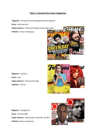
  • 1. Task 1- research into music magazines Magazine – Kerrang“The bestsellingweeklyrockmagazine” Genre – Alternate rock Target audience – Aimedatteenagersandyoungeradults Publisher– Bauermediagroup Magazine – Fabulous Genre – pop Target audience – femalesof anyage Publisher– The Sun Magazine – Q magazines Genre – Hip Hop,R&B Target audience – olderpeople intheir30’s and40’s Publisher- Bauer mediagroup
  • 2. Task 2 - Detailed analysis of music magazine The genre of musicmagazine thatI have chosentoresearchabout isrock. Front cover Typography The font stylesacross the frontcoverare sans serif.These fontshave beenusedtogive the magazine a harderand more rockerlook. Sans- serif isa more relaxedfontandthe musicwhichis inKerrang magazine isnotthe relaxedtype asis more heavyand sharp. The boldtextdrawsin attentionthisisdone byhavinga lotof different fontsizeslayereduponeachother. The master headand headlinesthisisbecause thisiswhere the audience lookfirsttodetermineif the magazine isworthbuying,ornot.The genre being rock needstobe dark, but alsoneedstostandout thisiswhy contrastingfontcoloursare usedthisis mostlywhite textonblackbackgroundsoryellow texton blackbackgrounds.These coloursare conventional forthe rockgenre ona front magazine cover. The majorityof thistextis capitalisedgivingitaloudand more energeticfeel whichsitsthe rock genre verywell. Colour The main coloursusedonthisfrom coverare; black,white,yellowandred. Black isassociatedwithpower,elegance,formality,death,evil,andmystery.Blackisamysterious colourassociatedwithfearandthe unknown.Itusuallyhasa negative connotation(blacklist,black humour,'blackdeath').Blackdenotesstrengthandauthority;itisconsideredtobe a veryformal, elegant, andprestigious colour. Inheraldry,blackisthe symbol of grief. White isassociatedwithlight,goodness,innocence,purity,andvirginity.Itisconsideredtobe the colourof perfection.Whitemeanssafety,purity,andcleanliness.Asopposedtoblack,white usually has a positive connotation.White canrepresentasuccessful beginning.Inheraldry,white depicts faithand purity.HoweverIfeel itisjustusedtocontrast againstthe blackbackgroundas this contrast worksveryeffectively. Yellowisthe colourof sunshine.It'sassociatedwithjoy,happiness,intellect,andenergy.Yellow producesa warmingeffect,arousescheerfulness,stimulatesmental activity,andgeneratesmuscle energy.Yellow isoftenassociatedwithfood.Bright,pure yellow isanattentiongetter,whichisthe reasontaxicabsare paintedthiscolour.Whenoverused,yellow mayhave adisturbingeffect;itis
  • 3. knownthat babiescrymore in yellow rooms.Yellow isseenbeforeothercolourswhenplaced againstblack;thiscombinationisoftenusedtoissue awarning.Inheraldry,yellow indicateshonour and loyalty.Laterthe meaningof yellowwasconnectedwithcowardice.Ithinkthatthe designartist choose yellowtogradto audience, itcouldalsobe an issue warningdue tothe explicitlanguage in the majorityof rock songs. Redis the colourof fire andblood,soit isassociatedwithenergy,war,danger,strength,power, determinationaswell aspassion,desire,andlove.Redisaveryemotionallyintensecolour.It enhances humanmetabolism, increasesrespirationrate,andraisesbloodpressure.Ithasveryhigh visibility,whichiswhystopsigns,stoplights,andfire equipmentare usuallypaintedred.Inheraldry, redis usedto indicate courage.Itisa colourfoundin manynational flags. Energyisthe main connotationIget fromthe red onthe frontof thismagazine. Image The imagesappeal tothe audience becausetheyare imagesof celebritieswhomake musicforthat genre.The artistsfeaturedare;  Nirvanasfrontman Kurt Cobain  All Time Low  Paramore  GuitaristSlashwithMylesKennedy Thisis nota lotof imageshoweverthe image of KurtCobainisratherlargerand impliesthatitisthe mainstory inthe magazine thisislikelytobe atleasta double page spread inthe magazine. These celebritiesare all respectedinthe rockgenre.The mainshoton thismagazine isof Kurt Cobainandis a mid-shothowevertheyare large enoughforthe audience tosee them.Thisislikely to make people buyitbecause if theirfavouritecelebritiesare featuredtheywill wanttoreadthe magazine tosee why. Layout As we can see fromthe coverthis front page has a cluttered layout.The effectsof thismake the magazine have afunlookto it, it alsomakesitlookas thoughthere isa large amountof content available toreadmeaningitsmore costeffecttothe consumer. From the image onthe rightwe can see that the coverfollowsthe route of eye technique,thisiswhere the mainbulkof the informationisinaZ formation. The principle of thirdsisalsoused thisisa veryeffective techniqueforwhenthismagazine of on storesshelfs.The isbecause whenonshelvesonlypartscan be seeneitherthe leftthirdwherethe bigonthe name will be a shownto showthat itsKerrangmagazine orthe topbannerwhich showsParamore are in the magazine, thisisa technique usedby the producerto make the magazine more popularandgain audience coverage.
  • 4. Language/Mode of address The language usedonthe frontcoveris positive aboutthe magazinecontentanexampleof a positive wordusedis“greatest”.The wordsalsolookgoodonthe page and scream outto the audience thatitis an excitingmagazine,thisisdone bythe use of exclamationmarksorthe headline and physiographicsbandnamesonthe lefthandside. The mode of addressisinformal Iknow this because of the language usedsuchas “sickest”,thiswill appeal tothe audience because this magazine shouldn’treadlikeatextbookor somethingalike.The tone of the magazine isveryupbeat and lively,thisiscreatedformthe use of imagesandpatchesof brightcolours,thisisveryappealing to the target audience andveryconventional forarock magazine,Kerrangmake all theirdesigns similartothisone. Conventions Thismagazine isveryconventional formychosengenre. The colourblackisveryconventionalfora rock magazine thisisbecause rocker are seento be people wholike dark colours,redisalsoa conventional couldbecause itsymbolisesthe angerinthe rockmusicand oftenthe angerthe rockersholdwithinthem.The masterheadgoingthe whole wayacrossthe widthof the magazine is alsousedinabundance withrock magazine show thatthe noise producedislargerthanlife.The informal textisalsopopularandconventionalinarock magazine,the story/contentswiththe magazine are alsoconventional asitgoesoverpastevents,withthe industry.The people name droppingisalsoconventional because if theydidn’tdothisitwouldbe as effective towardsthe target audience. Contents page Typography Typography All of fonton the contentspage issans- serif. Thisassuresthatthe sharp edgy lookisconsistentacrossthe whole magazine.There isa lotof texton this age showingthatthe magazine is crammedfull withexcitingmaterial. The wayin whichthe headingsappearinthis page makesit excitingandappealingto the audience asit makesthe contents seemexciting. The autographfontatthe bottomof the page,to the leftstands out andgivesa unique rockstar lookto it.Similarlytothe frontpage there isuse of an exclamationmarkwhichimplies loudmusicand excitingcontext.
  • 5. Colour Thisis a contentspage froma differentKerrangissue howeveritstill usesthe same coloursasthe previousone did,these are black,white,yellowandred. Blackisthe maincolourinthe image coveringalmostthe tophalf of the page. The white isused as a good contrastingbackground againstthe black andred textwhichisthe informationsectionof the contentspage.the yellow and redare usedas textcoloursbecause theycontrastwell andappeal tothe rock genre,redisa very appropriate colourforthe rock genre because of isconnotationof anger. The highlightedyellow headingsconnote fun,thiswillattractreaderstothese pages. Image The numberof imagesonthe contentspage islimitedcomparedtothe amountonthe frontcover. Thisallowsthe audience toappreciate the tidierlayoutinside, howeveritalsoshowsthe articles that have an image withthem,andthis couldmean theyhave largerimportance withinthe magazine. The large image at the top of the page isof rock legendSlash,thissetsthe rockgenre and appealstothe target audience.There isalsosmallerimagesof otherkerrangmagazines,thisis an advertisingsubscriptionforthe magazine itself. The mainimage onthe page isSlash it’sa close upof hisface and parts of hisupperbody,thisisa dark image butshowsoff what he iswearingthiscould appeal tothe audience if theywanttotry and lookmore like arock star. The otherimagesof male celebritiesare alsomidshots,thisisveryconventional withthe rockgenre onthe contentspage, and alsofrontcover,I will incorporate thisinmyfinal piece. Layout The layoutof the contentspage iscluttered;howeveritisslightlymore organisedthan the front cover,a reasonfor thisisbox outsare usedthisallowsdifferentarticlestobe separated. This magazine doesn'tuse the principleof thirds,howeveritdoesusedroute of eye, andthis wasalso usedon the frontcover. It is likelythatthe route of eye isusedtocarry the audience intothe magazine,thisallowsthemtosee the content, andthis alsogivesagoodflow throughoutthe magazine.The wayinwhichthe page islaidoutis to encourage the audience toview the pages whichtake up more space on thispage thisis done byrelatedimagesandpage numbersbythese images. The layoutisinhalf the top half holdsthe majorityof the image,whilstthe bottomhalf holdsthe textandinformation. Language/Mode of address The language usedforthe headingsisverylaidbackand approachable. Thisisdone bynot beingtoo formal.The wordsusedare onesthatwouldbe familiartothe targetaudience meaningthatthey are more likelytobuyitas theywill understanditanditwill be appropriatelyaimedatthem.The wordchoice is alsoaimedtowardsthe rock audience,anexample isthe word"gig"thisisoftenused insteadof showor performance inthe rockgenre. The majorityof the page comesacross in an informal manor,thisallowspeople toreaditat theirfree will andalsotostopthe magazine coming across like abroadsheetnewspaper,the informal appearanceis more funtoread and more interestingintermsof appearance.
  • 6. Conventions Thisis a very conventional contentspage forthe rock genre. Itis alsoconventionalforKerrangto have thislayout.Thislayoutmustbe successful otherwise theywouldn'tbe usingitas consistentlyas theydo socurrently.The colouruse is very conventionaldue totheirrepresentations.The images are alsoconventional tothisgenre because theyare midshotsandclose-upsthisallowsthe audience tosee whothe photoisof, the audience are more likelytobuythe magazine if their favourite celebritiesare include within itscontents. The amountof imagesisalsoconventionalas theyare neededbutthere shouldbe lessthanonthe frontcover of the magazine. Thisisa very typical contentspage forthe rock genre and alsothe for magazine Kerrangthemselves. Double page spread Typography Most the fontson this double page are sansserif, thisgivesthe page a masculine lookandfeel toit, whichisappropriate because of whatthe page isinforming the readerabout. The part that isn'tsans serif isthe headline,serif isusedhereto make the letteringeasierto distinguishandisalsomore visuallypleasingtothe eye. A droppedcapital isalso usedon thisdouble page spread.There are several differentfontsandfontsizes usedon thisspread,this givesita bold and interesting look.The textisin bothred and blackwhichaddscolour to the page and contrasts well withthe image onthe pages.
  • 7. Colour The three colourson thisdouble page are;blackredand white.These three coloursare oftenused for the hiphopgenre howeverinthiscase itis beingusedforrock.The redusedfor CoreyTayloris givingconnotationthathe isan angry person,thisissuitable forthe angrylyricshe singsinthe bandswhichhe’sin.The colourscontrast well againsteachotherandcomplementeachotherwell. The white representpuritythiscouldbe because the page isaskingquestions,meaningthe answers that he gives are honestandpure. Image There isone image withthisdouble page spread.The image onthe pagesisof CoreyTaylor,thisis because thisparticulararticle isabouthim.The image isa mid-shotof him, fromthisimage we can see CoreyTaylorstophalf.The image coversthe whole of the rightpage andalso comesoverthe leftpage,itisconventional forthislayouttoappearina rock genre magazine.The leatherjacketin the image isverystereotypical of arock star and the genre. These three colourstogethercanappear quite aggressive,thisishowrockmusiccan come across towardsthe audience,rockersare also consideredtobe aggressive people. The image isof CoreyTaylorwhoisleadvocalistof Slipknot, thisappealstothe audience because Slipknotare arock brand appealingtomychosengenre. Layout The layoutis 60% image and the otherbeing40% text.The layoutisorganisedaseverythinghasa designatedarea. The layoutistidiercomparedtothe contentspage andthe frontcover thisgivesa professionalfeel tothe readerandcouldbe more appealingtothe targetaudience.Ifindthatthis audience isexcitingandit’salsoveryconventionalforthisgenre,andmusicmagazinesingeneral. Language/Mode of address The mode of addressforthisdouble page spreadisformal,howeveritstill comesacrossina chatty informal way.One wayinwhichitappearsis the use of language,awordusedon the double page spreadis“pro” thisisshort forprofessional,if the magazine wantedtocome acrossformallythe wordprofessional wouldbe usedinreplacementtoit.The language usedis familiartowhatthe target audience are usedto,thismakesitmore appealing. Conventions Thisis a veryconventional double page spread formychosengenre.The coloursare verypopular because of whattheyconnote can relate tothe rock genre andthe differentlyrics.The layoutwith the image takingup a whole page isconventionalforthe rockgenre and all musicmagazinesin general.Thisallowsthe audience tosee whothe celebrityisandcan alsoinfluencethemonthe clothingtheywearsotheycan be more like theiricons.