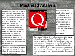
1. Masthead Analysis
The name ‘Q’ is a
single letter which is
unorthodox for a
magazine masthead
however it has been
effective since it is
very unique. Such
uniqueness makes it
stand out and catches
the attention of
audiences.
The choice of white and red colour scheme makes it very
eye-catching and impactful for the audience. The
white/red could be related to the Templars red cross and
white garments which became a symbol of justice. Road
signs also use the combination of red and white as it is
very eye-catching. The red is very dominant and powerful
as it is represents colours of strong emotions however the
white is more subtle and in turn, balances the dominating
red.
In terms of size, the red square is
very rough and finely edged. No
effort of blurring the edges have
been made and this suggests that
it was meant to be bold to really
stand out. The letter ‘Q’ is
oversized purposefully to
elaborate its importance. The
shape of the masthead is very
clear-cut and simple, in all of its
magazine covers, it overlaps the
main image which is done
intentionally to maintain its
importance for the audience.
Clearly the masthead’s awareness
to the audience is very important
for Q Magazine.
The shape of the letter ‘Q‘ is quite
significant as it has serifs which
elegantly curve to give the unique
shape to the letter Q.
2. ‘Billboard’ masthead design is
simple and subtle. This is
emphasised by its positioning in
most magazine front covers
behind the main image. Billboard
also connotes its own definition
as advertisement which most
people see on the side of a
motorway or in the road however
don’t take too notice of them.
Billboard’s effect as behind its
images makes it interesting as its
placement works in synergy with
its definition.
Billboard font is simple, san-serif style of font. Such simplicity
may have been done to take the audiences' attention away
from the masthead and direct it towards other texts or features
on the magazine cover. On the other hand, by placing it behind
the main image, the magazine could be intentionally making
audiences figure what the entire word could mean and by
doing so they have already attracted the audiences attention. It
could be a simple but effective tactic to attract the audiences
attention. This can also explain the choice of the yellowish
colour fill in the letter ‘d’. Drawing the audiences attention to
the beginning and end to direct their attention to the
magazine.
The colour scheme is very
simple, bold black letters based
on a white background which
expresses a degree of class.
Billboard connotes a degree of contemporary design where
simplicity gives it a sense of uniqueness in its own right. This
resonates a degree of honesty as it isn’t trying hard to attract
audiences therefore, it can be assumed that the content in the
magazine contains honest articles instead of loose celebrity
gossip. This can be appealing to young adults.
3. ‘Rolling Stone’ is a well recognised an
popular music magazine as it covers wide-
genres of music. The font style reflects the
swinging 60s/70s/80s style of music ‘Rock n
roll’ which was prominent and fashionable.
Through this, it can appeal to the mid-aged
music industry fans who have experienced
music develop through the years. By doing
so, the magazine is able to tailor for a wide
audience and so gain more attention. The
italics gives it a sense of relaxed and ease.
The prominent colour of red with a white outline
accompanied by a black shadow which is clear-cut and
quite rounded is a unique design. The combination of
the 3 colours works effectively as they do not
contradict each other yet each colour stands out
undermining the other colours. It is very eye-catching
since red is very enticing and draws the attention of
audiences. The shadow makes it appear 3-D which
emphasises its importance and creates a sense of
modernity which can appeal to contemporary
audiences.
The masthead position is normally found
behind the main image which could suggest
how in this instance ‘Rick Ross’ on the front
cover is a fan of Rolling stones. This
promotes the magazine and makes it also
appeal to Rick Ross’ fans thus, the
masthead behind the main image is quite
effective from this perspective.
The name of the masthead can be very appealing to
audiences as my personal opinion at first was
controversial as the font style contrasted the main
image. The font reflects the Rock n Roll ages which
put me off but then the images indicate the
contemporary music stars which made me feel that
the magazine would contain the type of content that
I’d be interested in. This feeling may be shared by
wider audiences alike.
The main image ‘Rick Ross’ supports what
the masthead is trying to connote, ‘crazy,
wreck less and uncontrollable’ nature that
music resonates.
4. This edition of ‘Vibe’s masthead design is quite
different. On this occasion, the style of the font
has been tailored to suit the main image of an
attractive lady. This could be how VIBE tries to
appeal to its audiences by reflecting their
magazine masthead to the main image which
elaborates the type of audience they’re aiming
for.
The font style is quite sensualised as feminine.
This is shown by the light shade of red which is
transparent revealing the top part of the main
image behind it. The transparentness also works
in-hand with the elegance of the main image and
the feminine aspect of the magazine which is
appealing to a female audience. The fade of the
masthead from red to white is effective in drawing
the audience's attention to the main image of the
female. A combination of such aspects makes the
masthead appealing to audiences.
The meaning of the masthead itself ‘VIBE’ is
quite appealing to contemporary audiences. This
is because it can be interpreted in the way music
has a ‘good vibe’. This can appeal to younger,
more in-touch with the music industry, clubs,
raves and parties in contrast to the mature
generations. Therefore ‘VIBE’ is an appropriate
name to reflect the wants of needs of modern
audiences. The design also infers a sense of
‘feeling’ the music which is again, a reach-out to
contemporary audiences by VIBE magazine. The
‘V’ in VIBE can be interpreted as their signature
design as it almost appears to be in italics
however something different altogether. By
doing so, VIBE has made its magazine name
better recogniseable which contributes to its
audience base.
The masthead is portrayed as simple by its style of
shape. It lacks any indication of serifs that could
suggest its expressing a serious and firm image to
audiences.
5. The font style of XXL is unique as it is bold
which reflects the meaning that the
magazine is inferring. Each letter is closely
positioned to each other to emphasise the
masthead as a whole and not by each letter.
This makes it stand-out and draw the
audiences attention.
The meaning of the
masthead itself stands out
in its own right as ‘XXL’
really does appeal to
people in many terms.
Firstly, ‘XXL’ can connote
the ‘American’ way of
living i.e. living large which
audiences can be
attracted to as they can
expect popular celebrities
and artists. XXL can also
appeal to audiences in
terms of clothing size,
‘large’ people can feel that
this magazine appeals to
them as it promotes
anything extra.. extra large
spinning it as something
fashionable.
The use of red and white
colours are simple yet
effective as they are
really eye-catching to
people (why they are
used in road signs). Red
is a provocative colour
and its combination with
white balances out the
strong colour. This can
appeal to audiences as it
is the combination of the
name and use of colour
is quite boisterous which
is easily recognisable
and memorable.
The shape of the masthead is rectangular which is simple and can work
alongside the shape of the magazine cover. The shape isn’t screaming at the
audience however its subtleness is enough to draw the attention of the
audience. It’s positioning behind the main image is stylistic as it tries to draw
attention to the artist in fact, it is also draws attention to itself as audiences
are curious to know what the letter behind the image is. More importantly, the
contrast of red/white of the masthead to the black/white main image really
pronounces its position on the magazine as its eye-catching.