
Recommended
More Related Content
What's hot
What's hot (20)
Viewers also liked
Viewers also liked (11)
Similar to Kerrang! magazine front cover analysis
Similar to Kerrang! magazine front cover analysis (20)
Recently uploaded
Recently uploaded (20)
Kerrang! magazine front cover analysis
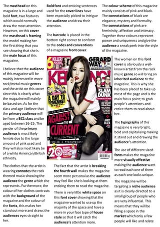
- 1. The masthead on this magazine is in a large and bold font, two features which would normally draw the most attention. However, on this cover the masthead is framing the model making her the firstthing that you see showing that she is the main focus of this magazine. The barcode is placed in the bottom right corner to conform to the codes and conventions of a magazine front cover. The colour scheme of this magazine mainly consists of pink and black. The connotations of black are elegance, mystery and formality. The connotations of pink are femininity, affection and intimacy. Together these colours represent power and uniqueness and give the audience a sneak peek into the style of the magazine. Boldfont and enticing sentences used for the cover lines have been especially picked to intrigue the audience and draw their attention. I believe that the audience of this magazinewill be mainly interested in more rock/metal music genres and the artist on this cover since this is clearly what the magazinewill mainly be based on. As for the class and age I believe that the primary audience will be from a BC1 class and be aged between 16-25. The gender of the primary audience is mostlikely female due to the large amount of pink used and they will also most likely be of a white American/British ethnicity. The women on this font cover is obviously a well- known artistfrom the rock music genre so will bring an inheritedaudience to the magazine. This is why she has been placed to take up most of the page and is the main focus point; to grab people’s attentions and entice them to read about her. The typography of this magazine is very bright, bold and capitalising making it stand out and drawing the audience’s attention. The use of different sized fonts makes the magazine more visually effective making the audience want to read each one of them as each one looks unique. The clothes that the artist is wearing connotes the rock themed music showing the audience the genre which she represents. Furthermore, the colour of her clothes contrasts with the background of the magazine and the colour of the fonts, this makes her stand out more and draws the audiences eyes straightto her. The fact that the artistis breaking the fourthwall makes the magazine seem more personalas the audience may feel like she is looking at them enticing them to read the magazine. The magazine will be targeting a niche audience as it is clearly directed to a small group of people who are very influential. This means that they will be filling a spacein the market which only a few people will like and relate There is very little white space on this font cover showing thatthe magazine wanted to useup the majority of the space and havea more in your face type of house style so that it will catch the audience’s attention more.