
Recommended
More Related Content
What's hot
What's hot (20)
Viewers also liked
Viewers also liked (9)
Similar to Magazine Design Elements
Similar to Magazine Design Elements (20)
Recently uploaded
Recently uploaded (20)
Magazine Design Elements
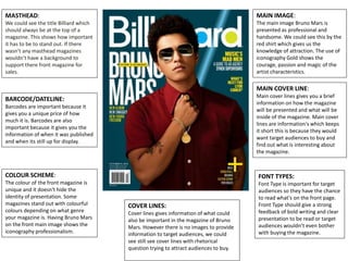
- 1. MASTHEAD: We could see the title Billiard which should always be at the top of a magazine. This shows how important it has to be to stand out. If there wasn’t any masthead magazines wouldn’t have a background to support there front magazine for sales. COVER LINES: Cover lines gives information of what could also be important in the magazine of Bruno Mars. However there is no images to provide information to target audiences, we could see still see cover lines with rhetorical question trying to attract audiences to buy. FONT TYPES: Font Type is important for target audiences so they have the chance to read what's on the front page. Front Type should give a strong feedback of bold writing and clear presentation to be read or target audiences wouldn’t even bother with buying the magazine. COLOUR SCHEME: The colour of the front magazine is unique and it doesn't hide the identity of presentation. Some magazines stand out with colourful colours depending on what genre your magazine is. Having Bruno Mars on the front main image shows the iconography professionalism. MAIN COVER LINE: Main cover lines gives you a brief information on how the magazine will be presented and what will be inside of the magazine. Main cover lines are information's which keeps it short this is because they would want target audiences to buy and find out what is interesting about the magazine. MAIN IMAGE: The main image Bruno Mars is presented as professional and handsome. We could see this by the red shirt which gives us the knowledge of attraction. The use of iconography Gold shows the courage, passion and magic of the artist characteristics. BARCODE/DATELINE: Barcodes are important because it gives you a unique price of how much it is. Barcodes are also important because it gives you the information of when it was published and when its still up for display.
- 2. MASTHEAD: The title vibe shows the importance for targeted audiences, however this magazine is a mass magazine and has a wider range of audiences. The title vibe gives a information of its open to age categories of teenagers, this means unemployment and students could read this magazine. Vibe refers back to many teenagers because it gives a brief description of gossips and information of the artist which is going to take place. COVER LINES: Cover lines which is displayed on the font page gives an brief explanation of what will be in the magazine. A short sentence which is shown on a front page magazine will depend on the information if it attracts audiences and if it is interesting enough for mass audiences to buy the magazine. FONT TYPES: Font type shows that information has been provided with bubble writing but isn’t in a professional and unique standard to stand out to audiences and isn’t presented in the correct writing font. This makes the magazine look unprofessional in their standard of code of conduct. COLOUR SCHEME: The colour shows us that it is very colourful and could be a magazine for lower classes which could afford this magazine. Having the use of different colours shows that it isn’t in a professional format for audiences like higher classes which expect something better. The colour white, green, black and red shows audiences the attraction of money, danger and etc. MAIN COVER LINE: The main cover line is provided with many information and details which gives audiences of description to buy the magazine to see what's inside. MAIN IMAGE: The Main image shows a massive change in the front magazine. This is because the rhetorical question shows a implication of audiences being worried. This shows stereotypically that audiences isn’t used to seeing Chris Brown in this sort of manner, because he is usually in a smart format and is an artist that cares about his clothing and his representation towards the industry. BARCODE/DATELINE: The barcode on this magazine is important to audiences to give them provided information on how much the magazine will be.
- 3. MASTHEAD: In this Magazine the title Vibe Is in a professional standard. The colour red implicates the image Of Jay- Z and is showing the manner of the front magazine. COVER LINES: Cover lines which is displayed on the font page gives an brief explanation of what will be in the magazine. This also shows the importance's in the population of mass audiences buying the magazine and how it will be worked out according to the standard of writing. The more written information the more it attracts audiences view. FONT TYPES: Font types is presented in a correct manner and is clear in the format of audiences reaction. The font has a massive impact on the design of how the magazine is going to look and what professionalism standard will it be presented as. COLOUR SCHEME: The colour looks unique and serious. The colours on the front magazine gives an information to target audience. The colour red is usually used for danger, courage, passion and etc. which gives an outstanding attraction, the colour blue implicates the theme and is used for the main image of Jay-Z because he is serious. MAIN COVER LINE: The main cover line provides audiences with more information. The use of bold writing and clear presentation shows the effort which has been accorded to this magazine. MAIN IMAGE: The Main image is focused and it is highly presented in the format of a music magazine. The main image showing Jay-Z gives a professional background and is used to attract audiences. BARCODE/DATELINE: The barcode is important on a front page magazine this is because it will give information to buyer how much it is and the issue date of the barcode.