
Recommended
More Related Content
What's hot
What's hot (20)
Similar to Task 3a
Similar to Task 3a (20)
Recently uploaded
Recently uploaded (20)
Task 3a
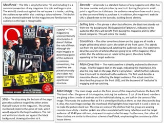
- 1. Masthead – The title is simply the letter ‘Q’ and including it is a common convention of any magazine. It is bold and large in size. The white Q stands out against the red square it is inside, catching the audiences eye whilst also creating a colour scheme . This builds a house theme/trademark for the magazine and familiarises the audience as the logo is recognisable. Main Image – The main image used on the front cover of this magazine features the band U2. This band reflect the genre of this magazine, enticing the audience. 2 out of the 4 band members are giving a direct mode of address and the individuals doing so, are both in the centre of the image. This makes the audience feel as if it is aimed specifically at them, so that they want to buy it. Also, the main image overlaps the masthead, this highlights how important it is and is done so to make the picture stand out. The mise-en-scene of the clothes that the group are wearing connote masculinity – leather jackets are often associated with being rebellious and the target audience of 30-40 year old men, may want to aspire to be this way. Furthermore, the colour of these clothes are similar to the colour scheme of red/black, emphasising the consistency of the house theme. Barcode – A barcode is a standard feature of any magazine and often has the issue number and price directly next to it. Putting the price in small print is significant as it distracts the audience away from how much it costs, so they are more likely to purchase it. In addition, the magazine’s website URL is placed next to the barcode, building brand identity. Selling Line – This phrase is short but effective, the black text stands out from the red background. The buzzword of ‘greatest’, indicates to the audience that they will benefit from buying this magazine and no other brand compares- This will entice the reader. Coverlines – The other coverlines shown on this page are all inside a bright yellow strip which covers the width of the front cover. This stands out from the dark background, catching the audiences eye. The statements describe a variety of articles that are going to be in the magazine, these artists that the articles are on relate to the genre, therefore further appealing to the target audience. Main Coverline – The main coverline is directly anchored to the main image. It is the biggest text on the page, indicating the importance. It is also the only text on the page that’s in grey/silver, which further indicates how it is meant to stand out to the audience. The font used denotes a masculine theme, reflecting the target audience. The actual coverline describes the group on the front (U2), and the buzzword of ‘exclusive’ is engaging and eye-catching. Layout – This magazine is unconventionally structured as it doesn’t follow the rule of thirds. Although the main image is in direct focal point of the audience (a common convention), the coverlines are placed unusually and it does not appear to follow a particular structure. Strip– The strip along the bottom of the page gives the audience insight into other artists that will feature in the magazine.. The artists mentioned relate to the genre of rock, which would appeal to the target audience. The red and white text stands out against the black background, drawing attention to it.