
Recommended
More Related Content
What's hot
What's hot (18)
Similar to AS Media Coursework: Research and Planning Task 2a Contents Page NME Analysis.
Similar to AS Media Coursework: Research and Planning Task 2a Contents Page NME Analysis. (20)
Recently uploaded
Recently uploaded (20)
AS Media Coursework: Research and Planning Task 2a Contents Page NME Analysis.
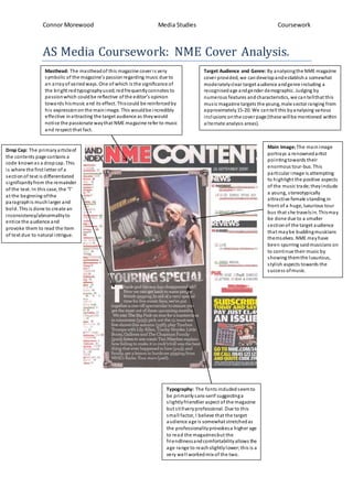
- 1. Connor Morewood Media Studies Coursework AS Media Coursework: NME Cover Analysis. Masthead: The mastheadof this magazine coveris very symbolic of the magazine’s passionregarding music due to an arrayof variedways.One of which is the significance of the bright redtypographyused;redfrequentlyconnotes to passionwhich couldbe reflective ofthe editor’s opinion towards hismusic and its effect. Thiscould be reinforcedby his expressionon the mainimage. This wouldbe incredibly effective inattracting the target audience as theywould notice the passionate waythat NME magazine referto music and respect that fact. Main Image: The mainimage portrays a renownedartist pointingtowards their enormous tour-bus. This particularimage is attempting to highlight the positive aspects of the music trade; theyinclude a young, stereotypically attractive female standing in front of a huge, luxurious tour bus that she travelsin. Thismay be done due to a smaller sectionof the target audience that maybe buddingmusicians themselves. NME mayhave been spurring saidmusicians on to continue their music by showing themthe luxurious, stylish aspects towards the success ofmusic. Target Audience and Genre: By analysingthe NME magazine cover provided, we candevelopandestablisha somewhat moderatelyclear target audience andgenre including a recognisedage andgender demographic. Judging by numerous features andcharacteristics, we cantellthat this music magazine targets the young, male sector ranging from approximately15-20. We cantell this byanalysing various inclusions onthe cover page (these willbe mentioned within alternate analysis areas). Typography: The fonts includedseemto be primarilysans-serif suggestinga slightlyfriendlier aspect of the magazine but stillveryprofessional. Due to this small factor, I believe that the target audience age is somewhat stretchedas the professionalityprovokesa higherage to read the magazinesbut the friendlinessandcomfortabilityallows the age range to reachslightlylower;this is a very well workedmix of the two. Drop Cap: The primaryarticleof the contents page contains a code knownas a dropcap. This is where the first letter of a sectionof text is differentiated significantlyfrom the remainder of the text. In this case, the ‘T’ at the beginning ofthe paragraphis muchlarger and bold. This is done to create an inconsistency/abnormalityto entice the audience and provoke them to read the item of text due to natural intrigue.