
Recommended
More Related Content
What's hot
What's hot (20)
Similar to Magazine cover analysis1
Similar to Magazine cover analysis1 (20)
More from heatherjanew
More from heatherjanew (20)
Recently uploaded
Recently uploaded (20)
Magazine cover analysis1
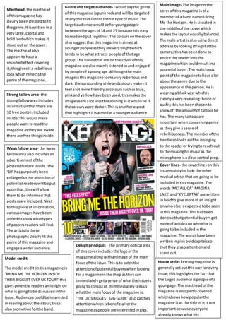
- 1. Masthead- the masthead of this magazine has clearly been created to fit the genre. It is written in a very large, capital and bold font which makes it stand out on the cover. The masthead also appears to have a smashed effect covering it; this gives it a rebellious look which reflects the genre of the magazine. Genre and target audience- I would say the genre of this magazine is punk rock and will be targeted at anyone that listens to that type of music. The target audience would be for young people between the ages of 14 and 25 because it is easy to read and put together. The colours on the cover also suggest that this magazine is aimed at younger people as they are very bright which tends to be what attracts people of that age group. The bands that are on the cover of this magazine are also mainly listened to and enjoyed by people of a young age. Although the main image is this magazine looks very rebellious and dark, the surrounding style and colours makes it feel a lot more friendly as colours such as blue, pink and yellow have been used, this makes the image seem a lot less threatening as it would be if the colours were darker. This is another aspect that highlights it is aimed at a younger audience. Main image- The image on the cover of this magazine is of a member of a band named Bring Me the Horizon. He is situated in the middle of the cover which makes the layout equally balanced. The male artist is also using direct address by looking straight at the camera; this has been done to entice the reader into the magazine which could result in a potential buyer. The main focus point of the magazine tells us a lot about the genre due to the appearance of the person. He is wearing a black vest which is clearly a very revealing choice of outfit; this has been chosen to show off the amount of tattoos he has. The many tattoos are important when concerning genre as they give a sense of rebelliousness. The member of the band also looks as if he is singing to the reader or trying to reach out to them using his music as the microphone is a clear central prop. Strong fallow area- the strong fallow area includes information that there are 10 free posters included inside; this would make people want to read the magazine as they are aware there are free things inside. Weak fallow area- the weak fallow area also includes an advertisement of the posters that are inside. The ‘10’ has purposely been enlarged so the attention of potential readers will be put upon that, this will allow them to be informed that posters are included. Next to this piece of information, various images have been added to show what types of posters readers will find. The artists in these photographs clearly fit the genre of this magazine and engage a wider audience. Cover lines- the cover lines on this issue mainly include the other musical artists that are going to be included in this magazine. The words ‘METALLICA’ ‘MADINA LAKE’ and ‘KVELERTAK’ are written in bold to give more of an insight on who else is expected to be seen in this magazine. This has been done so that potential buyers get more of an idea on who else is going to be included in the magazine. The words have been written in pink bold capitals so that they grasp attention and stand out. Model credit- The model credit on this magazine is ‘BRING ME THE HORIZEN INSIDE THEIR BIGGEST EVER UK TOUR!’ this gives potential readers an insight on what is going to be discussed in the issue. Audiences could be interested in reading about their tour; this is also promotion for the band. Design principals - The primary optical area of this cover includes the logo of the magazine along with an image of the main focus of the issue. This is to catch the attention of potential buyers when looking for a magazine in the shop as they can immediately get a sense of what the issue is going to consist of. It immediately tells us what the main focus of the magazine is. ‘THE UK’S BIGGEST GIG GUIDE’ also catches attention which is beneficial for the magazine as people are interested in gigs. House style- kerrang magazine is generally set out this way for every issue; this highlights the fact that the target audience is people of a young age. The masthead of the magazine is also partly covered which shows how popular the magazine is as the title of it is not important because everyone already knows what it is .