
Recommended
More Related Content
What's hot
What's hot (17)
Viewers also liked
Viewers also liked (18)
Similar to AS Media Coursework: My Own Contents Analysis.
Similar to AS Media Coursework: My Own Contents Analysis. (20)
Recently uploaded
Recently uploaded (20)
AS Media Coursework: My Own Contents Analysis.
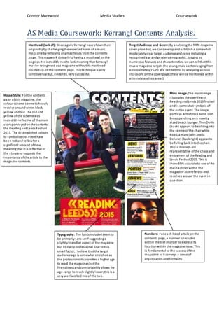
- 1. Connor Morewood Media Studies Coursework AS Media Coursework: Kerrang! Contents Analysis. Masthead (lack of): Once again, Kerrang! have showntheir originalitybychallengingthe expected norm of a music magazine byremoving anymastheads fromthe contents page. This maywork similarlyto havinga masthead onthe page as it is incrediblyrare to lack meaning that Kerrang! maybe recognised as a magazine without its masthead hoistedup onthe contents page. Thistechnique is very controversial but, evidently, verysuccessful. Main Image: The mainimage illustrates the overviewof ReadingandLeeds 2015 festival and is somewhat symbolic of the entire event. The image portrays Britishrock band, Don Broco perching ona novelty sizedbeach lounger. TomDoyle (back) appears to be sliding into the centre ofthe chairwhile Rob Damiani (left) and Si Delaney(back right) appear to be falling back intothe chair. These mishaps are representative ofthe chaos and enjoyment of the Reading and Leeds Festival 2015. This is incrediblyaccurate to one of the mainarticleswithin the magazine as it refers to and revolves around the event in question. Target Audience and Genre: By analysingthe NME magazine cover provided, we candevelopandestablisha somewhat moderatelyclear target audience andgenre including a recognisedage andgender demographic. Judging by numerous features andcharacteristics, we cantellthat this music magazine targets the young, male sector ranging from approximately15-20. We cantell this byanalysing various inclusions onthe cover page (these willbe mentioned within alternate analysis areas). Typography: The fonts includedseemto be primarilysans-serif suggestinga slightlyfriendlier aspect of the magazine but stillveryprofessional. Due to this small factor, I believe that the target audience age is somewhat stretchedas the professionalityprovokesa higherage to read the magazinesbut the friendlinessandcomfortabilityallows the age range to reachslightlylower;this is a very well workedmix of the two. House Style: For the contents page ofthis magazine, the colour scheme seems to heavily revolve aroundwhite, black, yellow andred. The redand yellow of the scheme was incrediblyreflective of the main storyportrayedonthe contents: the Readingand Leeds Festival 2015. The distinguished colours to symbolise this event have been red andyellowfora significant amount oftime meaningthat it is reflective of the storyand suggests the importance of the article to the magazine contents. Numbers: For each listed article onthe contents page, a numberis included within the text inorder to express its locationwithin the magazine issue. This is fundamental to the successof the magazine as it conveys a sense of organisationandformality.