SlideShare a Scribd company logo
1 of 10
Web address to show magazines multimedia format. The Masthead is bright and eye catching and has a union Jack design which is symbolic of the mod culture the magazine is aimed at in an attempt to engage with the reader. The graphic feature is set on a Union Jack flag which is contrasting to the background making it stand out clearer. Cover lines are in red to stand out and they are all end of year specials and music related so they tie in with it being a December issue The flash is in relation to the graphic feature and is a competition, the kind of idea that came from various other magazines The Kickers are in red, white and blue which stand out against the background and are the main colours of the target design associated with mod culture. Bar Code Headline is big and has a metallic effect to make it stand out and draw attention to it. Feature article photo is big and clear and the mode of address is directly at the camera in an almost intimidating pose to tie in with the rebellious nature of mod culture Menu strip is written in white so that it stands out against the photograph and it also fits in with the colour scheme.
Heading is bright and clearly visible. It is a play on the magazine title so because of this it has the same design with the Union Jack lettering. Date of Issue so readers can keep up to date.  Sub-Headings are blue so they stand out against the white background and a few of them are play-on-words of songs by the Jam who were one of the key bands during the mod period. Different picture for contents page than on the front cover, which is common in most magazines such as NME or Rolling Stone. The picture is clear and the mans shirt makes him stand out against the white wall. The Readership profile showed that alcohol was a prominent part in mod culture and this is why the location is a pub. The mode of address is away from the camera and towards the pool table and he is also smiling which is referenced in the caption underneath. The colours red, white and blue are continued throughout as they were prominent colours of the mods Advert is bright and eye catching it uses the same magazine cover to make it relevant and also highlights the multimedia aspect of the magazine. The arrows are in blue which make them stand out and is a colour involved in the house style. They were also an image that featured prominently in images found as part of my research.
Heading and quotes at the top of the page are dark and clear and introduce the article and capture the audiences attention at the same time. The two headings at the top incorporate arrows which have appeared prominently throughout my research and are a part of my house style. Also because the arrows appear in my research using them in headings like this make the reader feel more comfortable and includes them more Article includes mock-up of and album cover. This tested my photoshop skills and also I attempted to make the cover simple yet artistic which is why I chose the black and white colour scheme. Also on the cover the men are stood in an outdoor area where graffiti is present this appeals to the audience as it would be familiar to them because it was a popular image for mod bands at the time to be pictured outdoors.  Incorporating a pull quote into my main article made use of the photoshop skills I have developed. The pull quote talks of going beyond one generation, this word appeared frequently in my research of bands at the time of the mod revival. Also it appeals to the reader and involves them because the magazine is aimed to wards those who were interested in mod culture so these people would be interested in a previous generation. Feature article main photo is large and clear and the mode of address  is in different directions and away from the camera this makes the band looking interesting and appealing to the audience and the tough stance will be familiar for readers who are used to seeing pictures of the clash and the Jam. The clothes that they’re wearing are black which ties in with the text of the main article.
There is an added image at the top of the page which adds an extra dimension to the page. He is pictured as looking across the heading which will draw the readers attention to this. He is positioned stood on an arrow which will be familiar to the audience as they appear throughout. Also with one foot up he looks casual and relaxed and this will appeal to the reader as it makes the band look more normal and approachable. The arrow itself is pointing towards the extra heading which draws the readers attention to it. The mod target logo appears a lot across the top of the page as an additional background to  a heading, this not only appeals to the reader because it is  a familiar part of the mod iconography but because it also adds colour to the page. The background uses graffiti to give the magazine a more edgy look. Also the red colour is part of my house style and is a familiar colour to the audience and it also makes the page stand out because it adds more colour. Also because the main image stands out against the background it draws attention to the picture. It also gives the impression that the men are stood in front of the graffiti which will appeal to readers as they will be familiar seeing Paul Weller and other bands like the clash being pictured this way. Page numbers are familiar to readers as they are a common part of most magazines, it also appeals to the readers as it makes the magazine more easily navagatable.  Down the sidebar there are readers  comments on the album which will appeal to the audience as they will feel that they can contribute towards the magazine and it also involves them.
Mod culture is the social group targeted with my magazine and this is represented throughout the magazine with my house style in particular with the colour scheme being iconic mod colours e.g. red, white and blue. The stance of the group on the front cover is commanding which is impressive to that culture as they were known to be rebellious. This is also apparent in the Union Jack lettering which is also a symbol associated with the UK and the Mods were notoriously known to be patriotic according to my own research.  The setting for the magazine article referenced on the contents page is set within a pub because my research concluded that drinking was a major part in the mod lifestyle.  The Graffiti background of the double page spread will be familiar to Mods as they are used to seeing bands at the time e.g. The Jam being pictured in front of urbanised walls covered with graffiti. The song titles referenced in sub-headings on the contents page are songs which were around at the time of mod culture and will be very familiar to those in this sub-culture.
The clothes worn are not stereotypical mod clothes, however this was an effect I wanted as my magazine is a new innovation and I wanted to mix old mod ideas with new designs. The smart shirt mixed with a tie was somewhat typical of the time for smarter occasions and nowadays the look is more sported by veterans of the mod era such as Paul Weller, However I decided against a tailored jacket to give the photo a bit more informality in an attempt to make the photo a little edgier.  The smart black jacket worn by the other person was to give a somewhat contrasting style for example, the smart shirt/tie against a flat cap and jacket, however I wanted to maintain a dark/black colour scheme to show cohesion within the group and also I wanted the dark colours to contrast against the colourful nature of the front cover and also in the double page spread I wanted the dark colours to contrast against the white of the page. The jacket idea came from research into bands of the time like the Clash who wore smart/casual jackets with attitude, hence the focused and driven look to camera by the band.
IPC Media would be a good publisher for the magazine because they are the leading publisher in the market, and they would have more capital to devote to my magazine. My idea of a Mod Magazine is a niche market, so would probably be best suited to a smaller publisher, however IPC have a wide range of niche magazines. These are examples of 3 male orientated magazines and I have chosen them as examples because my magazine is a more male orientated magazine. For this reason IPC would be the main candidate for publishing because one of its main targets is men in general. The Mod era itself is known for its very “laddish” behaviour and it is this characteristic of my magazine that would be similar to “Nuts” magazine which is the leading men's magazine aimed at the devil may care male which was stereotypical of my genre. Also IPC  publish NME magazine which is a music magazine like mine and it is one of their top sellers’ however my magazine is not that similar so would be something different. My magazine also has an online aspect which would probably be best catered for by a smaller publisher, however the marketing potential IPC could offer would be far bigger e.g. TV and radio.
The target audience would be males either interested or involved in mod culture: The look: The Music: The average age of a mod who was alive at the time of the mod revival would be around 40-50. These men/women are now likely to have children who may share their interests. Because alcohol and drinking is a significant part in mod culture the magazine itself would probably be best aimed at the 18-45 range. Although with magazines like this one e.g. music magazines, the readership age would be slightly lower. However the 18-45 market covers about 91% of the readership in the case of the NME so I would expect these results would be similar with my magazine.
The magazine has an online aspect to get readers involved with the magazine on the internet. This is referenced on the double page spread where in the sidebar there are readers comments that were submitted via the internet. At the bottom of the sidebar the magazine personally thanks readers for submitting comments to create a sense that the magazine cares for its readers and it serves to give the readers a sense of belonging. Some of the language used in the articles were symbolic of mod culture, the mods were notorious for fighting and boisterous behaviour this is why I used the term “hits you like a well-timed punch in the face”. On the contents page there is the advert to subscribe to the magazine this also uses exclamation points to emphasise and it also catches the eye to create a sort of buzz about the advert. On the cover the price is clearly displayed, at £2 it is cheaper than the average music magazine e.g. NME and it is through this the magazine can maintain readers interest because if it was too expensive or even the same price as a mainstream magazine it would fail to sell because of its niche appeal. The front cover offers the readers a chance to win something, this creates a sense of excitement and will maintain the readers interest if they think that with every magazine comes with the chance to win something. This excitement also helps to create a further buzz around a smaller magazine. The colours of the magazine and the constant use of a union jack flag and the target symbol are familiar to those in mod culture and offers them a sense of belonging to something which speaks to them and has the same iconography as their culture.
Looking back at my designs of the college magazine I realised that throughout the magazine design process I have needed to learn new skills so I could make the magazine more attractive and user friendly. By making my music magazine far more colourful on the front than the college magazine it draws attention to it and by using the colours associated with the genre it appeals to that culture because of its sense of familiarity. Also on the contents page I have learned I needed to be a lot more precise with words and give a more detailed account  of what the reader should expect from the magazine, I chose to do this by adding more information on the front cover and giving more information in the contents page.  With the college magazine I decided that to follow the same colour scheme on to the contents page e.g. black and white, this I feel was a good decision for maintaining a house style but it was not as exciting or as well laid out as it could have been. This is where I had to learn how to create a more constructive contents page, that was appropriate for my genre of magazine. I achieved this through sub-headings and a more clever use of imagery. I used more camera techniques than on the college magazine also to really connect with the genre and make the magazine look more professional by using different modes of address.

More Related Content

What's hot

As media course work- evaluation
As media course work- evaluationAs media course work- evaluation
As media course work- evaluationBillysmedia
 
Unit 13 – Planning and Pitching a Print based Media Product (LO2)
Unit 13 – Planning and Pitching a Print based Media Product (LO2)Unit 13 – Planning and Pitching a Print based Media Product (LO2)
Unit 13 – Planning and Pitching a Print based Media Product (LO2)mdelmar97
 
Textual analysis
Textual analysisTextual analysis
Textual analysismeganmoody
 
AS media studies research & planning.
AS media studies research & planning.AS media studies research & planning.
AS media studies research & planning.davidmiles_16
 
Researching codes and conventions of music magazines double page spread
Researching codes and conventions of music magazines double page spreadResearching codes and conventions of music magazines double page spread
Researching codes and conventions of music magazines double page spreadEvijaKapeljuha
 
Media Studies Coursework 1
Media Studies Coursework 1Media Studies Coursework 1
Media Studies Coursework 1Zoyia
 
AS Media Magazine Evaluation
AS Media Magazine EvaluationAS Media Magazine Evaluation
AS Media Magazine EvaluationNoctisStar
 
Unit 13 (LO1) – Understanding existing print-based media products and how the...
Unit 13 (LO1) – Understanding existing print-based media products and how the...Unit 13 (LO1) – Understanding existing print-based media products and how the...
Unit 13 (LO1) – Understanding existing print-based media products and how the...mdelmar97
 
My music magazine evaluation new
My music magazine evaluation newMy music magazine evaluation new
My music magazine evaluation newRabbeah
 
My music magazine evaluation new
My music magazine evaluation newMy music magazine evaluation new
My music magazine evaluation newRabbeah
 
My music magazine evaluation new
My music magazine evaluation newMy music magazine evaluation new
My music magazine evaluation newRabbeah
 
My music magazine evaluation new
My music magazine evaluation newMy music magazine evaluation new
My music magazine evaluation newRabbeah
 
Evaluation Presentation
Evaluation PresentationEvaluation Presentation
Evaluation PresentationSamMarie1023
 

What's hot (20)

As media course work- evaluation
As media course work- evaluationAs media course work- evaluation
As media course work- evaluation
 
Evaluation
EvaluationEvaluation
Evaluation
 
Unit 13 – Planning and Pitching a Print based Media Product (LO2)
Unit 13 – Planning and Pitching a Print based Media Product (LO2)Unit 13 – Planning and Pitching a Print based Media Product (LO2)
Unit 13 – Planning and Pitching a Print based Media Product (LO2)
 
Textual analysis
Textual analysisTextual analysis
Textual analysis
 
Pitch.
Pitch.Pitch.
Pitch.
 
Evaluation
EvaluationEvaluation
Evaluation
 
AS media studies research & planning.
AS media studies research & planning.AS media studies research & planning.
AS media studies research & planning.
 
Researching codes and conventions of music magazines double page spread
Researching codes and conventions of music magazines double page spreadResearching codes and conventions of music magazines double page spread
Researching codes and conventions of music magazines double page spread
 
Media Studies Coursework 1
Media Studies Coursework 1Media Studies Coursework 1
Media Studies Coursework 1
 
AS Media Magazine Evaluation
AS Media Magazine EvaluationAS Media Magazine Evaluation
AS Media Magazine Evaluation
 
Unit 13 (LO1) – Understanding existing print-based media products and how the...
Unit 13 (LO1) – Understanding existing print-based media products and how the...Unit 13 (LO1) – Understanding existing print-based media products and how the...
Unit 13 (LO1) – Understanding existing print-based media products and how the...
 
My music magazine evaluation new
My music magazine evaluation newMy music magazine evaluation new
My music magazine evaluation new
 
Evaluation
EvaluationEvaluation
Evaluation
 
My music magazine evaluation new
My music magazine evaluation newMy music magazine evaluation new
My music magazine evaluation new
 
My music magazine evaluation new
My music magazine evaluation newMy music magazine evaluation new
My music magazine evaluation new
 
My music magazine evaluation new
My music magazine evaluation newMy music magazine evaluation new
My music magazine evaluation new
 
Front cover analysis
Front cover analysisFront cover analysis
Front cover analysis
 
Evaluation Presentation
Evaluation PresentationEvaluation Presentation
Evaluation Presentation
 
Task 2
Task 2 Task 2
Task 2
 
Evaluation
EvaluationEvaluation
Evaluation
 

Similar to Media Evaluation

Media Evaluation
Media EvaluationMedia Evaluation
Media Evaluationfitton92
 
AS Media Final Evaluation
AS Media  Final EvaluationAS Media  Final Evaluation
AS Media Final EvaluationNav Man
 
Magazinecontents courteeners
Magazinecontents courteenersMagazinecontents courteeners
Magazinecontents courteenersCharlotte Ayres
 
Lewis Merle magazine analysis
Lewis Merle  magazine analysisLewis Merle  magazine analysis
Lewis Merle magazine analysisAnne Horne
 
Music magazine research
Music magazine researchMusic magazine research
Music magazine researchbroganl4
 
Media evaluation jack kay
Media evaluation jack kayMedia evaluation jack kay
Media evaluation jack kayjackkaymedia
 
Evaluation Presentation
Evaluation PresentationEvaluation Presentation
Evaluation Presentationkatrinaamorton
 
Media evaluation
Media evaluationMedia evaluation
Media evaluationkatewray
 
How i challenged the norms and conventions of the typical norms of a music ma...
How i challenged the norms and conventions of the typical norms of a music ma...How i challenged the norms and conventions of the typical norms of a music ma...
How i challenged the norms and conventions of the typical norms of a music ma...etaylorchs
 

Similar to Media Evaluation (20)

Media evaluation 2
Media evaluation 2Media evaluation 2
Media evaluation 2
 
Media evaluation 2
Media evaluation 2Media evaluation 2
Media evaluation 2
 
Media evaluation 2
Media evaluation 2Media evaluation 2
Media evaluation 2
 
Media evaluation 2
Media evaluation 2Media evaluation 2
Media evaluation 2
 
Media Evaluation
Media EvaluationMedia Evaluation
Media Evaluation
 
AS Media Final Evaluation
AS Media  Final EvaluationAS Media  Final Evaluation
AS Media Final Evaluation
 
Evalution
EvalutionEvalution
Evalution
 
Evaluation
EvaluationEvaluation
Evaluation
 
Evaluation
EvaluationEvaluation
Evaluation
 
Magazinecontents courteeners
Magazinecontents courteenersMagazinecontents courteeners
Magazinecontents courteeners
 
Lewis Merle magazine analysis
Lewis Merle  magazine analysisLewis Merle  magazine analysis
Lewis Merle magazine analysis
 
Evaluation
EvaluationEvaluation
Evaluation
 
Music magazine research
Music magazine researchMusic magazine research
Music magazine research
 
3 research
3 research3 research
3 research
 
Media evaluation jack kay
Media evaluation jack kayMedia evaluation jack kay
Media evaluation jack kay
 
Evaluation Presentation
Evaluation PresentationEvaluation Presentation
Evaluation Presentation
 
Log book
Log bookLog book
Log book
 
Media evaluation
Media evaluationMedia evaluation
Media evaluation
 
How i challenged the norms and conventions of the typical norms of a music ma...
How i challenged the norms and conventions of the typical norms of a music ma...How i challenged the norms and conventions of the typical norms of a music ma...
How i challenged the norms and conventions of the typical norms of a music ma...
 
Evaluation
EvaluationEvaluation
Evaluation
 

Media Evaluation

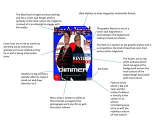
  • 1. Web address to show magazines multimedia format. The Masthead is bright and eye catching and has a union Jack design which is symbolic of the mod culture the magazine is aimed at in an attempt to engage with the reader. The graphic feature is set on a Union Jack flag which is contrasting to the background making it stand out clearer. Cover lines are in red to stand out and they are all end of year specials and music related so they tie in with it being a December issue The flash is in relation to the graphic feature and is a competition, the kind of idea that came from various other magazines The Kickers are in red, white and blue which stand out against the background and are the main colours of the target design associated with mod culture. Bar Code Headline is big and has a metallic effect to make it stand out and draw attention to it. Feature article photo is big and clear and the mode of address is directly at the camera in an almost intimidating pose to tie in with the rebellious nature of mod culture Menu strip is written in white so that it stands out against the photograph and it also fits in with the colour scheme.
  • 2. Heading is bright and clearly visible. It is a play on the magazine title so because of this it has the same design with the Union Jack lettering. Date of Issue so readers can keep up to date. Sub-Headings are blue so they stand out against the white background and a few of them are play-on-words of songs by the Jam who were one of the key bands during the mod period. Different picture for contents page than on the front cover, which is common in most magazines such as NME or Rolling Stone. The picture is clear and the mans shirt makes him stand out against the white wall. The Readership profile showed that alcohol was a prominent part in mod culture and this is why the location is a pub. The mode of address is away from the camera and towards the pool table and he is also smiling which is referenced in the caption underneath. The colours red, white and blue are continued throughout as they were prominent colours of the mods Advert is bright and eye catching it uses the same magazine cover to make it relevant and also highlights the multimedia aspect of the magazine. The arrows are in blue which make them stand out and is a colour involved in the house style. They were also an image that featured prominently in images found as part of my research.
  • 3. Heading and quotes at the top of the page are dark and clear and introduce the article and capture the audiences attention at the same time. The two headings at the top incorporate arrows which have appeared prominently throughout my research and are a part of my house style. Also because the arrows appear in my research using them in headings like this make the reader feel more comfortable and includes them more Article includes mock-up of and album cover. This tested my photoshop skills and also I attempted to make the cover simple yet artistic which is why I chose the black and white colour scheme. Also on the cover the men are stood in an outdoor area where graffiti is present this appeals to the audience as it would be familiar to them because it was a popular image for mod bands at the time to be pictured outdoors. Incorporating a pull quote into my main article made use of the photoshop skills I have developed. The pull quote talks of going beyond one generation, this word appeared frequently in my research of bands at the time of the mod revival. Also it appeals to the reader and involves them because the magazine is aimed to wards those who were interested in mod culture so these people would be interested in a previous generation. Feature article main photo is large and clear and the mode of address is in different directions and away from the camera this makes the band looking interesting and appealing to the audience and the tough stance will be familiar for readers who are used to seeing pictures of the clash and the Jam. The clothes that they’re wearing are black which ties in with the text of the main article.
  • 4. There is an added image at the top of the page which adds an extra dimension to the page. He is pictured as looking across the heading which will draw the readers attention to this. He is positioned stood on an arrow which will be familiar to the audience as they appear throughout. Also with one foot up he looks casual and relaxed and this will appeal to the reader as it makes the band look more normal and approachable. The arrow itself is pointing towards the extra heading which draws the readers attention to it. The mod target logo appears a lot across the top of the page as an additional background to a heading, this not only appeals to the reader because it is a familiar part of the mod iconography but because it also adds colour to the page. The background uses graffiti to give the magazine a more edgy look. Also the red colour is part of my house style and is a familiar colour to the audience and it also makes the page stand out because it adds more colour. Also because the main image stands out against the background it draws attention to the picture. It also gives the impression that the men are stood in front of the graffiti which will appeal to readers as they will be familiar seeing Paul Weller and other bands like the clash being pictured this way. Page numbers are familiar to readers as they are a common part of most magazines, it also appeals to the readers as it makes the magazine more easily navagatable. Down the sidebar there are readers comments on the album which will appeal to the audience as they will feel that they can contribute towards the magazine and it also involves them.
  • 5. Mod culture is the social group targeted with my magazine and this is represented throughout the magazine with my house style in particular with the colour scheme being iconic mod colours e.g. red, white and blue. The stance of the group on the front cover is commanding which is impressive to that culture as they were known to be rebellious. This is also apparent in the Union Jack lettering which is also a symbol associated with the UK and the Mods were notoriously known to be patriotic according to my own research. The setting for the magazine article referenced on the contents page is set within a pub because my research concluded that drinking was a major part in the mod lifestyle. The Graffiti background of the double page spread will be familiar to Mods as they are used to seeing bands at the time e.g. The Jam being pictured in front of urbanised walls covered with graffiti. The song titles referenced in sub-headings on the contents page are songs which were around at the time of mod culture and will be very familiar to those in this sub-culture.
  • 6. The clothes worn are not stereotypical mod clothes, however this was an effect I wanted as my magazine is a new innovation and I wanted to mix old mod ideas with new designs. The smart shirt mixed with a tie was somewhat typical of the time for smarter occasions and nowadays the look is more sported by veterans of the mod era such as Paul Weller, However I decided against a tailored jacket to give the photo a bit more informality in an attempt to make the photo a little edgier. The smart black jacket worn by the other person was to give a somewhat contrasting style for example, the smart shirt/tie against a flat cap and jacket, however I wanted to maintain a dark/black colour scheme to show cohesion within the group and also I wanted the dark colours to contrast against the colourful nature of the front cover and also in the double page spread I wanted the dark colours to contrast against the white of the page. The jacket idea came from research into bands of the time like the Clash who wore smart/casual jackets with attitude, hence the focused and driven look to camera by the band.
  • 7. IPC Media would be a good publisher for the magazine because they are the leading publisher in the market, and they would have more capital to devote to my magazine. My idea of a Mod Magazine is a niche market, so would probably be best suited to a smaller publisher, however IPC have a wide range of niche magazines. These are examples of 3 male orientated magazines and I have chosen them as examples because my magazine is a more male orientated magazine. For this reason IPC would be the main candidate for publishing because one of its main targets is men in general. The Mod era itself is known for its very “laddish” behaviour and it is this characteristic of my magazine that would be similar to “Nuts” magazine which is the leading men's magazine aimed at the devil may care male which was stereotypical of my genre. Also IPC publish NME magazine which is a music magazine like mine and it is one of their top sellers’ however my magazine is not that similar so would be something different. My magazine also has an online aspect which would probably be best catered for by a smaller publisher, however the marketing potential IPC could offer would be far bigger e.g. TV and radio.
  • 8. The target audience would be males either interested or involved in mod culture: The look: The Music: The average age of a mod who was alive at the time of the mod revival would be around 40-50. These men/women are now likely to have children who may share their interests. Because alcohol and drinking is a significant part in mod culture the magazine itself would probably be best aimed at the 18-45 range. Although with magazines like this one e.g. music magazines, the readership age would be slightly lower. However the 18-45 market covers about 91% of the readership in the case of the NME so I would expect these results would be similar with my magazine.
  • 9. The magazine has an online aspect to get readers involved with the magazine on the internet. This is referenced on the double page spread where in the sidebar there are readers comments that were submitted via the internet. At the bottom of the sidebar the magazine personally thanks readers for submitting comments to create a sense that the magazine cares for its readers and it serves to give the readers a sense of belonging. Some of the language used in the articles were symbolic of mod culture, the mods were notorious for fighting and boisterous behaviour this is why I used the term “hits you like a well-timed punch in the face”. On the contents page there is the advert to subscribe to the magazine this also uses exclamation points to emphasise and it also catches the eye to create a sort of buzz about the advert. On the cover the price is clearly displayed, at £2 it is cheaper than the average music magazine e.g. NME and it is through this the magazine can maintain readers interest because if it was too expensive or even the same price as a mainstream magazine it would fail to sell because of its niche appeal. The front cover offers the readers a chance to win something, this creates a sense of excitement and will maintain the readers interest if they think that with every magazine comes with the chance to win something. This excitement also helps to create a further buzz around a smaller magazine. The colours of the magazine and the constant use of a union jack flag and the target symbol are familiar to those in mod culture and offers them a sense of belonging to something which speaks to them and has the same iconography as their culture.
  • 10. Looking back at my designs of the college magazine I realised that throughout the magazine design process I have needed to learn new skills so I could make the magazine more attractive and user friendly. By making my music magazine far more colourful on the front than the college magazine it draws attention to it and by using the colours associated with the genre it appeals to that culture because of its sense of familiarity. Also on the contents page I have learned I needed to be a lot more precise with words and give a more detailed account of what the reader should expect from the magazine, I chose to do this by adding more information on the front cover and giving more information in the contents page. With the college magazine I decided that to follow the same colour scheme on to the contents page e.g. black and white, this I feel was a good decision for maintaining a house style but it was not as exciting or as well laid out as it could have been. This is where I had to learn how to create a more constructive contents page, that was appropriate for my genre of magazine. I achieved this through sub-headings and a more clever use of imagery. I used more camera techniques than on the college magazine also to really connect with the genre and make the magazine look more professional by using different modes of address.