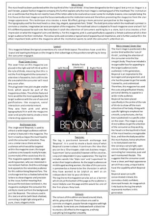
1. Main Image/ Cover Star
The mainimage is positionedinthe
centre third withinthe ‘rule of
thirds’, catching the attentionof
the consumer ontothe Star
image’s body. Theyhave includeda
recognisable face for appealing to
the target audience (niche
audience). Inthis generation,
Beyoncé is an inspirationto the
teenagers and youngwomen, and
she hasthe power to get her words
listened to, andunderstood.
Therefore, this magazine has used
the uses and gratification theory;
personalidentity, to appeal to a
wider niche audience.
Beyoncé has beenplaced
specificallyin the centre of the rule
of thirds to show off the main
attractionof her body. Along with
specific lightingto emphasis her
smooth, curvyfeatures, she has
been positionedina specific order
on the cover. The image is using
direct address to get the attention
of the consumer as theywalkby.
Her head is in the topthirdinfront
of the mast headas a recognisable
face, and thenthe bodywouldbe
the mainfeature, hence whythere
is no text placed over her.
She conveys a verybright, open
stance; holdinga straight posture
connoting her innocence, pure and
well maintainedlifestyle. This
suggests that the consumer could
have a clean, well-kept appearance
yet still has a sexy, unique lookto
have the capabilitywhich Beyoncé
has.
Beyoncé wears anoutfit
concentratedinblack, this
connotes a bold, confident,
dominant female. An image which
links backto the tag line which
represents mothers inthis
generation.
Plug/ Cover lines:
The cover lines on this magazine are
placedinthe right and left third within
the rule of thirds, meaning that this is
not the first thingwhichthe consumer’s
attentionis focused to, but is still inside
the area whichthe consumer will read
very soon after.
The plug/cover lines jobis to give smaller
hints which would be part of the
magazinesarticles. The articles featured
here wouldbe the most appealing to the
target audience withthe use of uses and
gratifications like escapism, social
interaction and entertainment.
They vary from pink and white
typographyto fit in with the magazine
cover and varythe text to create a more
interesting appearance.
Anchorage text:
The single word‘Beyoncé, is used to
attract a wide target audience andhint
at what is featured inthe magazine. The
font is nearlyas bigas the mast head to
catch the consumer’s attention. They
are a similar size as there are two
audiences whichwouldbe targeted
within the magazine cover;the target
audience aims towards mainlyfemales
(some male) ofthe socialclass A to C1.
The magazine appeals to middle-aged
workingwomen, who are interestedin
mainstream fashion. Andthe anchorage
text appealsto the secondaryaudience
for this editionbeing Beyoncé fans. The
anchorage text has a shadow behind the
letters to showelegance and precision
to the issue; further meaning that
because the text does not blend in, the
magazine couldgive the consumer the
abilityto stand out from the background
just like Beyoncé. The colours usedin
this text are white (with black shadow),
connoting a bright light alongwith a
pure, clean, elegant article.
Tag Line:
The tag is positioned beneath anchorage text
‘Beyoncé’. It is used to create a back story of what
Beyoncé’s career is about. It continues the idea that
you can be a ‘Chart topper, style icon, business mogul,
Supermom’ (verysuccessful) however still be creative,
sexyandindependent inyour appearance. The tag line
includes words like ‘Style icon’ and ‘supermom’ to
widentheir target audience. As the target audience are
middle agedworking women, the idea of this persona
is perceivedas a chance to be the character in which
they have wanted to be (stylish as well as an
independent idol to your children)
The tag line to thismagazine canalso act as a banner
which sits at the bottom ofthe page as the audience is
more likelyto scan the page andthis would be one of
the first places they look.
Layout:
This magazine follows the typical conventions ofa rule of thirds layout. The editors have used this
layout and layeringtechniques onthe image to their advantage as theypositioneverything to keep
the consumer engaged.
Mast Head
The mast headhasbeen positionedwithin the topthirdof the ‘rule of thirds’. It has beendesignedto be the largest text p rint as Vogue is a
well-known, popular fashionmagazine company;this further explains whythe mainimage is overlayingpart of the masthead. The institution
are so wellknow that theydonot needto have allthe letters able to be readandcancover some for multiple reasons;one e xample being the
first focus onthe main image canput the focus eventuallyontothe institutionname and therefore promoting the magazine from the star
image appearance. This technique also creates a more 3D effect, giving a more personal perspective to the magazine.
The typographyused for the mast head is a clear, big, elegant, appropriate font;‘Didot’. The bold pinkcolour which the masthead is printed in
connotes a creative, imaginative yet wise perception ofthe magazine. The masthead colour is adapted to fit each magazine cover and will full
fill a different purpose for each one. Not onlydoes it catch the attention of consumers walking by in a store, but it also creates a first
impression onwhat the magazine’s aim andidentityis. For this magazine, pink is usedspecificallyto appeal to a female audience whichis their
target audience for their institution. The colour pinkusedconnotes a typicallookof popularityand importance, and is further usedwithin the
other important texts within the magazine which the institution wants to catch the consumer’s attention on.
Colours:
The colours ofthis editionare basedaround, black,
white, greyand pink. These colours are used to
connote anelegant, popular female magazine withhigh
standards. Some texts are shadowedwith a blackline
to create a 3D effect to the magazine, andhelp
everything linktogether smoothly.
Left Third
Middle Third
(Vertical) Right Third