1. ‘Vibe’ Nicki Minaj Analysis- (2)
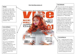
Skyline:
The skyline sounds catchy
and reflects the style of the
magazine. The uppercase use
of the skyline is effective
and immediately grabs the
audience’s attention with its
big, black font, placed
directly underneath the
masthead ‘Vibe’.
Cover/ sell line(s):
‘NICKI MINAJ NOTORIOUS
KING’, is the main sell line of
the magazine with its dominant,
uppercase and handwritten fonts
which allow the audience to
automatically identify who this
magazine is aimed at and who
the main feature (artist) of the
magazine is.
The fact that ‘NOTORIOUS
KING’ is displayed in a
completely different font to the
other sell-lines allows the
audience to focus on the main
sell-line, making them aware that
the artist they are presented with
is the main feature of the
magazine.
The Masthead:
The use of colour for the magazine’s
masthead is displayed in a tropical,
orange font which cleverly blends in
with the artist’s hair and makeup,
allowing the audience to spot a link
between the magazine and the artist
displayed to us: ‘Nicki Minaj’.
‘Vibe’ cleverly follows and uses its
typical, well-known and unique
masthead layout, as the artist is
placed above the masthead, allowing
the audience to see that she is the
spotlight of the magazine. The
colour ‘orange’ also connotes
vibrancy, passion and warmth
reflecting Nicki Minaj as she is a
fun-loving and very vibrant person.
Cover/sell line (s):
The ‘+’ symbol presented in orange
allows a symbiotic link to be created
which is very clever of the magazine
the use as they are maintaining the
colours of black and orange to allow
the audience to see a link between
the way the magazine is composed
and the feature s inside the magazine,
so the audience do not feel lost or
confused, keeping them focused.