
Recommended
More Related Content
What's hot
What's hot (20)
Viewers also liked
Viewers also liked (14)
Similar to Magazine Cover Annotations
Similar to Magazine Cover Annotations (20)
More from Jasmine Changnai
More from Jasmine Changnai (6)
Recently uploaded
Recently uploaded (20)
Magazine Cover Annotations
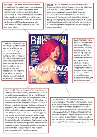
- 1. MASTHEAD - Use of the ‘Billboard’logo,seenon everyeditionof the magazine soisahouse style and isrecognisable.The fontisveryinformal which meansthe target audience isyoungerandless sophisticated. The coloursredandyellowinside the fontare genderneutral,whichtargetsbothsexes, expandingthe audience. Aswell asthisthe colours isa denotationof Billboardasa magazine asit coversa range of entertainment,e.g.music,film and currentaffairs. COVERLINES – The coverlines are arrangedwithtitleswhich have beenhighlightedand informationfollowingitis placedunderneath.The highlightedtitlesof the cover linesmatchRihanna’stopand create a house style fromthe image andtext.The spacing betweeneachanduse of highlightedtitlesadds perspective tothe magazine as the readercan analyse whatthe mainstoryis about and whattheyshouldexpect. SKYLINE– the use of the Skyline istopromote the other featureswithinthe Billboardmagazine.ReferringtoBillboard as a ‘FilmandTV Music conference’linkstowhat conferencesare typicallyassociatedwith(important meetings,where familiarcompaniesdiscussprivate information).The denotationof thiswouldbe,Billboard beingone companyandsharinginformationwithitsreaders, and like familiarcompanies,sharingfamiliarinterests,there isa relationshipof familiaritybetweenthe twoallowingin- depthconversation. MAIN COVERLINE – The coverline connotatesthe mainimage of Rihanna whichrevealshernewly transformationasshe now has big,brighteye- catchingred hair.This intereststhe audience as theywantto know what’snew andthe reasonfor change.The image itself woulddraw attentionbutto reinforce the change withRihanna, presentsRihannaas especiallyimportant,and exclusivetoBillboard readers. PULL OUT QUOTE – Thisissomethingwhich automaticallygrabsthe reader’s attentionasthe public wouldbelieve theydon’tknow Rihannafollowingpast publicity.Toreveal “Myfansdon’treallyknowwhoI am” suggestsshe isdisclosinginformationthatisonly exclusivelyavailablewithBillboard.Itisalsoimplying Rihannais beingshockingandtrue whichmay nothave beenseenbyherfansyet.Readerslovestoknowthey have the exclusive informationandthis pull-outquoteis reinforcingthe factthatthisis excitingand exclusive. MAIN IMAGE – The mainimage isof the singerRihanna. Her musiccrossesRnB,Hip-Hop,Popand Rock.The use of heron Billboarddirectlylinkstothe factthat Billboard doesn’tconformtoone style andincorporatesall typesof musicgenresintheirmagazine.The use of thisallowsan audience withawiderrange of preferences.The image of Rihannashowsherleaningoverslightlyrevealingone of hertattoos,whichcouldbe a connotationof rebellion whichmatchesthe musicgenresshe associatesherself with.She posesmysteriouslyandseductivelysuggesting thiscouldbe targetingmale readersaswell asfemale readerswhoaimto aspire to be like theiridol Rihanna. Thispose linkstothe pull-outquote “Myfansdon’treally knowwhoI am” thiswouldsuggestthatin thisinterview she will reveal whoshe isandBillboardisinpossessionof thisinformation.Thisautomaticallygrabsreader’s attentionanddesire forthemtoknowmore.
- 2. ++ MASTHEAD – “VIBE” stands out at the top of the page and is bright and clear. As it is the name of the magazine it must stand out from the rest of the page, which is why it takes up almost three quarters of the page. The blue is bright on the grey background and matches the trim of Kanye’s jacket, colour coordinating. SKYLINE – The skyline incorporates alternative colours to make the statement stand out. It summarises one of the stories presented in the magazine. This small insight into one of the stories attracts the reader and helps sell the magazine. MAIN IMAGE – The image used is a close up shot of Kanye West, it is a direct address to the audience which entices the reader more because it as if Kanye is targeting them directly. His facial expression is serious which gives us an indication of the type of the type of interview we should be expecting. The use of basic clothes could imply Kanye is not showing off and is simply being raw and honest. The use of a less revealing close up could indicate it is not a target for women and is aimed at both sexes. Typically a magazine cover targeted at women would entail a topless man wearing minimal clothing. COVER LINES – A smaller font is featured here to highlight the fact these are less important articles. The use of a pink and blue colour scheme attracts both a male and female audience, therefore expanding the target audience and creating a bigger sale income. This overall concludes to the target audience Kanye West is for both genders and there is no division. It gives an insight on articles inside the music magazine. Focusing specifically on Hip Hop artist, consumers who are fans of the artists listed feel inclined to purchase this magazine. PULL OUT QUOTE - The biggest, so assumingly main, cover line has a pull quote ‘I am rap’ – this pull quote fascinates the target audience because they are interested in the context and related information. This quotation is also a very bold statement which can come across as controversial and discussions could come about because of this quotation.BACKGROUND – The background is a very neutral, bland monochromatic colour. The simple background could imply that the interview with Kanye is a very clear and pure interview. It could signify there is truth in what he is saying, rather than him being in nature, which could represent peace, or a city which could represent importance, there is a very modest background that reflects Kanye’s attitude and mood in this edition. MAIN COVER LINE – There is a blue, pink, and black colour scheme which makes the magazine appear neat and coordinated. The font applied would be an example of a house style with Vibe. The continuous use of the same font helps the presentation of the magazine remain sophisticated and attractive.
- 3. MASTHEAD – “VIBE”has a gradientcolourscheme whichmakesitattractive and unusual.Itstandsoutat the top of the page and takesupabout one quarter of the page.It sticksto a red, black,greycolourscheme that isincorporatedthroughoutthe frontcoverwhich makesthe frontcover appearneatand attractive.Vibe can place theirmastheadbehindthe subjectbecause of the popularityandfamiliarityof the magazine.Itisa simple yeteffective boldfont,allowingittostandout as much as itpossiblycan. SKYLINE– Thissummarisessome of the rap artiststhat are featuredinthe magazine.Asthe genre of the magazine israp,it will continue toassociate the artists,withtheirmusicgenre,thenalsowiththe magazine’sgenre itself.Italsoasksthe readera question –‘IS 1998 RAP’SLASTCLASSICYEAR?’ – thisis mostlikelytobe a rhetorical questionbut automaticallyitengagesthe readerandmakesthem engage withthe frontcover.Therefore,itmakesthem r=feel asthoughtheymust readon and purchase the magazine. MAIN IMAGE – Thisisa mediumclose-upof Eminem, He isstoodwithhisarms crossedand a stern,serious expressionwhichcouldsignifythathe isa focused artist.The seriousnessof hisexpressioncouldalso relate tothe seriousnessof the articleshe isinvolved in,whichisdrugs and the dangersthatinvolve drugs. The costume he wearsallowsusto see hisarms and all the tattoos he has.These tattooscouldbe connotationsof the rap/hip-hopgenre.Theyare rather rebelliousandthatis reflectedinhismusicand social life. PULL OUT QUOTE – thispull-outquote is a veryseriousquotationthatcan catch a lotof readerseyes.Itisan on-going problemthata lot of people face and therefore canbe quite relatable,sotosee it happentoa celebritycouldmake the readermore inclinedtopickupa copy and readabout it. COVERLINES – The coverlines are all relatedtorap which showstheyare relevanttothe genre of the magazine.They brieflytell the readerafewof the stories/artistsfeaturedin the magazine.Smallertextis usedforthe lessimportantor lesspopulararticles,which couldinclude certainartist’s names.There hasalsobeena use of a rhetorical question, whichallowsthe readertoget involvedwiththe magazine and givesthemachance to decide certaindecisions. The use of the coloursred,black and greykeepsthe edition veryseriousandimportant.It keepsthe editionneatand consistent. MAIN COVERLINE – the maincoverline isthe boldestdisplayedcover line andisin brightred rather thangreyor black whichseemstobe the case forthe other cover lines.Aswell asthis,this coverline involvesapull- out quote,whichattracts the readerbecause itgives theman insightof what theyshouldexpectinthe article.The word ‘EMINEM’ is the biggest whichreinforcesthe fact the story involvesEminem and hisstruggle with drugs.