
Recommended
More Related Content
What's hot
What's hot (20)
Viewers also liked
Viewers also liked (20)
Similar to Dizzee rascal cover page
Similar to Dizzee rascal cover page (20)
Recently uploaded
Recently uploaded (20)
Dizzee rascal cover page
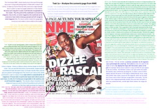
- 1. Task 1a – Analyse the contents page from NME Mis en scene- the mis en scene describes the arrangement ofscenery in an image (everything in the image). This can range from makeup, to costume andto props and so onand so on. It is usedin order to create a main feature ofthe magazine inorder to make the target audience want tobuy it. It also helps make use of space and make the cover look more exciting and fun tolook at as it will draw the audience’s attention towards them first. The mis enscene is conventional for all magazines in order to help portray the genre – e.g. rock magazines use guitars, gigs etcto showhowtheir magazine fits into rock. The main image of this NME magazine is of Dizzee Rascal, whichis supported by the large sell line in the middle third of the page. This helps us have an idea as towho the target audience of this magazine is. Dizzee rascal is age 29. As there are quite recent people suchas him, muse, maximo park, the yeah yeah yeahs andmuse (whoall are about the same age)it suggests to me that there is a target audience aged 17-30. Not only does it tell us about age range it tells us about ethnicity. Dizzee rascal has a ‘black’ ethnicity. As he is the main image ofthis magazine it suggests that this magazine must also be focused at those of the same ethnicity, whoalso enjoy his music and rapping. However, most ofthe other bands named on the cover contain white ethnic members. This suggests that the magazine is aimed at different ethnic groups. Furthermore, it is a stereotype that most rock singers or bands are males. This is supported as most ofthe bands mentionedinclude all male members. You could alsosay that gender is represented by Dizzee rascal because he is a male and the only personon the cover, thus showing ho the magazine should be targeted at. However, there are female members inbands suchas paramore and the yeah yeah yeahs. Therefore this suggests that the magazine could have a potential female audience but is mainly basedaroundmales. The price of the magazine is £2.30. As this isn’t too expensive it suggests to me that the target audience will have a working lifestyle and will be able toafford it andgo andbuy it in their spare time. He is looking straight at the camera, which creates a sense of direct address and makes the magazine seem user friendly. He looks very happy and his arms are spread out wide. The connotation of this is that he is reaching out and welcoming the target audience to the magazine. His clothes and accessories – a white vest, baggy jeans, a golden chain andpumps denotes that he is not a typical artist that would generally appear in this rock basedmagazine. Therefore he doesn’t stereotypically fitintothe genre of the magazine. This could connote that this editionofNME is a special edition andit is a one off which features an unusual artist which wouldn’t normally be considered to feature in a rock based magazine. His posture is crouched, whichsuggests a more informal magazine as he portrays a funand happy personality rather than a serious, harsh personality. Furthermore the way he is crouching andsmiling creates a sense that you are at his concert and he is on stage crouching down at you. This makes the audience feel like they are being directly looked at and makes them feel special as they wouldfeel as if they have just spoken tohim. Conventionally, the phototaken ofDizzee rascal is a long shot because it includes his whole body. However it appears as more ofa medium close up because of his posture. Colour scheme –thereis a distinctcolour schemeshown on this front cover. You canseethat the colour ofsomewords, shapes and the masthead allshare the samecolour to Dizzee rascals shoes,and the persons jacket in thebackground.The useofsuch colours (red, white and black) is used tocreatea housestyle which isconventional for all magazines. A house style isaparticular layout and coloursused on each issue, in order for it to becauserecognisable to the audience and so will brand the magazine. The vibrant colours included onthis magazineissueareusedto enticetheaudience and catchtheir attentionso that they mightpurchasethemagazine. The masthead-‘NME’ clearly stands out atthetopofthepage because it is big,bold writing which is filled with a vibrant red colour. It takes up mostof thetop third, anduses a large dramatic font in order to reachits target audienceor nichemarket. Because such abig font isused, it will become recognisableto the reader. Thusthe point ofthe masthead isto brand the magazine. Due to this, on some magazinesthemasthead can be covered or have lettersmissing aspeoplewillstill recognise what magazine it is. The black outline makes thetypography stand out, and makes it morevisible tothereader. Main sell line– the main sell line is a short punchy sentence (conventionally a quote or the person in the images name) and its sole purpose is to immediately sell the magazine to the audience just by what it says. It reads ‘Dizzee rascal’. This is done as a means to endorse the audience because the use of such a famous celebrity will intrigue the audience to buy the magazine. The typography is in a big white font, and fills one third of the page. It is in such a big size in order to connote high importance, and it creates a hot spot for the audience to look at as it is within the rule of thirds. The font is 3D and had a shadowed outline. This is done to enhance the overall 3D effect of the cover (due to Dizzee rascals open arms). Main cover line – the main cover line is conventionally a quote or a piece of text that will immediately reach out and entice the audience into reading the magazine. It is the main focus of the magazine issue and will relate to the main image and mis en scene of the cover. It reads “I’m spreading joy around the world, man!” A main cover line is a common convention used on the cover pages of magazines, and always links to the mis en scene. The quote says it spreading joy, which can be linked to the facial expression on Dizzee rascal. The cover line tells you a bit about what will be featured in the magazine, and gives you hints as to the content, thus intriguing the niche market/target audience and making them want to buy the magazine. The use of punctuation such as the exclamation make also intrigues the reader and makes the magazine seem user friendly as it makes the content sound fun and exciting to read. Barcode/date/issue/price – a barcode is an essential element neededon allmagazine covers inorder to inform the reader andsell the product. It is generallya small box, andplacedinthe bottomcorners ofthe page. Footer – The footer of a music magazine generallynamesother artists/bands that will feature inthe magazine. It is ina black fo nt andhasa white background inorder to make the writing stand out andmake it more visible andeasyto read for the audience. Fromthe bands featuredinthe footer, it helps you determine what sub genre the magazine is if you cannot denote this from the mis en scene (ifyou don’t knowwhothe person is). Header – the header generallysummarises the content of the magazine, and some bands or artists that will be featured. As the genre of the magazine is rock, the bands featuredwithinthe header are rock bands that the niche market / target audience willbe familiar with and enjoyreading about if they are fans of their music. Puff – A puff is an eye-catching graphic, which is simply used toadvertise more exciting information that can be found inside the magazine. It is also often usedto present cover mounts, which give the audience a chance to ‘win’ a competition or to get their hands on free merchandise. They appear at the side of the page aroundor slightly behind the main image (it wants to be noticed but doesn’t want todistract the audience from the main feature of the magazine). This puff appears at the side of the page, and generally contains cover mounts, important news or free merchandise that would appeal to the target audience. This particular puff uses buzz words suchas ‘news’ and ‘reunion’ in order to entice the audience’s attention. The use of a red background for the writing makes it standout because ofits vibrant colour, and it also links to the colour scheme, thus making a house style for the magazine. Rule of thirds – The rule of thirds -a common convention for all magazines -uses a grid (shaped like a hash tag - #) in order to create hot spots for the reader to look at by aligning the image with intersection points on the grid. For example, Dizzee rascal is placed in a way such that his eyes appear on the line of thirds. This therefore creates a hot sport where the reader will instantly look. Furthermore by doing this, it creates a sense of direct address because the person in the image is looking directly at you. Using rule of thirds helps create a layout for the magazine, which can be made into a house style so that it becomes recognisable to the reader. The left third of music magazines generally contains the cover lines and puffs or other key content/sell lines, and the right thirds contains the image and barcode.