
Recommended
More Related Content
What's hot
What's hot (19)
Viewers also liked
Similar to Double page analysis
Similar to Double page analysis (20)
More from asmediad14
More from asmediad14 (20)
Recently uploaded
Recently uploaded (20)
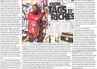
Double page analysis
- 1. Layout: The whole of one page is dedicated to the main image. The layout on the other is that the main heading takes up the majority of the page, it’s followed by the sub heading and below is the actual article which has been dissected into four columns structured around an image at the bottom of the page. The writing amount in each mini column is around the same – shows that there is equality here which makes it look appealing and normal. The order of image, text and image – like a sandwich makes the pages look nicely laid out and sensible. Main Image: The main image on this page is the same model from the cover – this is because he is the main attraction of this magazine issue. On the cover he was represented as fun, care free and a happy person. In contrast in this image he us quite comically represented as mischievous and doing some immoral to the law. However the implication that he’s using all these colours and simply doing “tags” still sets that fun tone. The shot itself is a medium shot – this shows off his outfit as it matches the magazines colour scheme and so is important to be displayed. Main heading: The heading is a subordinate clause which you wouldn’t usually start a sentence with – but the actual article carries it on which makes it work. Two words stand out in the heading as they are bolder and bigger: “tags” and “riches” this is because theses contrast each other as the before and after and so the editors wisely chose to highlight these key words. Position wise, it is at the top of the page and this follows the convention where titles are at the top so they are the first thing seen as they’re highly important. Sub heading: “ 2009 has been Dizee Rascal’s year…” The position of the sub heading is directing below the main heading this is ordinary and follows the convention of chronological and sensible ordering. “Dizzee Rascal’s” name is in bold as opoosed to the rest of the subheading – this is because he’s the main focus of the magazine he’s on the front of the actual magazine and the main image to this article – the links made highlight him as the main focus. The length of the subheading is longer than you’d expect creating the illusion that this article has a lot to it just like this subheading does. Byline: Positioned by the main title – near the top. It’s a convention that the contributors are mentioned before the actual article so its met. Their roles are titles “words” and “pictures” a basic view on their Colour scheme: The colour scheme is as it was before – and so this magazine has demonstrated the use of consistency through colour. The main background is white, the text is black and you get all three colours - including red from the models outfit. There is further use of colour from the graffiti and art work displayed on the background although this isn’t involved in the colour scheme but relates to the article. Mise en scene: On the second page there is a background image. The backing is paint blobs, graffiti lines and further down there are bottles and a stereo. The graffiti and paint side of this image connect to the main image where he is using these materials – bringing them onto the next page shows consistency and follows up well. In addition, the actual creativity and colour displayed creates a positive fun vibe which is the impression made by Dizzee Rascals presence throughout the magazine. The scene at the bottom of the page denote a scene from a hangout, party having a presence or more than one person – some kind of gathering displayed. The bottles probably contained an alcohol which symbolises high spirits and good times – linking with this positive theme. There is a contrast between the bottles where three are green and one is more of a brown – this can symbolise being unique which Dizzee is being displayed and talked about being. A bottle is tipped over and left on its side – this represents a s care free attitude once again associated with Dizee Rascel’s representation. Finally the stereo itself looks old and vintage like again linking with the past and a good time – its colours match that segregated bottle which makes it look effective.