
Recommended
More Related Content
What's hot
What's hot (16)
Similar to Content page analysis
Similar to Content page analysis (20)
More from garrett001
More from garrett001 (20)
Recently uploaded
Recently uploaded (20)
Content page analysis
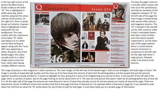
- 1. In the top right corner of the picture the Mast head is known visibly as the letter “Q”. This is highlighted in white colouring, which matches along wit the colour scheme of the picture. On the right of it, there is words known as Contents, however they’re highlighted in black along with the red background. This may contest with the importance of the letter “Q” rather overriding it as it’s rather rare for black writing to appear along with the “Issue 284” also appearing as white. Along the rest of the double pages, the colour actually sticks to a rather simple colour scene this time, rather than having multiple different colours. The range of pictures in this magazine is rather spread out. The main image, on the left side of the double page is that of Liam Gallagher, the lead singer of Oasis. The image is actually of especially high quality, and the close up of his face shows the amount of work that the photographers and the people that put the pictures together would’ve actually worked on. It seems to highlight his face, giving him a more of an enlightening aura around his face. In the top left of the left side of the page, there is a picture of queen, due to the page hosting an article about them on it. This was the only picture that wasn’t taken by Q’s photographers due to how old it is. On the right side of the page the pictures are more diverse in terms of what they actually consist of, and are spread out mainly all around the page. There are several that consist of different artists and numbers that link to the page that they’re featured on. For example Adele is featured on page 62, if you wanted to read about her and find out what the “Q” wrote about her you’d have to look for that page. It most likely leads you to a double page of information. The way this page is laid out is actually rather unique and lives up to the spontaneous and diverse standards of the magazine company “Q”. On the left side of the page the main image is located along with several other pictures and magazine columns. The “Q” is located in the top left corner, with a picture under it that is noticeably Queen, with their article number and information located underneath it. On the other side of the page however, there is a more diverse amount of pictures in comparison to the left side. On the right side there is large picture, followed under it by several small pictures.
- 2. In the top right corner of the picture the Mast head is known visibly as the letter “Q”. This is highlighted in white colouring, which matches along wit the colour scheme of the picture. On the right of it, there is words known as Contents, however they’re highlighted in black along with the red background. This may contest with the importance of the letter “Q” rather overriding it as it’s rather rare for black writing to appear along with the “Issue 284” also appearing as white. Along the rest of the double magazine cover page the amount of colour varies, from black to purple back to black,. To pink to green to orange etc. but this is mainly due to the focus of the pictures. The amount of pictures in this contents page is actually rather spread out, with most of the stretching along the course of the page. The main image, implemented right onto the middle the page and seeming to have been rendered, which means that it probably took a long time editing it, is that of Gorrilaz, a known producing band for making amazing beats and winning hundreds of prizes along the course of their year. The rest of the contents page has several p[pictures dotted around, depicting of different bands, different people, different artists all wearing different items of clothing and having different props in their pictures, i.e. as a man seen holding a gun with the page 54 hovering over his head. On this contents page the way it’s laid out is rather unique. On the first page on the right, there is a banner at the top, stretching from the start of that page on the left all the way along to the second page on the right. From there, The Q is placed as the masthead in the top left of the corner. Under there, another picture is placed under it, before a column of writing is then written. It dictates where several bands articles are, the chapters in the magazine, certain pages or certain materials. On the left is the main image of the main band of the magazine, namely the Gorrilaz. On the second page the layout is different, which proves to the Magazine’s sponmtaneous and absurd nature of laying it all out. On the left this time instead of a colum, there is a numerous amount of pictures of the rest of the band. On the right side, there is the columns dictating the pages.
- 3. The mast head is a large letter V which stands for the magazine name Vibe. It is always featured on Vibe magazine contents page and is positioned in the top half of the page which keep there magazines consistent and looks professional. This also a sort of logo for Vibe and makes the magazine recognisable by just using the letter V. Most of the contents pages in Vibe magazine uses a monochromatic colour scheme like this one as the V grey which matches with the background colour and the black and white image of the rapper – Kanye West. The colour scheme gives an elegant/classy look and makes the V stand out. The main image is amid shot of the rapper Kanye West who has a arm coming over his shoulder holding a heart-shaped object(only bright colour used on page which draws attention~) which may infer t6hat the woman is trying to win-over his heart., The image dominates the page and the simplicity of the page attracts the target audience as he is a famous rapper and this relates to the genre of the magazine and they are likely to listen to his music. Kanye is looking straight a the camera with a moody attitude expression on his faced which associates with rebellion and the genre of Rap music. Kanye West is on the front cover of this magazine as well which indicates he is the main feature. Also Kanye is dressed quite smartly considering he is a rap artist and this connects with the colour scheme and magazine being elegant/classy The Word Contents is in a large bold black font which is not in a straight line but is split up into three lines and contrasts with the background which makes it original and makes it stand out. Most Vibe contents pages display the word contents like this as well which ensure consistency and professionalism. Like the word Contents as above there are black bold sub headings which show the reader what the main area of interest are featured in the magazine (features and fashion). The font used for the sub headings is fancy and stylish which again relates to the colour scheme and Kanye’s clothes, and also makes it look more interesting. These are positioned under the sub headings which shows the category it comes under, and it shows the reader what the main articles/.stories are and the page number it is on. The font colour of brief headings is grey – making them stand out to the summary of content which is in black and matches the sub headings. The page number is in a bolder font than the heading which indicates it is slightly more important. In the bottom right of the pages there are a few lines of text which tell the reader the artists name, where and when the photo was taken, and who took the photo. This gives fans./target audience extra information which they may want.