Verified # 971581275265 # Indian Call Girls In Deira By International City Ca...
Task 1d
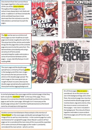
1. One element that I feel connect these
four pages together is the continuation
of the use of the colour scheme.
Throughout these pages the main
colours have always been red, black and
white. In addition in all these extracts the
white and black have been more
dominate then the red and so even this
little details is carried over to each the
pages.
The font can be seen as similar on all
these pages as main headlines on each
page seems to be roughly the same font.
The actual text of the articles and smaller
things like the page titles on the contents
page also seem to be the same font. This
demonstrates consistently and using a
set amount of fonts avoids
overwhelming the reader and creates a
sense of connection between all the
pages – so you identify that you’re still
reading NME.
A similarity between the cover page and the contents page is that they
both include the masthead “NME” at the top of the page. This is
because it is a convention that the masthead must be on the contents
page as well as the cover page. Although it isn’t necessary on the
double page and you don’t need the masthead anymore as the brand
name has already been distinguished.
Another common trend between these extracts is the mention of
“Dizee Rascal” on the cover page and double spread page there is an
image of him as well as a text mention – in the contents page he is only
mentioned as he’s assigned his page. Dizee Rascal is used on all four
pages as he is considered the main story of this issue and the repetition
of his name connects all these pages as the reader is constantly
reminded of the main article – which is on him.
On all these pages Mise en scene is
considered. As on the cover you can
see in the background tags and a tiled
floor, the contents page has a tour bus
involved and the double page spread
involves beers, tags and a stereo. Also,
the mise en scene is minimal on all
these pages – not a lot in included in
the background. This links all of them
together and makes is more evident
that these pages are all from the same
magazine.
The cover page and the double page
spread have a similarity of having graffiti
in the background of the main image –
this connects the two pictures to the
article on the double page spread. The
main image on the cover gives you an
insight of what’s to come whereas the
double page spread actually explains the
theory behind the tagging background.