1. Layout – There is a clear structure to the double page spread, as the text and typography are arranged
on the right page, whilst the main image that supports the article, is presented on the left page. Even
so, there are various graphics that coincide with the article, which are located on the right page,
alongside the text. These images are supposed to represent youth and a sense of wildness that
partying/music/Dizzee Rascal connotes.
Columns – The text is arranged
in four columns, as it is a
relatively short article. The
columns provide the reader with
an orderly structure, so that they
can read the article in the
intended manner. Also, it allows
space for certain images, such as
the bar.
Font – Due to the codes and
convention of magazine design,
the Main title is usually
presented in bold at the top of
the page. Often, the font style
will be the same/similar as the
masthead, as this demonstrates
a sense of consistency. The sub
title, is then presented
underneath the main title in a
smaller font size. The sub-title’s
font style usually matches the
main text, as it also represents
this idea of consistency. This
consistency builds a house style,
which can allow a magazine to
become branded.
Colours – There are various
colours used throughout the
article, to denote that the
magazine is ‘busy’ and ‘full of
life’. Even so, the reader should
be able to recognise a selection
of key colours – black, red and
off-white. These colours are
used throughout the magazine
as well as on the front cover, in
order to build a house style. A
clear colour scheme highlights to
the reader that this is the main
article, as it corresponds with
the cover. Whilst, the contrast
between the white and black
connotes a sense of diversity.
Page numbers – Page numbers
are an important feature, used
my all magazines to indicate to
the reader where they are in the
magazine. They also correspond
with the contents page, so that
they can easily identify where a
particular article is located.
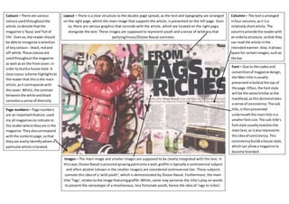
Images – The main image and smaller images are supposed to be clearly integrated with the text. In
this case, Dizzee Rascal is pictured spraying paint onto a wall; graffiti is typically a controversial subject
and often alcohol (shown in the smaller images) are considered controversial too. These subjects
connote this idea of a ‘wild youth’, which is demonstrated by Dizzee Rascal. Furthermore, the main
title ‘Tags’, relates to the image featuring graffiti. Whilst, some may perceive the title’s play on words
to present the stereotype of a mischievous, less fortunate youth, hence the idea of ‘rags to riches’.