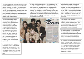
1. The double page spread featuring ‘The Vaccines’ taken
from the NME features a large image of the band. It’s
taken as a mid-shot and has all of the band members
looking up towards the camera. The image is taken
with low key lighting to convey their genre (indie rock)
and so that it doesn’t overwhelm the reader as it is
such a big image. All members of the bad are dressed
quite basically with neutral and dull colours. This is
because it is an indie rock band.
The bands front man is at the front of the camera bolding his
guitar. This establishes who has what roll in the band. They are
stood against a dull looking backdrop that complements the
colours in their outfits. They have very minimal styling
suggesting that for them it’s all about their music and not their
image. Their faces all hold blank expressions. This also helps the
point that they only care about their music. Their effortless style
conveys thoughts if the grunge era of the 90’s. This is also
apparent in the colour scheme.
All of the text on this page (including the
masthead) is written in sans serif. The
masthead, pull quote and kicker is written in a
bolder font to catch the reader’s attention.
The text its self is written in two columns with
both main paragraphs starting with a drop cap
typed in a dull light blue. The pull quote and
name ‘Jamie Fullerton’ is also typed in this
blue colour.
In the top right of the page there is a
magazine reference that maintains the colour
scheme of the page; that being black, grey
and blue. The reference says ‘The radar issue
2011’ this is very small and draws no
attention away from the main article.
The page background is an off-white colour
with grey and light blue blocks coming from
the corners pulling the whole design together
to complement the coloured parts of font
without overshadowing the artist picture.
The audience is instantly drawn to the image
because it takes up a large proportion of the
page. The band is centred in the photograph
and it looks as if they are staring directly at
the reader. There are hints of red on the
guitar and clothes and although it is dull it
does stand out compared to the more
frequent use of colours.
The magazine uses good design
symmetry as nothing is out of
proportion. All of the text is easy to
read and although the image
slightly overpowers the text the
large bold masthead draws the
reader back in. The article is split
into easy to understand sections
with a thin line dividing the two.
Also, the pull quote features the
name of the band member that
said it underneath; however this
time the text is not in bold,
drawing all of the attention to the
quote itself.
In the bottom left of the page there is a
page number typed in bold so that it
easy to read. Next to this there is also
the date of the magazine and the name.
this has been done to inform the reader
of what they are reading and the issue
date.
2. In the top right corner of the magazine there is the page name that says
‘Volume now’, the word ‘volume’ is typed in a black bold sans serif and
the word ‘now’ is bright blue in an elegant font. This is the closest that
the double page has to a masthead. The fact that the only other text in
bright blue is the artist’s name; this instantly links the two together (I.E,
Volume now: Solange Knowles)
The magazine has very good design symmetry as there are
decorative stripes separating the text and the images there
are also no images overlapping the text and the page doesn’t
look too busy. Within the stripes is some text talking about her
new single. The word ‘Single’ is in bold and the single name is
in bright orange to complement her dress.
As Solange is not yet well
known the magazine
references her more famous
sister ‘Beyoncé’ in the kicker
as it says ‘forget her sister’ this
is so the reader knows before
reading the article. This will
also draw them in.
He article also used a pull quote to
interest the reader with references to
fun used again referring to a child-like
state. The pull quote says –
“It’s no fun to feel like I have to
audition for everyone. Or be put on
display for folks to say I strategically
put on feather eyelashes just to be
different. I want people to fall back and
enjoy the music”
This is all typed in a black bold font to
catch the reader’s eye.
At the first look at the magazine the
reader is drawn t the main (bright)
image. The reader’s eyes then follow to
see the name in the kicker in bright
blue before they continue reading.
The main text is split into 4 sections in very small font. The font is in a dull
black/grey colour making the black text stand out. Above the first 2 font sections
there is a kicker in bold grey. The name ‘Solange Knowles’ is typed in a bright
blue complementing the artist’s outfit and page name in the top right corner. The
first line of text is in bold making it stand out against the rest of the article. In the
bottom far side of each corner there is a page number followed by the magazine
name and date. Below the main article there is a small photography credit and to
the left of Solange is a list of her outfit.
Solange is shown stood in a child-like pose
that suggests innocence. However, the
shadow on the left side of her face sinister
personality putting across the idea that she
has two sides. It’s as if she is hiding something
or is guilty as she stands with her hands
behind her back and feet pointing inwards.
She has a blank expression and her head is
slightly tilted making it look sinister.
The main image stretches across the
whole page. Solange is shown
wearing the same outfit as the
smaller images. However, this image
is in colour. The image appears to be
in high key lighting coming from the
right side causing a slight shadow on
the left. The dress she is seen
wearing is a vibrant orange colour
and is a short ruched puff ball style.
She is wearing lots of statement
jewellery, a cropped colourful fur
jacket and pink/purple shoes. Her
clothes appear very child-like which
coincides with stereotypes of the
pop genre.
There is a series of smaller
progressive images of Solange
dancing; making it apparent that is a
pop artist as it appeals to a fun,
young audience. These images are
taken in black and white so they
don’t draw away from the main
image.