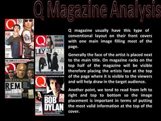
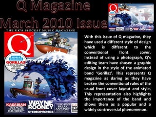
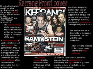
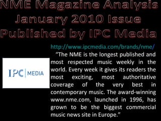
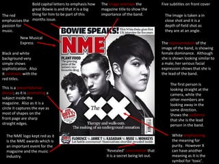
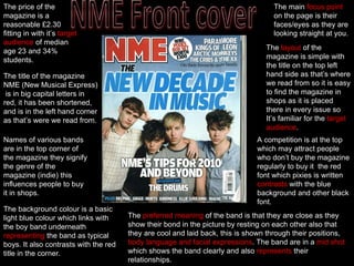
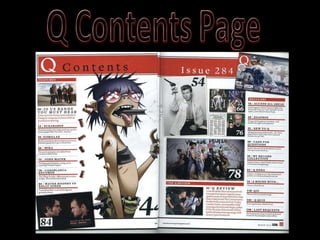
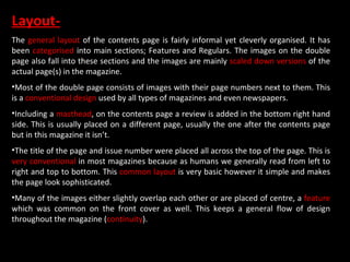
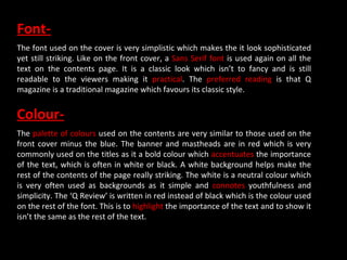
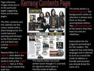
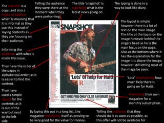
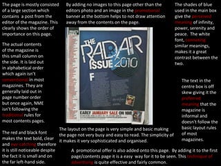
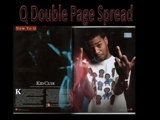
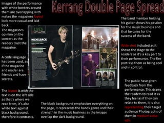
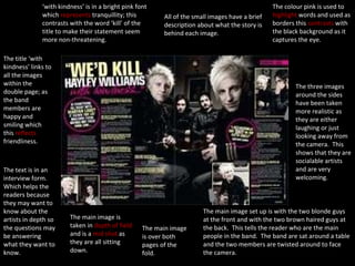
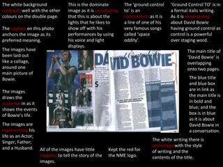
SlideShare a Scribd company logo
1 of 25
 
Q magazine usually have this type of  conventional layout on their front covers with one main image filling most of the page.  Generally the face of the artist is placed next to the main title. On magazine racks on the top half of the magazine will be visible therefore placing the artists face at the top of the page where it is visible to the viewers and will help draw in the target audience. Another point, we tend to read from left to right and top to bottom so the image placement is important in terms of putting the most valid information at the top of the cover.
With this issue of Q magazine, they have used a different style of design which is different to the conventional front cover. Instead of using a photograph, Q’s editing team have chosen a graphic design in the style of the animated band ‘Gorillaz’. This represents Q magazine as daring as they have broken the conventional rules of the usual front cover layout and style. This representation also highlights the importance of the band and shows them as a popular and a widely controversial phenomenon.
The Banner- Font=  The font used on the banner title is bold and simplistic making it striking to the viewers. It is in a  Sans Serif font  which makes it look traditional. This reflects  Q magazine as it is an well established magazine which has been published for many years. The word ‘ BIGGEST ’ is used in italics the  emphasise  the strength of the word. It is slanted to the right which gives the  preferred meaning  that the magazine is forward thinking and is with the latest trends. Also the use of the  superlative connotes  that it is a  mainstream  magazine and that it truly is the best in the UK. Colour=  The white writing makes the text bright and eye-catching against the black background. Together, the 2 colours  connote  power, sophistication and professionalism. Layout=  On magazine racks, only the top part of magazines is shown so therefore it is a competition and struggle to  target their specific audience  as it has to be striking. By placing the banner at the top of the page saying ‘THE UK’S BIGGEST MUSIC MAGAZINE’, this automatically draws viewers towards the magazine. This will help  attract their target audience  and also other viewers.
The Title- Font=  A simple yet sophisticated look has been used for the masthead, resembling the same font used in the banner.  The Sans Serif font  gives the title a classy yet modern look and gives the magazine the  preferred meaning  of that the magazine has been around for a long time and therefore it is more reliable with its information. Its  simplicity  makes it more striking as it is not over done or too busy. It doesn't draw too much attention away from the main image and is often overlapped by the main photo. Colour=  A red background is used behind the white title as it is a bold colour and therefore is used to  highlight the importance  of the title. It  connotes  power, boldness and even passion (for music). The red  contrasts  well with the white font making it more visible and striking to the viewers. The white title is also bold and  signifies  youthfulness and simplicity, it is neutral and therefore looks striking on the cover Layout=  It is widely  conventional  for titles to be placed in the top right-hand corner because as we have been taught, we generally read from left to right  so placing it there will make it one of the first things the audience reads. The title is overlapped by the main image putting it the  foreground . This  represents  that although the title is still bold and an important feature of the cover, it doesn’t interfere with the image which is the main focus of the cover.
The Sub Title- Font=  Most of the text in the puff is in  bold capital blocks . The boldness of the text suggests the importance of the title and also some of the content of the magazine. The name of the band ‘Gorillaz’ is placed in the largest  and boldest font making it the main focus point of the sub-title. The text ‘WORLD EXCLUSIVE’ is also in bold and has been highlighted in blue. The rest of the text in the ‘bubble’ is a  Sans Serif font , similar to that of the main title and banner.  The fact that it isn’t in bold capitals like the rest of the sub-title shows that it isn’t as important however is still a  key part of the title . Colour=  The sub-title uses the  same palette of colours  used throughout the front cover for  continuity . The text ‘Gorillaz’ is in red which links to the main title which is of the same colour. The colour  highlights  the importance of the band name and contrasts well against the white background. This is a reverse of the same colours used in the main title. ‘World Exclusive’ is in a white font and is highlighted in bright blue colour. The blue  connotes  harmony, strength and stability. By highlighting this text it really makes it striking to the viewers and  signifies  its significance. The text ‘set sail again’ links to the main image on the cover which shows the band, Gorillaz, sailing in a boat on the Hokusai wave.  Layout=  The sub-title is placed in a circular frame and  resembles  a sticker or badge.  Conventionally , it has been placed on the left-hand side of the cover as it is common for the viewers to read from left to right. This  style has been maintained  throughout most music magazines. The sub-title has been placed directly under the masthead and also overlaps it. However, the main image also overlaps the headlines which shows a link between the sub-title and photo. It allows the cover to  ‘flow’.
The Sub Headings- Font=  All of the font used in the headlines are in  capital block letters . This makes the text bold and although they are at the bottom of the cover, they are still eye-catching. There are 3 main stories on the cover and the headline placed in the middle has the largest fonts and is the boldest whilst the other 2 stories on either end are in a smaller font and are not as bold. The quotes in the sub-headings are in a  Sans Serif font  which again is similar to the main title, banner and some of the sub-title. This gives this text a  classic look  and creates a sophisticated look for the magazine.  Colour=  A majority of the text is in white as it contrasts with the dark blue background of the main image. The white is striking and although they aren’t the main headings of the cover, they are still bold and clearly visible. Some of the text however is in red, for example the band name in the first sub-heading, ‘Kasabian’ is highlighted in red; the same colour scheme used in the main title ‘Q’. The words ‘Interviews’ and ‘Plus’ are also in a red font . The red  connotes  strength, dominance and its boldness really  accentuates  the importance of the text.  Layout=  The 3 sub-headings have been neatly placed at the bottom of the page with dividers between each of them. It is a simplistic layout however this  connotes  sophistication and classiness and gives the magazine a sleek and classic look in  comparison  to the overlapping of the text and image on the rest of the cover.
The Main Image- Type of image=  The background is  graphically designed image  based on the virtual band (‘Gorillaz’) which is composed of 4 animated band members. The image also has some history within it as the main part of the photo is of the Hokusai wave which is one of the first prints ever made.  Colour=  The main colours used on the front cover (including the image) were mostly red, white and blue which are also the main colours of the Union Jack. The links to the fact that the band ‘Gorillaz’ are of a British heritage and therefore the colour scheme used  links  well to the idea.  Layout=  At the top of the image, it shows the band sailing on top of the Hokusai wave which is one of the  most iconic artwork  pieces in the world. In this image, it has been  reinterpreted  in different ways to maintain its link to the rest of the cover. For example, in the original copy the wave is falling to the right however in this magazine cover it is facing in the opposite direction. This could be because the titles are ( conventionally ) on the left hand side and therefore it would of taken the focus away from the titles. By placing it on the right-hand side it is able to show a  link between the text and image . The band on top of the wave have been placed in the top right-hand corner of the cover. A reason for this could be because when the magazines are placed on the rack only the top part of the magazine cover will be visible . Therefore placing the band at the top of the where it will be clearly seen will attract many readers as would the banner and the main title.
The Main Image (continued)- Layout=  A series of images were placed inside the wave as this links to the  puff ; ‘GORLLAZ & A Star-Studded Crew Set Sail Again’. The editors have used this form of artwork to link the main headline with the main image and really create a strong link between the two. The image is simply another  form of media  which explains the main content of the magazine. Again, the editors have cleverly used this cartoon graphic image to put a spin on the cover. The original Hokusai wave (The Great Wave off Kanagaua) depicts an enormous wave (the ‘Gorillaz’) threatening to destroy close-by boats (other artists). They have modernised an image almost 200 years old and used it to link to the comeback of a band.
[object Object]
[object Object],The title looks faded in capital letters with an explanation  mark, this suggests that it’s loud and exciting also suggesting a younger target audience, therefore it is  representing  the magazines genre of rock. A  medium long shot  is used on the band, and they  represent  the genre of rock. They are at the top of the page overlapping the title and looking directly at the readers and their  target audience  which represents their success, and that they are in control.  The bands name are in the middle of the page in white which contrasts with the black background. On the front cover there is no wasted space as there is  content analysis  everywhere. The  layout  of the magazine is practical as there are only bits of the background that show. The  content analysis  of the magazine are the band Rammstein as they are the main subject in the centre of the page The  preferred meaning  that has been constructed in this image is that they are cool. A bar code and price are in the bottom corner , clear for the  target audience .
http:// www.ipcmedia.com/brands/nme /   “The NME is the longest published and most respected music weekly in the world. Every week it gives its readers the most exciting, most authoritative coverage of the very best in contemporary music. The award-winning www.nme.com, launched in 1996, has grown to be the biggest commercial music news site in Europe.”
Five subtitles on front cover The  image overlaps  the magazine title to show the importance of the band. Bold capital letters to emphasis how great Bowie is and that it is a big thing for him to be part of this months issue. The red emphasises the passion for music. New Musical Express Black and white background very simple shows sophistication.  Also it  contrasts  with the red titles. This is a  presentational device ; as it is  promoting  a subject inside the magazine.  Also as it is a circle it captures the eye as most of shapes on the front page are sharp straight edges. The NME logo kept red as it is the NME awards which is an important event for the magazine and the music industry. ‘ Revealed’  connotation  that it is a secret being let out. White  emphasising  the meaning for purity.  However X can have another meaning as it is the symbol for ‘toxic’. The image is taken a in close shot and it is a depth of field shot as they are at an angle. The first person is looking straight at the camera, while the other members are looking away in the same direction.  Shows the  audience  that she is the lead person in the band. The  representation  of the image of the band, is showing female dominance.  Although she is shown looking similar to a male; her serious facial expression shows that she is the lead of the band.
The  layout  of the magazine is simple with the title on the top left hand side as that’s where we read from so it is easy to find the magazine in shops as it is placed there in every issue so It’s familiar for the  target audience . The background colour is a basic light blue colour which links with the boy band underneath  representing  the band as typical boys. It also contrasts with the red title in the corner. The  preferred meaning  of the band is that they are close as they show their bond in the picture by resting on each other also that they are cool and laid back, this is shown through their positions,  body language and facial   expressions . The band are in a  mid   shot  which shows the band clearly and also  represents  their relationships. Names of various bands are in the top corner of the magazine they signify the genre of the magazine (indie) this influences people to buy it in shops. A competition is at the top which may attract people who don’t buy the magazine regularly to buy it  the red font which pixies is written  contrasts  with the blue background and other black font. The title of the magazine NME (New Musical Express)  is in big capital letters in red, it has been shortened, and is in the left hand corner as that’s were we read from. The price of the magazine is a reasonable £2.30 fitting in with it’s  target audience  of median age 23 and 34% students. The main  focus point  on the page is their faces/eyes as they are looking straight at you.
 
[object Object],[object Object],[object Object],[object Object],[object Object],[object Object],[object Object]
Font- The font used on the cover is very simplistic which makes the it look sophisticated yet still striking. Like on the front cover, a  Sans Serif font  is used again on all the text on the contents page. It is a classic look which isn’t to fancy and is still readable to the viewers making it  practical . The  preferred reading  is that Q magazine is a traditional magazine which favours its classic style.  Colour- The  palette of colours  used on the contents are very similar to those used on the front cover minus the blue. The banner and mastheads are in red which is very commonly used on the titles as it a bold colour which  accentuates  the importance of the text, which is often in white or black. A white background helps make the rest of the contents of the page really striking. The white is a neutral colour which is very often used as backgrounds as it simple and  connotes  youthfulness and simplicity. The ‘Q Review’ is written in red instead of black which is the colour used on the rest of the font. This is to  highlight  the importance of the text and to show it isn’t the same as the rest of the text.
The title- contents and the subtitles are the colour yellow with a black background, this could represent warning and link back to the front cover as red and black was used to  represent  danger. The bands photo is a  medium long shot . The background is white so attention is drawn onto them as they are wearing black clothes. The  preferred meaning  of the band is that they have fun and are rebellious. The Deputy Editor has hand-written (even though it’s scanned) his signature which gives a friendly mode of address. Subscription for the magazine promoting it for the readers. The magazine has used slang language and is referred to as K! as a result the mode of address is friendly and assumes you already know the name of it. Page reference images draw you in to the particular pages suggesting these are the best pages. Deputy Editor in a  medium close-up  shot above the column shows that he wrote it and so the  target audience  feel as if they have a close relationship with him.
The layout is simple however there is a lot of text on the main image.  The title at the top is on the image however behind the singers head as he is the main focus on the page.  Also at the bottom where it has the explanation for the image it is above the image; however still letting most of the image be seen. The title ‘snapshot’ is  signifying  what is the latest news going on. The typing is done in a way to look like diary. Telling the audience they were there at the moment when they were performing. The  sub-title  is a copy; and also a  mode of address  which is meaning that it is informal as they use this instead of saying contents as they are focusing on their audience.   Informing the  audience  with what is inside this issue. They have the order of the pages in alphabetical order; as it is easier to find the content. ‘ Lots’  emphasising  how much help there is going on for Haiti. Promoting  their own magazine for a monthly subscription. Telling the  audience  that they should do it as soon as possible, as this offer will not be available for much longer. They have used a simple  layout  for the contents as it is out of the way but neat to the left side. By laying this out in a long list, the magazine  represents  itself as proving to be very good for the value for money.
The page is mostly consisted of a large section which contains  a post from the editor of the magazine. This clearly shows the order of importance on this page. The text in the centre box is off skew giving it the  preferred meaning  that the magazine is informal and doesn't follow the basic layout rules of most magazines. The actual contents of the magazine is this small column on the side. It is laid out in alphabetical order which again isn’t  conventional  in most magazines. They are generally laid out in page number order but once again, NME isn’t following the  traditional  rules for most contents pages. A  promotional offer is also added onto this page.  By adding it to the first page/contents page it is a easy  way for it to be seen. This  technique of advertising  is quite effective and fairly common. The red and black font makes the text bold, clear and  eye-catching  therefore it is still noticeable despite the fact it is small and on the far left-hand side. The shades of blue used in the main box give the  perceived meaning  of infinity, power, serenity and peace.  The white font,  connoting  similar meanings, makes it a great contrast between the two. By adding no images to this page other than the editors photo and an image in the  promotional  banner at the bottom helps to not draw attention away from the contents on the page.  The layout on the page is very simple and basic making the page not very busy and easy to read. The simplicity of it makes it very sophisticated and organised.
 
Kid Cudi double page- Font=  Once again, the  Sans Serif font  is used for the text and also that it has the  preferred meaning  that Q is a classic and respectable magazine. It has become common in the magazine and throughout all of Q magazines. The text is clear and readable, making it appealing to the viewers. Colour=  The colours used are very simplistic, mainly black and white. The black background makes the page look very serious,  conventional and professional . It makes the lighter colours on the page look brighter, such as the white text and the image of the artist. The artist, Kid Cudi, is shot with a light shining slightly above and in front of him. This  highlights  the artist however still parts if him are in the shadow. This  connotes  a sense of mystery to the celebrity.  Layout=  A small title is placed in the top right-hand corner, a  conventional  feature in many magazines and also Q. The text is placed in the bottom right-hand corner, an odd  feature  when text is placed on a double page spread. It is commonly placed in the middle of the page this layout still connotes sophistication and is still  conventional . The image of the artist has taken up the whole of the left-hand page  making it the main focus of the entire double page spread.
A code language has been used, as if the magazine and reader are friends and have secrets. The  layout  is with the text is on the left side as that’s where we read from, it’s also white text against black background, therefore it contrasts. The black background emphasises everything on the page, it represents the bands genre and their strength in the music business as the images overlap the dark background. The band member holding his guitar shows his passion for the music business and that he cares for the success of the band. Wide shot  included as it shows the stage to the readers as it’s a key part to their performance. The fire portrays them as being cool and in control. Images of the performance with white borders around them are overlapping with makes the magazines  layout  look more casual and laid back. The public have given feedback from the performance. This draws the readers to read it as they feel as if they can relate to   them, it is also  representing  their target audience Photographs of them in  medium close-ups. The magazines opinion on the concert as the readers trust the magazine.
‘ with kindness’ is in a bright pink font which  represents  tranquillity; this contrasts with the word ‘kill’ of the title to make their statement seem more non-threatening. The title ‘with kindness’ links to all the images within the double page; as the band members are happy and smiling which this  reflects  friendliness. The text is in an interview form.  Which helps the readers because they may want to know about the artists in depth so the questions may be answering what they want to know. The main image is taken in  depth of field  and is a  mid shot  as they are all sitting down. The main image is over both pages of the fold. The main image set up is with the two blonde guys at the front and with the two brown haired guys at the back.  This tells the reader who are the main people in the band.  The band are sat around a table and the two members are twisted around to face the camera. The three images around the sides have been taken more realistic as they are either laughing or just looking away from the camera.  This shows that they are socialable artists and are very welcoming.  The colour pink is used to  highlight  words and used as borders this  contrasts  with the black background as it captures the eye. All of the small images have a brief description about what the story is behind each image.
The white background  contrasts  well with the other colours on the double page. The  caption  on this photo anchors the image as its preferred meaning. The images have been laid out like a collage, around one main picture of Bowie. This is the dominate image as it is  co notating  that this is about the lights that he likes to show off with his performances by using his voice and light displays. The images draws the  audience  in as it shows the events of Bowie’s life. The images are  representing  his life as an Actor; Singer; Father; and a Husband. All of the images have little  captions  to tell the story of the images. Kept the red for the NME logo. The white writing there is  anchorage  with the style of writing and the contents of the title. The blue title and blue box are in link as the main title is in bold and blue; and the box is in blue as it is about David Bowie in a conversation. The main title of ‘David Bowie’ is overlapping onto two pages. ‘ Ground Control TO’ is in a formal italic writing.  As it is  emphasising  about David Bowie having ground control as control is a powerful over staging word. The ‘ground control to’ is an  connotation  as it is a line of one of his very famous songs called ‘space oddity’.

More Related Content

What's hot

NME Cover Analysis
NME Cover AnalysisNME Cover Analysis
NME Cover AnalysisLukaMedia
 
Textual Analysis
Textual AnalysisTextual Analysis
Textual Analysispinogo
 
Cover page analysis(muskaan n aveed)
Cover page analysis(muskaan n aveed)Cover page analysis(muskaan n aveed)
Cover page analysis(muskaan n aveed)baninadeem
 
Content page analysis by muskaan final
Content page analysis by muskaan finalContent page analysis by muskaan final
Content page analysis by muskaan finalbaninadeem
 
Magazine front cover analysis
Magazine front cover analysisMagazine front cover analysis
Magazine front cover analysismegan_brockwell
 
Magazine anaylisis
Magazine anaylisisMagazine anaylisis
Magazine anaylisissineadjen
 
Template for magazine analysis
Template for magazine analysisTemplate for magazine analysis
Template for magazine analysisRafaelPerezOlivan
 
Analysis of cover, contents page + double page spread
Analysis of cover, contents page + double page spread Analysis of cover, contents page + double page spread
Analysis of cover, contents page + double page spread EDavoile13
 
Samantha etridge music magazine front cover analysis
Samantha etridge music magazine front cover analysisSamantha etridge music magazine front cover analysis
Samantha etridge music magazine front cover analysisbir
 
Unit 13 - LO1
Unit 13 - LO1Unit 13 - LO1
Unit 13 - LO1jbowers96
 
Unit 13 - LO1
Unit 13 - LO1Unit 13 - LO1
Unit 13 - LO1jbowers96
 
Homework double page spread 2
Homework double page spread 2Homework double page spread 2
Homework double page spread 2JadeOckerby
 
Music Magazine Cover Analysis
Music Magazine Cover AnalysisMusic Magazine Cover Analysis
Music Magazine Cover Analysisfob163
 
Magazine double spread analysis muskaaaannnnnnnn media work
Magazine double spread analysis muskaaaannnnnnnn media workMagazine double spread analysis muskaaaannnnnnnn media work
Magazine double spread analysis muskaaaannnnnnnn media workMahnoor Tariq
 
Double Spread Analysis
Double Spread AnalysisDouble Spread Analysis
Double Spread Analysisbaninadeem
 
Front cover analysis
Front cover analysisFront cover analysis
Front cover analysisML1421
 

What's hot (19)

NME Cover Analysis
NME Cover AnalysisNME Cover Analysis
NME Cover Analysis
 
Analysis of Double Page Spread
Analysis of Double Page SpreadAnalysis of Double Page Spread
Analysis of Double Page Spread
 
Textual Analysis
Textual AnalysisTextual Analysis
Textual Analysis
 
Cover page analysis(muskaan n aveed)
Cover page analysis(muskaan n aveed)Cover page analysis(muskaan n aveed)
Cover page analysis(muskaan n aveed)
 
Content page analysis by muskaan final
Content page analysis by muskaan finalContent page analysis by muskaan final
Content page analysis by muskaan final
 
Magazine front cover analysis
Magazine front cover analysisMagazine front cover analysis
Magazine front cover analysis
 
Magazine cover analysis
Magazine cover analysisMagazine cover analysis
Magazine cover analysis
 
Magazine anaylisis
Magazine anaylisisMagazine anaylisis
Magazine anaylisis
 
Template for magazine analysis
Template for magazine analysisTemplate for magazine analysis
Template for magazine analysis
 
Analysis of cover, contents page + double page spread
Analysis of cover, contents page + double page spread Analysis of cover, contents page + double page spread
Analysis of cover, contents page + double page spread
 
Samantha etridge music magazine front cover analysis
Samantha etridge music magazine front cover analysisSamantha etridge music magazine front cover analysis
Samantha etridge music magazine front cover analysis
 
Unit 13 - LO1
Unit 13 - LO1Unit 13 - LO1
Unit 13 - LO1
 
Unit 13 - LO1
Unit 13 - LO1Unit 13 - LO1
Unit 13 - LO1
 
Homework double page spread 2
Homework double page spread 2Homework double page spread 2
Homework double page spread 2
 
Textual analysis
Textual analysisTextual analysis
Textual analysis
 
Music Magazine Cover Analysis
Music Magazine Cover AnalysisMusic Magazine Cover Analysis
Music Magazine Cover Analysis
 
Magazine double spread analysis muskaaaannnnnnnn media work
Magazine double spread analysis muskaaaannnnnnnn media workMagazine double spread analysis muskaaaannnnnnnn media work
Magazine double spread analysis muskaaaannnnnnnn media work
 
Double Spread Analysis
Double Spread AnalysisDouble Spread Analysis
Double Spread Analysis
 
Front cover analysis
Front cover analysisFront cover analysis
Front cover analysis
 

Viewers also liked

Curacio de continguts aprofita els continguts de tercers per la teva estrateg...
Curacio de continguts aprofita els continguts de tercers per la teva estrateg...Curacio de continguts aprofita els continguts de tercers per la teva estrateg...
Curacio de continguts aprofita els continguts de tercers per la teva estrateg...Eva Sanagustin
 
Marqueting de continguts dialoga amb els teus clients oferint los materials u...
Marqueting de continguts dialoga amb els teus clients oferint los materials u...Marqueting de continguts dialoga amb els teus clients oferint los materials u...
Marqueting de continguts dialoga amb els teus clients oferint los materials u...Eva Sanagustin
 

Viewers also liked (6)

prezentacja
prezentacjaprezentacja
prezentacja
 
Best Photos Slide
Best Photos SlideBest Photos Slide
Best Photos Slide
 
Questionnaire results
Questionnaire resultsQuestionnaire results
Questionnaire results
 
Questionnaire results
Questionnaire resultsQuestionnaire results
Questionnaire results
 
Curacio de continguts aprofita els continguts de tercers per la teva estrateg...
Curacio de continguts aprofita els continguts de tercers per la teva estrateg...Curacio de continguts aprofita els continguts de tercers per la teva estrateg...
Curacio de continguts aprofita els continguts de tercers per la teva estrateg...
 
Marqueting de continguts dialoga amb els teus clients oferint los materials u...
Marqueting de continguts dialoga amb els teus clients oferint los materials u...Marqueting de continguts dialoga amb els teus clients oferint los materials u...
Marqueting de continguts dialoga amb els teus clients oferint los materials u...
 

Similar to F:\Magazine Radials

Analyising music magazines
Analyising music magazinesAnalyising music magazines
Analyising music magazinesJess Stafford
 
Front Covers - Research Task
Front Covers - Research TaskFront Covers - Research Task
Front Covers - Research Taskbeckyjay26
 
Tolu Awojobi AS Media Coursework Magazine Analysis
Tolu Awojobi AS Media Coursework Magazine AnalysisTolu Awojobi AS Media Coursework Magazine Analysis
Tolu Awojobi AS Media Coursework Magazine AnalysisToluwalojuAwojobi
 
Analysis of Music Magazines
Analysis of Music MagazinesAnalysis of Music Magazines
Analysis of Music MagazinesSarah Green
 
NME analysis
NME analysisNME analysis
NME analysisbeckyt95
 
Analyising music magazines
Analyising music magazinesAnalyising music magazines
Analyising music magazinesjessasmedia4
 
Analyising music magazines
Analyising music magazinesAnalyising music magazines
Analyising music magazinesjessasmedia4
 
Analyising music magazines
Analyising music magazinesAnalyising music magazines
Analyising music magazinesjessasmedia4
 
Contents analysis
Contents analysis Contents analysis
Contents analysis tafigaza
 
Magazine analysis
Magazine analysis Magazine analysis
Magazine analysis asmediae13
 
Analysing music magazine front covers kerrang
Analysing music magazine front covers   kerrangAnalysing music magazine front covers   kerrang
Analysing music magazine front covers kerrangernest16
 
Classical magazine analysis
Classical magazine analysisClassical magazine analysis
Classical magazine analysisshahana18
 
Music Magazines - Research
Music Magazines - ResearchMusic Magazines - Research
Music Magazines - ResearchVanessa S
 
Analysis Of Music Magazine Covers
Analysis Of Music Magazine CoversAnalysis Of Music Magazine Covers
Analysis Of Music Magazine CoversJordan
 
Task one and two
Task one and twoTask one and two
Task one and twoMaddy39241
 

Similar to F:\Magazine Radials (20)

Analyising music magazines
Analyising music magazinesAnalyising music magazines
Analyising music magazines
 
Front Covers - Research Task
Front Covers - Research TaskFront Covers - Research Task
Front Covers - Research Task
 
Tolu Awojobi AS Media Coursework Magazine Analysis
Tolu Awojobi AS Media Coursework Magazine AnalysisTolu Awojobi AS Media Coursework Magazine Analysis
Tolu Awojobi AS Media Coursework Magazine Analysis
 
Analysis of Music Magazines
Analysis of Music MagazinesAnalysis of Music Magazines
Analysis of Music Magazines
 
NME analysis
NME analysisNME analysis
NME analysis
 
Magazine analysis
Magazine analysisMagazine analysis
Magazine analysis
 
Analyising music magazines
Analyising music magazinesAnalyising music magazines
Analyising music magazines
 
Magazine Research
Magazine ResearchMagazine Research
Magazine Research
 
Analyising music magazines
Analyising music magazinesAnalyising music magazines
Analyising music magazines
 
Analyising music magazines
Analyising music magazinesAnalyising music magazines
Analyising music magazines
 
Contents analysis
Contents analysis Contents analysis
Contents analysis
 
Magazine analysis
Magazine analysis Magazine analysis
Magazine analysis
 
Analysing music magazine front covers kerrang
Analysing music magazine front covers   kerrangAnalysing music magazine front covers   kerrang
Analysing music magazine front covers kerrang
 
Classical magazine analysis
Classical magazine analysisClassical magazine analysis
Classical magazine analysis
 
Music Magazines - Research
Music Magazines - ResearchMusic Magazines - Research
Music Magazines - Research
 
Research
ResearchResearch
Research
 
Codesandconventions
CodesandconventionsCodesandconventions
Codesandconventions
 
Analysis Of Music Magazine Covers
Analysis Of Music Magazine CoversAnalysis Of Music Magazine Covers
Analysis Of Music Magazine Covers
 
Task one and two
Task one and twoTask one and two
Task one and two
 
Codesandconventions
CodesandconventionsCodesandconventions
Codesandconventions
 

More from CharlottNatalieJasmine (9)

Poster research
Poster researchPoster research
Poster research
 
Final layout plans
Final layout plansFinal layout plans
Final layout plans
 
Final layout plans
Final layout plansFinal layout plans
Final layout plans
 
Final layout plans
Final layout plansFinal layout plans
Final layout plans
 
E:\media year 12\jhp eval2
E:\media year 12\jhp eval2E:\media year 12\jhp eval2
E:\media year 12\jhp eval2
 
E:\Media Year 12\Questionnaire Results Chart
E:\Media Year 12\Questionnaire Results ChartE:\Media Year 12\Questionnaire Results Chart
E:\Media Year 12\Questionnaire Results Chart
 
Prom Slide For Blogspot
Prom Slide For BlogspotProm Slide For Blogspot
Prom Slide For Blogspot
 
Images Of First Shoot
Images Of First ShootImages Of First Shoot
Images Of First Shoot
 
Newsletters
NewslettersNewsletters
Newsletters
 

F:\Magazine Radials

  • 1.  
  • 2. Q magazine usually have this type of conventional layout on their front covers with one main image filling most of the page. Generally the face of the artist is placed next to the main title. On magazine racks on the top half of the magazine will be visible therefore placing the artists face at the top of the page where it is visible to the viewers and will help draw in the target audience. Another point, we tend to read from left to right and top to bottom so the image placement is important in terms of putting the most valid information at the top of the cover.
  • 3. With this issue of Q magazine, they have used a different style of design which is different to the conventional front cover. Instead of using a photograph, Q’s editing team have chosen a graphic design in the style of the animated band ‘Gorillaz’. This represents Q magazine as daring as they have broken the conventional rules of the usual front cover layout and style. This representation also highlights the importance of the band and shows them as a popular and a widely controversial phenomenon.
  • 4. The Banner- Font= The font used on the banner title is bold and simplistic making it striking to the viewers. It is in a Sans Serif font which makes it look traditional. This reflects Q magazine as it is an well established magazine which has been published for many years. The word ‘ BIGGEST ’ is used in italics the emphasise the strength of the word. It is slanted to the right which gives the preferred meaning that the magazine is forward thinking and is with the latest trends. Also the use of the superlative connotes that it is a mainstream magazine and that it truly is the best in the UK. Colour= The white writing makes the text bright and eye-catching against the black background. Together, the 2 colours connote power, sophistication and professionalism. Layout= On magazine racks, only the top part of magazines is shown so therefore it is a competition and struggle to target their specific audience as it has to be striking. By placing the banner at the top of the page saying ‘THE UK’S BIGGEST MUSIC MAGAZINE’, this automatically draws viewers towards the magazine. This will help attract their target audience and also other viewers.
  • 5. The Title- Font= A simple yet sophisticated look has been used for the masthead, resembling the same font used in the banner. The Sans Serif font gives the title a classy yet modern look and gives the magazine the preferred meaning of that the magazine has been around for a long time and therefore it is more reliable with its information. Its simplicity makes it more striking as it is not over done or too busy. It doesn't draw too much attention away from the main image and is often overlapped by the main photo. Colour= A red background is used behind the white title as it is a bold colour and therefore is used to highlight the importance of the title. It connotes power, boldness and even passion (for music). The red contrasts well with the white font making it more visible and striking to the viewers. The white title is also bold and signifies youthfulness and simplicity, it is neutral and therefore looks striking on the cover Layout= It is widely conventional for titles to be placed in the top right-hand corner because as we have been taught, we generally read from left to right so placing it there will make it one of the first things the audience reads. The title is overlapped by the main image putting it the foreground . This represents that although the title is still bold and an important feature of the cover, it doesn’t interfere with the image which is the main focus of the cover.
  • 6. The Sub Title- Font= Most of the text in the puff is in bold capital blocks . The boldness of the text suggests the importance of the title and also some of the content of the magazine. The name of the band ‘Gorillaz’ is placed in the largest and boldest font making it the main focus point of the sub-title. The text ‘WORLD EXCLUSIVE’ is also in bold and has been highlighted in blue. The rest of the text in the ‘bubble’ is a Sans Serif font , similar to that of the main title and banner. The fact that it isn’t in bold capitals like the rest of the sub-title shows that it isn’t as important however is still a key part of the title . Colour= The sub-title uses the same palette of colours used throughout the front cover for continuity . The text ‘Gorillaz’ is in red which links to the main title which is of the same colour. The colour highlights the importance of the band name and contrasts well against the white background. This is a reverse of the same colours used in the main title. ‘World Exclusive’ is in a white font and is highlighted in bright blue colour. The blue connotes harmony, strength and stability. By highlighting this text it really makes it striking to the viewers and signifies its significance. The text ‘set sail again’ links to the main image on the cover which shows the band, Gorillaz, sailing in a boat on the Hokusai wave. Layout= The sub-title is placed in a circular frame and resembles a sticker or badge. Conventionally , it has been placed on the left-hand side of the cover as it is common for the viewers to read from left to right. This style has been maintained throughout most music magazines. The sub-title has been placed directly under the masthead and also overlaps it. However, the main image also overlaps the headlines which shows a link between the sub-title and photo. It allows the cover to ‘flow’.
  • 7. The Sub Headings- Font= All of the font used in the headlines are in capital block letters . This makes the text bold and although they are at the bottom of the cover, they are still eye-catching. There are 3 main stories on the cover and the headline placed in the middle has the largest fonts and is the boldest whilst the other 2 stories on either end are in a smaller font and are not as bold. The quotes in the sub-headings are in a Sans Serif font which again is similar to the main title, banner and some of the sub-title. This gives this text a classic look and creates a sophisticated look for the magazine. Colour= A majority of the text is in white as it contrasts with the dark blue background of the main image. The white is striking and although they aren’t the main headings of the cover, they are still bold and clearly visible. Some of the text however is in red, for example the band name in the first sub-heading, ‘Kasabian’ is highlighted in red; the same colour scheme used in the main title ‘Q’. The words ‘Interviews’ and ‘Plus’ are also in a red font . The red connotes strength, dominance and its boldness really accentuates the importance of the text. Layout= The 3 sub-headings have been neatly placed at the bottom of the page with dividers between each of them. It is a simplistic layout however this connotes sophistication and classiness and gives the magazine a sleek and classic look in comparison to the overlapping of the text and image on the rest of the cover.
  • 8. The Main Image- Type of image= The background is graphically designed image based on the virtual band (‘Gorillaz’) which is composed of 4 animated band members. The image also has some history within it as the main part of the photo is of the Hokusai wave which is one of the first prints ever made. Colour= The main colours used on the front cover (including the image) were mostly red, white and blue which are also the main colours of the Union Jack. The links to the fact that the band ‘Gorillaz’ are of a British heritage and therefore the colour scheme used links well to the idea. Layout= At the top of the image, it shows the band sailing on top of the Hokusai wave which is one of the most iconic artwork pieces in the world. In this image, it has been reinterpreted in different ways to maintain its link to the rest of the cover. For example, in the original copy the wave is falling to the right however in this magazine cover it is facing in the opposite direction. This could be because the titles are ( conventionally ) on the left hand side and therefore it would of taken the focus away from the titles. By placing it on the right-hand side it is able to show a link between the text and image . The band on top of the wave have been placed in the top right-hand corner of the cover. A reason for this could be because when the magazines are placed on the rack only the top part of the magazine cover will be visible . Therefore placing the band at the top of the where it will be clearly seen will attract many readers as would the banner and the main title.
  • 9. The Main Image (continued)- Layout= A series of images were placed inside the wave as this links to the puff ; ‘GORLLAZ & A Star-Studded Crew Set Sail Again’. The editors have used this form of artwork to link the main headline with the main image and really create a strong link between the two. The image is simply another form of media which explains the main content of the magazine. Again, the editors have cleverly used this cartoon graphic image to put a spin on the cover. The original Hokusai wave (The Great Wave off Kanagaua) depicts an enormous wave (the ‘Gorillaz’) threatening to destroy close-by boats (other artists). They have modernised an image almost 200 years old and used it to link to the comeback of a band.
  • 10.
  • 11.
  • 12. http:// www.ipcmedia.com/brands/nme / “The NME is the longest published and most respected music weekly in the world. Every week it gives its readers the most exciting, most authoritative coverage of the very best in contemporary music. The award-winning www.nme.com, launched in 1996, has grown to be the biggest commercial music news site in Europe.”
  • 13. Five subtitles on front cover The image overlaps the magazine title to show the importance of the band. Bold capital letters to emphasis how great Bowie is and that it is a big thing for him to be part of this months issue. The red emphasises the passion for music. New Musical Express Black and white background very simple shows sophistication. Also it contrasts with the red titles. This is a presentational device ; as it is promoting a subject inside the magazine. Also as it is a circle it captures the eye as most of shapes on the front page are sharp straight edges. The NME logo kept red as it is the NME awards which is an important event for the magazine and the music industry. ‘ Revealed’ connotation that it is a secret being let out. White emphasising the meaning for purity. However X can have another meaning as it is the symbol for ‘toxic’. The image is taken a in close shot and it is a depth of field shot as they are at an angle. The first person is looking straight at the camera, while the other members are looking away in the same direction. Shows the audience that she is the lead person in the band. The representation of the image of the band, is showing female dominance. Although she is shown looking similar to a male; her serious facial expression shows that she is the lead of the band.
  • 14. The layout of the magazine is simple with the title on the top left hand side as that’s where we read from so it is easy to find the magazine in shops as it is placed there in every issue so It’s familiar for the target audience . The background colour is a basic light blue colour which links with the boy band underneath representing the band as typical boys. It also contrasts with the red title in the corner. The preferred meaning of the band is that they are close as they show their bond in the picture by resting on each other also that they are cool and laid back, this is shown through their positions, body language and facial expressions . The band are in a mid shot which shows the band clearly and also represents their relationships. Names of various bands are in the top corner of the magazine they signify the genre of the magazine (indie) this influences people to buy it in shops. A competition is at the top which may attract people who don’t buy the magazine regularly to buy it the red font which pixies is written contrasts with the blue background and other black font. The title of the magazine NME (New Musical Express) is in big capital letters in red, it has been shortened, and is in the left hand corner as that’s were we read from. The price of the magazine is a reasonable £2.30 fitting in with it’s target audience of median age 23 and 34% students. The main focus point on the page is their faces/eyes as they are looking straight at you.
  • 15.  
  • 16.
  • 17. Font- The font used on the cover is very simplistic which makes the it look sophisticated yet still striking. Like on the front cover, a Sans Serif font is used again on all the text on the contents page. It is a classic look which isn’t to fancy and is still readable to the viewers making it practical . The preferred reading is that Q magazine is a traditional magazine which favours its classic style. Colour- The palette of colours used on the contents are very similar to those used on the front cover minus the blue. The banner and mastheads are in red which is very commonly used on the titles as it a bold colour which accentuates the importance of the text, which is often in white or black. A white background helps make the rest of the contents of the page really striking. The white is a neutral colour which is very often used as backgrounds as it simple and connotes youthfulness and simplicity. The ‘Q Review’ is written in red instead of black which is the colour used on the rest of the font. This is to highlight the importance of the text and to show it isn’t the same as the rest of the text.
  • 18. The title- contents and the subtitles are the colour yellow with a black background, this could represent warning and link back to the front cover as red and black was used to represent danger. The bands photo is a medium long shot . The background is white so attention is drawn onto them as they are wearing black clothes. The preferred meaning of the band is that they have fun and are rebellious. The Deputy Editor has hand-written (even though it’s scanned) his signature which gives a friendly mode of address. Subscription for the magazine promoting it for the readers. The magazine has used slang language and is referred to as K! as a result the mode of address is friendly and assumes you already know the name of it. Page reference images draw you in to the particular pages suggesting these are the best pages. Deputy Editor in a medium close-up shot above the column shows that he wrote it and so the target audience feel as if they have a close relationship with him.
  • 19. The layout is simple however there is a lot of text on the main image. The title at the top is on the image however behind the singers head as he is the main focus on the page. Also at the bottom where it has the explanation for the image it is above the image; however still letting most of the image be seen. The title ‘snapshot’ is signifying what is the latest news going on. The typing is done in a way to look like diary. Telling the audience they were there at the moment when they were performing. The sub-title is a copy; and also a mode of address which is meaning that it is informal as they use this instead of saying contents as they are focusing on their audience. Informing the audience with what is inside this issue. They have the order of the pages in alphabetical order; as it is easier to find the content. ‘ Lots’ emphasising how much help there is going on for Haiti. Promoting their own magazine for a monthly subscription. Telling the audience that they should do it as soon as possible, as this offer will not be available for much longer. They have used a simple layout for the contents as it is out of the way but neat to the left side. By laying this out in a long list, the magazine represents itself as proving to be very good for the value for money.
  • 20. The page is mostly consisted of a large section which contains a post from the editor of the magazine. This clearly shows the order of importance on this page. The text in the centre box is off skew giving it the preferred meaning that the magazine is informal and doesn't follow the basic layout rules of most magazines. The actual contents of the magazine is this small column on the side. It is laid out in alphabetical order which again isn’t conventional in most magazines. They are generally laid out in page number order but once again, NME isn’t following the traditional rules for most contents pages. A promotional offer is also added onto this page. By adding it to the first page/contents page it is a easy way for it to be seen. This technique of advertising is quite effective and fairly common. The red and black font makes the text bold, clear and eye-catching therefore it is still noticeable despite the fact it is small and on the far left-hand side. The shades of blue used in the main box give the perceived meaning of infinity, power, serenity and peace. The white font, connoting similar meanings, makes it a great contrast between the two. By adding no images to this page other than the editors photo and an image in the promotional banner at the bottom helps to not draw attention away from the contents on the page. The layout on the page is very simple and basic making the page not very busy and easy to read. The simplicity of it makes it very sophisticated and organised.
  • 21.  
  • 22. Kid Cudi double page- Font= Once again, the Sans Serif font is used for the text and also that it has the preferred meaning that Q is a classic and respectable magazine. It has become common in the magazine and throughout all of Q magazines. The text is clear and readable, making it appealing to the viewers. Colour= The colours used are very simplistic, mainly black and white. The black background makes the page look very serious, conventional and professional . It makes the lighter colours on the page look brighter, such as the white text and the image of the artist. The artist, Kid Cudi, is shot with a light shining slightly above and in front of him. This highlights the artist however still parts if him are in the shadow. This connotes a sense of mystery to the celebrity. Layout= A small title is placed in the top right-hand corner, a conventional feature in many magazines and also Q. The text is placed in the bottom right-hand corner, an odd feature when text is placed on a double page spread. It is commonly placed in the middle of the page this layout still connotes sophistication and is still conventional . The image of the artist has taken up the whole of the left-hand page making it the main focus of the entire double page spread.
  • 23. A code language has been used, as if the magazine and reader are friends and have secrets. The layout is with the text is on the left side as that’s where we read from, it’s also white text against black background, therefore it contrasts. The black background emphasises everything on the page, it represents the bands genre and their strength in the music business as the images overlap the dark background. The band member holding his guitar shows his passion for the music business and that he cares for the success of the band. Wide shot included as it shows the stage to the readers as it’s a key part to their performance. The fire portrays them as being cool and in control. Images of the performance with white borders around them are overlapping with makes the magazines layout look more casual and laid back. The public have given feedback from the performance. This draws the readers to read it as they feel as if they can relate to them, it is also representing their target audience Photographs of them in medium close-ups. The magazines opinion on the concert as the readers trust the magazine.
  • 24. ‘ with kindness’ is in a bright pink font which represents tranquillity; this contrasts with the word ‘kill’ of the title to make their statement seem more non-threatening. The title ‘with kindness’ links to all the images within the double page; as the band members are happy and smiling which this reflects friendliness. The text is in an interview form. Which helps the readers because they may want to know about the artists in depth so the questions may be answering what they want to know. The main image is taken in depth of field and is a mid shot as they are all sitting down. The main image is over both pages of the fold. The main image set up is with the two blonde guys at the front and with the two brown haired guys at the back. This tells the reader who are the main people in the band. The band are sat around a table and the two members are twisted around to face the camera. The three images around the sides have been taken more realistic as they are either laughing or just looking away from the camera. This shows that they are socialable artists and are very welcoming. The colour pink is used to highlight words and used as borders this contrasts with the black background as it captures the eye. All of the small images have a brief description about what the story is behind each image.
  • 25. The white background contrasts well with the other colours on the double page. The caption on this photo anchors the image as its preferred meaning. The images have been laid out like a collage, around one main picture of Bowie. This is the dominate image as it is co notating that this is about the lights that he likes to show off with his performances by using his voice and light displays. The images draws the audience in as it shows the events of Bowie’s life. The images are representing his life as an Actor; Singer; Father; and a Husband. All of the images have little captions to tell the story of the images. Kept the red for the NME logo. The white writing there is anchorage with the style of writing and the contents of the title. The blue title and blue box are in link as the main title is in bold and blue; and the box is in blue as it is about David Bowie in a conversation. The main title of ‘David Bowie’ is overlapping onto two pages. ‘ Ground Control TO’ is in a formal italic writing. As it is emphasising about David Bowie having ground control as control is a powerful over staging word. The ‘ground control to’ is an connotation as it is a line of one of his very famous songs called ‘space oddity’.