
Recommended
More Related Content
What's hot
What's hot (18)
Similar to Main article analysis
Similar to Main article analysis (20)
Recently uploaded
Recently uploaded (20)
Main article analysis
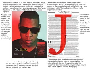
- 1. Main image of jay-z takes up an entire left page, drawing the readers attention immediately to him. It is an extreme close up, capturing him with a serious facial expression. This fits with the tone of the article as it seems formal. He is wearing sunglasses and ‘bling’ which show him to be rich and powerful, backed up by the stern facial expression. The text in the article is shown over a large red ‘J’ this corresponds with jay-z as it is the first initial of his name. This draws a lot of attention to the article and highlights that it is the main feature article. This may be a norm followed in all q magazines main article. each new paragraph has a enlarged letter showing this, this is the largest font used on the articles page (beside the large J). The page has a large amount of text, laid out simply so it is easy to read. Colour scheme of red and white is consistent throughout, even applied to the main image by the use of a filter. This colour scheme is also used throughout the rest of the magazine as it corresponds with the magazines logo, pictured in the bottom left hand corner of the right page. A quote is used over the main image in a red font to stand out from the background, it is the largest piece of font on the left image that goes over, but doesn’t subtract attention from, the main image The use of two eye-catching visuals on both pages encourages the reader to draw their eyes immediately to them and have interest in both pages.
- 2. # The main image takes up the majority of the first left page, it shows the band the article is based on, they are dressed casually and are in relaxed natural positions to show they are laid back. The name of the band is in the top left corner in a font that follows the colour scheme. The image interferes slightly with the right page, making the image seem like its been placed on slanted, keeping with the informal, casual style the main image portrays The majority of the text used this feature article on the right page and doesn’t interfere with the main image. The main articles font is very small whilst the title is much bigger and the subheading medium, drawing your attention immediately to the top of the page and working its way down The colour scheme of this article is black and yellow, these colours stand out from each other whilst also fitting with the tone of the magazine. The text is white which also stands out from the black background The first paragraph has a enlarged letter, this is the largest font used on the articles page throughout the text. The page has a large amount of text, laid out simply so it is easy to read.
- 3. The main images on this page are on the left hand side (different from the norm of other magazines I have looked at). Instead of one main image there is a variety of different images which are arranged in a collage like fashion which all have a relation to the articles focus, Kurt Cobain. The text on the left page is in 4 columns that have been laid out to be easy to follow, however in the middle of the second and third column a quote is placed, caused a gap between the text and allowing more focus to be drawn to the text rather than being seen as boring and plain. The title of the article is rendered using the affect of torn up paper over the article, this fits with the tone of the article with it seeming hand made and different from a simple looking magazine article. The effect of a shadow casted by the paper is also used to create a 3d affect. The overlapping of images on the main image also helps create this effect. The magazines website is advertised/plugged in the bottom right hand corner in a large font, encouraging fans of the article of people mentioned in it to visit the website and learn more. The images on the page are also used to seem to follow the column layout that the text follows as instead of being scattered of take up an entire page, the images take up one strip of the article. This could be highlighting that the images are just as interesting and important as the text in the article. There is no clear colour scheme to this article as the images show a variety of colours yet the article just seems simplistic. However I don’t think the article aimed for a colour scheme as it wanted to seem stylised and unique, perhaps referring to the artist.