
Recommended
More Related Content
What's hot
What's hot (17)
Viewers also liked
Viewers also liked (20)
Similar to Q magazine
Similar to Q magazine (20)
Recently uploaded
Recently uploaded (20)
Q magazine
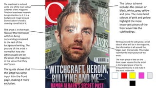
- 1. The masthead is red and white one of the main colour schemes of this magazine. This bold masthead instantly brings attention to it. It is a background image because Damon Albarn’s head is covering a small bit of it. The quote shows that the artist has some input into the front page, making it more exclusive. Writing around the side gives a small idea of what will be in the magazine, the information is all around the edges even the barcode. This makes room for the main picture of the artist. The colour scheme includes the colours of black, white, grey, yellow and pink. The more bold colours of pink and yellow highlight the more important pieces of the front cover like the subheadings. The artist is in the main focus of this front cover with him being outstanding compared to the rest of the background writing. The posture of the artist is normal for how the artists usually are on the cover of Q magazine in the sense that they don’t care. The main piece of text on the front cover a quote fro the artist is the largest piece of text to bring attention to it and make it the most noticeable.
- 2. Follows the Q magazine colour scheme of white, black and red. Pictures which show glimpses of upcoming articles in this edition of the magazine. Contents uses the Q colour scheme by using the colours red and black to show the difference between the page numbers and titles, they also contain a small explanation of what they contain so this engages the reader more to work out what they want to read. This edition has a special section which is shown by a different font and colour scheme to highlight that its different to the rest of the contents and rest of the magazine. Sub-headings on the page break up the high amount of information on the page into smaller readable chunks. This photo of the Courteeners is the largest image which shows that they must be the main article of this edition of Q magazine.
- 3. This image is large as it takes up half the DPS which amounts to the size of A4, this shows that the picture of Lady Gaga has importance and that this article must be about her. The photo is black and white which adds effect to the article matching the classic design with the title on the right hand side of the DPS. The colour palette matches the rest of Q’s magazine for this page. ‘Classic’ looking style of title which matches the photo style of it being in a classic style. The ‘L’ signifies that it is for Lady Gaga who is obviously the main focus of this article with the large photograph, title and large ‘L’. The large letters signify the start of paragraphs or that they are the start of most important paragraphs. The image of Lady Gaga very much follows her own style of being provocative by her being in minimal dress but it also follows Q’s design style as most of the time it has the artist pose for a photograph in close-up shot of the shoulders upwards.
- 4. Information on Q magazine Started: 1986 Circulation: 52,781 Genre of music: Pop/Rock music Target audience: Mainly a mainstream audience but it is read most commonly by young men aged 18-30.