
Recommended
More Related Content
What's hot
What's hot (19)
Viewers also liked
Similar to Task 2(d)
Similar to Task 2(d) (20)
More from asmediad14
More from asmediad14 (20)
Recently uploaded
Recently uploaded (20)
Task 2(d)
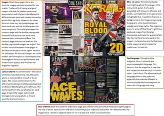
- 1. Images: On all these pages there are multiple images used and provided for the reader. The benefit of having a range of images is to give the reader more visual presentation and it helps in identifying the different music starts and creates interaction within their gig shots. However the cover focus on close ups, the contents page has more mediums and the double spread has more long shots. Particularly between the contents page and the double page spread the additional picture sizes are similar however their orientation differs. The contents page pictures are level and the double page spread images are angled. This creates contrast between these pages as well as similarities to create a good balance for the reader. All the main images are of the models performing this is a connotation that the magazine focuses on performance and the exclusive aspects and this links the magazine together. Colour scheme: As conventional – the colour scheme is locked at yellow, red, black and white as this is evident on each of these pages. The colour combination itself is effective in making everything stand out and visible and denoting the genre of music. The excitement from the use of colour on each page draws in the target audience of teenagers and young adults as they’re youthful and bold colours. Mise en scene: The dominant prop running throughout these pages is the instrument: guitar. It is heavily associated with the genre of music and so they use repetition of its appearance to highlight that. In addition features in backgrounds to the images showcasing the gigs are: other band members, speakers and stage lights. The magazine wants to show off that they’re got these exclusive images from the gigs themselves and make the audience feel like they’re there but also each of the images emit a positive and thrilling tone to the magazine which makes the reader want to read on. Text language: Throughout the magazine there is informal and sometimes explicit language. This denotes that the magazine is care free and not serious and wants to entertain rather than inform. The abnormality of language draws in the audience, especially the audience of teens as stereotypically they’re more prone to use explicit language and slang. Rule of thirds: Both the contents and double page spread follow the convention of structuring the page in the rule of thirds. Each column and row is reasonably equal and easily noticeable. This demonstrates the magazine as a whole is organised and set out in a way that avoids visual confusion.