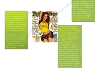
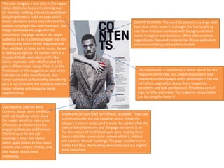
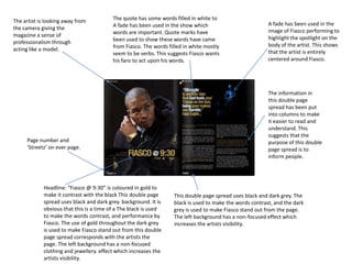
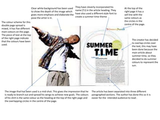
SlideShare a Scribd company logo
1 of 10
Abdallah Hassen
Main Image:- The main image is obviously of
Lady Gaga, who takes up most of the whole
page, making the text revolve around her
body, which adds in extra emphasis on her
curvy figure. Her pose can be seen as sexual
to some extent, from her finger in her mouth,
to her outfit, which is revealing. The colour of
black relates well with the rest of the cover..
Furthermore, her black eye make up matches
with the rest of her look. The side pose
illustrates her figure, which also shows off her
‘sexy’ side.
Other Images:- At the bottom, there are four
other images, which show off her crazy
outfits, which she is famous for. A picture of
her as a child is also included, showing that
the magazine covers a range of years of her
life, which will attract readers even more. The
colours within these images are also black,
white and red, which is consistent from the
rest of the front cover. Lady Gaga is placed
between this strip of pictures, evening it out
of two pictures on either side of the main
image of her.

SMASH HITS: Masthead:- The masthead is in
capital letters, and red, which stands out,
especially due to the plain white
background. The font used isn’t very
common, but the fact that’s its different
gives a unique factor to the page. However,
this can be seen as a contrast to ‘LADY
GAGA,’ which may be in a different font and
colour, but the size is still big, and grabs
attention as its also placed on top of the
image.

Coverline: The cover line is ‘The world’s
biggest start uncovered!’ Lady Gaga is
considered as one of the biggest stars of
today, therefore, this instantly attracts
attentions to her fans, as they want to
know more about her and her life.
‘BIGGEST’ is in a bigger font size than the
rest of the text, which stands out, and is
actually the first word you see within
that section.

Colour :- The colour scheme of the front
cover is limited, only consisting of the
colours black, white and red, with a bit of
yellow in certain places, to grab attention.
The use of each colour is used carefully and
is relevant as to where its been included.
Furthermore, the colours go well with the
main image, which brings clarity to the front
cover on a whole.
The Masthead“Rolling Stones”
is located in the top left hand
corner of the front cover. This
positioning applies to all of
their magazine issues. It is
bold and they have given it a
3D effect to make it standout
from the rest of the magazine
cover. The green of the title
also matches the house style.
Cover Story: The cover stories
give the audience an idea of
what their magazine is about,
with the language, the names
of the people they have
involved in them to target
their audience.

The Main Image: The picture
is located in the middle of the
magazine so it grabs peoples
attention. It also overlaps the
title showing that it is the
main focus. The picture is very
eye catching with the pose
she is pulling, targeting the
male audience as it is a very
erotic pose.

Cover Story: In the bottom
right hand corner there is a
section cut off with a headline
in it. It is in bold, back font
therefore emphasising the
headline, encouraging others
to read the magazine. The
word “dark” represents
mystery and therefore the
producers of the magazine
have hidden the headline in
the corner of the page. There is
a rhetorical question which
lures people in to read the
magazine, consequently the
target audience want to read
the magazine. Many people
would disagree that she’s shy
and therefore want to read the
magazine to find out more!
The Masthead: The Masthead
is in the top left hand corner,
and this is how it is always
positioned on their
magazines. The writing saying
‘Ebony’ is in Capitals and bold
making it stand out, with the
background being red and the
font being white making it
stand out even more to catch
your eye. Also the red
background matches the
house colour with this
magazine cover.
Ebony used some catchy words in the
cover lines to grab the attention to
both females and males, as ‘Super
Sexy Singles’ could be meant for
either. Another story with the
magazine is called ‘Addicted to
Facebook?’ this then grabs the
attention to most people, as they have
it. Also, it means it for a male and
female audience as Facebook isn’t
aimed at one specific gender. The font
colour fits the house colour with the
red from the title, and from all the
stories. They haven’t made these titles
have huge fonts making them seem
not as important, but have used
capitals to make them stand out.

Cover Story: Ebony made the font size for
the ‘it’ massive so that it grabs your
attention, also the bottom left hand corner
is the last place you look at when you first
look at a magazine, so creating a cover story
to have a big font means that people won’t
miss it. Also, from the title it grabs both
female and male attention, as females want
to know who the 25 women are, but also
males like to see this too.

Information: They have put
information about the
magazine in the bottom right
hand corner, in a small font
showing it isn’t as important as
the rest.

The Main Image: Alicia Keys’ face is in the
middle of the page, so it is the first part
you look at. Her eyes are looking straight
at us, so she’s engaging the audiences
attention, making it seem like she is
actually looking at us. Alicia Keys is a
attraction for the male audience, as she
is wearing revealing clothesattracting
them to read the magazine, but also
attracting females to read the magazine
too as they might like her.
The main image is a mid shot of the rapper
Kanye West who has a arm coming over
his shoulder holding a heart-shaped object
(only bright colour used on page which
draws attention) which may infer that the
woman is trying to win-over his heart. The
image dominates the page and the
simplicity of the page attracts the target
audience as he is a famous rapper and this
relates to the genre of the magazine and
they are likely to listen to his music. Kanye
is looking straight at the camera with a a
moody attitude expression on his face
which associates with rebellion and the
genre of Rap music. Kanye West is on the
front cover of this magazine as well which
indicates he is the main feature. Also
Kanye is dressed quite smartly considering
he is a rap artist and this connects with the
colour scheme and magazine being
elegant/classy.

Sub Heading- Like the word
Contents above there are black
bold sub headings which show
the reader what the main areas
of interest are featured in the
magazine (features and fashion).
The font used for the sub
headings is fancy and stylish
which again relates to the colour
scheme and Kanye’s clothes, and
also makes it look more
interesting.

CONTENTS WORD- The word Contents is in a large bold
black font which is not in a straight line but is split up
into three lines and contrasts with background which
makes it original and stands out. Most Vibe contents
pages display the word contents like this as well which
ensures consistency and professionalism.

The masthead is a large letter V which stands for the
magazine name Vibe. It is always featured on Vibe
magazine contents pages and is positioned in the top
half of the page which keeps there magazines
consistent and look professional. This also a sort of
logo for Vibe and makes the magazine recognisable
just by using the letter V.

SUMMARY OF CONTENT WITH PAGE NUMBER- These are
positioned under the sub headings which shows the
category it comes under, and it show the reader what the
main articles/stories are and the page number it is on.
The font colour of brief headings is grey- making them
stand out to the summary of content which is in black
and matches the sub headings. The page number is in a
bolder font than the heading which indicates it is slightly
more important.
THE MAIN IMAGE- The main image is a mid
shot of the vocalist from the band The
Bronx who is shown singing at a gig. The
image is larger than the others on the page
which indicate that it is the main feature of
the magazine, and it gives the page
number in the top right corner of the
image and a brief description of article. The
page number is in a larger and bolder
yellow font style than the brief description
which is in a white font colour and this
makes it stand out more and signifies that
it is slightly more important.

OTHER IMAGES- The images are dominant
on this page which is appealing for the
reader as it indicates that the magazine
includes a wide range of articles and
imagery. It also looks quite cluttered which
associates with Rock. The images to the
side and below the image of the singer
from The Bronx show that the articles
related to the images are less important as
the images are smaller. They also have
smaller sized font for the page number and
brief description which confirms this.

WORD CONTENTS AND BOX- The
word contents uses a bold yellow font
in a black box which contrasts and
makes it stand out and shows what
the page is about. It is also
inconsistent with the front cover
colour scheme which is unusual in
magazines and this associates with
Rock- individuality.

DATE AND ISSUE NUMBER- The date
and issue number are important
features as they identify how current
it is and when it was published and
for example buyers and target
audience can see whether they have
missed out on buying the previous
issue(s). Also they are in a white font
contrasting with the box- making it
stand out.
In the masthead there is
obviously the name of the
magazine which in this case
has been abbreviated to RS
standing for ‘Rolling Stone’.
This constantly reminds the
reader what magazine they
are reading. Nearly every
contents page from Rolling
Stones has the same
masthead abbreviated to ‘RS’
this makes their magazines
consistent and professional.

main Page numbers in
grey – article. May be a
hint as stand out. Titles
in bold – easy to who
the article is about to
find desired section.
The background colour is white
because this makes the other
conventions of the magazine stand
out distinctly.

The images on the contents page
all show hip hop artists, which
relates to the subgenre of Hip Hop.
The artists used are seen as
legends in the hip hop industry,
this would certainly attract readers
because they could be seen as
idols to readers.
The Contents page has a bit
where it says ‘Features’ this
sums up all the main articles
in the magazine. This is also
used for the audience to
know that these are the
Main Headlines.

‘Special Edition’ has been
written in black and red;
colours that stand out which
also reflects how special this
part is. Following the ‘Special
Edition’ the subtitle has been
written in bold to make it
stand out and also to keep a
consistent theme so there is
an element of familiarity.
The artist is looking away from
the camera giving the
magazine a sense of
professionalism through
acting like a model.

The quote has some words filled in white to
A fade has been used in the show which
words are important. Quote marks have
been used to show these words have came
from Fiasco. The words filled in white mostly
seem to be verbs. This suggests Fiasco wants
his fans to act upon his words.

Page number and
‘Streetz’ on ever page.

Headline: “Fiasco @ 9:30” is coloured in gold to
make it contrast with the black This double page
spread uses black and dark grey. background. It is
obvious that this is a time of a The black is used
to make the words contrast, and performance by
Fiasco. The use of gold throughout the dark grey
is used to make Fiasco stand out from this double
page spread corresponds with the artists the
page. The left background has a non-focused
clothing and jewellery. effect which increases the
artists visibility.

A fade has been used in the
image of Fiasco performing to
highlight the spotlight on the
body of the artist. This shows
that the artist is entirely
centered around Fiasco.

The information in
this double page
spread has been put
into columns to make
it easier to read and
understand. This
suggests that the
purpose of this double
page spread is to
inform people.

This double page spread uses black and dark grey. The
black is used to make the words contrast, and the dark
grey is used to make Fiasco stand out from the page.
The left background has a non-focused effect which
increases the artists visibility.
The facial expression of the artist
seems to look quite sarcastic but
at the same time serious. It looks
as if he thinks he is too good.

The quote by ‘Jay-Z’ is positioned
in a black rectangle. This contrasts
deeply with the colour white and it
suggests that this artist wants his
words to be seen.

Page number positioned above a
thin black line. It looks neat with the
background colour.

Large ‘I’ to start off
the article. This
shows that this
double page spread
is purely based on
the rapper ‘Jay-Z’.

Large image of rapper ‘Jay-Z’ which
indicates that this double page
spread is based on him.

There is a shadow on the right side of his
face, makes the title of this spread contrast.
He is also turning his face towards the source
of light.

Futuristic text- Implies
Jay-Z is the future of the
hip hop industry. As we
know he is already been
named as one of the all
time greats with a lot of
his songs on top of the
charts.

The title ‘Jay-Z’ is filled with the same colour as
the background so there is no edges for the ‘Z’ in
this title. The ‘J’ in this title is stretched upwards
to the top of the page. This neatly separates the
first page to the second page.
Clear white background has been used
to show the depth of the image which
gives more emphasis and elaborate the
pose the artist is in.

They have cleverly incorporated his
name (T.I) in the article heading. They
have also used a different style font to
create a summer time theme

The colour scheme for this
double page spread is
mixed, it has five different
main colours on the page.
The piece of text at the top
of the right page indicate
that the colours have been
used.

The image that has been used is a mid-shot. This gives the impression that he
is ready to branch out and spread his wings to achieve new goals. The colours
of his shirt is the same colour as the heading at the top of the right page and
the overlapping circles in the centre of the page.

At the top of the
right page it has a
sell line with the
same colours as
the circles in the
centre of the page.

The creator has decided
to overlap circles over
the text, this may have
been done because the
main article about
summer time, so they
decided to do summer
colours to represent the
sun.

The article has been separated into three different
paragraphed sections. The author has done this so it is
easier for the intended audience to read .

More Related Content

What's hot

Double page spread research
Double page spread researchDouble page spread research
Double page spread researchchloehiorns1
 
Music Magazine Textual Analysis
Music Magazine Textual AnalysisMusic Magazine Textual Analysis
Music Magazine Textual AnalysisLennon Riley
 
Magazine analysis
Magazine analysisMagazine analysis
Magazine analysissoniawardg322
 
Music Magazine analysis
Music Magazine analysis Music Magazine analysis
Music Magazine analysis gracemediastudies
 
Analysing existing magazines
Analysing existing magazinesAnalysing existing magazines
Analysing existing magazinesamber_foster
 
Deconstructions
DeconstructionsDeconstructions
DeconstructionsSamWalker7991
 
Front Covers
Front CoversFront Covers
Front Covers10lysharp
 
Analysis of Music Magazines
Analysis of Music MagazinesAnalysis of Music Magazines
Analysis of Music MagazinesBeniboy39
 
Media front cover analysis
Media front cover analysisMedia front cover analysis
Media front cover analysisurvisha38
 
Analysis of magazines
Analysis of magazinesAnalysis of magazines
Analysis of magazinesasmediag13
 
Magazine analysis (1)
Magazine analysis (1)Magazine analysis (1)
Magazine analysis (1)shaniajay
 
Analysis' of magazines
Analysis' of magazines Analysis' of magazines
Analysis' of magazines chloenugget
 
Music Magazine Analysis
Music Magazine AnalysisMusic Magazine Analysis
Music Magazine Analysisrachelmullenx
 
Task 3 - VIBE Analysis
Task 3 - VIBE AnalysisTask 3 - VIBE Analysis
Task 3 - VIBE Analysisgeorgiamarie
 

What's hot (19)

Double page spread research
Double page spread researchDouble page spread research
Double page spread research
 
Music Magazine Textual Analysis
Music Magazine Textual AnalysisMusic Magazine Textual Analysis
Music Magazine Textual Analysis
 
Magazine analysis
Magazine analysisMagazine analysis
Magazine analysis
 
Music Magazine analysis
Music Magazine analysis Music Magazine analysis
Music Magazine analysis
 
Analysing existing magazines
Analysing existing magazinesAnalysing existing magazines
Analysing existing magazines
 
Deconstructions
DeconstructionsDeconstructions
Deconstructions
 
Front Covers
Front CoversFront Covers
Front Covers
 
As 21
As 21As 21
As 21
 
Analysis of Music Magazines
Analysis of Music MagazinesAnalysis of Music Magazines
Analysis of Music Magazines
 
Media front cover analysis
Media front cover analysisMedia front cover analysis
Media front cover analysis
 
Analysis of magazines
Analysis of magazinesAnalysis of magazines
Analysis of magazines
 
Magazine analysis (1)
Magazine analysis (1)Magazine analysis (1)
Magazine analysis (1)
 
Med
MedMed
Med
 
Analysis' of magazines
Analysis' of magazines Analysis' of magazines
Analysis' of magazines
 
Vibe
VibeVibe
Vibe
 
Music Magazine Analysis
Music Magazine AnalysisMusic Magazine Analysis
Music Magazine Analysis
 
The source magazine
The source magazineThe source magazine
The source magazine
 
Task 3
Task 3 Task 3
Task 3
 
Task 3 - VIBE Analysis
Task 3 - VIBE AnalysisTask 3 - VIBE Analysis
Task 3 - VIBE Analysis
 

Viewers also liked

Survey results
Survey resultsSurvey results
Survey resultsasmediae13
 
Double page spread 2
Double page spread 2Double page spread 2
Double page spread 2asmediae13
 
Question 2 final
Question 2 finalQuestion 2 final
Question 2 finalasmediae13
 
22-09-14 diary entry TOM
22-09-14 diary entry TOM22-09-14 diary entry TOM
22-09-14 diary entry TOMasmediae13
 
Theo de Raadt: The bane of backwards compatibility
Theo de Raadt: The bane of backwards compatibilityTheo de Raadt: The bane of backwards compatibility
Theo de Raadt: The bane of backwards compatibilityYandex
 
Logging sheet 6
Logging sheet   6Logging sheet   6
Logging sheet 6asmediae13
 
Choice of Experts
Choice of ExpertsChoice of Experts
Choice of Expertsasmediae13
 
Logging sheet - 5
Logging sheet  - 5Logging sheet  - 5
Logging sheet - 5asmediae13
 

Viewers also liked (8)

Survey results
Survey resultsSurvey results
Survey results
 
Double page spread 2
Double page spread 2Double page spread 2
Double page spread 2
 
Question 2 final
Question 2 finalQuestion 2 final
Question 2 final
 
22-09-14 diary entry TOM
22-09-14 diary entry TOM22-09-14 diary entry TOM
22-09-14 diary entry TOM
 
Theo de Raadt: The bane of backwards compatibility
Theo de Raadt: The bane of backwards compatibilityTheo de Raadt: The bane of backwards compatibility
Theo de Raadt: The bane of backwards compatibility
 
Logging sheet 6
Logging sheet   6Logging sheet   6
Logging sheet 6
 
Choice of Experts
Choice of ExpertsChoice of Experts
Choice of Experts
 
Logging sheet - 5
Logging sheet  - 5Logging sheet  - 5
Logging sheet - 5
 

Similar to Magazine analysis

Contents page analysis
Contents page analysisContents page analysis
Contents page analysismaureen97
 
Analysis of music magazine covers/contents/doublepage
Analysis of music magazine covers/contents/doublepageAnalysis of music magazine covers/contents/doublepage
Analysis of music magazine covers/contents/doublepagejamsterdj
 
Analysing existing magazines
Analysing existing magazinesAnalysing existing magazines
Analysing existing magazinesamber_foster
 
Audience Research
Audience ResearchAudience Research
Audience ResearchEmilyPlenty
 
Front cover analysis
Front cover analysisFront cover analysis
Front cover analysisalexberry27
 
Magazine analysing
Magazine analysingMagazine analysing
Magazine analysingpavithran121
 
Textual analysis 1
Textual analysis 1Textual analysis 1
Textual analysis 1demi050787
 
Presentation1[1]
Presentation1[1]Presentation1[1]
Presentation1[1]Domelar
 
Front Covers - Research Task
Front Covers - Research TaskFront Covers - Research Task
Front Covers - Research Taskbeckyjay26
 
Analysing music magazines! NME
Analysing music magazines! NMEAnalysing music magazines! NME
Analysing music magazines! NMEcharlottebonnell
 
ANALYSIS OF FRONT COVERS
ANALYSIS OF FRONT COVERSANALYSIS OF FRONT COVERS
ANALYSIS OF FRONT COVERSmegankavanagh_96
 
Deconstruction practice
Deconstruction practiceDeconstruction practice
Deconstruction practicerobynneve
 
Annotations of double page spreads
Annotations of double page spreadsAnnotations of double page spreads
Annotations of double page spreadslucyvh
 
Powerpoint on deconstructions
Powerpoint on deconstructionsPowerpoint on deconstructions
Powerpoint on deconstructionsellie_kershaw
 
Annotations of double page spreads
Annotations of double page spreadsAnnotations of double page spreads
Annotations of double page spreadslucyvh
 
Industry analysis
Industry analysisIndustry analysis
Industry analysisdammyalaka
 
Music magazine analysis
Music magazine analysisMusic magazine analysis
Music magazine analysisHannahbrownx2
 
Music magazine analysis
Music magazine analysisMusic magazine analysis
Music magazine analysisHannahbrownx2
 

Similar to Magazine analysis (20)

Contents page analysis
Contents page analysisContents page analysis
Contents page analysis
 
Analysis of music magazine covers/contents/doublepage
Analysis of music magazine covers/contents/doublepageAnalysis of music magazine covers/contents/doublepage
Analysis of music magazine covers/contents/doublepage
 
Analysing existing magazines
Analysing existing magazinesAnalysing existing magazines
Analysing existing magazines
 
Audience Research
Audience ResearchAudience Research
Audience Research
 
Front cover analysis
Front cover analysisFront cover analysis
Front cover analysis
 
Magazine 2
Magazine 2Magazine 2
Magazine 2
 
Magazine analysing
Magazine analysingMagazine analysing
Magazine analysing
 
Magazine research
Magazine researchMagazine research
Magazine research
 
Textual analysis 1
Textual analysis 1Textual analysis 1
Textual analysis 1
 
Presentation1[1]
Presentation1[1]Presentation1[1]
Presentation1[1]
 
Front Covers - Research Task
Front Covers - Research TaskFront Covers - Research Task
Front Covers - Research Task
 
Analysing music magazines! NME
Analysing music magazines! NMEAnalysing music magazines! NME
Analysing music magazines! NME
 
ANALYSIS OF FRONT COVERS
ANALYSIS OF FRONT COVERSANALYSIS OF FRONT COVERS
ANALYSIS OF FRONT COVERS
 
Deconstruction practice
Deconstruction practiceDeconstruction practice
Deconstruction practice
 
Annotations of double page spreads
Annotations of double page spreadsAnnotations of double page spreads
Annotations of double page spreads
 
Powerpoint on deconstructions
Powerpoint on deconstructionsPowerpoint on deconstructions
Powerpoint on deconstructions
 
Annotations of double page spreads
Annotations of double page spreadsAnnotations of double page spreads
Annotations of double page spreads
 
Industry analysis
Industry analysisIndustry analysis
Industry analysis
 
Music magazine analysis
Music magazine analysisMusic magazine analysis
Music magazine analysis
 
Music magazine analysis
Music magazine analysisMusic magazine analysis
Music magazine analysis
 

More from asmediae13

Logging sheet- 4
Logging sheet-  4Logging sheet-  4
Logging sheet- 4asmediae13
 
Logging sheet- 3
Logging sheet-   3Logging sheet-   3
Logging sheet- 3asmediae13
 
Logging sheet - 2
Logging sheet - 2Logging sheet - 2
Logging sheet - 2asmediae13
 
Logging sheet 1
Logging sheet   1Logging sheet   1
Logging sheet 1asmediae13
 
Storyboard 4
Storyboard   4Storyboard   4
Storyboard 4asmediae13
 
Storyboard - 1
Storyboard  - 1Storyboard  - 1
Storyboard - 1asmediae13
 
Storyboard - 2
Storyboard  - 2Storyboard  - 2
Storyboard - 2asmediae13
 
Storyboard - 3
Storyboard  - 3Storyboard  - 3
Storyboard - 3asmediae13
 
screenshots replying nick
screenshots replying nickscreenshots replying nick
screenshots replying nickasmediae13
 
Expert interview questions
Expert interview questions Expert interview questions
Expert interview questions asmediae13
 
Expert interview questions
Expert interview questionsExpert interview questions
Expert interview questionsasmediae13
 
Expert interview questions
Expert interview questionsExpert interview questions
Expert interview questionsasmediae13
 
Expert interview questions
Expert interview questions Expert interview questions
Expert interview questions asmediae13
 
A2 doc questionnaire
A2 doc questionnaireA2 doc questionnaire
A2 doc questionnaireasmediae13
 
A2 doc questionnaire
A2 doc questionnaireA2 doc questionnaire
A2 doc questionnaireasmediae13
 
What are the main codes and conventions of the documentary genre used in
What are the main codes and conventions of the documentary genre used inWhat are the main codes and conventions of the documentary genre used in
What are the main codes and conventions of the documentary genre used inasmediae13
 
A2 doc questionnaire
A2 doc questionnaireA2 doc questionnaire
A2 doc questionnaireasmediae13
 
Messages to nick and mike
Messages to nick and mike Messages to nick and mike
Messages to nick and mike asmediae13
 
Apple interveiw
Apple interveiwApple interveiw
Apple interveiwasmediae13
 

More from asmediae13 (20)

Logging sheet- 4
Logging sheet-  4Logging sheet-  4
Logging sheet- 4
 
Logging sheet- 3
Logging sheet-   3Logging sheet-   3
Logging sheet- 3
 
Logging sheet - 2
Logging sheet - 2Logging sheet - 2
Logging sheet - 2
 
Logging sheet 1
Logging sheet   1Logging sheet   1
Logging sheet 1
 
Storyboard 4
Storyboard   4Storyboard   4
Storyboard 4
 
Storyboard - 1
Storyboard  - 1Storyboard  - 1
Storyboard - 1
 
Storyboard - 2
Storyboard  - 2Storyboard  - 2
Storyboard - 2
 
Storyboard - 3
Storyboard  - 3Storyboard  - 3
Storyboard - 3
 
screenshots replying nick
screenshots replying nickscreenshots replying nick
screenshots replying nick
 
Expert interview questions
Expert interview questions Expert interview questions
Expert interview questions
 
Expert interview questions
Expert interview questionsExpert interview questions
Expert interview questions
 
Expert interview questions
Expert interview questionsExpert interview questions
Expert interview questions
 
Expert interview questions
Expert interview questions Expert interview questions
Expert interview questions
 
A2 doc questionnaire
A2 doc questionnaireA2 doc questionnaire
A2 doc questionnaire
 
A2 doc questionnaire
A2 doc questionnaireA2 doc questionnaire
A2 doc questionnaire
 
What are the main codes and conventions of the documentary genre used in
What are the main codes and conventions of the documentary genre used inWhat are the main codes and conventions of the documentary genre used in
What are the main codes and conventions of the documentary genre used in
 
A2 doc questionnaire
A2 doc questionnaireA2 doc questionnaire
A2 doc questionnaire
 
Messages to nick and mike
Messages to nick and mike Messages to nick and mike
Messages to nick and mike
 
Apple interveiw
Apple interveiwApple interveiw
Apple interveiw
 
results
resultsresults
results
 

Recently uploaded

costume and set research powerpoint presentation
costume and set research powerpoint presentationcostume and set research powerpoint presentation
costume and set research powerpoint presentationphoebematthew05
 
"Federated learning: out of reach no matter how close",Oleksandr Lapshyn
"Federated learning: out of reach no matter how close",Oleksandr Lapshyn"Federated learning: out of reach no matter how close",Oleksandr Lapshyn
"Federated learning: out of reach no matter how close",Oleksandr LapshynFwdays
 
Advanced Test Driven-Development @ php[tek] 2024
Advanced Test Driven-Development @ php[tek] 2024Advanced Test Driven-Development @ php[tek] 2024
Advanced Test Driven-Development @ php[tek] 2024Scott Keck-Warren
 
APIForce Zurich 5 April Automation LPDG
APIForce Zurich 5 April  Automation LPDGAPIForce Zurich 5 April  Automation LPDG
APIForce Zurich 5 April Automation LPDGMarianaLemus7
 
Beyond Boundaries: Leveraging No-Code Solutions for Industry Innovation
Beyond Boundaries: Leveraging No-Code Solutions for Industry InnovationBeyond Boundaries: Leveraging No-Code Solutions for Industry Innovation
Beyond Boundaries: Leveraging No-Code Solutions for Industry InnovationSafe Software
 
Unleash Your Potential - Namagunga Girls Coding Club
Unleash Your Potential - Namagunga Girls Coding ClubUnleash Your Potential - Namagunga Girls Coding Club
Unleash Your Potential - Namagunga Girls Coding ClubKalema Edgar
 
Connect Wave/ connectwave Pitch Deck Presentation
Connect Wave/ connectwave Pitch Deck PresentationConnect Wave/ connectwave Pitch Deck Presentation
Connect Wave/ connectwave Pitch Deck PresentationSlibray Presentation
 
Snow Chain-Integrated Tire for a Safe Drive on Winter Roads
Snow Chain-Integrated Tire for a Safe Drive on Winter RoadsSnow Chain-Integrated Tire for a Safe Drive on Winter Roads
Snow Chain-Integrated Tire for a Safe Drive on Winter RoadsHyundai Motor Group
 
Pigging Solutions Piggable Sweeping Elbows
Pigging Solutions Piggable Sweeping ElbowsPigging Solutions Piggable Sweeping Elbows
Pigging Solutions Piggable Sweeping ElbowsPigging Solutions
 
Transcript: #StandardsGoals for 2024: What’s new for BISAC - Tech Forum 2024
Transcript: #StandardsGoals for 2024: What’s new for BISAC - Tech Forum 2024Transcript: #StandardsGoals for 2024: What’s new for BISAC - Tech Forum 2024
Transcript: #StandardsGoals for 2024: What’s new for BISAC - Tech Forum 2024BookNet Canada
 
SIEMENS: RAPUNZEL – A Tale About Knowledge Graph
SIEMENS: RAPUNZEL – A Tale About Knowledge GraphSIEMENS: RAPUNZEL – A Tale About Knowledge Graph
SIEMENS: RAPUNZEL – A Tale About Knowledge GraphNeo4j
 
Build your next Gen AI Breakthrough - April 2024
Build your next Gen AI Breakthrough - April 2024Build your next Gen AI Breakthrough - April 2024
Build your next Gen AI Breakthrough - April 2024Neo4j
 
Integration and Automation in Practice: CI/CD in Mule Integration and Automat...
Integration and Automation in Practice: CI/CD in Mule Integration and Automat...Integration and Automation in Practice: CI/CD in Mule Integration and Automat...
Integration and Automation in Practice: CI/CD in Mule Integration and Automat...Patryk Bandurski
 
AI as an Interface for Commercial Buildings
AI as an Interface for Commercial BuildingsAI as an Interface for Commercial Buildings
AI as an Interface for Commercial BuildingsMemoori
 
Artificial intelligence in the post-deep learning era
Artificial intelligence in the post-deep learning eraArtificial intelligence in the post-deep learning era
Artificial intelligence in the post-deep learning eraDeakin University
 
Benefits Of Flutter Compared To Other Frameworks
Benefits Of Flutter Compared To Other FrameworksBenefits Of Flutter Compared To Other Frameworks
Benefits Of Flutter Compared To Other FrameworksSoftradix Technologies
 
Automating Business Process via MuleSoft Composer | Bangalore MuleSoft Meetup...
Automating Business Process via MuleSoft Composer | Bangalore MuleSoft Meetup...Automating Business Process via MuleSoft Composer | Bangalore MuleSoft Meetup...
Automating Business Process via MuleSoft Composer | Bangalore MuleSoft Meetup...shyamraj55
 
Kotlin Multiplatform & Compose Multiplatform - Starter kit for pragmatics
Kotlin Multiplatform & Compose Multiplatform - Starter kit for pragmaticsKotlin Multiplatform & Compose Multiplatform - Starter kit for pragmatics
Kotlin Multiplatform & Compose Multiplatform - Starter kit for pragmaticsAndrey Dotsenko
 

Recently uploaded (20)

Hot Sexy call girls in Panjabi Bagh 🔝 9953056974 🔝 Delhi escort Service
Hot Sexy call girls in Panjabi Bagh 🔝 9953056974 🔝 Delhi escort ServiceHot Sexy call girls in Panjabi Bagh 🔝 9953056974 🔝 Delhi escort Service
Hot Sexy call girls in Panjabi Bagh 🔝 9953056974 🔝 Delhi escort Service
 
costume and set research powerpoint presentation
costume and set research powerpoint presentationcostume and set research powerpoint presentation
costume and set research powerpoint presentation
 
"Federated learning: out of reach no matter how close",Oleksandr Lapshyn
"Federated learning: out of reach no matter how close",Oleksandr Lapshyn"Federated learning: out of reach no matter how close",Oleksandr Lapshyn
"Federated learning: out of reach no matter how close",Oleksandr Lapshyn
 
Advanced Test Driven-Development @ php[tek] 2024
Advanced Test Driven-Development @ php[tek] 2024Advanced Test Driven-Development @ php[tek] 2024
Advanced Test Driven-Development @ php[tek] 2024
 
APIForce Zurich 5 April Automation LPDG
APIForce Zurich 5 April  Automation LPDGAPIForce Zurich 5 April  Automation LPDG
APIForce Zurich 5 April Automation LPDG
 
Beyond Boundaries: Leveraging No-Code Solutions for Industry Innovation
Beyond Boundaries: Leveraging No-Code Solutions for Industry InnovationBeyond Boundaries: Leveraging No-Code Solutions for Industry Innovation
Beyond Boundaries: Leveraging No-Code Solutions for Industry Innovation
 
Unleash Your Potential - Namagunga Girls Coding Club
Unleash Your Potential - Namagunga Girls Coding ClubUnleash Your Potential - Namagunga Girls Coding Club
Unleash Your Potential - Namagunga Girls Coding Club
 
Connect Wave/ connectwave Pitch Deck Presentation
Connect Wave/ connectwave Pitch Deck PresentationConnect Wave/ connectwave Pitch Deck Presentation
Connect Wave/ connectwave Pitch Deck Presentation
 
E-Vehicle_Hacking_by_Parul Sharma_null_owasp.pptx
E-Vehicle_Hacking_by_Parul Sharma_null_owasp.pptxE-Vehicle_Hacking_by_Parul Sharma_null_owasp.pptx
E-Vehicle_Hacking_by_Parul Sharma_null_owasp.pptx
 
Snow Chain-Integrated Tire for a Safe Drive on Winter Roads
Snow Chain-Integrated Tire for a Safe Drive on Winter RoadsSnow Chain-Integrated Tire for a Safe Drive on Winter Roads
Snow Chain-Integrated Tire for a Safe Drive on Winter Roads
 
Pigging Solutions Piggable Sweeping Elbows
Pigging Solutions Piggable Sweeping ElbowsPigging Solutions Piggable Sweeping Elbows
Pigging Solutions Piggable Sweeping Elbows
 
Transcript: #StandardsGoals for 2024: What’s new for BISAC - Tech Forum 2024
Transcript: #StandardsGoals for 2024: What’s new for BISAC - Tech Forum 2024Transcript: #StandardsGoals for 2024: What’s new for BISAC - Tech Forum 2024
Transcript: #StandardsGoals for 2024: What’s new for BISAC - Tech Forum 2024
 
SIEMENS: RAPUNZEL – A Tale About Knowledge Graph
SIEMENS: RAPUNZEL – A Tale About Knowledge GraphSIEMENS: RAPUNZEL – A Tale About Knowledge Graph
SIEMENS: RAPUNZEL – A Tale About Knowledge Graph
 
Build your next Gen AI Breakthrough - April 2024
Build your next Gen AI Breakthrough - April 2024Build your next Gen AI Breakthrough - April 2024
Build your next Gen AI Breakthrough - April 2024
 
Integration and Automation in Practice: CI/CD in Mule Integration and Automat...
Integration and Automation in Practice: CI/CD in Mule Integration and Automat...Integration and Automation in Practice: CI/CD in Mule Integration and Automat...
Integration and Automation in Practice: CI/CD in Mule Integration and Automat...
 
AI as an Interface for Commercial Buildings
AI as an Interface for Commercial BuildingsAI as an Interface for Commercial Buildings
AI as an Interface for Commercial Buildings
 
Artificial intelligence in the post-deep learning era
Artificial intelligence in the post-deep learning eraArtificial intelligence in the post-deep learning era
Artificial intelligence in the post-deep learning era
 
Benefits Of Flutter Compared To Other Frameworks
Benefits Of Flutter Compared To Other FrameworksBenefits Of Flutter Compared To Other Frameworks
Benefits Of Flutter Compared To Other Frameworks
 
Automating Business Process via MuleSoft Composer | Bangalore MuleSoft Meetup...
Automating Business Process via MuleSoft Composer | Bangalore MuleSoft Meetup...Automating Business Process via MuleSoft Composer | Bangalore MuleSoft Meetup...
Automating Business Process via MuleSoft Composer | Bangalore MuleSoft Meetup...
 
Kotlin Multiplatform & Compose Multiplatform - Starter kit for pragmatics
Kotlin Multiplatform & Compose Multiplatform - Starter kit for pragmaticsKotlin Multiplatform & Compose Multiplatform - Starter kit for pragmatics
Kotlin Multiplatform & Compose Multiplatform - Starter kit for pragmatics
 

Magazine analysis

  • 2. Main Image:- The main image is obviously of Lady Gaga, who takes up most of the whole page, making the text revolve around her body, which adds in extra emphasis on her curvy figure. Her pose can be seen as sexual to some extent, from her finger in her mouth, to her outfit, which is revealing. The colour of black relates well with the rest of the cover.. Furthermore, her black eye make up matches with the rest of her look. The side pose illustrates her figure, which also shows off her ‘sexy’ side. Other Images:- At the bottom, there are four other images, which show off her crazy outfits, which she is famous for. A picture of her as a child is also included, showing that the magazine covers a range of years of her life, which will attract readers even more. The colours within these images are also black, white and red, which is consistent from the rest of the front cover. Lady Gaga is placed between this strip of pictures, evening it out of two pictures on either side of the main image of her. SMASH HITS: Masthead:- The masthead is in capital letters, and red, which stands out, especially due to the plain white background. The font used isn’t very common, but the fact that’s its different gives a unique factor to the page. However, this can be seen as a contrast to ‘LADY GAGA,’ which may be in a different font and colour, but the size is still big, and grabs attention as its also placed on top of the image. Coverline: The cover line is ‘The world’s biggest start uncovered!’ Lady Gaga is considered as one of the biggest stars of today, therefore, this instantly attracts attentions to her fans, as they want to know more about her and her life. ‘BIGGEST’ is in a bigger font size than the rest of the text, which stands out, and is actually the first word you see within that section. Colour :- The colour scheme of the front cover is limited, only consisting of the colours black, white and red, with a bit of yellow in certain places, to grab attention. The use of each colour is used carefully and is relevant as to where its been included. Furthermore, the colours go well with the main image, which brings clarity to the front cover on a whole.
  • 3. The Masthead“Rolling Stones” is located in the top left hand corner of the front cover. This positioning applies to all of their magazine issues. It is bold and they have given it a 3D effect to make it standout from the rest of the magazine cover. The green of the title also matches the house style. Cover Story: The cover stories give the audience an idea of what their magazine is about, with the language, the names of the people they have involved in them to target their audience. The Main Image: The picture is located in the middle of the magazine so it grabs peoples attention. It also overlaps the title showing that it is the main focus. The picture is very eye catching with the pose she is pulling, targeting the male audience as it is a very erotic pose. Cover Story: In the bottom right hand corner there is a section cut off with a headline in it. It is in bold, back font therefore emphasising the headline, encouraging others to read the magazine. The word “dark” represents mystery and therefore the producers of the magazine have hidden the headline in the corner of the page. There is a rhetorical question which lures people in to read the magazine, consequently the target audience want to read the magazine. Many people would disagree that she’s shy and therefore want to read the magazine to find out more!
  • 4. The Masthead: The Masthead is in the top left hand corner, and this is how it is always positioned on their magazines. The writing saying ‘Ebony’ is in Capitals and bold making it stand out, with the background being red and the font being white making it stand out even more to catch your eye. Also the red background matches the house colour with this magazine cover. Ebony used some catchy words in the cover lines to grab the attention to both females and males, as ‘Super Sexy Singles’ could be meant for either. Another story with the magazine is called ‘Addicted to Facebook?’ this then grabs the attention to most people, as they have it. Also, it means it for a male and female audience as Facebook isn’t aimed at one specific gender. The font colour fits the house colour with the red from the title, and from all the stories. They haven’t made these titles have huge fonts making them seem not as important, but have used capitals to make them stand out. Cover Story: Ebony made the font size for the ‘it’ massive so that it grabs your attention, also the bottom left hand corner is the last place you look at when you first look at a magazine, so creating a cover story to have a big font means that people won’t miss it. Also, from the title it grabs both female and male attention, as females want to know who the 25 women are, but also males like to see this too. Information: They have put information about the magazine in the bottom right hand corner, in a small font showing it isn’t as important as the rest. The Main Image: Alicia Keys’ face is in the middle of the page, so it is the first part you look at. Her eyes are looking straight at us, so she’s engaging the audiences attention, making it seem like she is actually looking at us. Alicia Keys is a attraction for the male audience, as she is wearing revealing clothesattracting them to read the magazine, but also attracting females to read the magazine too as they might like her.
  • 5. The main image is a mid shot of the rapper Kanye West who has a arm coming over his shoulder holding a heart-shaped object (only bright colour used on page which draws attention) which may infer that the woman is trying to win-over his heart. The image dominates the page and the simplicity of the page attracts the target audience as he is a famous rapper and this relates to the genre of the magazine and they are likely to listen to his music. Kanye is looking straight at the camera with a a moody attitude expression on his face which associates with rebellion and the genre of Rap music. Kanye West is on the front cover of this magazine as well which indicates he is the main feature. Also Kanye is dressed quite smartly considering he is a rap artist and this connects with the colour scheme and magazine being elegant/classy. Sub Heading- Like the word Contents above there are black bold sub headings which show the reader what the main areas of interest are featured in the magazine (features and fashion). The font used for the sub headings is fancy and stylish which again relates to the colour scheme and Kanye’s clothes, and also makes it look more interesting. CONTENTS WORD- The word Contents is in a large bold black font which is not in a straight line but is split up into three lines and contrasts with background which makes it original and stands out. Most Vibe contents pages display the word contents like this as well which ensures consistency and professionalism. The masthead is a large letter V which stands for the magazine name Vibe. It is always featured on Vibe magazine contents pages and is positioned in the top half of the page which keeps there magazines consistent and look professional. This also a sort of logo for Vibe and makes the magazine recognisable just by using the letter V. SUMMARY OF CONTENT WITH PAGE NUMBER- These are positioned under the sub headings which shows the category it comes under, and it show the reader what the main articles/stories are and the page number it is on. The font colour of brief headings is grey- making them stand out to the summary of content which is in black and matches the sub headings. The page number is in a bolder font than the heading which indicates it is slightly more important.
  • 6. THE MAIN IMAGE- The main image is a mid shot of the vocalist from the band The Bronx who is shown singing at a gig. The image is larger than the others on the page which indicate that it is the main feature of the magazine, and it gives the page number in the top right corner of the image and a brief description of article. The page number is in a larger and bolder yellow font style than the brief description which is in a white font colour and this makes it stand out more and signifies that it is slightly more important. OTHER IMAGES- The images are dominant on this page which is appealing for the reader as it indicates that the magazine includes a wide range of articles and imagery. It also looks quite cluttered which associates with Rock. The images to the side and below the image of the singer from The Bronx show that the articles related to the images are less important as the images are smaller. They also have smaller sized font for the page number and brief description which confirms this. WORD CONTENTS AND BOX- The word contents uses a bold yellow font in a black box which contrasts and makes it stand out and shows what the page is about. It is also inconsistent with the front cover colour scheme which is unusual in magazines and this associates with Rock- individuality. DATE AND ISSUE NUMBER- The date and issue number are important features as they identify how current it is and when it was published and for example buyers and target audience can see whether they have missed out on buying the previous issue(s). Also they are in a white font contrasting with the box- making it stand out.
  • 7. In the masthead there is obviously the name of the magazine which in this case has been abbreviated to RS standing for ‘Rolling Stone’. This constantly reminds the reader what magazine they are reading. Nearly every contents page from Rolling Stones has the same masthead abbreviated to ‘RS’ this makes their magazines consistent and professional. main Page numbers in grey – article. May be a hint as stand out. Titles in bold – easy to who the article is about to find desired section. The background colour is white because this makes the other conventions of the magazine stand out distinctly. The images on the contents page all show hip hop artists, which relates to the subgenre of Hip Hop. The artists used are seen as legends in the hip hop industry, this would certainly attract readers because they could be seen as idols to readers. The Contents page has a bit where it says ‘Features’ this sums up all the main articles in the magazine. This is also used for the audience to know that these are the Main Headlines. ‘Special Edition’ has been written in black and red; colours that stand out which also reflects how special this part is. Following the ‘Special Edition’ the subtitle has been written in bold to make it stand out and also to keep a consistent theme so there is an element of familiarity.
  • 8. The artist is looking away from the camera giving the magazine a sense of professionalism through acting like a model. The quote has some words filled in white to A fade has been used in the show which words are important. Quote marks have been used to show these words have came from Fiasco. The words filled in white mostly seem to be verbs. This suggests Fiasco wants his fans to act upon his words. Page number and ‘Streetz’ on ever page. Headline: “Fiasco @ 9:30” is coloured in gold to make it contrast with the black This double page spread uses black and dark grey. background. It is obvious that this is a time of a The black is used to make the words contrast, and performance by Fiasco. The use of gold throughout the dark grey is used to make Fiasco stand out from this double page spread corresponds with the artists the page. The left background has a non-focused clothing and jewellery. effect which increases the artists visibility. A fade has been used in the image of Fiasco performing to highlight the spotlight on the body of the artist. This shows that the artist is entirely centered around Fiasco. The information in this double page spread has been put into columns to make it easier to read and understand. This suggests that the purpose of this double page spread is to inform people. This double page spread uses black and dark grey. The black is used to make the words contrast, and the dark grey is used to make Fiasco stand out from the page. The left background has a non-focused effect which increases the artists visibility.
  • 9. The facial expression of the artist seems to look quite sarcastic but at the same time serious. It looks as if he thinks he is too good. The quote by ‘Jay-Z’ is positioned in a black rectangle. This contrasts deeply with the colour white and it suggests that this artist wants his words to be seen. Page number positioned above a thin black line. It looks neat with the background colour. Large ‘I’ to start off the article. This shows that this double page spread is purely based on the rapper ‘Jay-Z’. Large image of rapper ‘Jay-Z’ which indicates that this double page spread is based on him. There is a shadow on the right side of his face, makes the title of this spread contrast. He is also turning his face towards the source of light. Futuristic text- Implies Jay-Z is the future of the hip hop industry. As we know he is already been named as one of the all time greats with a lot of his songs on top of the charts. The title ‘Jay-Z’ is filled with the same colour as the background so there is no edges for the ‘Z’ in this title. The ‘J’ in this title is stretched upwards to the top of the page. This neatly separates the first page to the second page.
  • 10. Clear white background has been used to show the depth of the image which gives more emphasis and elaborate the pose the artist is in. They have cleverly incorporated his name (T.I) in the article heading. They have also used a different style font to create a summer time theme The colour scheme for this double page spread is mixed, it has five different main colours on the page. The piece of text at the top of the right page indicate that the colours have been used. The image that has been used is a mid-shot. This gives the impression that he is ready to branch out and spread his wings to achieve new goals. The colours of his shirt is the same colour as the heading at the top of the right page and the overlapping circles in the centre of the page. At the top of the right page it has a sell line with the same colours as the circles in the centre of the page. The creator has decided to overlap circles over the text, this may have been done because the main article about summer time, so they decided to do summer colours to represent the sun. The article has been separated into three different paragraphed sections. The author has done this so it is easier for the intended audience to read .