
Recommended
More Related Content
What's hot
What's hot (18)
Similar to Media contents page analysis
Similar to Media contents page analysis (20)
Recently uploaded
Recently uploaded (20)
Media contents page analysis
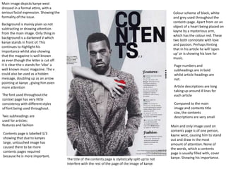
- 1. Colour scheme of black, white and grey used throughout the contents page. Apart from on an object of a heart being placed on kayne by a mysterious arm, which has the colour red. These two both connotate with love and passion. Perhaps hinting that in his article he will ‘open up’ or is showing his love for music. Main and only image used on contents page is of one person, kayne west, causing him to stand out and draw in the most amount of attention. None of the words, which a contents page is usually filled with, cover kanye. Showing his importance. Main image depicts kanye west dressed in a formal attire, with a serious facial expression. Showing the formality of the issue. Background is mainly plain so not subtracting or drawing attention from the main image. Only thing in background is a darkened V which kanye stands in front of. This continues to highlight his importance whilst also showing that the magazine is well known as even though the letter is cut off it is clear the v stands for ‘vibe’ a well known music magazine. The v could also be used as a hidden message, doubling up as an arrow pointing at kanye , giving him even more attention The font used throughout the context page has very little consistency with different styles of font being used throughout. Two subheadings are used for articles: features and fashion The title of the contents page is stylistically split up to not interfere with the rest of the page of the image of kanye Contents page is labelled 1/3 showing that due to kanyes large, untouched image has caused there to be more contents pages required because he is more important. Page numbers and subheadings are in bold whilst article headings are not. Article descriptions are long taking up around 4 lines for each article Compared to the main image and contents title size, the contents descriptions are very small
- 2. Image with largest space on contents page is also shown to be the cover star, highlighting that he is the main article of the issue. Every main image used has a page number listed on the image, allowing easy accessibility for fans of that artist to find the page Image of magazines front cover shown in top right hand corner Clear formal layout with articles and information on them shown at sides of pages with images in the centre Issue number shown, encourages collectors Size of image could represent amount of content in article, e.g bigger the picture the bigger the article Follows colour scheme of red white and black. This simplistic but used effectively throughout. Article titles, page numbers and description are all done in black in the same font. The page numbers are bold and the same size as the accompanying titles, the descriptions are long in less bold font. Articles are divided between two subheadings: features and regulars and one sigle article under ‘the Q review’ one feature article has a larger font its title and its description is in red and it positioned above all the other feature article. Highlighting its importance Font is not bold. Slim and formal looking, setting tone fort magazine and way articles will be presented inside One single article has its own subheading and its title is larger than the others, similar to the first feature article, the description text is red too. This could be highlighting the importance or that that article is special/exclusive
- 3. Darkened colour scheme is fit with edgy theme of magazine. All headings follow pattern of Yellow font on black backgrounds to stand out. Second page has lighter colours to show it is more informative and allows a more clear, simple layout Images of feature articles included on contents page so fans of the people in the articles will immediately see and be tempted to buy so they can read it. First page is just images. Main image is of a concert, some thing the target audience enjoy and are known for going to Subscription offer in bottom right hand corner encouraging readers that may enjoy the content shown to be inside to buy more Large editors note at side of page including image of editor. Pages divided into sections by subheadings e.g. news, live reviews etc. so articles are easy to find Page number and article heading are the same size but number is presented in red whilst title in black, separates them, stands out Bold fonts used throughout Displays issue number (for collectors to keep track and even encourage new readers to buy more) and cover date Smaller images used throughout contents page that shows information on the articles, perhaps highlighting the less well known/ importance of those artists/articles. Logo continuously used throughout. Familiarity. Not all articles shown have description to explain what the article is about