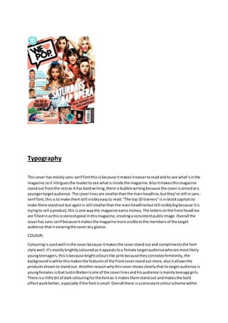
1. Typography
Thiscover hasmostlysans-serif fontthisisbecause itmakesiteasiertoreadandto see what’sinthe
magazine soit intriguesthe readertosee whatisinside the magazine.Alsoitmakesthismagazine
standout fromthe restas it has boldwriting,there isbubblewritingbecause the coverisaimedata
youngertargetaudience.The coverlinesare smallerthanthe mainheadline,butthey’re still insans-
serif font,thisisto make themstill visiblyeasyto read.“The top10 trainers”is inblockcapitalsto
make themstandout but againis still smallerthanthe mainheadlinebutstill visiblybigbecause itis
tryingto sell aproduct,this isone waythe magazine earnsmoney.The lettersonthe frontheadline
are filledinasthisisstereotypical inthismagazine,creatingaconsistentpublicimage.Overall the
coverhas sans-serif becauseitmakesthe magazine more visibletothe membersof the target
audience thatisviewingthe coverata glance.
COLOUR:
Colouringisusedwell inthe coverbecause itmakesthe coverstandoutand complimentsthe font
style well,it’smostlybrightlycolouredasitappealstoa female targetaudiencewhoare mostlikely
youngteenagers,thisisbecause brightcolourslike pinkbecausetheyconnotesfemininity,the
backgroundiswhite thismakesthe featuresof the frontcoverstandout more,alsoitallowsthe
productsshownto standout. Anotherreasonwhythiscovershowsclearlythatitstargetaudience is
youngfemales isthatJustinBieberisone of the coverlinesandhisaudience ismainlyteenagegirls.
There isa little bitof darkcolouringforthe fontas it makesthemstandout andmakesthe bold
effectworkbetter,especiallyif the fontissmall.Overall there isaconsistentcolourscheme within
2. the front cover,makingthe readereasilyunderstandwhichmagazine itiswithouthavingtolooktoo
closely.Thisshowsthatthe magazine standout.
Language
There is a smallercoverline inthe cornerabouttrainers.Trainersare unisex butall the trainers
advertisedare specificallyfemale.One of the feature coverlinessays,“Girl PowerPosters”thisquite
clearlyshowsthe female targetaudience isyoungbecause theyare atthat age whentheyhate boys.
It saysin the top lefthandcorner,the one directionsymbol,thisattractsthe female targetaudience.
The editorof the magazine hasshownwhatisthe mostimportantthroughthe colourscheme.
Anotherwayinwhichlanguage isusedisthe use of the words,“girl power”thisisto try and
encourage the female audience tobuythe coverbecause theythinkit’saboutall girlsbutinreality
it’sjustabout the celebrities.The use of the “<3” symbol showsthatitstarget audience isayoung
audience because it’sinformal.The language isone of the mainwaysinwhichthe magazine creates
a specificyoungertargetaudience because itintriguesthemintowantingtoreadmore.
LAYOUT:
The layoutof the coveris conventionalbecause thereisapopulargroupin the middle andcover
linesaroundthemwithinvitinglanguageforexample,”Tears,tantrumsandtotal meltdown!”this
connotesgossip,youngfemaleswill like thissothattheycan discussitwiththeirfriends.Another
waythe layoutisconventional isbecauseit hassub-headingsaroundthe mainfeature of the front
cover,thisisso that theyare noticedbutdon’ttake any attentionawayfromthe mainfeature.
Under the mainheadline thereisasmall subtitle.Thisgivesthe audience somemore information
aboutthe article.Thistechnique isalsousedforthe subarticles.Soitmakesthe frontcoverseem
more business.
MISE-EN-SCENE:
The womenon the frontcoverall have theirmakeupdone soit usesthe technique of aspiration
because teenage girlswill wantto looklike them.The picture of the groupusesmid-shotstoshow
theirbodiesbutthere isenoughdetails. All the womenare posingsothe magazine looksmore
professionalthanif theyhadnot of beenposingbecause itshowsthattheyallowedthe magazine to
take the photos.The trainersinthe fashionarticle are trendingtrainers,soappeal tothe younger
audience asthese are shoestheywouldwant.
Contentspage:
3. Typography:
The font issans-serif thisisbecause itmakesiteasierfor the readertoreadit especiallyasit’sa
youngertargetaudience,ithasuseda fontconsistentlyasitmakesthe magazine lookmore
professional,inthe headline,“WE LOVE THIS …” the “O” has beenfilledinthisaunique technique
that “WE <3 POP”use this,thismeansthatit’sunconventional,itappealstothe youngertarget
audience because it’sinventiveandfun,makingitlessformal.There isnobubble writingasit’smore
of a frontcoverpresentationtechnique.The subheadingsare smallerthanthe title butare in a
differentcoloursothat theystill attractthe reader’sattention.
Colour:
The colourslike the frontcoverare brightas thisis the theme for“WE <3 POP”but the fontisdark
so itmakesit standsout,the page numbershave beenusedinagreat colourscheme tomake it look
stylishbutstill connote ayoungfemale targetaudience.Thisisbecause it’sapinkandblackcolour
scheme,the blackmakesitstandout and the pinkmakesita girlyscheme.The backgroundiswhite
and makes everythingelsestandoutmore makingiteasiertoread.There is a pinkborderto make
the magazine seemmore fun.
Language:
4. The language isverybasic as thismeetsthe requirementof the targetaudience,there are quoteson
the page forexample,“IwasinpiecesleavingMarvin”thismakesthe article seeminterestingeven
thoughthismightbe the highlightof the article.Anotherpieceof language usedwell isthe use of
beingpersonal,“Emilyx”isagood use of beingpersonal,thisisbecause itmakesitseemlikeone of
your friendshave wrote it,thisisbecause of the wayitissignedoff.
Layout:
The layoutis verybasicbut conventional,thisisaprovenmethodof how contentspagescanbe laid
out.For example the mainarticle isinthe middle withalittle preview,thisissothatthe magazine
makesa good impressiononthe standardof qualityof the magazine,thisisdone because it’sinthe
middle itattractsthe viewerseye.Anothergooduse of a conventionalmethodissubarticlesaround
the mainarticle,thisaddsabit of quantitytothe page,the subarticlesare youngboy singers,this
attracts a youngfemale targetaudience astheyare probablytheircrushes,andthisiscelebrity
endorsement.Makingthe audience more intriguedtoreadthe article.Thisisa professional
technique asitmakesthe readerkeenonreadingmore articles.
Mise-en-scene:
The main article hasa picture of “The Saturdays”comparedto the front covertheyaren’tposingas
much,they’re pullingsillyfaces,thismakesthe magazine seemmore funforthe youngtarget
audience,anotherwaymise-en-sceneisusedwellisthatare picturesof famouspeople posinginthe
bottommast head.
Double Page Spread:
Typography:
The font issans-serif thismakesiteasierforthe youngertargetaudience toread,the fontforthe
title isthe same size andfontstyle,the sub-titleissmallerbutstill sans-serif,thiscreates
consistency,the “O”and the “D” in “CherLloydis filledin,thisisaunique techniquetothe
magazine,thismakesthe magazine differenttoothers,whichisgoingagainstthe convention,italso
makesthe magazine more informal butthisisbecause the targetaudience issoyoung.There isa
kickerat the start of the text,thisattracts the audience toread,thisiskeyfor a youngtarget
audience astheyare lesslikelytowanttoread thena holdertargetaudience.
Colour:
5. The coloursare veryfeminineaspinkandblackconnote feminity,CherLloydiswearing
conventionallycolouredclothingforagirl,blackand white whichisunisex coloursaswell asblue,
and neitherconnote masculinity.Thisisbecause thenitopensupthe targetaudience tobothmale
and female.The backgroundiswhite soitmakesall the contentstandout withouthavingtouse the
boldtool.
Language:
Because of the target audience the language isverybasic.The title usesthe techniqueof being
personal makingitseemlike CherLloydisopeninguptoone of her bestfriends.Forexample,“Iwas
the girl parentsblamed”thismakesthe article seeminterestingeventhoughthismightbe the
highlightof the article,itmakesitseempersonal because thatissomethingyoutellyourfriendsnot
complete strangers.Anotherpiece of languageusedwell isthe use of bodylanguage,the wayCher
Lloydisstandingmakesitseemlike she’stellingsomethingpersonal andsecretthisisagood use of
beingpersonal,thisisbecause itmakesitseemlikeshe’sonlytellingyouasecretthat she hasn’t
toldanyone else.
Layout:
The layoutis conventionalwithabigpicture of the star thena smallerone withinthe text.The textis
wrote incolumnformworkingitsway down,thisisa conventional wayof writinganarticle,the title
isabove the sub-title thisisimportant because itshowswhichisthe mostimportant.Overall the
layoutisveryconventional.
Mise-en-scene:
The picture of CherLloydisveryconventional becauseit’sherposing,she’stryingtoact sillyinthe
picture,thisisconventional tothe targetaudience,if ithadbeentargetinganolderaudience then
there wouldhave beenamore sexual orientation.The use of herclothingmakesherlooklikea
normal personandnot a celebritybecause she’snotwearinganexpensivedress.There isone
significantprop,she isholdingacamera,thissignifiesherrelationshipwithherfans,because it’s
usuallyherhavingherphototaken,itshowsherfansdeserve asmuchof the spotlightasher.