
Recommended
More Related Content
What's hot
What's hot (19)
Similar to Magazine textual analysis
Similar to Magazine textual analysis (20)
More from katieniz
More from katieniz (20)
Recently uploaded
Recently uploaded (20)
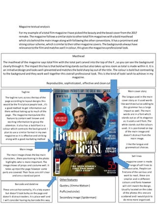
Magazine textual analysis
- 1. Magazine textual analysis For my example of atotal filmmagazine Ihave pickedthe beautyandthe beast coverfromthe 2017 remake.The magazine followsasimilarstyle toothertotal filmmagazineswithaboldmasthead whichsitsbehindthe mainimage alongwithfollowingthe otherconventions.Ithasa prominentand strongcolour scheme,whichissimilar totheirothermagazine covers.The backgroundsalwayshave relevance tothe filmandmatcheswell incolour,thisgivesthe magazineaprofessional look. Masthead The masthead of the magazine says total film with the total part carved into the top of the F , so you can see the background clearlythroughit.The impact thishasis that boldwritingstands out but also takes up less room as total is made within it. It is an initiativedesignandlookswell-presentedandmatchesthe boldsharplayout of the title. The colour is bold but contrasting to the background and they work well together this overall professional look. This is the kind of look I wish to achieve in my magazine. Reproducible, sophisticated , effective and clean cut Tagline The tagline runs across the top of the page according to layout designs this would be the first place people look , it’s a good method to get information out there without taking up to much of the page . The magazine manipulate this feature to contain well known and exciting information to grasp the attention. It also has a bold font in a colour which contrasts the back ground. I plan to use a similar format in my own magazine as it is effective and striking along with a good marketing method Main cover story The langue used in the main cover story as it used words like world exclusive adding to this grammar has a large impact as well. The main words are in a font which stands out as of its elegance as it used a serif font. The white stands out the colours used . It is positioned on top of the main image and doesn’t distract from the main image. I like the langue and grammatical choices. Main image The main image shows the key main characters , there positioning in the photo highlights who is more important. The image shows of props and costume well. It takes up most the page however some parts are covered. Their faces are still clear and are a stand out point Barcode and dateline These are sat horizontally, it’s a key aspect but doesn’t look bulky on the page and doesn’t distractreaders.Itis place well and I will consider having my barcode this way Sell lines The magazine cover is made up of a range of sell lines to increase sales. People can find one of the various and want to read , these are smaller and in different colours and fonts however will still match the design. Usually located on the sides of the photos this one are scattered and I would pick to do mine more organised. Otherfeatures Quotes,( Emma Watson) Puffs(redcircle) Secondaryimage ( Spiderman)
- 2. Total film magazine over view Main image The main image showsthe beautyandthe beasttogetherhoweverthe waythere backsmeetand there lookinginoppositedirectionsshowsthat andhighlightsthe contrast.Neithercharacteris lookingatthe camera thiscouldbe usedto add mysteryhoweverIthinkIwill have mymodel / actresslookat the camerafor some kindof connection.The lackof eye contact fromboth couldbe usedto symbolisethere equalimportance orthattheymaybe afraidto make that connection. The princessislookingoutintothe distance this,thisshowsherelegance butalsoherindependence as she isnot lookingatthe male character. Her costume isa yellow dress, thiscolourcouldgive the connotationsof richesandgoldwhichcouldlinktoher royal status.She isalso holdingarose which isbrightred whichcouldsymboliselust,loveanddanger.My interoperationwouldbe the rose is meantto symbolise love asitisbeautiful howeverhasthorn’smeaningbeyondthe beautyyoucan still gethurt.She holdsitin herhand whichshowsthe relevance off it. The image is the centre of the cover and overlapsthe masthead(thisisacommondesign layout) howeveritdoesn’tcovertoomuchof the mastheadyoucan’tmake out the masthead.It takesup the perfectamountof the page to containotherinformationanditcoversthe rightinformationto an extentitisstill relevant.Writingwhichcoversthe image haslarge importance andthisisshown by the fact itcovers the mainvisual aspectof the page. I like the mainimage howeverbecause of the different themes, plotlinesandcharacter representationIwill use bodylangue andfacial expressionsinadifferentway.HoweverIdolike the ideaof havingthe maincharacter positionedfurtherforwardwithamainsecondarycharacter slightlybehindtoshowthe hierarchyandimportance of the characters.I will alsouse propsand costume to myadvantage. The main storyis aboutthe beautyand the beast.The fontusedto highlightthisisasitis more styledthana plainboldfont.Whichhasa nice effect.Itstandsoutyetis elegantandhasrelevance to the movie itsself.Inmymagazine coverIshall try to use a fontwhichmay have itsown relevance. Thisgivesitan overall goodlookthatstandsout. The taglinesdon’tstandoutverymuch howeverthe page isn’tbusyandthere isn’tasmuch to look at as others.So the audience still looksatthem.Itlookswell-formedandworkswell withthe featuresalthoughitisn’tasbusyand boldas othersitstill isgoodat catchingpeople’sattention. The backgroundcomplementsthe aspectsof the cover.The blue backgroundwhichchangesfrom dark to lightmakesitlookmagical (relatestothe factit isa Disneyfilm)the mixturemakesthe backgroundsoftbut a standout and unique background.The factthat itblendsmakesitmore interestingandappealing. Overall I like the magazine’scover,itlooksprofessional.It’ssimple howevereffective.Thisisagood wayto attract an audience asit’seasyto pickout the contentthat theywantand isn’tfully distracting.ThroughthiscoverI have learntthatit isabout the overall looknotthe specificaspects. To have it puttogetheryouhave to lookat what workswiththe masthead,the main image andthe information.
- 3. Empire magazine The Main image is veryeffective asitshowsthe characteristicsof the actor and character.The body langue usediskeytoestablishhowpeoplesee the movie.The actor’sbodylangue shows independenceandstrength.Somethingasuperherohaslookingatthischaracter you can assume he isa successful superherowhichthenmeanstherewill be lotsof actionashe getsthissuccess. The fact he is lookingatthe camera couldalsomake a connectionwiththe audience,thiscouldreflectin hisguardianrole as a superhero. His facial expression,eye contactwiththe cameraand bodylangue Masthead– The name is shortand snappywhichmeansitdoesn’ttake upto much of the page.The mastheadisinred which isa brighteye catchingcolour.The fontis boldwhichmakesitstandout on the darkerbackground.Andthe mainimage over lapsit butdoesn’tcoverto much.The mastheadworkswell inthe colourscheme andasa title. Tagline – Alongthe topthere is a tagline whichusesits vocabularytocatch your attentionlike usingthe word“ amazing“ , the fact the fontsize changesisalso a unique feature whichemphasisespartsof the line. Main image – The mainimage highlightsthe keyactorof the film,he isalsoin a costume whichisrecognizable and relevant.He’smakingeye contact withthe camera which makesa connectionwiththe audience anddrawsyouinto the image.It’sa mediumclose up showwhichhighlights featureslike hisarms. Main story – The mainstoryis in the centre of the page and overlapsthe mainimage aswell as beinginboldwriting.Asthis isa mainsellingpointithasto standout. It alsomatchesthe colourscheme andworkswell withthe othersell linesand there fontsandcolours. Sell lines –The coverconsists of themandthere all backgroundaspects.The white colouron the blackbackground and fontmake themstandout. There organisedandwell positioned.Addingtothe professionallookof the page The page alsohas a barcode whichisa necessityto magazinestobe sold.However it islocatedhorizontallywhich workswell withthe sell line locatedabove it.Makingnot to bulkylookingonthe page Puff – In thiscircle ittellsyou some informationbecauseit doesn’tblendinwiththe other detailsitstandsoutas of the circle.Makingthisa good feature tohave if you wanted to have somethingwhich standsout. Thishas beenon bothmagazine whichmay highlightitmayb a good feature tohave for an effective magazine Thiscover looksveryprofessional andorganised.The redwhite andblack colourscheme workswell with makingstandout textandlinkingwiththe costume usedforthe mainimage.Nothinglooksoutof place and itworkswell.Colourscheme issomethingthat mustbe takenintoconsideration
- 4. have a huge impact thisiswhyit mustbe consideredinthe photo-shootof the imagesforthe magazine.Ilike the waytheyhave usedthe photographytomake an impact.It is somethingsimple yethas a strong meaningwithoutitbeingtoobusy. The factitis a mediaclose upmeanswe can see the mise –enscene of the costume andthat the bodylangue playa huge role withinthe image. The red and white usedfortextworkswell incomplementingthe costume.The darkercolourslike the navy andthe darkback ground bringforwardthe brightercolourslike the redandwhite.Ialso likedthatthe mainstoryline isina greywhere the gradientchangestowhite tomake itlooklike it shineswhichmatchesthe name “man of steel “the textlookslike itcouldbe reflective metal.The brightredcould alsobe resemblance of the factmanof steel isanaction filmasredhas connotationsof danger,violence andangerall thingswhichlinktoconventionsof actionfilms. Howeverthe white colourcouldresemblehow the heroispure and triestosave innocentlives.This issomethingthatpeople maythingof subconsciously. Thiscover usesa range of fonts.There isa mixture of fine,bold andsanserifsfonts. The fonts mixture helpscomplementthe mainarticle andthe pinnacle taglines.Theystandoutcomparedto the otherlineshoweverbecause of the unique mixof fontstheyare notlostamong the writingon the page.The keypointssuchas the mastheadandthe mainstoryare boldand standout.The fact the writingisincapitalsmakesitstand outand lookslike aboldstatement.Thisgrabsaudience’s attentionandtheywill stoptoreadit and itis workedsothat itwill catch their attentionandthey will stopandread it. The fact there isn’ta secondaryphotoworkswiththe structure of havingwriting.Itmakessure the place isnot t busy.The writingiseffectiveoveroccupyingthe page andprovidinginformation howeverthiscouldhave anindicationonthe targetaudience.The Factthere ismore writingcould be because the targetaudience isolder.People whovalue wordsasmuchas a message animage can represent.Howeverwordsinthiscase don’tprovide the same information,contextandcolours whichwouldattract a youngeraudience withalowerattentionspan. Sightand sound. Thismagazine clearlyshowsamore simplisticlook.There are lessof the commonconventions.Howeverit’sstilleffective. Masthead- the masthead isinyellow andredtwobright colourshoweverthe boldisIna lowercase font.However because the magazine lacksabusy page itworkswell Main image- adramatic engagingimage Main storytitle Bar code Sell lines The magazine issimple and lessbusy.Thiscouldbe the magazine has a specificaudiencewhotheyknowwillhave the magazine butit couldalsobe because of theirtargetaudience. The title usesbold coloursto standout but doesn’thave tofightforattentionasit doesn’thave manysell lines.The mainstoryinhighlightedandis centre page whichbringsyourattentiontothe keysellingpoint.
- 5. Thismatchesthe main image whichisa picture of the actress makingdirecteye contact.Her costume andheavymakeupsuggestsanedgystyle whichcouldmatchthe dark coloursof the background.The image standsoutas itis a close upand centre page althoughitis tuckedbehindthe masthead.Thissimplisticstyle isclassyandprofessional.Thiscouldreflectthe audience andalsothe fact the article isabout the actressinsteadof the film.Thisattracts a differentkindof audience toif it wasthe name of the film. The magazine statesitinternational whichsuggestsawide audienceandsuccessthiscouldrelate to whatI mentionedaboutitlackextrasto attract an audience asitprobablyhas specificaudience who alreadypurchase itand itsto appeal tothem. A simple anddramaticlookiscommonthroughoutthe issues.Makingita sleekandeffective cover. Anda differentstyle comparedtothe othermagazinesthathave beenlookedat.Afterata range of coversI have noticedthattheychange the style of the mastheadhoweverkeepthe same fontsand colours.Thisisa unique andinterestingfeature toinclude.