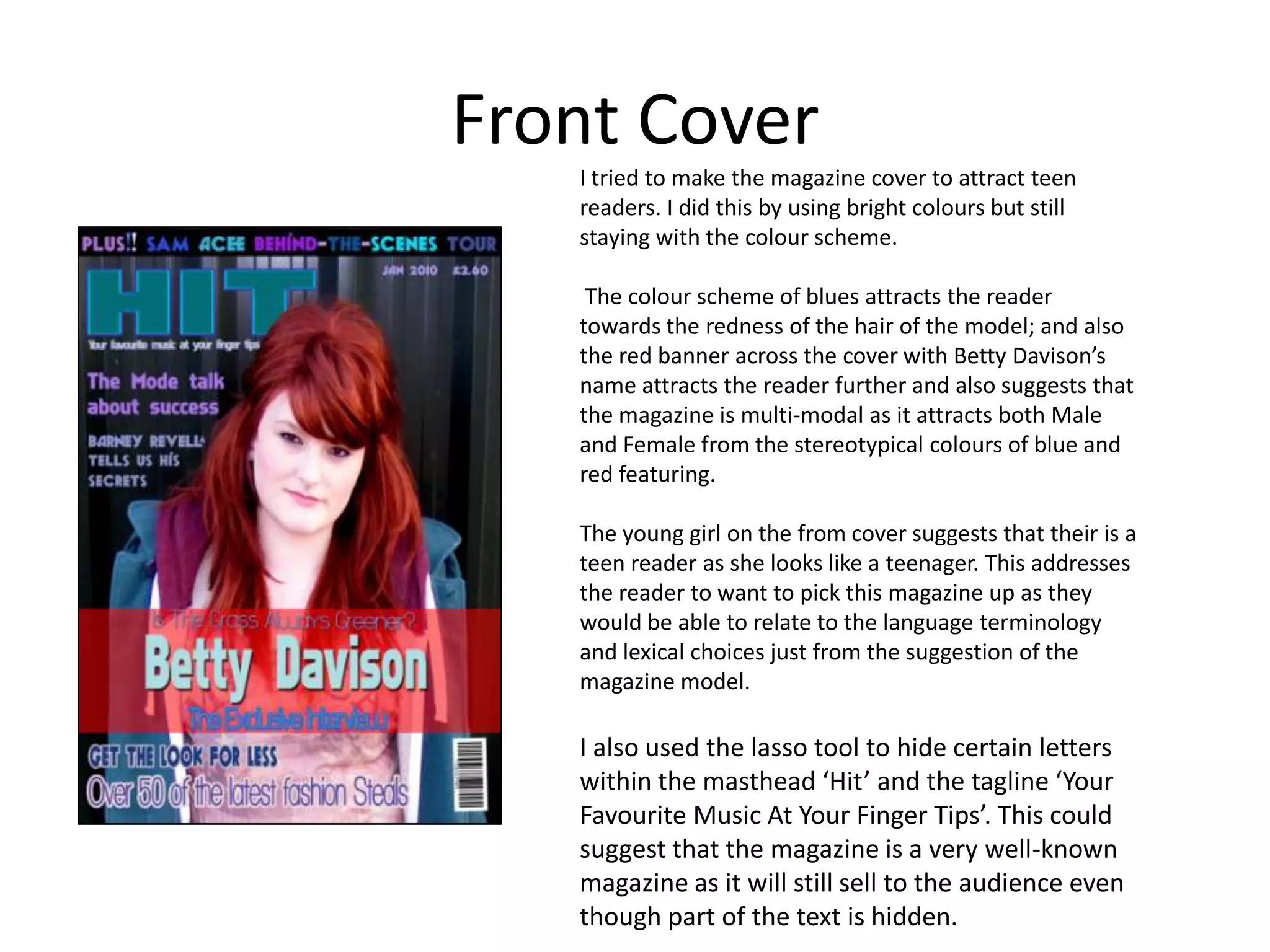
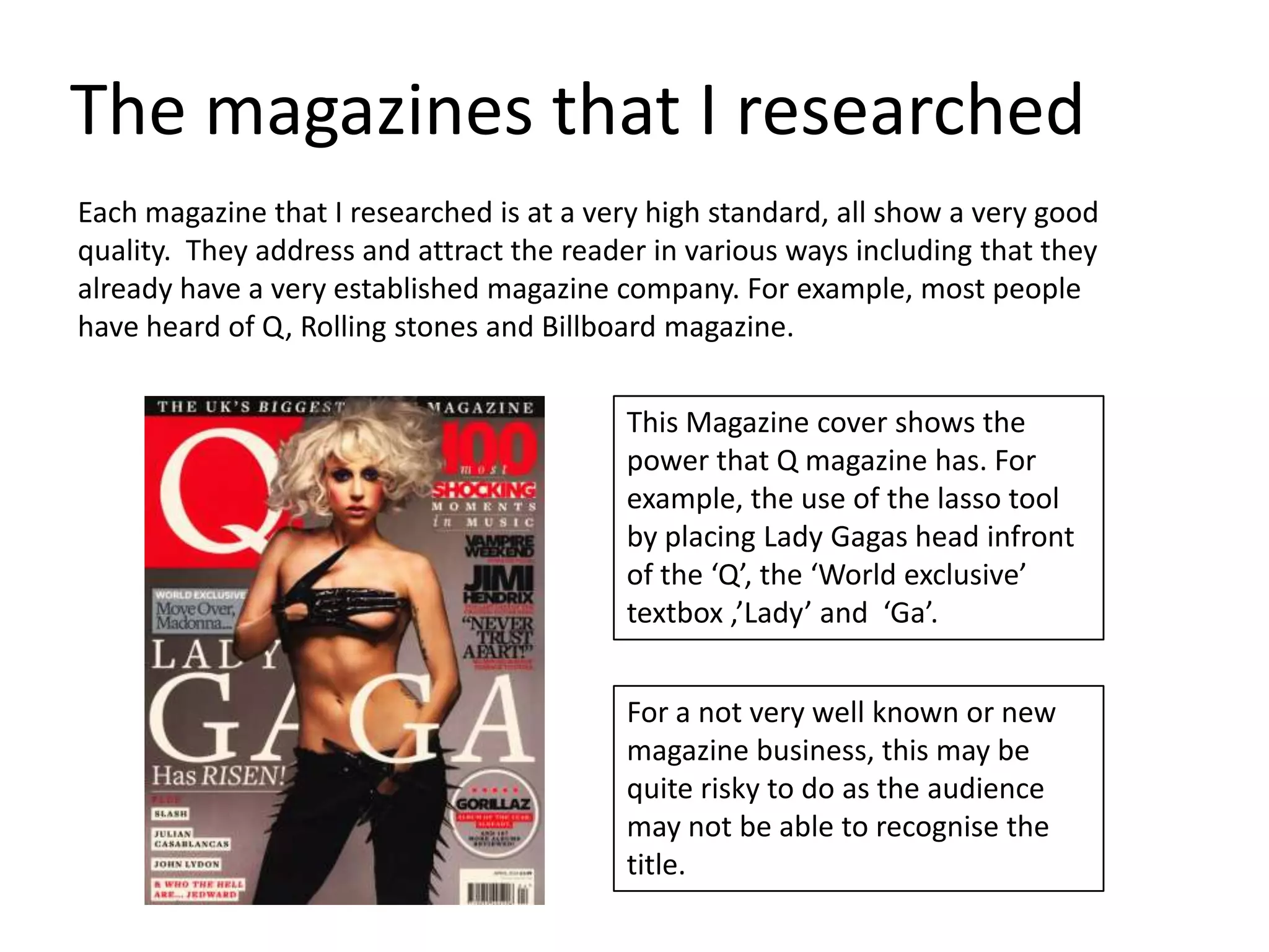
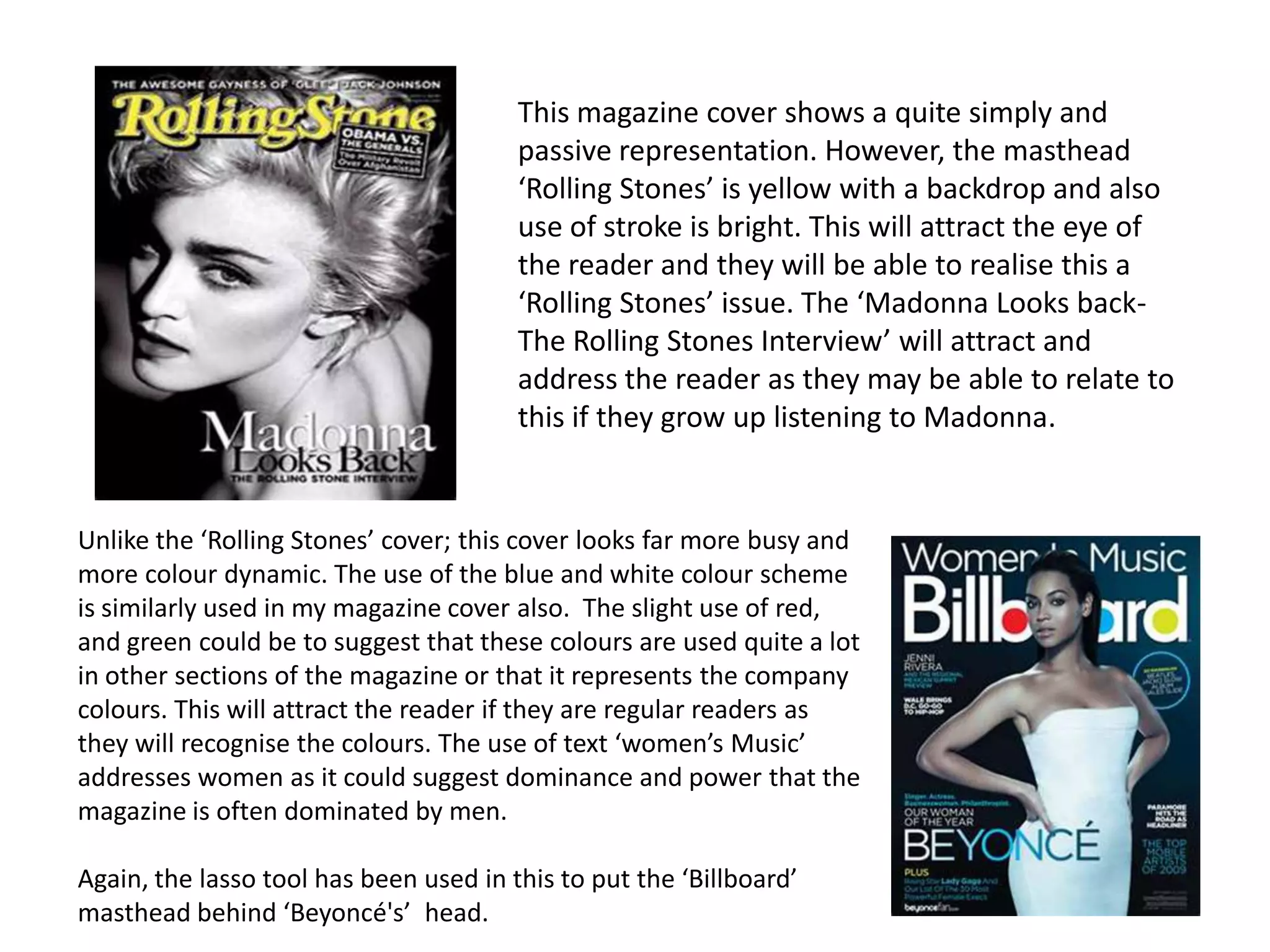
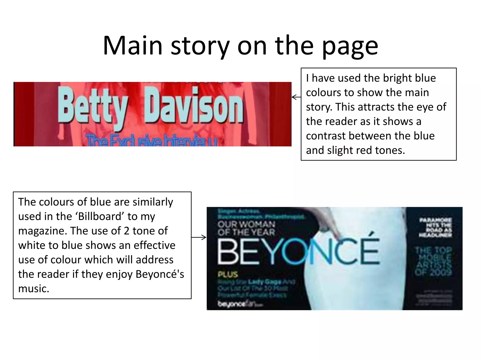
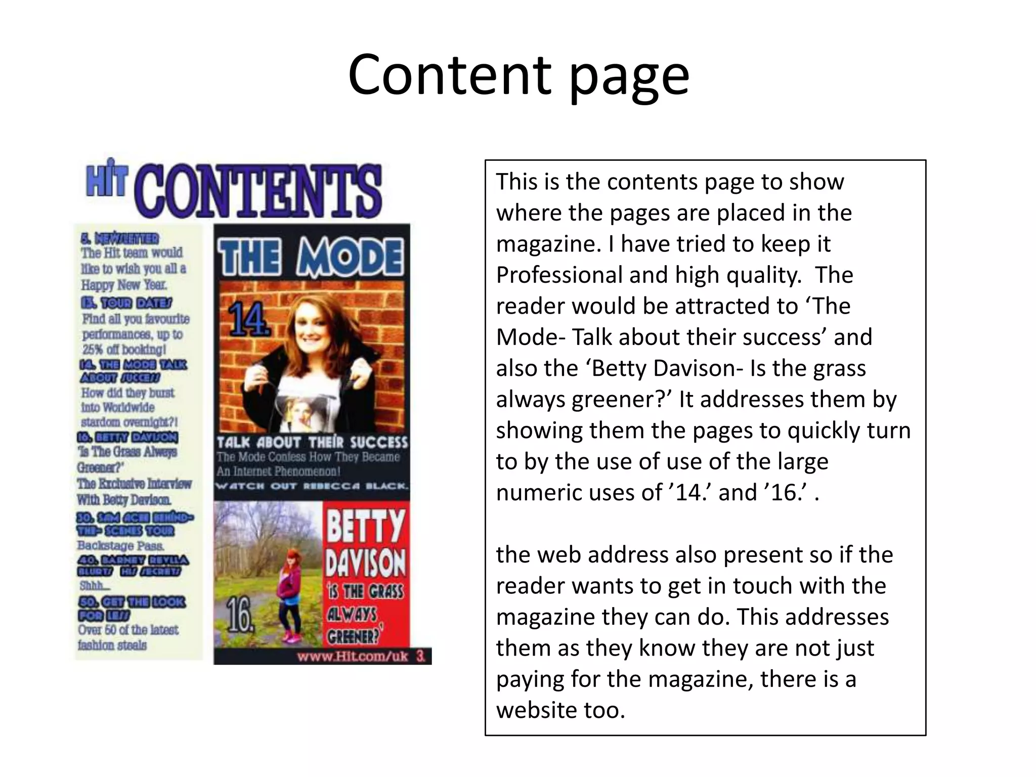
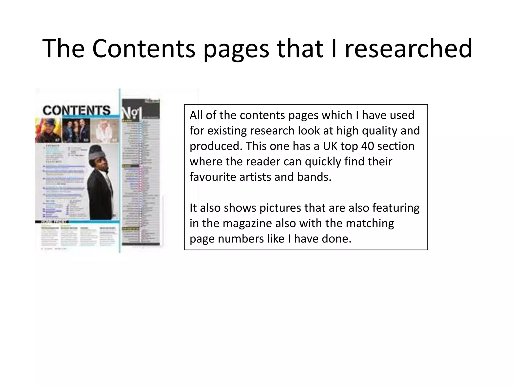
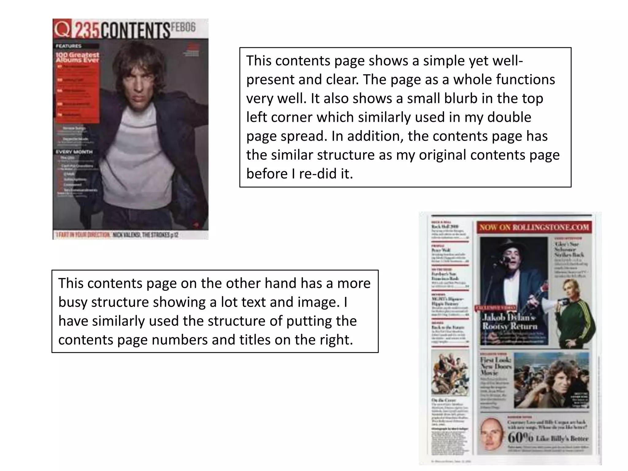
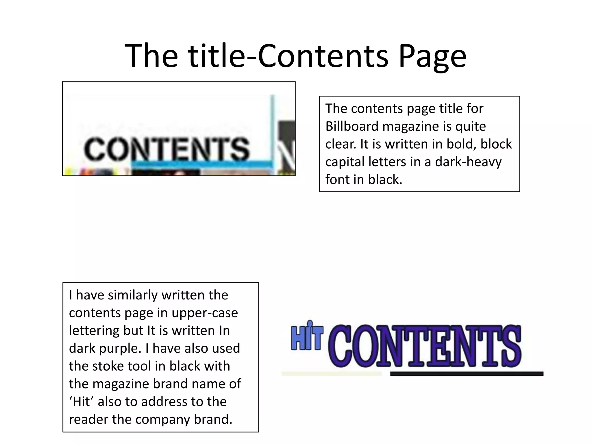
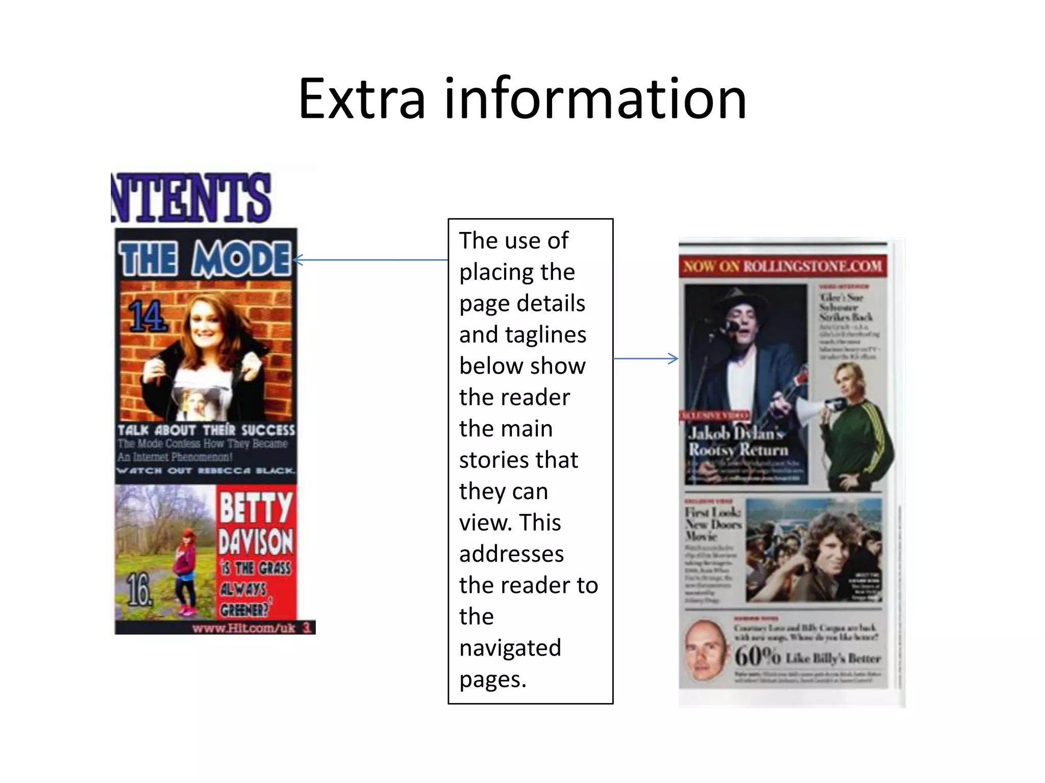
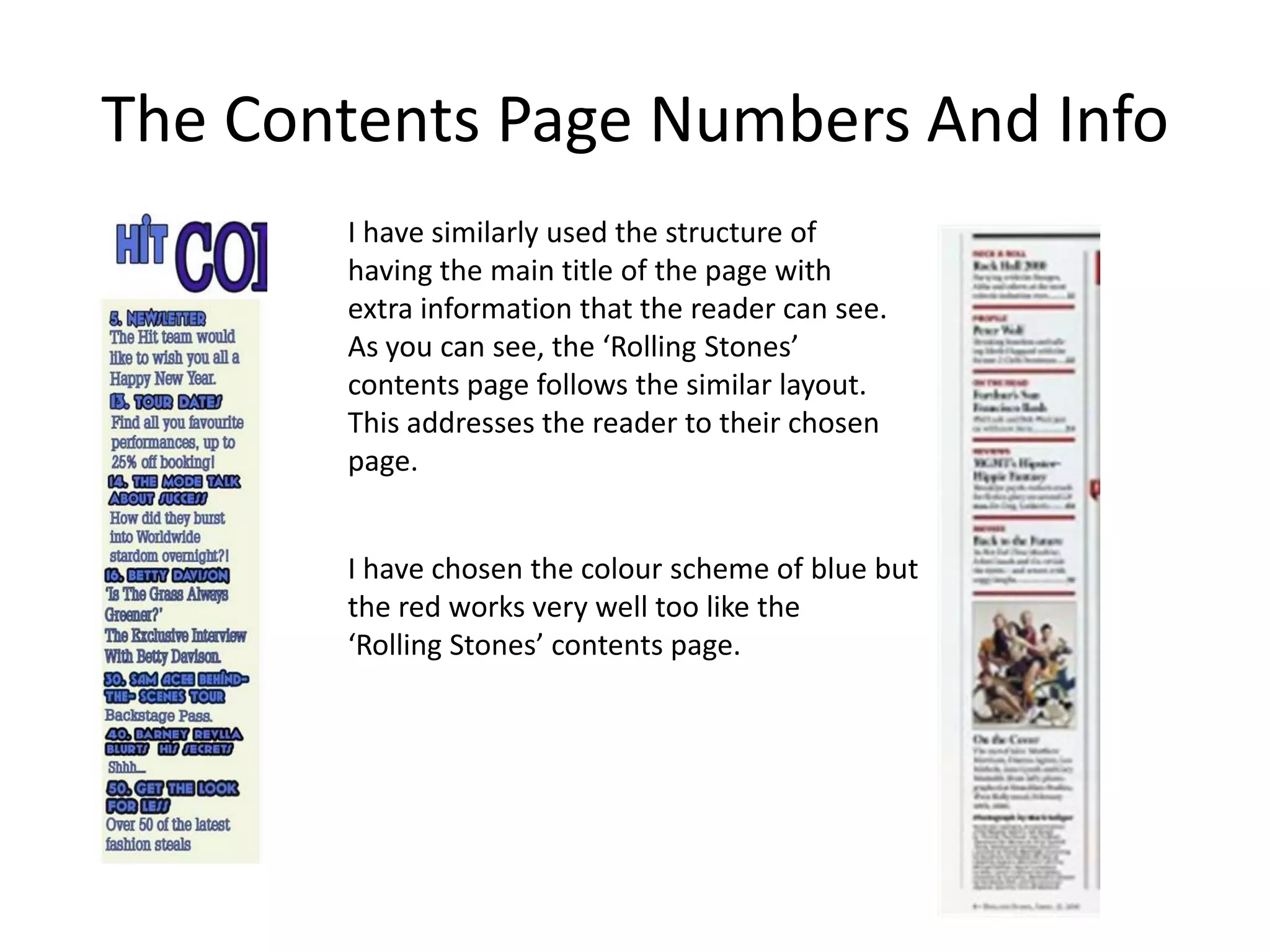
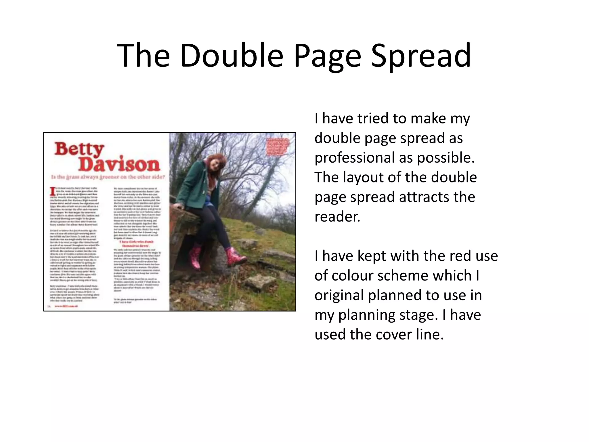
How did you attract/address
     your audience?
Front Cover
   I tried to make the magazine cover to attract teen
   readers. I did this by using bright colours but still
   staying with the colour scheme.

    The colour scheme of blues attracts the reader
   towards the redness of the hair of the model; and also
   the red banner across the cover with Betty Davison’s
   name attracts the reader further and also suggests that
   the magazine is multi-modal as it attracts both Male
   and Female from the stereotypical colours of blue and
   red featuring.

   The young girl on the from cover suggests that their is a
   teen reader as she looks like a teenager. This addresses
   the reader to want to pick this magazine up as they
   would be able to relate to the language terminology
   and lexical choices just from the suggestion of the
   magazine model.

   I also used the lasso tool to hide certain letters
   within the masthead ‘Hit’ and the tagline ‘Your
   Favourite Music At Your Finger Tips’. This could
   suggest that the magazine is a very well-known
   magazine as it will still sell to the audience even
   though part of the text is hidden.
The magazines that I researched
Each magazine that I researched is at a very high standard, all show a very good
quality. They address and attract the reader in various ways including that they
already have a very established magazine company. For example, most people
have heard of Q, Rolling stones and Billboard magazine.


                                           This Magazine cover shows the
                                           power that Q magazine has. For
                                           example, the use of the lasso tool
                                           by placing Lady Gagas head infront
                                           of the ‘Q’, the ‘World exclusive’
                                           textbox ,’Lady’ and ‘Ga’.


                                           For a not very well known or new
                                           magazine business, this may be
                                           quite risky to do as the audience
                                           may not be able to recognise the
                                           title.
This magazine cover shows a quite simply and
                                        passive representation. However, the masthead
                                        ‘Rolling Stones’ is yellow with a backdrop and also
                                        use of stroke is bright. This will attract the eye of
                                        the reader and they will be able to realise this a
                                        ‘Rolling Stones’ issue. The ‘Madonna Looks back-
                                        The Rolling Stones Interview’ will attract and
                                        address the reader as they may be able to relate to
                                        this if they grow up listening to Madonna.


Unlike the ‘Rolling Stones’ cover; this cover looks far more busy and
more colour dynamic. The use of the blue and white colour scheme
is similarly used in my magazine cover also. The slight use of red,
and green could be to suggest that these colours are used quite a lot
in other sections of the magazine or that it represents the company
colours. This will attract the reader if they are regular readers as
they will recognise the colours. The use of text ‘women’s Music’
addresses women as it could suggest dominance and power that the
magazine is often dominated by men.

Again, the lasso tool has been used in this to put the ‘Billboard’
masthead behind ‘Beyoncé's’ head.
In addition, I have
                           The Masthead
positioned the
                           I have tried to make the   I have also used the effects
masthead behind the
                           masthead clear and easy    to create this two-tone look.
models head, this is
                           to read.                   I did this by using colour
because my audience
                                                      overlay, gradient overlay,
would be able to
                                                      pattern overlay, satin, stroke
realise what the
                                                      to apply a more professional
magazine is and also
                                                      look.
‘your favourite music
at your finger tips’ is
also slightly behind the                              I have also made the strap
models head, this                                     line ‘plus!! Sam Ace
addresses the                                         behind-the-scenes tour’,
                            I have made this bold
audience as they                                      this shows the reader that
                            and eye catching so
would be already be                                   there is extras to the
                            the reader would be
familiar with the                                     magazine from the lexical
                            drawn towards it.
language.                                             choice of ‘plus’. The use of
                                                      exclamation marks attract
                                                      the audiences attention as
                                                      they are imperative.
The existing magazine masthead and
               mine
                                 I similarly used the lasso tool
                                 to place the models head in
                                 front of the masthead.


The masthead shows clear use
of lasso tool by placing ‘lady
Gaga’s’ in front of the text.
Pricing, Bar-coding and Issue Date
The pricing and bar-coding to present the magazine as a real magazine that you
would see in your local News agents. The price of the magazine is £2.60; I priced it
at this price as the audience is teenagers to young adults so they may not be able
to afford an expensive amount although I would presume that they would have a
disposable Income that would at least be able to afford a monthly amount of
£2.60.


                                                I have put the price in
                                                the top right corner,
                                                this doesn’t distract
                                                the audience from
                                                the main stories but
                                                is still visible to see.
Bar-coding
• I have bar-coded the magazine cover to make
  it look like an actual magazine cover so it
  would be sellable In a shop.
• A bar-codes is used with machines, a barcode
  transfers data.
• In this case of my product, the data will be
  transferred from the barcode to the till
  machine so it can be sold.
Main story on the page
                                     I have used the bright blue
                                     colours to show the main
                                     story. This attracts the eye of
                                     the reader as it shows a
                                     contrast between the blue
                                     and slight red tones.


The colours of blue are similarly
used in the ‘Billboard’ to my
magazine. The use of 2 tone of
white to blue shows an effective
use of colour which will address
the reader if they enjoy Beyoncé's
music.
Content page
     This is the contents page to show
     where the pages are placed in the
     magazine. I have tried to keep it
     Professional and high quality. The
     reader would be attracted to ‘The
     Mode- Talk about their success’ and
     also the ‘Betty Davison- Is the grass
     always greener?’ It addresses them by
     showing them the pages to quickly turn
     to by the use of use of the large
     numeric uses of ’14.’ and ’16.’ .

     the web address also present so if the
     reader wants to get in touch with the
     magazine they can do. This addresses
     them as they know they are not just
     paying for the magazine, there is a
     website too.
The Contents pages that I researched

            All of the contents pages which I have used
            for existing research look at high quality and
            produced. This one has a UK top 40 section
            where the reader can quickly find their
            favourite artists and bands.

            It also shows pictures that are also featuring
            in the magazine also with the matching
            page numbers like I have done.
This contents page shows a simple yet well-
                            present and clear. The page as a whole functions
                            very well. It also shows a small blurb in the top
                            left corner which similarly used in my double
                            page spread. In addition, the contents page has
                            the similar structure as my original contents page
                            before I re-did it.


This contents page on the other hand has a more
busy structure showing a lot text and image. I
have similarly used the structure of putting the
contents page numbers and titles on the right.
The title-Contents Page
                                 The contents page title for
                                 Billboard magazine is quite
                                 clear. It is written in bold, block
                                 capital letters in a dark-heavy
                                 font in black.


I have similarly written the
contents page in upper-case
lettering but It is written In
dark purple. I have also used
the stoke tool in black with
the magazine brand name of
‘Hit’ also to address to the
reader the company brand.
Extra information

      The use of
      placing the
      page details
      and taglines
      below show
      the reader
      the main
      stories that
      they can
      view. This
      addresses
      the reader to
      the
      navigated
      pages.
The Contents Page Numbers And Info
       I have similarly used the structure of
       having the main title of the page with
       extra information that the reader can see.
       As you can see, the ‘Rolling Stones’
       contents page follows the similar layout.
       This addresses the reader to their chosen
       page.


       I have chosen the colour scheme of blue but
       the red works very well too like the
       ‘Rolling Stones’ contents page.
The Double Page Spread
            I have tried to make my
            double page spread as
            professional as possible.
            The layout of the double
            page spread attracts the
            reader.

            I have kept with the red use
            of colour scheme which I
            original planned to use in
            my planning stage. I have
            used the cover line.
The existing Double spread pages that
             I researched

                   The double page spread
                   shows Florence welch
                   as the model in the
                   image. She is sat on
                   what looks to be a
                   American flag will ‘USA
                   got the love’ written
                   behind. This addresses
                   the reader as they may
                   live in America or be
                   interested in America.
Double Page Spread
                              The double page attracts the attention of the
                              reader from the poison pen letter style cover line
                              of ‘people think I'm an attention seeker, but I'm
                              just honest’, this attracts the reader as it looks
                              fierce and attention grabbing and addresses them
                              by the actually lexis content that will give the
                              reader a reaction to it. In addition the semantic
                              field of being defensive and attitude by the
                              position that ‘Lily Allen’ is stood.

This double page spread attracts the reader of
the readers by the use of the bright white
colour and image in front of the dark black as
it shows the contrast between the colours.
The titles


The ‘Betty Davison’ in       Similarly to this, it grabs the
red stays with the red       readers attention by the bright
colour scheme but also       contrast. This addresses the
shows a diverse of the       reader also as it will address the
red colour.                  reader as they will react to the
                             lexis.
Images


I have tried to relate my magazine image to my existing research
double page spread image by similarly having red as part of the
colour scheme. I have tried to make this image of ‘Betty Davison’
clear from text as much as possible so it can double up as an
poster for the reader. This will attract the reader as it is a freebie
which promotes the artist.

However, I created a blurb which addresses the reader to another
page for a promotional offer to win something.
The main Story- Article


                               The beginning of the of the article
                               is written larger than the other
The main article is written    text. This is to intrigue the reader
in a column of 2. I tried to   by attracting them towards the
space it out to attract the    article. This done in my article by
audience as it doesn’t look    the colour use of red with the
overpowering and boring.       larger ‘I’ and in the existing
I have also added the web      research page of ‘I’ also.
address and page number.
Quoted Text
                                       The quoted text on the
                                       ‘Madonna’ double page
                                       spread is used on the image.
                                       This attracts the reader as it
                                       is usually something that is
                                       really interesting that would
                                       intrigue the reader.
I similarly used a quote from the
article in a different colour to the
rest of the text. This attracts the
readers as it sound interesting and
addresses them also as they may be
able to relate to this.
The Blurb
 This small piece of text at the top left hand
 side of the image in the double page spread is
 to show the reader that is interested in ‘Betty
 Davison’ can turn to page ’25’ for a ‘chance of
 winning a Betty Knows Best’ black suede heels
 exclusive to Topshop. This adds effects and
 attracts the reader even more as they could
 have a chance of winning something.

  Many Double page spreads do have a
  small blurb on images but unfortunately
  non of the magazines that I researched
  did so I cant compare this to my
  research.

How did you attract

  • 1.
    How did youattract/address your audience?
  • 2.
    Front Cover I tried to make the magazine cover to attract teen readers. I did this by using bright colours but still staying with the colour scheme. The colour scheme of blues attracts the reader towards the redness of the hair of the model; and also the red banner across the cover with Betty Davison’s name attracts the reader further and also suggests that the magazine is multi-modal as it attracts both Male and Female from the stereotypical colours of blue and red featuring. The young girl on the from cover suggests that their is a teen reader as she looks like a teenager. This addresses the reader to want to pick this magazine up as they would be able to relate to the language terminology and lexical choices just from the suggestion of the magazine model. I also used the lasso tool to hide certain letters within the masthead ‘Hit’ and the tagline ‘Your Favourite Music At Your Finger Tips’. This could suggest that the magazine is a very well-known magazine as it will still sell to the audience even though part of the text is hidden.
  • 3.
    The magazines thatI researched Each magazine that I researched is at a very high standard, all show a very good quality. They address and attract the reader in various ways including that they already have a very established magazine company. For example, most people have heard of Q, Rolling stones and Billboard magazine. This Magazine cover shows the power that Q magazine has. For example, the use of the lasso tool by placing Lady Gagas head infront of the ‘Q’, the ‘World exclusive’ textbox ,’Lady’ and ‘Ga’. For a not very well known or new magazine business, this may be quite risky to do as the audience may not be able to recognise the title.
  • 4.
    This magazine covershows a quite simply and passive representation. However, the masthead ‘Rolling Stones’ is yellow with a backdrop and also use of stroke is bright. This will attract the eye of the reader and they will be able to realise this a ‘Rolling Stones’ issue. The ‘Madonna Looks back- The Rolling Stones Interview’ will attract and address the reader as they may be able to relate to this if they grow up listening to Madonna. Unlike the ‘Rolling Stones’ cover; this cover looks far more busy and more colour dynamic. The use of the blue and white colour scheme is similarly used in my magazine cover also. The slight use of red, and green could be to suggest that these colours are used quite a lot in other sections of the magazine or that it represents the company colours. This will attract the reader if they are regular readers as they will recognise the colours. The use of text ‘women’s Music’ addresses women as it could suggest dominance and power that the magazine is often dominated by men. Again, the lasso tool has been used in this to put the ‘Billboard’ masthead behind ‘Beyoncé's’ head.
  • 5.
    In addition, Ihave The Masthead positioned the I have tried to make the I have also used the effects masthead behind the masthead clear and easy to create this two-tone look. models head, this is to read. I did this by using colour because my audience overlay, gradient overlay, would be able to pattern overlay, satin, stroke realise what the to apply a more professional magazine is and also look. ‘your favourite music at your finger tips’ is also slightly behind the I have also made the strap models head, this line ‘plus!! Sam Ace addresses the behind-the-scenes tour’, I have made this bold audience as they this shows the reader that and eye catching so would be already be there is extras to the the reader would be familiar with the magazine from the lexical drawn towards it. language. choice of ‘plus’. The use of exclamation marks attract the audiences attention as they are imperative.
  • 6.
    The existing magazinemasthead and mine I similarly used the lasso tool to place the models head in front of the masthead. The masthead shows clear use of lasso tool by placing ‘lady Gaga’s’ in front of the text.
  • 7.
    Pricing, Bar-coding andIssue Date The pricing and bar-coding to present the magazine as a real magazine that you would see in your local News agents. The price of the magazine is £2.60; I priced it at this price as the audience is teenagers to young adults so they may not be able to afford an expensive amount although I would presume that they would have a disposable Income that would at least be able to afford a monthly amount of £2.60. I have put the price in the top right corner, this doesn’t distract the audience from the main stories but is still visible to see.
  • 8.
    Bar-coding • I havebar-coded the magazine cover to make it look like an actual magazine cover so it would be sellable In a shop. • A bar-codes is used with machines, a barcode transfers data. • In this case of my product, the data will be transferred from the barcode to the till machine so it can be sold.
  • 9.
    Main story onthe page I have used the bright blue colours to show the main story. This attracts the eye of the reader as it shows a contrast between the blue and slight red tones. The colours of blue are similarly used in the ‘Billboard’ to my magazine. The use of 2 tone of white to blue shows an effective use of colour which will address the reader if they enjoy Beyoncé's music.
  • 10.
    Content page This is the contents page to show where the pages are placed in the magazine. I have tried to keep it Professional and high quality. The reader would be attracted to ‘The Mode- Talk about their success’ and also the ‘Betty Davison- Is the grass always greener?’ It addresses them by showing them the pages to quickly turn to by the use of use of the large numeric uses of ’14.’ and ’16.’ . the web address also present so if the reader wants to get in touch with the magazine they can do. This addresses them as they know they are not just paying for the magazine, there is a website too.
  • 11.
    The Contents pagesthat I researched All of the contents pages which I have used for existing research look at high quality and produced. This one has a UK top 40 section where the reader can quickly find their favourite artists and bands. It also shows pictures that are also featuring in the magazine also with the matching page numbers like I have done.
  • 12.
    This contents pageshows a simple yet well- present and clear. The page as a whole functions very well. It also shows a small blurb in the top left corner which similarly used in my double page spread. In addition, the contents page has the similar structure as my original contents page before I re-did it. This contents page on the other hand has a more busy structure showing a lot text and image. I have similarly used the structure of putting the contents page numbers and titles on the right.
  • 13.
    The title-Contents Page The contents page title for Billboard magazine is quite clear. It is written in bold, block capital letters in a dark-heavy font in black. I have similarly written the contents page in upper-case lettering but It is written In dark purple. I have also used the stoke tool in black with the magazine brand name of ‘Hit’ also to address to the reader the company brand.
  • 14.
    Extra information The use of placing the page details and taglines below show the reader the main stories that they can view. This addresses the reader to the navigated pages.
  • 15.
    The Contents PageNumbers And Info I have similarly used the structure of having the main title of the page with extra information that the reader can see. As you can see, the ‘Rolling Stones’ contents page follows the similar layout. This addresses the reader to their chosen page. I have chosen the colour scheme of blue but the red works very well too like the ‘Rolling Stones’ contents page.
  • 16.
    The Double PageSpread I have tried to make my double page spread as professional as possible. The layout of the double page spread attracts the reader. I have kept with the red use of colour scheme which I original planned to use in my planning stage. I have used the cover line.
  • 17.
    The existing Doublespread pages that I researched The double page spread shows Florence welch as the model in the image. She is sat on what looks to be a American flag will ‘USA got the love’ written behind. This addresses the reader as they may live in America or be interested in America.
  • 18.
    Double Page Spread The double page attracts the attention of the reader from the poison pen letter style cover line of ‘people think I'm an attention seeker, but I'm just honest’, this attracts the reader as it looks fierce and attention grabbing and addresses them by the actually lexis content that will give the reader a reaction to it. In addition the semantic field of being defensive and attitude by the position that ‘Lily Allen’ is stood. This double page spread attracts the reader of the readers by the use of the bright white colour and image in front of the dark black as it shows the contrast between the colours.
  • 19.
    The titles The ‘BettyDavison’ in Similarly to this, it grabs the red stays with the red readers attention by the bright colour scheme but also contrast. This addresses the shows a diverse of the reader also as it will address the red colour. reader as they will react to the lexis.
  • 20.
    Images I have triedto relate my magazine image to my existing research double page spread image by similarly having red as part of the colour scheme. I have tried to make this image of ‘Betty Davison’ clear from text as much as possible so it can double up as an poster for the reader. This will attract the reader as it is a freebie which promotes the artist. However, I created a blurb which addresses the reader to another page for a promotional offer to win something.
  • 21.
    The main Story-Article The beginning of the of the article is written larger than the other The main article is written text. This is to intrigue the reader in a column of 2. I tried to by attracting them towards the space it out to attract the article. This done in my article by audience as it doesn’t look the colour use of red with the overpowering and boring. larger ‘I’ and in the existing I have also added the web research page of ‘I’ also. address and page number.
  • 22.
    Quoted Text The quoted text on the ‘Madonna’ double page spread is used on the image. This attracts the reader as it is usually something that is really interesting that would intrigue the reader. I similarly used a quote from the article in a different colour to the rest of the text. This attracts the readers as it sound interesting and addresses them also as they may be able to relate to this.
  • 23.
    The Blurb Thissmall piece of text at the top left hand side of the image in the double page spread is to show the reader that is interested in ‘Betty Davison’ can turn to page ’25’ for a ‘chance of winning a Betty Knows Best’ black suede heels exclusive to Topshop. This adds effects and attracts the reader even more as they could have a chance of winning something. Many Double page spreads do have a small blurb on images but unfortunately non of the magazines that I researched did so I cant compare this to my research.