MASTHEAD:-
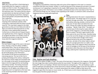
NME uses a sans serif font in thick lettering to
show boldly what the magazine is called and
makes sure that it is clear. The magazine also
used colour denotations of blacks and whites for
this particular cover. This means that the colours
are particularly non-descript and haven’t really
got any stereotyping around them, helping to
attract both genders and potentially widening
their readership.
Due to the use of just lettering as a title, the
meaning of the masthead could be a little
confusing to understand what the letters actually
stand for. This may help to appeal to the older
generations as they are more likely to be able to
figure out what the lettering stands for as they
may have a more sophisticated vocabulary.
Furthermore, to those who are frequent buyers
and significant fans of this magazine, being able
to recognise the letters can provide a sense of
familiarity and almost a smug-ness that they
know what this magazine stands for.
Date and Price:-
To magazines and publishers, featuring a date and a price of the magazine on the cover is a common
convention that they must include. Usually, it is small and discreet as the company do not want it to stand
out because it isn’t appealing or important to the reader. NME however have recently become a free
magazine, and so their information is not so hidden, and featured close to the mast head so that “free” is
one of the first things you see, making it quite appealing to the readers, in contrast to other conventional
magazines that are usually quite expensive.
Plug:-
The plug featured on the cover is represented as a
battered sticker. The design looks as if it is real and
has been through some wear. This, paired with the
stark yellow colouring, provides a contrast to the
crisp cover of clean black and white lines and
fonts. It draws the reader into what message it is
providing - “MUSIC, FILM, STYLE.” The plug is an
inventive way of informing the reader what the
genre of this magazine is, and what they will get
from its content. The font is again similar to the
fonts used on the rest of the cover, therefore tying
it in to the rest of the designs so it doesn’t look too
much out of place (even though it does have a
different format to the rest of the magazine.)
The rustic, old style of the sticker helps to attract
those of a younger generation as it adds a cool,
effortless vibe to the magazine which may also be
a sort of nostalgia to the old ways of the previous
generations when they were into these types of
things, widening their readership even further.
Main Image:-
The main feature image of the cover is the band
Foals, showing us that this edition of NME is
mainly about them. They are all looking at the
camera and using direct address which makes us
feel connected to the band as if they are going to
be personally giving us the information.
The members of the band are positioned in an
interesting way too. The man at the front is
jumping and kicking at the camera, making him
the main focus of the image and connotates that
he is the leader of the band. His positioning also
helps to link the image with the sub-headings
and making it all flow. The kicking movement
however meant that certain members of the
band were cut off slightly, also telling us that
maybe they aren’t as important as the main man,
or the remaining members that have stayed
uncovered.
Title, Tagline and Sub-Heading:-
The title of this edition of NME is “Foals”, the name of the band who is featured in this magazine. Paired with
the main image they make it pretty obvious what the issue entails. The tagline of this magazine is “It’s All
Kicking Off” and its sun-heading is “Britain’s best live band are coming for you.” The sub-heading is a puff,
used to emphasise and advertise this certain band and to interest the NME readers to buy the new edition of
this mag. By calling Foals the “best”, it is almost reassuring to the readers of NME as they rely on this
magazine to give them the latest on music trends. So, if Foals have an entire feature dedicated to them, they
must be good, therefore people will buy it.
Who is the text aimed at?
According to their mission statement and reader statistics, their target audience is mostly male readers aged 20-25. Through the marketing of this
magazine, they have achieved this mainly by appealing to the latest music and fashion trends, and featuring well known upcoming artists and trend-
setting themselves. They have additionally altered the language used in the magazine. Unlike newspapers or other genres such as sports, the texts are
written quite informally and have a humorous tone which mirrors the language used by those of the current generation.
What assumptions are made about the audience which are revealed in the text’s scheduling and
positioning?
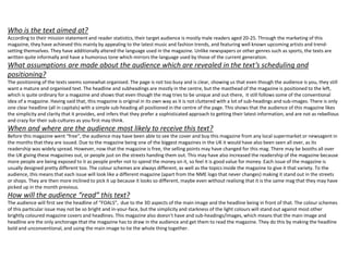
The positioning of the texts seems somewhat organised. The page is not too busy and is clear, showing us that even though the audience is you, they still
want a mature and organised text. The headline and subheadings are mostly in the centre, but the masthead of the magazine is positioned to the left,
which is quite ordinary for a magazine and shows that even though the mag tries to be unique and out-there, it still follows some of the conventional
idea of a magazine. Having said that, this magazine is original in its own way as it is not cluttered with a lot of sub-headings and sub-images. There is only
one clear headline (all in capitals) with a simple sub-heading all positioned in the centre of the page. This shows that the audience of this magazine likes
the simplicity and clarity that it provides, and infers that they prefer a sophisticated approach to getting their latest information, and are not as rebellious
and crazy for their sub-cultures as you first may think.
When and where are the audience most likely to receive this text?
Before this magazine went “free”, the audience may have been able to see the cover and buy this magazine from any local supermarket or newsagent in
the months that they are issued. Due to the magazine being one of the biggest magazines in the UK it would have also been seen all over, as its
readership was widely spread. However, now that the magazine is free, the selling points may have changed for this mag. There may be booths all over
the UK giving these magazines out, or people just on the streets handing them out. This may have also increased the readership of the magazine because
more people are being exposed to it as people prefer not to spend the money on it, so feel it is good value for money. Each issue of the magazine is
usually designed pretty different too. The colour schemes are always different, as well as the topics inside the magazine to give it that variety. To the
audience, this means that each issue will look like a different magazine (apart from the NME logo that never changes) making it stand out in the streets
or shops. They are then more inclined to pick it up because it looks so different, maybe even without realising that it is the same mag that they may have
picked up in the month previous.
How will the audience “read” this text?
The audience will first see the headline of “FOALS”, due to the 3D aspects of the main image and the headline being in front of that. The colour schemes
of this particular issue may not be so bright and in-your-face, but the simplicity and starkness of the light colours will stand out against most other
brightly coloured magazine covers and headlines. This magazine also doesn’t have and sub-headings/images, which means that the main image and
headline are the only anchorage that the magazine has to draw in the audience and get them to read the magazine. They do this by making the headline
bold and unconventional, and using the main image to tie the whole thing together.
Headline:-
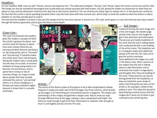
For the headline, NME came up with “Houses, Horses and Superstar DJs.” The alliteration between “Houses” and “Horses” gives the article a humorous and fun vibe.
The things can also be considered extravagant and usually what you would associate with well-known, rich DJs, giving the readers an impression on what they are
about to read, and the alliteration reinforces this idea due to the humour behind it. The use of American Dollar signs to replace the S’s in the words also reinforces
the fact that this article is about spending and what these crazy DJs have done with their earned cash, which helps to show the audience what this feature is about
whether or not they actually want to read it.
The font that the headline is written in also sets the design tone for the entire spread. It almost has a 70’s vibe, which gives it a cool retro feel but also stays modern
through the abstract geometry used to give the feature some depth.
Cover Line:-
The cover line beneath the headline
gives the readers a synopsis of what
the article is going to be about, and
confirms that this feature is about
how much money these DJs are
earning and what they are spending it
on. By using words such as “lucrative”
and “out-earning” it instantly makes
the article seem more interesting by
letting the readers have a sneak peak
into the lives of out idols. A common
ambition of many young adults is to
become rich and famous, and to
spend their money on lots of
luxurious things. So, to get to read
about people that have actually
achieved this and are “out-earning”
others, it is almost indulging in a
fantasy and raises ambitions higher
because it shows that it is actually
achievable.
Sub Image:-
Instead of having one main image and
a few sub images, this double page
spread relies only on sub images to
give it the attraction and information.
The pictures are mostly headshots of
the artist that the text is talking about,
and usually paired with a sub heading
of the artists name. The headshots are
in a triangular shape with additional
details to fit with the 70’s vibe and to
give the article continuity.
Some additional sub images are used
in the feature also, often a picture of
the subject that the text is talking
about to add information and to
contribute the reader’s imaginations
and thoughts that they are building of
the artist. These pictures can also be
distinguished from the headshots, as
they are tinted the same shade of
colour that that particular piece of the
article is, for example a shade of the
yellow or pink. This helps the spread to
keep flowing correctly and so that the
images don’t seem out of place or get
confused to be something else.
Article:-
The article of this feature looks at first glance to be a little complicated to follow,
however it simple just splits each of the A4 pages into three columns, which breaks
up the pages in an interesting yet conventional way for a magazine. The shapes and
positioning's of the images and geometric designs only help to draw our eyes
through different lines of the page, making it seem complicated and bright. The
fonts are small enough to get all of their information in, however clear enough so
that it is still legible and ties into the 70’s vibe.
Masthead:-
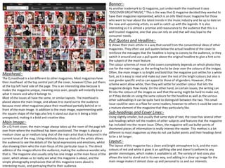
The Q masthead is a lot different to other magazines. Most magazines have
their masthead at the top central part of the cover, however Q has put theirs
at the top left hand side of the page. This is an interesting idea because it
makes the magazine unique, meaning once seen, people will instantly know
what it means and who it belongs to.
Most of the issues all have the same, or similar layouts. The masthead is
placed above the main image, and allows it to stand out to the audience
because most other magazines place their masthead partially behind or in
front of the main image. In addition to the main image, experimenting with
the square shape of the logo also lets it stand out due to it being a little
unexpected, making it a bold and creative idea.
Main Image:-
On a Q front cover, the main image always takes up the room of the page left
over from where the masthead has been positioned. The image is always a
medium close up or medium long shot of the main artist that is featured in the
current issue of the mag. Using relatively close up shots of the artists allows
the audience to see the details of the facial expressions and emotions, whilst
also showing them who the main focus of this particular issue is. The direct
address of the images allures the audience, making the audience wonder why
that is. The magazine also usually only has one image as the main focus of the
cover, which allows us to really see what this magazine is about, and the
simple photography emphasises that all this magazine cares about is
interesting music, and portraying that to their audience.
Banner:-
As another trademark to Q magazine, just underneath the masthead it says
“DISCOVER GREAT MUSIC.” This is the way that Q magazine decided they wanted to
have their magazine represented, which is an info filled music magazine for those
who want to hear about the latest trends in the music industry and be up to date on
the new and upcoming artists, as well as catch up with the legends. It is also
interesting as it is almost a promise and reassurance to the audience that this is a
well trusted magazine, one that you can rely on and that will stay loyal to the
consumer needs.
Pull Quotes and Headline:-
Q shows their main article in a way that varied from the conventional ideas of other
magazines. They often use pull quotes below the actual headline of the cover to
reinforce the messages that the headline is trying to convey to the audience, or they
switch it around and use a pull quote above the original headline to give a hint as to
the subject of the main feature.
The colour schemes of most of the covers completely depends on which photo they
use for the main image, as the writing has to be clear over the colours of the images.
Often, the main image is so bright and bold that the magazine just settles for a white
font, as it is easy to read and make out over the rest of the bright colours but also is
non gender specific and so can appeal to those of all genders. However, if the
scheme wont allow white, then they will settle for another colour that lets the
magazine designs flow nicely. On the other hand, on certain issues, the writing can
fit into the colours of the images so well that the wring might be hard to make out,
or if they decide on using the same colours for the headline as well as the various
other subheadings it can be quite hard to distinguish between the two. This small
issue could be seen as a flaw for some readers, however to others it could be seen as
a mature element of the magazine that they particularly like.
Sub-headings and Cover Lines:-
Using slightly smaller, but usually that same style of text, the cover has several other
sub-headings which tell the readers of other subjects and features that the magazine
has included into the recent issue. Often, the magazine will use bullet points of
shortened pieces of information to really interest the reader. This methos is a lot
different to most magazines as they do not use bullet points and their headings tend
to be a bit longer.
Layout:-
The layout of this magazine has a clean and bright atmosphere to it, and the main
colours of red and white it gives it an uplifting vibe and doesn’t conform to any
gender stereotypes, which makes it available to all. The variety of text sizes also
allows the text to stand out in its own way, and adding in a close up image for the
main image makes it almost close up and personal to us and our interests.
Masthead:-
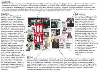
The masthead on this contents page is very fitting to the original “Q” themes. It features the signature Q logo next to the word contents so that the reader knows
what it is from that moment on. The writing is has also been places on a black square in the very top left hand corner of thefirst page. This provides a great
contrast against the white back grounds and the other formats of the design and directs our eyes to it. In addition using the Q alongside the contents is a way of
showing that what we are reading is property of Q, and that this is their edition and what they have decided to feature in their latest edition of their magazine. Its
all about implying to the audience that this was all their idea and that they are the best at what they do (so to speak.)
Headlines:-
The headlines of this pages are all
different names of each band that is
featured in this issue of Q, and interests
the audience as they can familiarise
themselves to the musicians that they
want to read about. It also emphasises
that this is a music magazine, and makes
it simple for the audience to understand
and follow the information that this page
is trying to convey, in this case, which
articles are going to feature which
artists. The headlines are written in the
same fonts as each other which aids to
keep the simplicity, but also the different
band names are all it needs to keep the
differentiation in the article and keep it
interesting to the audience.
A separate headline is also featured in
the contents. “100 best albums of the
’90s” has been places in a large red
square in the centre of the first page. It
is the first thing that your eyes are
drawn to on the page, due to the bright
colours and contrast to the other aspects
of the contents. The text is in a different
font to the rest of the writing on the
pages, again drawing our eyes to this
first and implying that this is what Q are
most proud of and want to present to
their readers as something they think is
important and valued in their
community.
Sub-Images:-
There are lots of images presented on
this page instead of having one main
image, and each one is presented
quite small as to link them to the
different articles that are named.
~This adds to the idea that there is
more than one interesting article and
reassures the audience that they have
supplied plenty of new content and
found out new information that they
would like to show. It also makes the
page seem more full and makes it
more appealing to the eye in general
due to the different subjects of the
images, even though they are
somehow all related, shows by the
fact they most of them contain the use
of musical props. This is so that it
reinforces the genre of this magazine
and although it is about these
musicians it altogether shows that
music is the key element of the
magazine.
Layout:-
Aside from the conventional aspects of a contents page: the headlines, the page numbers and added sub images to
highlight them, this certain layout of the contents page makes the whole design seem quite complex and makes it
stand out to those who love to be unique. The layout contains use of square shapes of different sizes and works to
divide the page into segments of a particular subject. The use of sectioning all the different parts of the page including
“Q Reviews” allows the audience to view it easier. For example some of the content feels divided as the article sets for
a different purpose. This design although seems complex, the simple shaping used still lets the audience read the
information as it is clearly presented and not too chaotic.
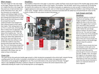
Main Image:-
The main image isn’t the only image
on the page, however the sheer size
of it implies that this is the image that
they want you to look and take most
of the information from. Also, all of
the characters are using direct
address and looking straight into the
camera. The individuals all have pretty
grim looking facial expressions as well,
which could infer that they are a little
bit annoyed that say the
audience/readers have barged into
their rehearsal space to learn about
their habits. Their setting looks to be
as if its in a small room, almost garage
like or a back room of a gig space. This
helps to reinforce to the reader the
ideas of the headline also, “Into The
Wild” as non of the characters look as
if they care about their appearance or
that of the room and they are just
doing what they love without a care
of what the audience may think,
because they know what their fans
like. This is an interesting concept that
Q have chosen as it attracts those of
maybe a younger generation that are
interested in the unique, and can
relate to those in the band.
Headline:-
The headline is featured on the page in a way that is subtle and flows nicely into the layout of the double page spread, whilst
still being noticeable enough to draw in the readers. The headline “Into the Wild” seems to be a quirky was of introducing
the band to the audience as it looks as if the editors have gone on appearance to come up with it, shown by the bands
rugged appearance and casual, messy style. Later on it then becomes apparent that the headline is also hinting to the bands
actual name, “Savages” which is a word most commonly associated with the wilderness and potentially the nature of the
music or habits of the sub-culture to which they belong.
Cover Line
The cover line for this particular double page spread is a little introduction paragraph to the article itself, instead of being
a pulling quote from the article. It provides a small detail as to what the article includes, but apparently crucial
information as the paragraph is highlighted in red. This crucial information is the actual name of the bad, “Savages”
which is also highlighted (literally) in yellow to indicate its importance and direct the article towards them, and
additionally drawing the reader in by introducing them so extravagantly.
Sub-Images and Sub-
Headings
This side bar features a number of
additional sub-headings and sub-
images arranged in a column that is
slightly off-colour to the rest of the
article. This suggests that it contains
extra information about separate
things to the subject of the article as it
doesn’t follow the same design
patterns however still seems to flow
with the rest. The small sub-images
that are shown next to the paragraphs
shows the audience what the extra
pieces of information are actually
about if they don’t know already and
add some variety to the double page
spread to keep the audience
interested.
The column features bands that have
also followed a similar path to the
main band featured in the article, and
ones that have influenced the
particular genre of music in the same
way that “Savages” have. This allows
the magazine to stay popular within
the reader hip as it gives the readers
information on new music and other
artists that they may be interested in
which is an important element of
every magazine.

Magazine Analysis

  • 1.
    MASTHEAD:- NME uses asans serif font in thick lettering to show boldly what the magazine is called and makes sure that it is clear. The magazine also used colour denotations of blacks and whites for this particular cover. This means that the colours are particularly non-descript and haven’t really got any stereotyping around them, helping to attract both genders and potentially widening their readership. Due to the use of just lettering as a title, the meaning of the masthead could be a little confusing to understand what the letters actually stand for. This may help to appeal to the older generations as they are more likely to be able to figure out what the lettering stands for as they may have a more sophisticated vocabulary. Furthermore, to those who are frequent buyers and significant fans of this magazine, being able to recognise the letters can provide a sense of familiarity and almost a smug-ness that they know what this magazine stands for. Date and Price:- To magazines and publishers, featuring a date and a price of the magazine on the cover is a common convention that they must include. Usually, it is small and discreet as the company do not want it to stand out because it isn’t appealing or important to the reader. NME however have recently become a free magazine, and so their information is not so hidden, and featured close to the mast head so that “free” is one of the first things you see, making it quite appealing to the readers, in contrast to other conventional magazines that are usually quite expensive. Plug:- The plug featured on the cover is represented as a battered sticker. The design looks as if it is real and has been through some wear. This, paired with the stark yellow colouring, provides a contrast to the crisp cover of clean black and white lines and fonts. It draws the reader into what message it is providing - “MUSIC, FILM, STYLE.” The plug is an inventive way of informing the reader what the genre of this magazine is, and what they will get from its content. The font is again similar to the fonts used on the rest of the cover, therefore tying it in to the rest of the designs so it doesn’t look too much out of place (even though it does have a different format to the rest of the magazine.) The rustic, old style of the sticker helps to attract those of a younger generation as it adds a cool, effortless vibe to the magazine which may also be a sort of nostalgia to the old ways of the previous generations when they were into these types of things, widening their readership even further. Main Image:- The main feature image of the cover is the band Foals, showing us that this edition of NME is mainly about them. They are all looking at the camera and using direct address which makes us feel connected to the band as if they are going to be personally giving us the information. The members of the band are positioned in an interesting way too. The man at the front is jumping and kicking at the camera, making him the main focus of the image and connotates that he is the leader of the band. His positioning also helps to link the image with the sub-headings and making it all flow. The kicking movement however meant that certain members of the band were cut off slightly, also telling us that maybe they aren’t as important as the main man, or the remaining members that have stayed uncovered. Title, Tagline and Sub-Heading:- The title of this edition of NME is “Foals”, the name of the band who is featured in this magazine. Paired with the main image they make it pretty obvious what the issue entails. The tagline of this magazine is “It’s All Kicking Off” and its sun-heading is “Britain’s best live band are coming for you.” The sub-heading is a puff, used to emphasise and advertise this certain band and to interest the NME readers to buy the new edition of this mag. By calling Foals the “best”, it is almost reassuring to the readers of NME as they rely on this magazine to give them the latest on music trends. So, if Foals have an entire feature dedicated to them, they must be good, therefore people will buy it.
  • 2.
    Who is thetext aimed at? According to their mission statement and reader statistics, their target audience is mostly male readers aged 20-25. Through the marketing of this magazine, they have achieved this mainly by appealing to the latest music and fashion trends, and featuring well known upcoming artists and trend- setting themselves. They have additionally altered the language used in the magazine. Unlike newspapers or other genres such as sports, the texts are written quite informally and have a humorous tone which mirrors the language used by those of the current generation. What assumptions are made about the audience which are revealed in the text’s scheduling and positioning? The positioning of the texts seems somewhat organised. The page is not too busy and is clear, showing us that even though the audience is you, they still want a mature and organised text. The headline and subheadings are mostly in the centre, but the masthead of the magazine is positioned to the left, which is quite ordinary for a magazine and shows that even though the mag tries to be unique and out-there, it still follows some of the conventional idea of a magazine. Having said that, this magazine is original in its own way as it is not cluttered with a lot of sub-headings and sub-images. There is only one clear headline (all in capitals) with a simple sub-heading all positioned in the centre of the page. This shows that the audience of this magazine likes the simplicity and clarity that it provides, and infers that they prefer a sophisticated approach to getting their latest information, and are not as rebellious and crazy for their sub-cultures as you first may think. When and where are the audience most likely to receive this text? Before this magazine went “free”, the audience may have been able to see the cover and buy this magazine from any local supermarket or newsagent in the months that they are issued. Due to the magazine being one of the biggest magazines in the UK it would have also been seen all over, as its readership was widely spread. However, now that the magazine is free, the selling points may have changed for this mag. There may be booths all over the UK giving these magazines out, or people just on the streets handing them out. This may have also increased the readership of the magazine because more people are being exposed to it as people prefer not to spend the money on it, so feel it is good value for money. Each issue of the magazine is usually designed pretty different too. The colour schemes are always different, as well as the topics inside the magazine to give it that variety. To the audience, this means that each issue will look like a different magazine (apart from the NME logo that never changes) making it stand out in the streets or shops. They are then more inclined to pick it up because it looks so different, maybe even without realising that it is the same mag that they may have picked up in the month previous. How will the audience “read” this text? The audience will first see the headline of “FOALS”, due to the 3D aspects of the main image and the headline being in front of that. The colour schemes of this particular issue may not be so bright and in-your-face, but the simplicity and starkness of the light colours will stand out against most other brightly coloured magazine covers and headlines. This magazine also doesn’t have and sub-headings/images, which means that the main image and headline are the only anchorage that the magazine has to draw in the audience and get them to read the magazine. They do this by making the headline bold and unconventional, and using the main image to tie the whole thing together.
  • 3.
    Headline:- For the headline,NME came up with “Houses, Horses and Superstar DJs.” The alliteration between “Houses” and “Horses” gives the article a humorous and fun vibe. The things can also be considered extravagant and usually what you would associate with well-known, rich DJs, giving the readers an impression on what they are about to read, and the alliteration reinforces this idea due to the humour behind it. The use of American Dollar signs to replace the S’s in the words also reinforces the fact that this article is about spending and what these crazy DJs have done with their earned cash, which helps to show the audience what this feature is about whether or not they actually want to read it. The font that the headline is written in also sets the design tone for the entire spread. It almost has a 70’s vibe, which gives it a cool retro feel but also stays modern through the abstract geometry used to give the feature some depth. Cover Line:- The cover line beneath the headline gives the readers a synopsis of what the article is going to be about, and confirms that this feature is about how much money these DJs are earning and what they are spending it on. By using words such as “lucrative” and “out-earning” it instantly makes the article seem more interesting by letting the readers have a sneak peak into the lives of out idols. A common ambition of many young adults is to become rich and famous, and to spend their money on lots of luxurious things. So, to get to read about people that have actually achieved this and are “out-earning” others, it is almost indulging in a fantasy and raises ambitions higher because it shows that it is actually achievable. Sub Image:- Instead of having one main image and a few sub images, this double page spread relies only on sub images to give it the attraction and information. The pictures are mostly headshots of the artist that the text is talking about, and usually paired with a sub heading of the artists name. The headshots are in a triangular shape with additional details to fit with the 70’s vibe and to give the article continuity. Some additional sub images are used in the feature also, often a picture of the subject that the text is talking about to add information and to contribute the reader’s imaginations and thoughts that they are building of the artist. These pictures can also be distinguished from the headshots, as they are tinted the same shade of colour that that particular piece of the article is, for example a shade of the yellow or pink. This helps the spread to keep flowing correctly and so that the images don’t seem out of place or get confused to be something else. Article:- The article of this feature looks at first glance to be a little complicated to follow, however it simple just splits each of the A4 pages into three columns, which breaks up the pages in an interesting yet conventional way for a magazine. The shapes and positioning's of the images and geometric designs only help to draw our eyes through different lines of the page, making it seem complicated and bright. The fonts are small enough to get all of their information in, however clear enough so that it is still legible and ties into the 70’s vibe.
  • 4.
    Masthead:- The Q mastheadis a lot different to other magazines. Most magazines have their masthead at the top central part of the cover, however Q has put theirs at the top left hand side of the page. This is an interesting idea because it makes the magazine unique, meaning once seen, people will instantly know what it means and who it belongs to. Most of the issues all have the same, or similar layouts. The masthead is placed above the main image, and allows it to stand out to the audience because most other magazines place their masthead partially behind or in front of the main image. In addition to the main image, experimenting with the square shape of the logo also lets it stand out due to it being a little unexpected, making it a bold and creative idea. Main Image:- On a Q front cover, the main image always takes up the room of the page left over from where the masthead has been positioned. The image is always a medium close up or medium long shot of the main artist that is featured in the current issue of the mag. Using relatively close up shots of the artists allows the audience to see the details of the facial expressions and emotions, whilst also showing them who the main focus of this particular issue is. The direct address of the images allures the audience, making the audience wonder why that is. The magazine also usually only has one image as the main focus of the cover, which allows us to really see what this magazine is about, and the simple photography emphasises that all this magazine cares about is interesting music, and portraying that to their audience. Banner:- As another trademark to Q magazine, just underneath the masthead it says “DISCOVER GREAT MUSIC.” This is the way that Q magazine decided they wanted to have their magazine represented, which is an info filled music magazine for those who want to hear about the latest trends in the music industry and be up to date on the new and upcoming artists, as well as catch up with the legends. It is also interesting as it is almost a promise and reassurance to the audience that this is a well trusted magazine, one that you can rely on and that will stay loyal to the consumer needs. Pull Quotes and Headline:- Q shows their main article in a way that varied from the conventional ideas of other magazines. They often use pull quotes below the actual headline of the cover to reinforce the messages that the headline is trying to convey to the audience, or they switch it around and use a pull quote above the original headline to give a hint as to the subject of the main feature. The colour schemes of most of the covers completely depends on which photo they use for the main image, as the writing has to be clear over the colours of the images. Often, the main image is so bright and bold that the magazine just settles for a white font, as it is easy to read and make out over the rest of the bright colours but also is non gender specific and so can appeal to those of all genders. However, if the scheme wont allow white, then they will settle for another colour that lets the magazine designs flow nicely. On the other hand, on certain issues, the writing can fit into the colours of the images so well that the wring might be hard to make out, or if they decide on using the same colours for the headline as well as the various other subheadings it can be quite hard to distinguish between the two. This small issue could be seen as a flaw for some readers, however to others it could be seen as a mature element of the magazine that they particularly like. Sub-headings and Cover Lines:- Using slightly smaller, but usually that same style of text, the cover has several other sub-headings which tell the readers of other subjects and features that the magazine has included into the recent issue. Often, the magazine will use bullet points of shortened pieces of information to really interest the reader. This methos is a lot different to most magazines as they do not use bullet points and their headings tend to be a bit longer. Layout:- The layout of this magazine has a clean and bright atmosphere to it, and the main colours of red and white it gives it an uplifting vibe and doesn’t conform to any gender stereotypes, which makes it available to all. The variety of text sizes also allows the text to stand out in its own way, and adding in a close up image for the main image makes it almost close up and personal to us and our interests.
  • 5.
    Masthead:- The masthead onthis contents page is very fitting to the original “Q” themes. It features the signature Q logo next to the word contents so that the reader knows what it is from that moment on. The writing is has also been places on a black square in the very top left hand corner of thefirst page. This provides a great contrast against the white back grounds and the other formats of the design and directs our eyes to it. In addition using the Q alongside the contents is a way of showing that what we are reading is property of Q, and that this is their edition and what they have decided to feature in their latest edition of their magazine. Its all about implying to the audience that this was all their idea and that they are the best at what they do (so to speak.) Headlines:- The headlines of this pages are all different names of each band that is featured in this issue of Q, and interests the audience as they can familiarise themselves to the musicians that they want to read about. It also emphasises that this is a music magazine, and makes it simple for the audience to understand and follow the information that this page is trying to convey, in this case, which articles are going to feature which artists. The headlines are written in the same fonts as each other which aids to keep the simplicity, but also the different band names are all it needs to keep the differentiation in the article and keep it interesting to the audience. A separate headline is also featured in the contents. “100 best albums of the ’90s” has been places in a large red square in the centre of the first page. It is the first thing that your eyes are drawn to on the page, due to the bright colours and contrast to the other aspects of the contents. The text is in a different font to the rest of the writing on the pages, again drawing our eyes to this first and implying that this is what Q are most proud of and want to present to their readers as something they think is important and valued in their community. Sub-Images:- There are lots of images presented on this page instead of having one main image, and each one is presented quite small as to link them to the different articles that are named. ~This adds to the idea that there is more than one interesting article and reassures the audience that they have supplied plenty of new content and found out new information that they would like to show. It also makes the page seem more full and makes it more appealing to the eye in general due to the different subjects of the images, even though they are somehow all related, shows by the fact they most of them contain the use of musical props. This is so that it reinforces the genre of this magazine and although it is about these musicians it altogether shows that music is the key element of the magazine. Layout:- Aside from the conventional aspects of a contents page: the headlines, the page numbers and added sub images to highlight them, this certain layout of the contents page makes the whole design seem quite complex and makes it stand out to those who love to be unique. The layout contains use of square shapes of different sizes and works to divide the page into segments of a particular subject. The use of sectioning all the different parts of the page including “Q Reviews” allows the audience to view it easier. For example some of the content feels divided as the article sets for a different purpose. This design although seems complex, the simple shaping used still lets the audience read the information as it is clearly presented and not too chaotic.
  • 6.
    Main Image:- The mainimage isn’t the only image on the page, however the sheer size of it implies that this is the image that they want you to look and take most of the information from. Also, all of the characters are using direct address and looking straight into the camera. The individuals all have pretty grim looking facial expressions as well, which could infer that they are a little bit annoyed that say the audience/readers have barged into their rehearsal space to learn about their habits. Their setting looks to be as if its in a small room, almost garage like or a back room of a gig space. This helps to reinforce to the reader the ideas of the headline also, “Into The Wild” as non of the characters look as if they care about their appearance or that of the room and they are just doing what they love without a care of what the audience may think, because they know what their fans like. This is an interesting concept that Q have chosen as it attracts those of maybe a younger generation that are interested in the unique, and can relate to those in the band. Headline:- The headline is featured on the page in a way that is subtle and flows nicely into the layout of the double page spread, whilst still being noticeable enough to draw in the readers. The headline “Into the Wild” seems to be a quirky was of introducing the band to the audience as it looks as if the editors have gone on appearance to come up with it, shown by the bands rugged appearance and casual, messy style. Later on it then becomes apparent that the headline is also hinting to the bands actual name, “Savages” which is a word most commonly associated with the wilderness and potentially the nature of the music or habits of the sub-culture to which they belong. Cover Line The cover line for this particular double page spread is a little introduction paragraph to the article itself, instead of being a pulling quote from the article. It provides a small detail as to what the article includes, but apparently crucial information as the paragraph is highlighted in red. This crucial information is the actual name of the bad, “Savages” which is also highlighted (literally) in yellow to indicate its importance and direct the article towards them, and additionally drawing the reader in by introducing them so extravagantly. Sub-Images and Sub- Headings This side bar features a number of additional sub-headings and sub- images arranged in a column that is slightly off-colour to the rest of the article. This suggests that it contains extra information about separate things to the subject of the article as it doesn’t follow the same design patterns however still seems to flow with the rest. The small sub-images that are shown next to the paragraphs shows the audience what the extra pieces of information are actually about if they don’t know already and add some variety to the double page spread to keep the audience interested. The column features bands that have also followed a similar path to the main band featured in the article, and ones that have influenced the particular genre of music in the same way that “Savages” have. This allows the magazine to stay popular within the reader hip as it gives the readers information on new music and other artists that they may be interested in which is an important element of every magazine.