
Recommended
More Related Content
What's hot
What's hot (20)
Viewers also liked
Viewers also liked (20)
Similar to Drafting a School Magazine Cover
Similar to Drafting a School Magazine Cover (20)
Recently uploaded
Recently uploaded (20)
Drafting a School Magazine Cover
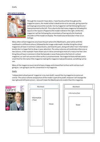
- 1. Drafts Throughthe researchIhave done,I have foundoutthat throughoutthe magazine covers,the model eitherisdeadcentre orto one side,givingroomfor writingtogo aroundthe outside.Formymagazine Iwill be followingthe one I have presentedto the left.Thisisdue tothe fact many magazine followingthis layoutor the layoutisflippedsothe model indeedonthe right.Unlike this magazine Iwill be followingthe conventionsof havingonlythe headand shouldersof the model ondisplay.The modelalsotendstobe inYear 11 or College. Many otherschool magazinesalsohave the part where the Mastheadis,plainwhite withthe mastheadina differentcolours,followedbythe image underneath.Anotherthingthe school magazinesall have incommon isaboutExams,and how thispart, alongwithothermaininformation tendto be in a largerfontto draw inyour attention.The colourschemesall tendtobe eitherone or twocolours,inthe example Ihave shownyouitisblue connotingtomore of a masculine feel. One thingtheyall have incommonin that the barcode isneverfeaturedonthe frontof a school magazine,soI will notuse one eitherasthisisunconventional.The magazinefeaturedhaduseda smart fontfor the name if the magazine makingthe magazine lookprofessional,somethingIamto use. Many of the magazine coverstendtohave a happy andrelaxedfeel tothemwithnottoomuch goingon.I am goingto use this conventioninmymagazine. Drafts ‘Independentschool parent’magazine ismy maindraft,Iwouldlike mymagazine tocome out similar.The colourscheme andpositionof the model ispartof my draft,howeverIwill change the top rightand lefthandcorners.I alsowill make the Mastheada lotsmallerthanthismagazine. Masthead Masthead Information / Text Model Model Information/text
- 2. Drafts The fontsI’m to use: I shall use this for myMasthead because itisboldand therefore will grab my targetaudience straightaway,anditwill alsobe the darkest,boldestfonton the page so it isclearlyvisible thatthisisthe mostimportantpiece onthe magazine page.Ichose thisfontto show the sentimentsof the Magazine andtocarry out the theme. I will use these fontsasmySubheadingsbecause itisstill boldandeasy to readhoweveritwill nottake the mainattentionawayfromthe mainmagazine Headlines.Ilike this fontas it isnot to simple butnotovercomplex,italsohasa relaxed,modernfemininefeel,whichis howI wouldlike myschool magazine tolook. The colour scheme: These colours are not too vibrant but are also no too plain, also the colours chosen have a relaxed, girly feel meaning that it is relatable to my Target audience. Another reason why I chose these colourswhere tograb attentionand because theyall matchand contrast.The various colours create a subtle colour scheme and does not over power the magazine.